
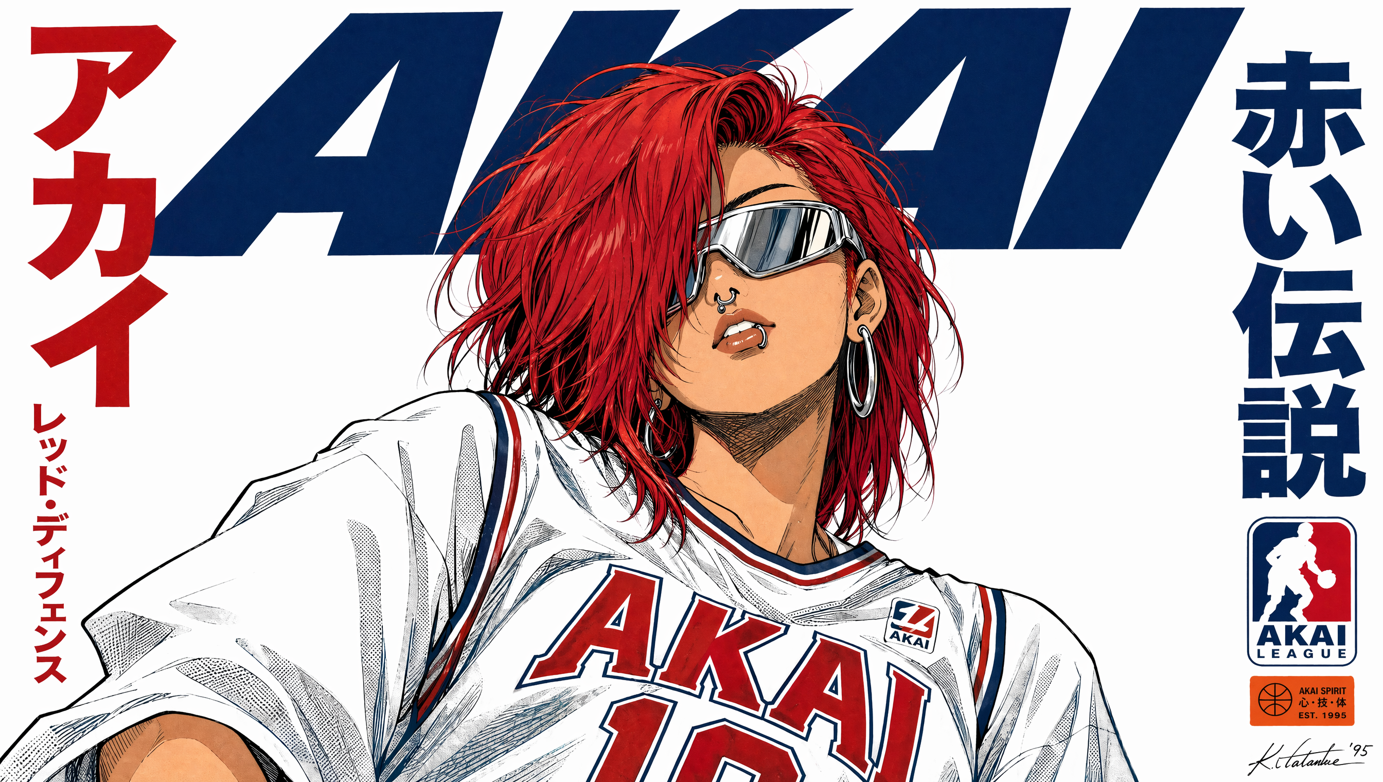
Why Logo Design and Promo Video Belong in One Workflow
Most small teams still treat a logo as a static file and a promo video as a separate project handed to a different freelancer weeks later. That split creates a predictable problem: the mark in the video does not quite match the mark on the website. Spacing drifts, colors shift, and the animation looks like an afterthought bolted onto a finished identity.
Generative tools have collapsed that gap. A single pipeline can take a rough brand idea, produce a set of mark candidates, refine one into a clean geometric logo, and then animate that same logo inside a short promotional film — all while keeping color values, proportions, and typography tied to one specification document.
This guide walks through that pipeline end to end. It assumes you are a designer, founder, or marketing generalist who wants professional-looking output without hiring a full studio. Nothing here depends on one specific vendor; the principles transfer between image models, video models, and editing suites.
What AI Does Well in Logo Design, and What It Does Not
Generative image models are extraordinary at exploration and mediocre at finalization. Understanding that boundary saves hours of frustration.
Where image models genuinely help
- Volume. You can review forty directions in the time it takes to sketch four by hand. Volume matters because the first idea is rarely the best one.
- Unusual combinations. Models happily blend a botanical curve with a circuit trace, or a letterform with an architectural silhouette. Human designers often self-censor those combinations before exploring them.
- Style translation. Give a model an existing mark plus the instruction "reinterpret this as a 1970s geometric badge," and you get a usable reinterpretation rather than a blank page.
- Moodboarding. Even rejected generations are useful as reference material for a client conversation.
Where they consistently fail
- True vector output. Most models return raster images. A raster logo breaks the moment it is scaled to a billboard or printed on a pen.
- Typographic precision. Any text baked into a generated image will have uneven baseline alignment, inconsistent stroke weights, and frequently misspelled letters.
- Negative space logic. The cleverness of a good mark often lives in what is removed. Models tend to fill space rather than carve it.
The vector reality check
Treat every generated logo as a composure, not a deliverable. Your job after generation is to redraw the winning concept on a grid, snap the curves, set the type in a real font, and export clean SVG and EPS files. This is the step most tutorials skip, and it is the single biggest difference between amateur and professional AI-assisted identity work.
A practical compromise: generate at the highest resolution available, place the image in your vector editor, trace the primary shapes manually, then discard the raster. You keep the concept and lose the artifacts.
Build a Brand Kit Before You Generate a Single Frame
The most common cause of a messy AI promo video is starting production before the brand is defined. Motion amplifies inconsistency — a color that looks acceptable in a static frame becomes obviously wrong once it moves.
The five assets to lock first
- Primary mark — the full lockup with wordmark.
- Condensed mark — an icon-only version for small placements and video bugs.
- Color tokens — exact hex values for primary, secondary, accent, and background. Name them ("Deep Slate," "Signal Amber") so you can reference them in prompts.
- Typeface pair — one display face and one text face, or a single family with distinct weights.
- Motion rule — one sentence describing how the brand moves. "Calm, slow, never bouncy" is a valid and useful rule.
Speaking brand language to a model
Video and image models respond to descriptive language, not to design vocabulary. Instead of writing "use the secondary accent color," write "a warm amber highlight, roughly the color of a traffic light at dusk."
A reliable prompt scaffold looks like this:
[Subject and action] + [environment] + [lighting] + [camera movement] + [color guidance] + [mood adjectives] + [technical spec]
For example: A minimalist amber icon rotating slowly above a dark slate surface, soft studio key light from the upper left, slow dolly-in, cool background with one warm accent, calm and confident mood, 16:9, shallow depth of field.
That sentence gives the model subject, space, light, motion, palette, tone, and format. Omitting any one of those variables is usually what produces the generic, slightly-off result that makes AI video look like AI video.
From Static Mark to Animated Logo: The Motion Ladder
Not every brand needs a full promo film. Think in levels, and stop at the level your budget and channels justify.
Level 1 — The reveal animation
Three to five seconds. The mark assembles itself: strokes draw on, a mask wipes across the wordmark, or geometric parts slide into place. This is the workhorse asset for video intros, presentation decks, and social avatars.
Production approach: build it natively in your motion editor of choice using vector shapes. AI is not required here, and hand-built vector animation usually looks cleaner than generated footage because every frame is exact.
Level 2 — The kinetic lockup
Eight to twelve seconds. The mark animates into its final position while a tagline types or slides on, ending on a held frame. This level benefits from AI-generated backgrounds — an abstract gradient, a particle field, or macro footage of a material relevant to the brand.
Layer the generated background behind your vector logo. The logo stays crisp; the background supplies texture. This is the highest-value hybrid technique in the entire workflow.
Level 3 — The full promotional film
Fifteen to forty-five seconds. Now you need shots, pacing, sound, and a narrative arc. This is where generative video models earn their place, and also where the discipline of storyboarding becomes non-negotiable.
Storyboarding a Promo Film Before You Generate Anything
Models reward specificity. A storyboard converts vague intent into the shot list that a model can actually execute.
Write the beat sheet first
A thirty-second promo typically has six beats:
- Hook (0–3s) — a striking image or motion that stops the scroll.
- Problem (3–7s) — the friction your audience recognizes.
- Turn (7–12s) — the moment your product enters.
- Proof (12–22s) — two or three shots showing it working.
- Brand (22–27s) — logo animation and tagline.
- Call to action (27–30s) — one clear instruction and a URL frame.
Each beat becomes one or two prompts. Writing the beat sheet in plain text before touching a model is what separates a coherent film from a sequence of unrelated beautiful clips.
Keep a shot bible
For every shot, record: prompt text, seed or reference image, aspect ratio, duration, and which color tokens appear. When you need to regenerate shot four because a hand looks wrong, the shot bible lets you reproduce everything else exactly. Without it, you will regenerate four times and end up with four different lighting setups.
Aspect ratios and platform cuts
Generate in the widest ratio you will need, then crop down. A 16:9 master can be reframed to 9:16 and 1:1, but a 9:16 generation cannot be widened. For vertical-first campaigns, do the opposite: generate vertical and accept that the horizontal version will be tighter and less composed. Decide the primary platform before generation, not after.
Holding Visual Consistency Across Shots
Consistency is the hardest problem in AI video, and it is solved with references, not with luck.
Use reference images aggressively
Most modern video models accept a reference image that anchors style, subject, or both. Feed the model:
- A frame from the previous shot to continue the look.
- Your logo lockup to keep the brand element accurate.
- A color swatch image to keep the palette on target.
When a model offers separate style and subject references, use them for different jobs: style reference for lighting and grade, subject reference for the product or character.
Lock the grade before you edit
Applying one color grade to every clip in your editor is faster and more consistent than trying to match generation settings across a dozen prompts. Generate slightly flatter and more neutral than you want, then push contrast, saturation, and tint globally. This also makes it easier to match any live-action footage you blend in later.
Continuity checklist
- Does the light direction stay consistent between cuts?
- Do recurring objects keep the same color and shape?
- Does the logo appear at the same scale and position each time?
- Do transitions hide the small inconsistencies models inevitably produce?
- Does the pace feel like one film rather than a montage?
Cutting on motion — a whip pan, a passing foreground object, a match on shape — hides more AI artifacts than any post-processing filter.
Sound Design: The Fastest Quality Upgrade
Audiences forgive imperfect visuals far more readily than bad audio. Budget real attention here.
Music. Choose a track with a clear structural hit near your brand reveal. If the drop lands at 0:22 and your logo animation starts at 0:19, shift the edit rather than the music. Editing to the track is what makes a promo feel professionally cut.
Voice. Synthetic narration has become genuinely usable, but two rules matter: write for the ear (short sentences, no clauses stacked three deep), and generate at a slower pace than feels natural, then speed up slightly in post. Rushed synthetic narration is immediately recognizable.
Sound effects. Whooshes on transitions, a soft impact on the logo reveal, subtle room tone under dialogue. A film with music but no effects sounds like a slideshow; a film with effects but no music sounds like a demo.
Mix levels. Aim for dialogue around −12 dB with music sitting 10 to 14 dB below it, then master the whole piece to a consistent loudness target. Most platforms normalize audio, so an unbalanced mix will simply get quieter, not better.
Quality Control Before You Publish
Run every deliverable through the same checklist. It takes four minutes and prevents most embarrassing launches.
Technical checks
- Text accuracy. Read every on-screen word aloud. Models still misspell, especially in text baked into generated frames. Rebuild all text as an overlay instead.
- Logo integrity. Verify the animated mark against the master file. Check stroke weights, letter spacing, and color values.
- Resolution and frame rate. Export at the platform's preferred specification rather than the model's default.
- Safe zones. Keep text inside the central area so it survives cropping in vertical feeds and profile previews.
Common failure modes
- Morphing hands and faces. Shorten the shot, cut earlier, or replace the frame with B-roll.
- Flickering textures. Reduce the prompt's complexity or regenerate with a stronger reference image.
- Warping straight lines. Architecture and typography are the first things to break. Avoid generating text-heavy signage.
- Inconsistent color between shots. Fix in the grade, not by regenerating.
- Too much motion. A slow, deliberate camera move reads as expensive; constant movement reads as unstable. When in doubt, slow down.
Budget, Time, and When to Bring In a Human
AI compresses the expensive part of identity work — exploration and iteration — but it does not eliminate craft. A realistic breakdown for a solo operator:
- Concept exploration: one to two hours of prompting and shortlisting.
- Vector redraw and type setting: two to four hours. This is where the quality lives.
- Brand kit documentation: one hour.
- Storyboard and shot bible: one to two hours.
- Generation and selection: two to four hours, including failures.
- Edit, sound, and grade: three to five hours.
That is roughly two working days for a logo plus a thirty-second promo — achievable solo, and dramatically faster than traditional production.
Bring in a human specialist when: the logo must survive trademark scrutiny, the mark must work in physical manufacturing, the film needs live actors or a real location, or the brand operates in a regulated category where claims carry legal weight. Use AI for the parts it is good at and pay professionals for the parts where mistakes are expensive.
Frequently Asked Questions
Can I legally use an AI-generated logo?
Copyright rules for purely generated images vary by jurisdiction and are still evolving. In most places, a design you substantially modify and redraw by hand carries stronger protection than a raw generation. If the mark is central to your business, have an intellectual-property professional review it, and always verify the terms of the specific tool you used.
How do I stop AI videos from looking like AI videos?
Five habits do most of the work: generate with a reference image, keep shots shorter than feels intuitive, apply one global color grade, cut on motion rather than on static frames, and invest in audio. Generic output usually traces back to a generic prompt — a prompt with no lighting, no lens, and no mood guidance.
Should I animate the logo in a video model or a motion editor?
Build the logo animation in a vector motion editor and use AI for backgrounds and supporting footage. Vector animation stays crisp at any resolution and can be reused for years, while generated logo motion is difficult to control and hard to revise later.
How many shots should a thirty-second promo have?
Between eight and fourteen. Fewer makes the film drag; more makes it feel frantic. Count each cut as a shot, including the logo reveal and the closing call to action.
Do I need a different prompt for every aspect ratio?
No, but you do need to plan the composition for the primary ratio. If vertical is your main channel, generate vertical with the subject centered and leave headroom for text overlays. Then crop to other ratios from that master.
What if my brand mark is text-only?
That is the hardest case for generators and the easiest for traditional typography. Set the wordmark in real type, use AI for supporting imagery and video, and treat the animated lockup as a motion-design task. Your result will be cleaner and faster to produce.
How long until I should revisit the identity?
Review the kit whenever the market, product line, or primary channel changes substantially. A logo built for a horizontal website hero often needs a condensed variant once short-form vertical video becomes the main acquisition channel — and a good kit anticipates that with a documented icon-only version.
The through-line across all of this is simple: let models handle exploration and texture, and keep human judgment on structure, type, and the final ten percent of polish. That division of labor is what produces work that looks deliberately designed rather than merely generated.
