

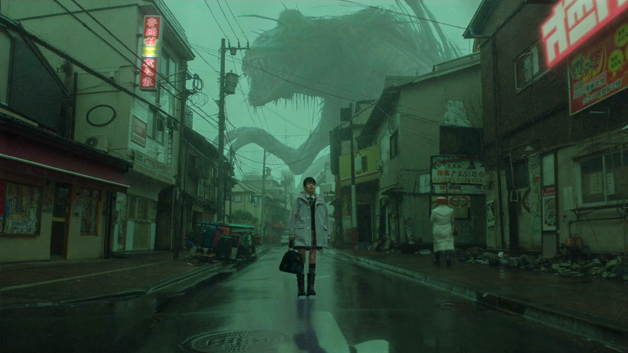

A thumbnail is not decoration. It is the largest single lever most creators control over whether a video ever gets watched. Two channels can publish the same topic, the same runtime, and the same production quality, and one collects ten times the impressions simply because its thumbnail earns more clicks from the same shelf. That gap is not luck. It is a design and testing problem, and modern AI image tools have made the iteration loop dramatically faster than it used to be.
This guide walks through a complete, repeatable AI thumbnail workflow: how to write a visual brief, which categories of AI tools fit which job, how to compose for a preview that is barely 120 pixels wide, how to test variants without fooling yourself, and the mistakes that quietly suppress click-through rate. It is written for creators, editors, and small channel teams who want a process rather than a pile of one-off designs.
Why the Thumbnail Decides Whether Your Video Gets Watched
A thumbnail competes inside a horizontal shelf of four to twelve other images, each rendered roughly the width of a thumbnail nail on a phone. Before anyone reads a title, hears a voice, or sees a single frame of your edit, they process shape, contrast, and faces. That processing happens in well under a second and produces a binary decision: click or scroll. Every hour you spent on scripting, lighting, and sound design is downstream of that decision.
This asymmetry explains an uncomfortable fact about channel growth. Improving your thumbnail can raise total views more than improving your video. Consider a video that receives 40,000 impressions in a day at a 4 percent click-through rate. It collects about 1,600 clicks. Raise the click-through rate to 6 percent and the same video collects 2,400 clicks, a 50 percent audience gain for zero extra production time. Now imagine applying that lift across fifty videos.
AI does not change that math. What it changes is how cheaply you can explore it. Producing eight genuinely distinct thumbnail directions used to require eight rounds of photography, compositing, and revision. With current image models, a broad first pass takes minutes, which frees your attention for the parts that actually determine outcomes: selection, refinement, and testing.
Keep one principle in mind throughout: the goal is not to make a thumbnail that looks AI-generated. The goal is to make the highest-performing thumbnail, using AI as a speed advantage. Viewers never reward the tool. They reward the clarity of the promise in the image.
How Thumbnail Performance Feeds Discovery
It helps to understand what the recommendation and search systems actually do with your thumbnail, because most thumbnail advice treats it as a purely aesthetic question. It is a behavioral question.
Click-through rate as a ranking input
Platforms compare your click-through rate against the expected rate for your position in the shelf and the audience segment being shown. A thumbnail that outperforms expectations on a small test group earns a wider distribution. A thumbnail that underperforms gets throttled quickly. This is why impressions can collapse within hours of publishing and why a single thumbnail replacement sometimes revives a dead video. The system is not judging your artwork. It is measuring whether real people chose it over the alternatives next to it.
Watch time, session time, and the follow-on effect
A thumbnail makes a promise. If the video does not deliver on that promise in the first thirty seconds, the audience leaves, and early abandonment is one of the most damaging signals you can send. A high-performing thumbnail paired with a mismatched video is a short-term win and a long-term penalty. The best thumbnails are aggressive but honest: they dramatize the actual payoff rather than inventing one.
There is also a session effect. A thumbnail that keeps a viewer inside the platform for two more videos is worth more than one that produces a quick bounce, even if both earn the same click-through rate.
What the platform does not measure
No recommendation system knows whether your thumbnail was made with an AI model, a studio camera, or a marker on paper. It does not know how long you worked on it, how much your gear cost, or how clever the concept is. It measures behavior: impressions, clicks, watch duration, and what happens next. That is liberating. It means a two-minute AI composite can beat a two-day photoshoot whenever it communicates the promise more clearly.
Search visibility deserves a note here too. Thumbnails do not directly reorder video search results, but they strongly influence whether people click the results they already see. When your thumbnails reliably earn clicks from search traffic, your channel accumulates the watch-time signals that push future videos higher in search and suggests. Visual relevance matters as well: if a search query is about a specific object, person, or setting, an image that visibly matches the query reads as relevant at a glance.
Build the Visual Brief Before You Open Any Tool
The most common failure in AI thumbnail work is starting with a prompt. A prompt without a brief produces pretty images that do not sell the video. Write the brief first, in plain language, and the prompting becomes almost mechanical.
A four-line brief you can reuse every time
- Promise: the single claim the video delivers, in one clause. Not a topic, a claim.
- Subject: who or what is on screen, plus their emotional state or physical action.
- Contrast device: what makes this frame visually different from the shelf around it. An unusual angle, an unexpected scale, a colour no competitor uses, a before-and-after split.
- Text: three words maximum, in the language your audience thinks in, chosen so the text adds information rather than repeating the title.
A completed brief might read: the promise is that a cheap setup outperforms an expensive one; the subject is a creator laughing in disbelief while holding a small device; the contrast device is a stark split frame with a warm side and a cool side; the text is a three-word result claim.
Research the shelf before you design
Open a private browser window, search your target keyword, and capture the top twelve thumbnails. Then answer four questions. What colours dominate? How many use a human face? Where is text placed, and how much of it is there? What visual style is overrepresented? The answers tell you where the gap is. If nine of twelve thumbnails are dark blue with a shocked face on the left, a bright warm frame with a calm, confident expression and text on the right will stand out for reasons that have nothing to do with quality.
Do the same audit on your own channel. View your last twenty thumbnails as a grid. Consistency builds recognition, but sameness produces fatigue. Aim for a recognizable family: same typeface, same general text placement, same colour accents, with genuine variation in subject, scale, and mood.
Choosing AI Image Tools for Thumbnail Work
There is no single best tool, only tools that fit a specific stage of the pipeline. Think in categories and match the category to the job.
Tool categories and what each is good for
Text-to-image generators are best for backgrounds, props, textures, environments, and concept imagery. They excel when you need a scene that would be expensive or impossible to photograph.
Generative fill and inpainting, usually inside a full image editor, handle extension, cleanup, and object removal. This is where a generated background becomes a finished frame: you extend the canvas to the exact aspect ratio, remove a distracting element, and blend real photographs of your subject.
Template and layout tools handle the parts that should never be generated: type layers, alignment guides, safe-zone indicators, brand colours, and batch export. Keeping type in a design layer rather than inside the generated image is the single biggest quality decision in this workflow.
Upscaling and detail-enhancement tools matter because you will often crop aggressively. A generated image at native size may look fine full-screen and mushy at thumbnail scale.
Frame extraction from your own footage is the most underrated source. Sometimes the best thumbnail is a real frame that you brighten, crop, and separate from the background, with AI used only to rebuild what the crop removed.
Prompt patterns that produce usable frames
Use a consistent prompt skeleton: subject, action or expression, framing, lighting, background treatment, style, and negative space. The final element is the one most people forget. If you need room for three words of text, say so explicitly, for example: leave the right third of the frame as clean, uncluttered space.
Two example skeletons you can adapt:
A mid-shot of a single adult looking directly at the camera with a surprised but genuine expression, strong rim lighting, bold single-colour background, clean empty space on the right third, high contrast, sharp focus, photographic style, wide aspect ratio.
A dramatic close-up of hands holding a small object, moody directional light, dark textured background, subtle motion blur in the background only, product-photography look, empty space across the top, wide aspect ratio.
Generate at the widest aspect ratio your tool supports, then crop. Generating several variations of the same prompt is usually more useful than writing one perfect prompt, because selection is faster than refinement.
Generation versus compositing
Use a simple decision rule. If the value of the thumbnail is a real person, a real product, or a real result, composite: keep the authentic subject and generate only the environment, texture, and background. If the value is conceptual, metaphorical, or illustrative, full generation is fine. Audiences have become sensitive to synthetic faces at thumbnail scale, and an AI-only frame with an implausible face can underperform a simpler composite built from one real photograph.
Composition Rules That Hold Up at Small Sizes
Thumbnails are watched at the size of a postage stamp. Design for that, then enjoy how good the full-size version looks.
Faces and emotional legibility
One face beats three. A large face beats a small face. An expression that is readable at a glance, such as surprise, delight, concentration, or disbelief, beats a neutral pose, however photogenic. Direction matters too: a subject looking toward the text or toward an off-frame object creates a visual path that pulls the eye across the frame, while a subject staring blankly forward creates a dead end.
Avoid the stock-photo smile. Thumbnail expressions should be slightly exaggerated versions of a real reaction, not a catalogue pose. This is also where AI generation often fails: generated faces can be beautiful and completely emotionless. If your generated subject looks inert, prompt for a specific feeling and a specific body position rather than a generic portrait.
Text hierarchy and the three-word ceiling
Type on a thumbnail has one job: to add information the image cannot convey. If the title already says everything, the thumbnail text is noise. Keep it to three words, four at the absolute limit. Set it large, in a heavy sans-serif, with strong contrast against the background, and never place it over a busy area of the image.
Check contrast in both light and dark interface modes. A thumbnail that reads well on a white page can vanish on a dark one. A subtle stroke, a soft shadow, or a solid colour block behind the type solves most contrast problems. And check the letterforms at small size: thin fonts disappear. If you cannot read the words on a phone screen from arm's length, the type is too small.
Safe zones and cross-device framing
The duration badge sits in the bottom-right corner of every thumbnail on the shelf. Keep critical elements, especially type, out of that region. Leave a margin of roughly five percent around the edges so elements are not clipped by rounded corners or overlay elements.
Then run the three-size test. View the thumbnail at roughly 320 pixels wide, 210 pixels wide, and 120 pixels wide. Most designs fail at the smallest size and need one of two fixes: enlarge the subject or delete an element. The squint test is a fast substitute. Squint at the image until details blur. Whatever still reads is your actual design. Everything else is decoration that will not survive the shelf.
Run a Thumbnail Testing Loop That Actually Teaches You Something
Testing is where most creators give up, usually because they compare numbers across videos instead of within them. Done properly, testing is what converts AI speed into compounding improvement.
What to change between variants
Isolate variables when you want to learn, and combine them when you want speed. Useful variables include: face versus no face; warm versus cool colour grade; text versus no text; one wording versus another; wide shot versus tight close-up; clean background versus detailed background; subject on the left versus the right.
A practical middle path is to build three variants per video, each changing one significant variable from your current default. Over ten videos you accumulate thirty data points and a much clearer picture of what your specific audience responds to. Generic best practices are a starting point; your audience is the authority.
Reading results without fooling yourself
Cross-video click-through comparisons are contaminated by traffic source, subscriber mix, topic demand, and seasonality. Prefer within-video testing whenever the platform supports swapping thumbnails and measuring the result. When you do test, wait for meaningful impression volume, at least several thousand per variant, before drawing conclusions. A two percent difference on four hundred impressions is noise.
Judge variants on click-through rate alongside average view duration. A variant that lifts clicks but tanks retention has not solved anything; it has attracted the wrong viewers. Watch for novelty effects too: a radically different thumbnail may spike for three days and then settle back to baseline.
Finally, log everything. Keep a simple table with the video, the hypothesis, the variant description, the impressions, the click-through rate, the retention change, and the decision. Six months of logs is more valuable than any guide, including this one.
A Step-by-Step Production Workflow
Here is the full pipeline, condensed into a sequence you can follow for every upload.
- Write the four-line brief before touching any tool. Promise, subject, contrast device, text.
- Audit the shelf for your target keyword. Note the visual gap you intend to occupy.
- Assemble source material. Real photographs of the subject, product shots, or extracted frames, plus any assets you already own.
- Generate a wide first pass. Aim for twelve to twenty rough options using two or three prompt skeletons, not one.
- Shortlist three concepts that satisfy the brief. Discard anything that would look like everything else on the shelf.
- Composite. Bring the best generated background into an editor, place your authentic subject, extend the canvas to the correct aspect ratio, and clean distractions.
- Add type in a separate layer. Three words, high contrast, outside the duration badge zone, inside the margin.
- Run the three-size test and the squint test. Fix by enlarging or deleting, not by nudging.
- Export, upload, and record the variant in your testing log. Revisit after a set impression threshold.
Total hands-on time for a repeatable workflow usually settles between twenty and forty minutes once you are familiar with your tools. That is a reasonable price for a 30 to 50 percent lift in clicks.
Failure Modes, Mistakes, and Fixes
Most underperforming thumbnails fail for one of a small number of reasons.
Type that is too small or too thin. Fix: increase size, increase weight, and remove words until three remain.
Too many competing elements. Fix: choose one subject and one idea. If two things are fighting for attention, delete one.
Visible AI artifacts. Fix: avoid generating hands close-up, inspect teeth and eyes at full size, never let the model render text, and regenerate rather than trying to repair a broken face.
Mismatch between promise and content. Fix: dramatize the real payoff. If the video does not have a payoff worth dramatizing, that is an editing problem, not a thumbnail problem.
The same composition every single time. Fix: rotate your composition scheme deliberately. Keep the brand layer constant and vary the layout family.
Low contrast against the interface. Fix: check the thumbnail in both light and dark modes and add separation behind the subject.
Ignoring the title relationship. Fix: let the thumbnail and title divide the work. If the title names the subject, the thumbnail should show the outcome, and the reverse.
Designing only on a large monitor. Fix: preview on an actual phone, at shelf size, before you export.
Scaling Thumbnail Production Across a Channel
Once the workflow is stable, the goal shifts from individual thumbnails to a system that produces them consistently.
Build a small library of reusable skeletons: three or four layout families that have performed well, each with defined type placement and safe zones. New videos then start from a known-good structure rather than a blank canvas. Keep brand elements fixed and vary everything else.
Use consistent file naming so assets remain findable: channel, video identifier, variant letter, date. Batch your generation sessions so that one sitting produces backgrounds for several upcoming videos. Set a cadence you can sustain, such as three concepts and one live test per upload.
Introduce a short review checklist before publishing, with five questions: is the promise clear, is there exactly one focal point, is the type readable at the smallest size, is the bottom-right corner clear, and does the image add something the title does not already say? A checklist sounds bureaucratic until you notice how many weak thumbnails would have been caught by question three.
If you work with an editor or designer, give them the brief format rather than revision notes. Briefs scale; taste-based feedback does not.
Frequently Asked Questions
Can AI-generated thumbnails hurt my channel?
Not inherently, but synthetic-looking images with implausible faces can reduce click-through rate and erode trust. The safest approach is compositing: use AI for backgrounds, textures, and environments, and keep real photographs of people and products where authenticity matters.
How many thumbnail variants should I make per video?
Three is the practical sweet spot. One is your default approach, and the other two test a single significant variable each. More than three extends production time without adding much learning, unless you already have a large audience generating high impression volume quickly.
Should the thumbnail text repeat the title?
No. Text on the image should add information, not echo it. If the title poses a question, the thumbnail can show the outcome. If the title names the subject, the thumbnail can show the result or the reaction.
How long should I wait before judging a thumbnail test?
Wait for impression volume, not time. Several thousand impressions per variant is a reasonable floor before you compare click-through rates. Below that, differences are noise. Also check average view duration, because a click that immediately bounces is not a win.
Does a better thumbnail really improve search ranking?
Thumbnails do not directly reorder search results, but they determine whether people click the results they see. Sustained clicks and strong watch time from search traffic feed the behavioral signals that lift future videos in search and recommendations. Visual relevance to the query also helps the image read as a match at a glance.
What size and format should I export?
Export at the largest standard thumbnail resolution your platform accepts, in a 16:9 ratio, and keep the file under a couple of megabytes so it uploads cleanly. Always verify legibility at shelf sizes before publishing, not just at full resolution.
Do I need paid design software?
No. A capable free editor plus a generative image tool covers the entire workflow. The variables that decide performance are the brief, the composition, and the testing discipline, not the software license.
How do I keep thumbnails consistent without making them repetitive?
Fix the brand layer and vary the content layer. Typeface, accent colour, and general text placement stay constant. Subject, camera distance, mood, and background treatment change for every video, guided by what the specific promise of that video requires.
