

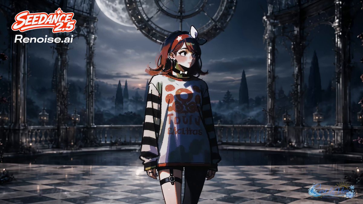
What Pixel-Block Style Transfer Actually Does
Most people meet style transfer as a one-click filter. You drop a photo in, pick a look such as anime, watercolor, or oil paint, and the model repaints the entire frame in a single global pass. It looks impressive in a demo and falls apart in production, because one global pass has no way to distinguish the parts of a frame you wanted protected from the parts you wanted changed. A pixel-block workflow fixes that by changing the unit of control from the image as a whole to a measurable grid.
The core idea is straightforward. Before any stylization happens, the frame is decomposed into a lattice of small tiles that behave like interlocking bricks. Each brick carries its own local statistics: average color, luminance distribution, edge density, dominant gradient direction, and a rough texture signature. A brick sitting over a character's cheek is statistically nothing like one sitting over a brick wall, a sky gradient, or a logo. The pipeline knows the difference because it measured it rather than guessed it.
Once the frame is measured, stylization becomes a layered operation instead of a single repaint. Low-frequency bricks such as skies, backdrops, and soft shadows can absorb the target style aggressively. High-frequency bricks such as facial features, hands, typography, and brand marks are constrained, so the style arrives as a surface treatment rather than a structural rewrite. A reconstruction pass then stitches the bricks back together with edge-aware blending so no grid seams survive.
The practical payoff is that apply this look stops being a gamble. It becomes a parameterized operation you can repeat across dozens of shots and get a predictable answer every time. That repeatability, not raw visual novelty, is what separates a hobby experiment from a deliverable pipeline.
Why Visual Consistency Breaks in AI Pipelines
Ask anyone who has shipped a multi-episode series or a sixty-second brand spot built with generative tools what went wrong, and the answer is almost never that the model was not good enough. It is that shot fourteen does not look like shot two. The jaw is slightly different. The jacket is a different shade of green. The lighting direction flipped between cuts. Audiences may not be able to name the problem, but they feel it immediately, and the work reads as amateur.
Consistency tends to break in four predictable places.
Seed drift. Every new generation introduces new noise and new micro-decisions. Even with a fixed seed, any change to prompt weighting, resolution, or guidance strength creates a cascade of downstream differences.
Reference dilution. A single reference image carries style information and identity information in the same signal. When you push hard on style, identity moves with it. When you push hard on identity, the style flattens out.
Resolution mismatch. Stylizing at a low base resolution and upscaling afterward amplifies the model's brush texture into visible artifacts. Shots rendered at different base sizes end up with visibly different grain, line weight, and edge softness.
Model swaps. Mid-project you switch checkpoints or tools to unlock a specific capability, and the entire visual language resets. Nobody documents the old settings, so the team spends a week reverse-engineering its own look.
A pixel-block stage addresses all four problems because it operates downstream of generation. You are not pleading with the model to be consistent. You are enforcing consistency on whatever it produced, using measurements taken from an approved reference frame rather than from memory.
The Four-Stage Pipeline: Analyze, Layer, Rebuild, Validate
A reliable pixel-block pass has four stages. Skipping any one of them is where quality leaks out.
Stage one: analysis and normalization
The input frame is cropped to the delivery aspect ratio, denoised, exposure-matched against the project reference, and converted into a working color space. Then the frame is segmented into a brick grid, and a statistics table is generated for every brick. At the same time, protection masks are drafted for faces, hands, text, logos, and any prop that carries brand meaning. Normalization matters more than people expect: if shot A is half a stop brighter than shot B before stylization, they will diverge after stylization no matter how identical your settings are.
Stage two: style layering
The style plate, meaning the image that defines the target look, is decomposed with the same grid logic to produce a style profile. That profile holds the palette, contrast curve, edge treatment, and texture signature you are trying to import. The profile is then applied brick by brick using a strength map rather than a single global value. Background bricks might run at high strength, subject bricks at medium, and protected bricks at low strength with detail retention locked on.
Stage three: rebuild and coherence validation
Reconstruction blends the bricks with an edge-aware filter, suppresses seams, and optionally matches grain to the source plate. Then validation runs automated checks: palette distance between the result and the reference, edge-position similarity, facial landmark drift, and a temporal flicker score if you are working on a sequence. Automated checks catch gross drift. They do not catch taste, so a human still reviews a short strip at full size before anything is approved.
Stage four: temporal extension
For video, per-brick statistics are smoothed across a moving window of frames instead of being recomputed independently. This single change removes most of the shimmer that makes stylized footage look like it is boiling. The window is usually three to seven frames, and the correct value depends on how much motion the shot contains.
Building a Reference Kit Before You Generate Anything
The highest-leverage habit in this entire workflow is preparing references before generating a single frame. A reference kit is six to twelve assets plus a one-page written spec, and it costs an afternoon to assemble.
A solid kit contains a hero frame that represents the project at its best, a style plate that defines the target look, a palette strip with the five to seven colors that must survive every pass, a character sheet with three angles and two expressions, a prop sheet, a lighting reference, a texture or grain plate, and one negative reference showing exactly what you do not want.
The written spec is just as important. Record color temperature, contrast curve shape, grain intensity, lens character, and the block size you intend to use and why. Six months from now, when someone asks why the final episode looks different, that page answers the question in thirty seconds.
When choosing the hero frame, prefer a mid-shot with a neutral expression, even lighting, the full costume visible, minimal motion blur, and the highest native resolution available. Do not choose the most dramatic frame. Choose the most representative one, because it will be your anchor for everything else.
Step-by-Step: Running a Pixel-Block Pass on a Still Image
- Lock your working resolution. Decide the delivery size now. If you are finishing at 1080p, a block size of twenty-four to thirty-two pixels is a good starting point. At 4K, forty-eight to sixty-four pixels keeps the same perceived scale.
- Prepare the source frame. Crop, denoise lightly, and color-match against your hero frame. Do not fix contrast after stylization, because stylization amplifies whatever curve you fed it.
- Segment the grid. Generate the brick lattice and export the statistics table so you can inspect which regions read as high-frequency.
- Build protection masks. Mask faces, hands, text, and logos, then dilate each mask by two to three bricks to prevent halo fringing at the boundary.
- Extract the style profile from the style plate, never from the hero frame. Using the hero frame for both identity and style is the most common self-inflicted wound in this workflow.
- Apply with a strength map. Background bricks high, subject bricks medium, protected bricks low with detail retention enabled.
- Rebuild and inspect twice. Once at one hundred percent zoom for artifacts, once at twenty-five percent for overall balance. A still that looks great zoomed in and muddy zoomed out is a failure.
- Save the settings as a preset and file it with the reference kit. Presets are the product here, not the individual render.
Common issues and their fixes: visible seams mean the blend radius is too small; plasticky skin means strength over high-frequency bricks is too high; halos around hair mean the protection mask needs dilation; and color crawl between shots usually means exposure was matched after stylization instead of before.
Moving from Video Generation to a Finished Sequence
Temporal work is where most image-based pipelines collapse. The reason is simple: per-frame statistics jitter. Each frame gets its own slightly different style profile, and the resulting micro-differences read as a boiling or shimmering texture, which the eye detects far more readily than it detects grain.
Three techniques fix it. First, apply temporal smoothing to the statistics across a short window of frames rather than recomputing per frame. Second, anchor keyframes: choose every tenth or fifteenth frame as an anchor, lock it to an approved plate, and interpolate between anchors. Third, use motion-aware brick tracking so that a brick follows a moving edge instead of re-evaluating from scratch. Optical flow or point tracking both work; even a lightweight tracker is enough for moderate camera movement.
Render order matters too. Stylization should happen before final upscaling, and the upscaler should be one that does not invent texture. Alternatively, stylize at final resolution directly if your hardware budget allows, which is always the cleanest option.
Finally, resist the urge to render the whole sequence before checking. Render a three-second strip, watch it on a real display, and fix the preset before committing compute to a full pass. Team after team burns a full day on a render that a thirty-second review would have caught.
Keeping Characters Stable Across Shots
Identity lives in high-frequency detail. Style mostly lives in low-frequency structure. That single observation explains why most style-and-character conflicts happen, and it also tells you how to resolve them.
Start with a character sheet rather than a single portrait. Three angles and two expressions give the identity pass enough information to survive pose changes. Generate or select an approved hero frame for the character, then treat it as your anchor for the whole project.
When producing new shots, prefer image-driven generation over text-only prompting. Feeding a stylized hero frame into an image-to-video or image-variation step preserves far more identity than describing the character in words, because the model receives the actual pixel relationships rather than a description of them.
Use a wardrobe lock. Build a palette strip from the costume and enforce it as a constraint during any color pass. When the jacket drifts two shades, the audience notices in a wide shot even though nobody can articulate why.
Keep an expression library of eight to twelve approved faces per principal character. When a new shot needs a smile you have not generated before, start from the closest approved expression instead of a fresh prompt. It is faster and it keeps the character's micro-features intact.
Finally, run a five-item quality check on every shot: silhouette match, palette distance, landmark drift, grain consistency, and eye-line continuity. Five checks, thirty seconds each, and you catch almost every continuity failure before an editor does.
A Worked Mini-Project: Three Shots, One Look
Imagine a sixty-second product spot with three shots: a wide establishing frame, a medium character shot, and an extreme close-up of the product with a logo.
For the wide, run high style strength with no protection masks at all. The backdrop is the whole point, and nothing in the frame carries identity. For the medium shot, drop subject strength to about sixty percent of background strength and protect the face, hands, and clothing edges. For the close-up, invert the priorities entirely: protect the logo and product texture with strong masks, and let the style live only in the background falloff and the light wrap.
At the end, run one shared grading pass across all three so the grain, black level, and saturation match. Without that final grade, three individually perfect shots will still look like three different projects stitched together. The grade is what makes it a sequence.
Common Mistakes and How to Fix Them
Styling before color management. Fix the color pipeline first. Stylization is not a substitute for shot matching, and it never has been.
Using one reference for everything. Separate style plates from identity plates. Mixing them guarantees that one of the two will drift.
Masks that are too tight or too loose. Tight masks leave halos; loose masks erase detail you wanted to keep. Dilating by two to three bricks is the reliable middle ground.
One strength value everywhere. Uniform strength is why amateur passes look like a filter and professional passes look like art direction.
Judging on a phone at thirty percent zoom. Review at one hundred percent on a calibrated display. Mobile review is for story, not for artifacts.
Swapping models mid-project without re-running the preset. Every checkpoint change needs a re-validation pass on your hero frame. If the hero frame does not match, nothing downstream will.
Over-stylizing faces because the still looked cool. Static frames forgive a lot that motion does not. Faces in particular become uncanny the moment they move.
Forgetting to version presets. Name them with the project, the pass number, and the change you made. Future you will be grateful.
Decision Criteria: When a Pixel-Block Pass Is Worth It
Not every project needs this level of rigor. Use five questions to decide.
How many shots are you delivering? Under five, a well-crafted prompt and a good eye are usually enough. Over twenty, a repeatable pipeline wins every time.
Does identity matter? If a recurring character carries the story, protect identity with masks and references. If it is a landscape montage, skip the ceremony.
Is there text, a logo, or a product in frame? Anything legible must be protected. Generative passes mangle typography more often than they improve it.
How many people will touch the project? A solo creator can hold a look in their head for a week. A team of four cannot. Pipelines exist to make taste transferable.
How likely is revision? Brand work always comes back at least twice. Presets make revisions cheap, and cheap revisions are the whole argument.
A useful rule of thumb: if you expect to regenerate more than fifteen shots, build the reference kit and the preset before you build the shots. If you expect fewer, spend the time on the prompts instead.
FAQ
Do I need a specific model or tool to do this? No. Pixel-block processing is a concept, not a product. Any stack that lets you segment an image, extract local statistics, style a region, and blend the result back together can implement it, whether that is a node-based generative interface, a traditional compositing application, or a small script.
What block size should I start with? Match perceived scale to output resolution. Roughly twenty-four to thirty-two pixels at 1080p and forty-eight to sixty-four at 4K. Smaller blocks preserve detail but cost more compute and introduce more seam risk.
Can I use this on live-action footage? Yes, and the results are often more interesting than on animation because real footage gives the style profile more texture to work with. Expect to spend more time on protection masks around skin and hair.
How do I avoid the plastic look? Lower the style strength over high-frequency bricks and keep detail retention enabled in those regions. Plastic skin is almost always a strength problem, not a model problem.
Does this work for a flat, illustrative style? Yes, and it is often easier because the target style has fewer gradients. Flat styles also tolerate larger block sizes, which makes the pass noticeably faster.
How many references do I actually need? Six assets minimum: hero frame, style plate, palette strip, character sheet, prop sheet, and negative reference. More is better up to about twelve, after which the returns flatten.
Can the workflow be automated? The analysis, masking, application, and validation steps can all be scripted. The approval step should not be. Automate everything except taste, and keep one human review gate before each deliverable leaves the building.
What is the biggest time saver? Building the preset before rendering anything. Teams that invest an afternoon in a reference kit routinely save multiple days of re-rendering later, and they ship a look that stays coherent from the first shot to the last.
