

Why the image generator landscape still feels unsettled
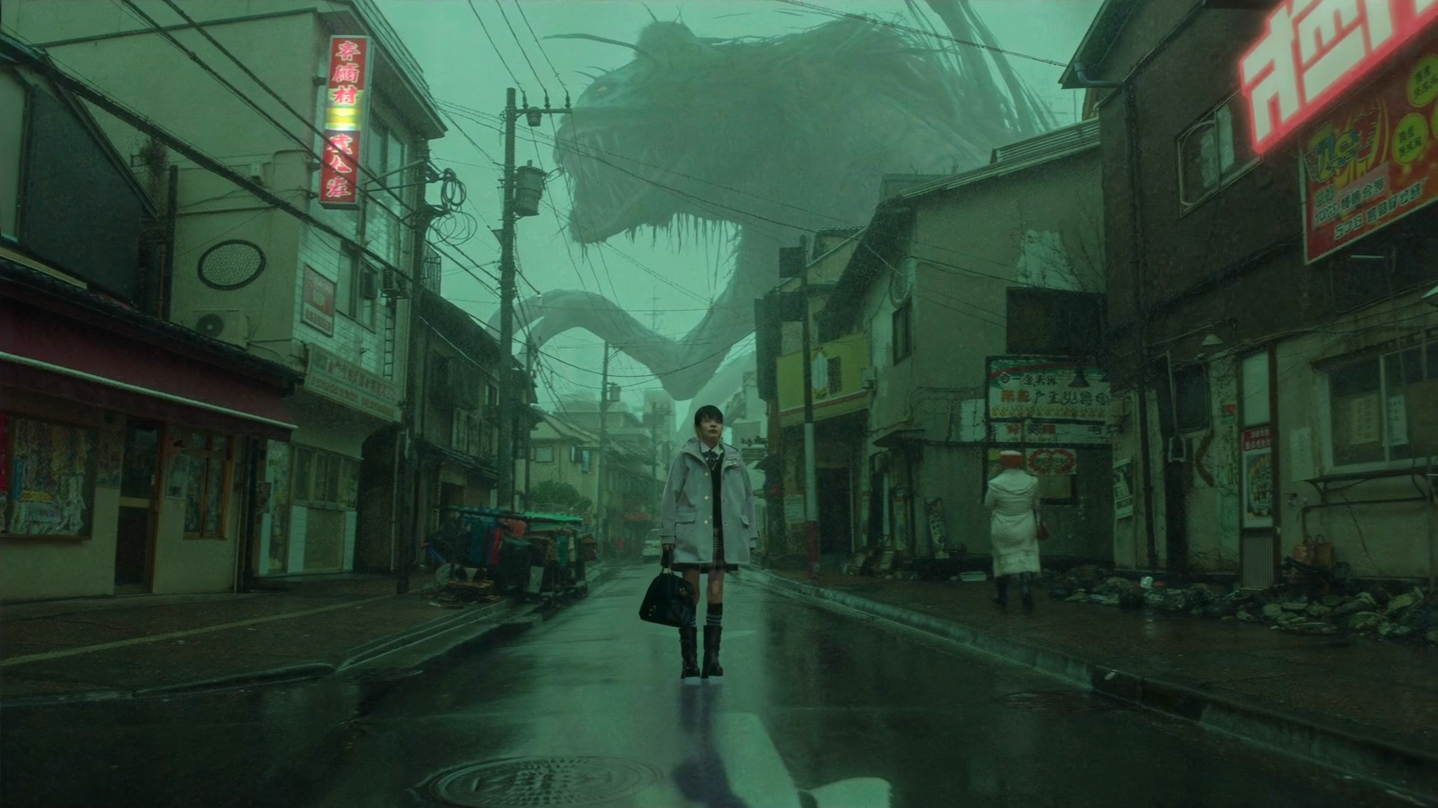
Every few weeks a new model appears, a familiar one gets a quiet upgrade, and the tool that felt unbeatable last quarter suddenly looks average on a specific task. That churn is not a sign that the category is immature. It is a sign that image generation has split into many different jobs: photorealistic portraits, product mockups, editorial illustration, typographic posters, storyboards, texture work, and quick visual brainstorming. No single model is best at all of them, which is why comparisons keep being written and re-written.
Gemini sits in an unusual position in this landscape. It is not a standalone image studio built only for aesthetics. It is a general assistant with image generation and editing woven into a broader conversational workflow. That changes what it is good at and what it is frustrating at, and it makes a straight feature-by-feature comparison against dedicated art tools misleading. The more useful question is: for which stage of my work does Gemini earn a place in the pipeline, and where do I reach for something else?
This guide answers that question with decision criteria rather than hype. It walks through how to evaluate any generator fairly, where Gemini stands out, how the main alternatives differ, which tool wins in specific scenarios, and a prompt workflow you can reuse across all of them.
How to compare image generators fairly
Most comparisons fall apart because they test the wrong things. A model that produces a gorgeous fantasy landscape may be terrible at rendering a legible label on a bottle. A model that nails clean text may produce flat, lifeless lighting. Before picking a tool, decide which of the following dimensions actually matter for your project.
Prompt adherence and instruction following
This is the ability to respect constraints: subject, count, pose, camera angle, background, color palette, and negative instructions. Strong adherence matters most when you need a specific composition — for example, a hero image where a product must sit on the right third of the frame with copy space on the left. Weaker adherence is acceptable when you just want a beautiful image and are happy to be surprised.
Test adherence with prompts that contain three or four checkable constraints, then count how many survive. Models that ignore one constraint will ignore others.
Text rendering
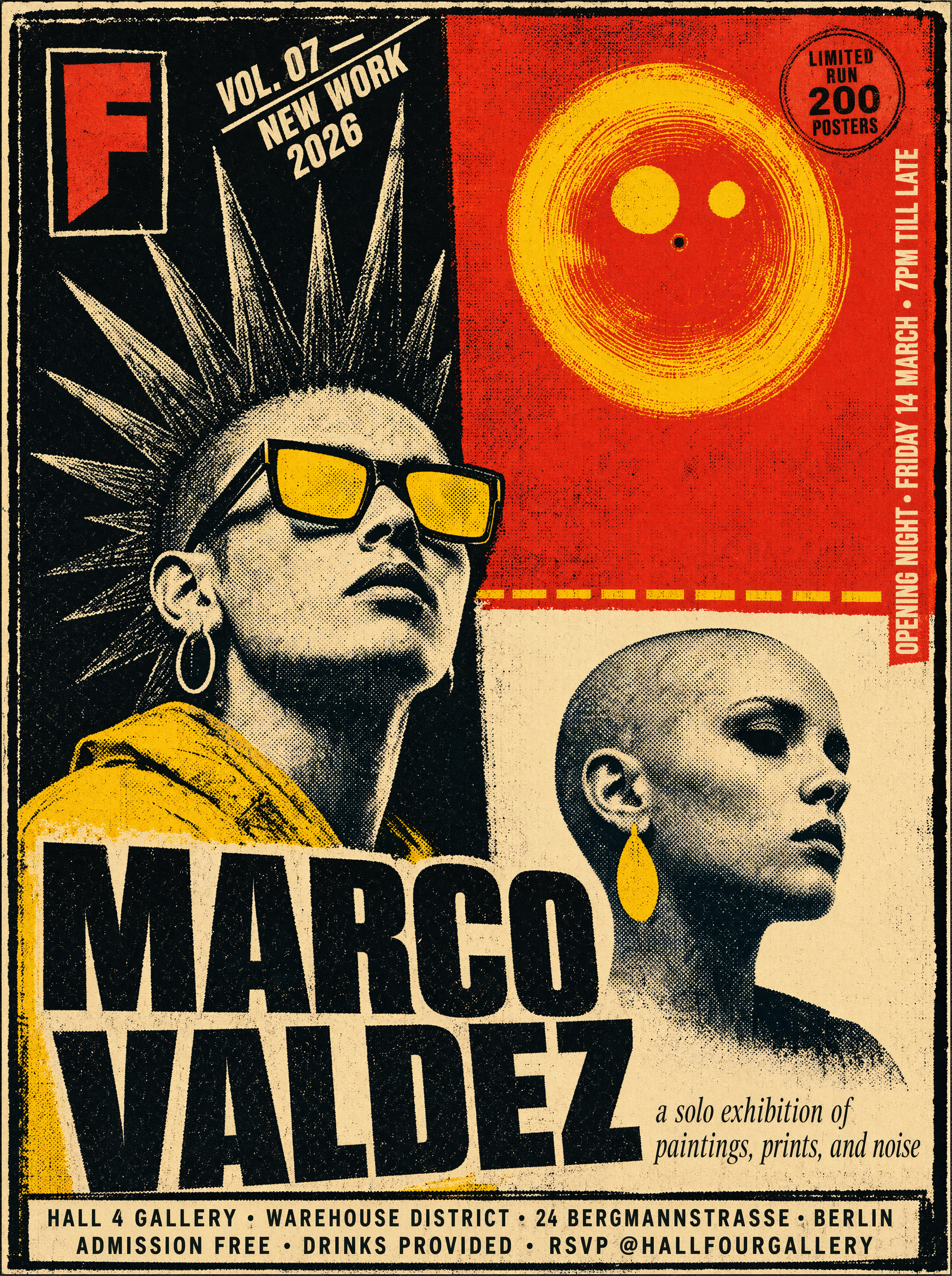
Rendering readable words inside an image used to be a joke. Some current models handle short phrases, labels, and signage well, while others smear letters into decorative shapes. If your output needs a poster, a packaging mock, or a social graphic with a headline baked in, test text early. Remember that even when a model renders text correctly, a design tool is usually still the better place to set final typography.
Style range versus aesthetic defaults
Some tools have a strong house style. Everything they make looks cinematic, or painterly, or glossy in the same way. That is a feature when you want consistency and a limitation when you need range. Other models are closer to neutral, which means more work in the prompt but more flexibility in the result. Ask yourself whether you want a tool that flatters you or a tool that obeys you.
Editing, inpainting, and iteration
Generation is only the first half of real work. The second half is fixing. Cropping, extending the canvas, replacing a background, removing an object, and adjusting a single region without regenerating the whole image are what turn a lucky result into a usable asset. Evaluate how the tool handles follow-up instructions: can you say "keep everything, change only the jacket color" and have it actually comply?
Speed, access, and workflow fit
Latency matters when you are iterating sixty times. It matters less when you produce one polished image a week. Beyond speed, consider where the tool lives: a browser chat, a desktop app, a plugin inside your design software, or an API. A slightly weaker model inside the tool you already use often beats a stronger model that forces a context switch.
Gemini for image generation: where it fits
The practical strength of Gemini is not raw rendering quality in a vacuum. It is the conversational wrapper. You describe a scene, get an image, ask for a change, and the model carries context across turns. That makes it excellent for exploratory work where you are still deciding what you want.
Strengths worth relying on
Iterative editing in plain language. Instead of rebuilding a prompt from scratch, you can reference the previous result and request a targeted change. This shortens the loop between idea and revision.
Broad world knowledge. Because it is a general-purpose assistant, it understands references, historical styles, scientific diagrams, and abstract concepts without needing a special prompt dialect. Ask for a diagram of a specific process and it usually understands the intent rather than the keywords.
Mixing text and image tasks. Generating a caption, a shot list, alt text, and a matching image in one conversation is a real time-saver for content teams, especially when consistency across a series matters more than single-image brilliance.
Accessibility. It is available in places people already work, which lowers the barrier for teammates who would never open a dedicated art tool.
Limitations to plan around
Aesthetic ceiling. Dedicated art models often produce more striking lighting, texture, and composition out of the box. Gemini tends toward clean, legible, safe imagery. That is fine for documentation and communication, less fine for a portfolio centerpiece.
Fine-grained style control. If you want a very specific rendering style, you may need to describe it in words where another tool would accept a style reference image or a trained model.
Precision editing limits. Complex compositing tasks — precise masking, layered edits, non-destructive adjustments — still belong in a raster editor. Treat the generator as a source of raw material, not a replacement for a retoucher.
Consistency across a series. Keeping a character or product identical across twenty images is still hard. Expect to combine generation with reference-driven workflows elsewhere.
The main alternatives at a glance
The rest of the field can be roughly grouped by what they optimize for.
Midjourney-style aesthetic engines
These tools are built first for beauty. Their default outputs have strong lighting, confident composition, and distinct visual identity, which is why they dominate mood boards and concept exploration. They reward short, evocative prompts and punish over-specification. The trade-off is control: precise compositions and long text inside images are harder, and iterative editing is less conversational.
Best for: mood boards, concept art, editorial visuals, hero imagery where atmosphere outweighs exactness.
Conversational assistants with integrated image generation
Gemini belongs here, alongside other general assistants that added image output. The value is breadth and continuity: one thread handles research, copy, and visuals. These tools are weaker on fine stylistic control and stronger on contextual understanding and follow-up edits.
Best for: rapid ideation, explainer visuals, internal documents, slides, and content workflows where speed beats polish.
Open and locally runnable models
Stable Diffusion-family models and newer open architectures such as Flux give you something no hosted tool can: full ownership of the pipeline. You can install community-trained styles, run batches overnight, fine-tune on your own product photos, and keep everything offline. The cost is setup, hardware, and a learning curve around samplers, steps, and guidance values.
Best for: teams with volume needs, strict confidentiality requirements, or a repeated visual style that justifies training.
Typography-first generators
A few tools made legible text their headline feature and now handle posters, packaging, and social graphics far better than general models. They are usually strong at graphic, flat, and illustrative styles and weaker at photorealistic depth.
Best for: posters, labels, badges, thumbnails, and anything where the words are the design.
Creator-suite and commercial-safe tools
Some tools ship inside larger creative suites, with tight integration into layout and vector applications plus clearer guidance on commercial usage. They rarely set benchmark records, but the workflow integration and licensing clarity are worth a lot to studios.
Best for: agency production work, brand systems, and teams that need predictable rights.
Side-by-side scenarios: which tool wins when
Abstract comparisons are useless without tasks. Here is how the decision usually plays out.
Product mockups and packaging
You need a bottle, box, or device rendered consistently, with accurate proportions and space for copy. Start with a typography-first or photography-oriented model, then import into a layout tool. General assistants are useful here mainly for composing the surrounding scene and testing background variants quickly.
Failure mode to avoid: letting the model invent logo text. Generate the object clean and add real branding afterwards.
Editorial illustration
You need something that communicates an idea — remote work, data privacy, burnout — and looks intentional. This is where aesthetic engines shine, because the visual metaphor benefits from atmosphere. General assistants are surprisingly good at the metaphor itself and can suggest three directions in one message, which is often more valuable than one beautiful render.
Workflow tip: use the assistant to generate concepts and captions, then the art engine to execute the chosen direction at higher quality.
Social ads with embedded text
Text-heavy layouts are the wrong job for most general models. Use a typography-capable generator for the background visual and set the words in a design tool where you control kerning, hierarchy, and safe margins. Models that do render text still offer no spell-check, no accessibility guarantees, and no brand consistency.
Concept art and storyboards
For sequences, consistency is everything. Dedicated tools with character references and seed control handle this better than chat-based generators. Use the assistant for the script, beat breakdown, and shot descriptions, then feed those descriptions into the art tool.
Documentation and internal visuals
This is Gemini territory: quick diagrams, labeled illustrations, simple icon-style graphics, and images that just need to be clear rather than beautiful. Speed and low friction matter more than polish.
A prompt workflow that works across every tool
The prompt structure matters less than the process around it. This four-step loop survives model changes.
Step 1: write a one-line brief
Before prompting, write a single sentence describing the job the image must do: "A wide banner image for a landing page about remote team rituals, calm tone, space on the left for a headline." This is your acceptance test. If a result fails this sentence, it fails, no matter how attractive it is.
Step 2: build a four-part prompt skeleton
Use a consistent skeleton so you can compare tools fairly:
- Subject: what the image is about, with counts and actions.
- Setting and framing: location, time of day, camera angle, distance.
- Style signals: medium, lighting, palette, level of realism.
- Constraints: what to exclude, aspect ratio, empty space requirements.
Example: "A ceramic mug on a wooden counter, morning light from the left, medium shot, soft natural photography, warm neutral palette, no text, no people, wide aspect with empty space on the right."
Keep the skeleton stable and change one variable at a time when iterating. Random rewrites hide which change actually helped.
Step 3: generate in threes, not ones
Batch three variations per idea. Compare them against the brief, then refine the winner with conversational edits if the tool supports them. Three is enough to reveal variety without flooding your review process.
Step 4: finish outside the generator
Upres, color correct, add typography, and composite in a proper editor. A generator's output is a starting asset, not a deliverable. Building this finishing step into your timeline is what separates professional results from demo results.
Common mistakes and how to avoid them
Chasing realism when clarity was the goal. For explainers and diagrams, clean and simple beats photoreal every time.
Overloading one prompt. Ten constraints in one sentence means the model silently drops half of them. Split complex scenes into layers or generate components separately.
Ignoring aspect ratio. Deciding the crop after generation wastes the most valuable part of the image. Set it first.
Treating a lucky result as a repeatable process. Save the prompt, seed, and settings. If you cannot reproduce it, you do not have a workflow.
Skipping the rights check. Usage terms differ between tools and between free and paid tiers. Confirm what you are allowed to publish before an asset ships.
Assuming output is factual. Generated diagrams, charts, and historical scenes are plausible, not accurate. Verify any visual that carries information.
Where image generation fits in a larger content pipeline
Images rarely ship alone. A typical sequence looks like this: research and outline, script or copy, visual concepting, image generation, editing and layout, then motion or video if the format requires it. The tool choice at each stage should follow the format, not loyalty to a brand.
A practical division of labor that holds up well:
- Concepting: a general assistant for ideation, references, captions, and shot lists.
- Hero visuals: a dedicated aesthetic engine for quality and atmosphere.
- Text-bearing graphics: a typography-capable generator plus a design tool for final type.
- Repeated styles at volume: an open model you can fine-tune and run locally.
- Motion: animate a still or generate video separately, then keep color and grain consistent across the sequence.
Teams that treat each stage as a separate decision, instead of standardizing on one tool for everything, consistently produce better work with less rework. The temptation to pick a single "winner" is strong, but the honest answer is that your pipeline is the product, and tools are interchangeable parts within it.
FAQ
Is Gemini good enough as a primary image generator?
For documentation, internal visuals, ideation, and quick social assets, yes. For portfolio-grade hero imagery and precise stylistic control, most people pair it with a dedicated art tool.
Do I need more than one image tool?
Most working creators use two or three: one for exploration, one for quality output, and one for text or editing. The overlap is smaller than it looks.
How do I keep a consistent look across many images?
Lock your prompt skeleton, palette, and lighting description, use the same aspect ratio, and reuse seeds or reference images where the tool supports them. Consistency comes from constraints, not from luck.
Can I use generated images commercially?
It depends on the tool and your tier. Check the current terms for your specific account before publishing, and be cautious with recognizable people, brands, and trademarks.
Why does the same prompt give different results across tools?
Each model was trained differently, weighs prompt tokens differently, and applies its own aesthetic defaults. Treat prompts as portable drafts, not universal instructions, and expect to adjust per tool.
What is the fastest way to improve my results?
Replace adjectives with concrete nouns and camera language, generate three variations per idea, and fix images in an editor instead of regenerating endlessly.
The practical takeaway
Gemini is best understood as a flexible, conversational image tool that excels at speed, context, and iteration, and trails specialist models on aesthetic punch and fine control. The right setup is rarely one tool. Match the tool to the job: assistant for thinking and quick visuals, aesthetic engine for beauty, typography-first model for words, open models for repeatable volume, and a real editor for the final ten percent that makes an image usable. Build that pipeline once, document your prompt skeleton, and future model releases become upgrades rather than disruptions.
