
Affiliazione
Inizia Gratis Ora
AI Poster Generators for Marketing: A Practical Workflow
Oct 13, 2026

Why AI Poster Generation Changed the Marketing Production Line
For years, the poster was the slowest asset in a campaign. A single key visual could sit in a design queue for a week while the copy, the offer, and the launch date all moved. That delay shaped behavior in ways most teams stopped noticing: they reused tired assets, shrank ambitious ideas to fit available design capacity, and treated posters as a once-a-quarter deliverable instead of an always-on channel.
Generative image tools collapsed that timeline. A marketer can describe a concept in the morning and have twenty rough directions before lunch. That is not the same as having twenty finished posters, and confusing the two is where most teams get into trouble. The real value is not that software replaces a designer. It is that the blank-page problem disappears and the first stretch of iteration becomes almost free, leaving humans to do the judgment work: choosing, refining, adapting, and protecting the brand.
This guide is a working manual rather than a product pitch. It covers what AI poster generators genuinely do well, where they still fail, how to structure a repeatable production workflow, and the quality checks that separate a campaign asset from something that looks obviously machine-made.
What an AI Poster Generator Actually Does
At its core, an AI poster generator is a text-to-image system wrapped in marketing-friendly controls. You describe a scene, a mood, a product, or a layout, and the model returns rendered images. Around that core, the better tools add practical scaffolding: preset aspect ratios, style references, background removal, upscaling, text overlay fields, and templates that keep repeated elements in the same place across a series.
The three layers worth understanding
The first layer is generation: producing photographic scenes, illustrations, textures, abstract backgrounds, or product mockups. The second layer is composition, where generated pieces meet real brand assets such as logos, typography, QR codes, legal lines, and prices. The third layer is adaptation, where one approved direction is resized and re-cropped for feed posts, stories, print flyers, and display banners.
Most disappointment with these tools comes from expecting one layer to do all three. A generator that produces a beautiful background is not automatically a layout engine, and a layout engine is not a copywriter. Treat them as separate stages with separate quality bars.
What they still struggle with
Two categories remain genuinely hard. First, precise typography. Models have improved at rendering short words, but long headlines, unusual fonts, tight kerning, and languages with complex scripts still break unpredictably. The reliable pattern is to generate imagery without text and add typography in a real layout tool. Second, factual precision. If a poster needs an accurate product label, a specific packaging color, or a legally mandated disclaimer, generate the surrounding composition and composite the exact asset in afterward.
Everything else, from moody lifestyle scenes to clean studio backdrops to stylized poster art, is now fast and repeatable enough to build an entire content calendar around.
The Core Building Blocks of a Modern Poster Workflow
Before generating anything, define the pieces that will be reused across every asset in the campaign. Three building blocks do most of the heavy lifting.
Prompting with structure, not vibes
Freestyle prompts produce lottery results. Structured prompts produce a system. A useful formula is: subject, action, environment, lighting, color palette, camera or rendering style, and negative constraints. For example: "ceramic coffee cup on a marble counter, morning light from the left, warm neutral palette, shallow depth of field, editorial product photography, no text, no people." That prompt is repeatable, and small edits to it produce a coherent family of images rather than ten unrelated pictures.
Brand systems that survive generation
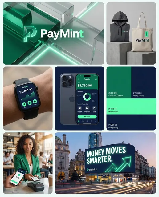
Establish the palette as hex values, the type family as two or three licensed fonts, and the logo rules as clear-space and minimum-size requirements. Then decide where the AI is allowed to improvise. Most resilient brands lock the color temperature and the lighting direction, and let the model vary composition and props. That produces variety without visual drift.
Aspect ratios and channel requirements
Map every channel before you generate: square feed posts, vertical stories, 16:9 for display and video thumbnails, 4:5 for high-impact feed placement, and A-series print sizes for physical flyers. Generating once at the largest required resolution and cropping down is almost always better than generating five separate images, because the lighting and composition stay consistent across the set.
A Step-by-Step Workflow: From Brief to Exported Poster
Step 1: Write a one-page brief
Keep it short enough that someone else could generate from it. Include the audience, the single message, the offer, the emotional tone, the mandatory elements, the channel list, and the deadline. If the brief cannot name one primary message, the poster will try to say everything and communicate nothing.
Step 2: Lock the visual direction with a reference board
Collect six to ten existing images that capture the intended look. Group them into a palette reference, a lighting reference, and a composition reference. Many tools accept these as style inputs; even when they do not, the board keeps every human reviewer aligned on what "good" means before anyone argues about a render.
Step 3: Generate in batches with controlled variation
Pick one structured prompt and change exactly one variable per batch. Batch A varies the environment. Batch B keeps the winning environment and varies lighting. Batch C varies the crop and focal length. This is faster than random exploration because each batch answers a specific question, and it produces a documented trail of what worked.
Generate at least eight to twelve options per batch at low resolution, then re-run only the two or three strongest candidates at full resolution. Iterating cheaply and finishing expensively is the single biggest efficiency gain in this workflow.
Step 4: Composite, repair, and typeset
Bring the selected render into a layout tool. Add the logo, headline, subhead, price, call to action, and legal line. Fix the small generation artifacts: a distorted corner, an extra object on the surface, a shadow that runs the wrong way. Repair tools and generative fill handle most of this in seconds. Add real typography rather than relying on the model's text rendering, and use a consistent grid so a series of posters feels like a family.
Step 5: Check contrast and accessibility early
Overlay text on a busy background and you will lose half your audience on a phone in daylight. Run a contrast check on every text layer, keep the headline above the minimum ratio for large text, and test the poster at thumbnail size. If the message is unreadable when the image is 200 pixels wide, the headline is doing the wrong job or the background is too loud.
Step 6: Export, name, and archive
Export at the required resolutions and color profiles, then name files with a predictable convention: campaign, channel, size, version, date. Archive the winning prompt alongside the final asset. Six weeks later, when a similar campaign appears, that prompt archive is worth more than any single poster you produced.
Prompt Patterns That Produce Usable Marketing Posters
A few recurring patterns cover most marketing needs. Learn these and you can build a personal library rather than reinventing language every time.
The clean studio shot. Neutral seamless background, soft directional light, product centered, generous negative space on one side for a headline. This is the workhorse for offers and price-led posters.
The lifestyle context. A person or scene that implies the benefit rather than stating it. Specify the emotional tone explicitly, because models default to generic stock optimism unless you ask for something specific such as quiet focus or relaxed celebration.
The illustration system. Flat vector-style imagery with a limited palette creates a distinctive poster look that scales across a campaign and reads clearly at small sizes. Ask for a limited number of colors and no gradients to keep it consistent.
The seasonal or event backdrop. Textures, environmental motifs, and abstract shapes work well because they carry mood without demanding product accuracy. Generate several variants and reuse the strongest one across all channels.
The typographic-poster base. A bold, textured, or collage-like background designed to hold a large headline. Generate it with deliberate empty space and never ask the model to place the words.
Across all patterns, negative constraints matter as much as positive ones. Explicitly exclude text, watermarks, extra limbs, brand-adjacent logos, and unwanted props. The more specific the exclusion, the fewer renders you throw away.
Common Mistakes That Sink AI Poster Campaigns
The first mistake is chasing novelty. Teams generate striking, strange, award-bait imagery that has nothing to do with the offer, then wonder why engagement rises and conversions do not. A poster is a conversion surface with an aesthetic component, not the other way around.
Editorial consistency is the second trap. Each poster looks good alone, but the set has five different lighting setups, four palettes, and three type scales. The fix is a locked brand system and a small set of approved visual recipes rather than free experimentation for every asset.
The third mistake is treating the first render as final. Generation is the cheapest part of the process; refinement is where quality lives. Budget roughly as much time for compositing, repair, and typesetting as you spent generating.
Finally, ignore the legal and disclosure side at your peril. Know whether you can use generated imagery in a paid advertisement, whether your model or platform restricts certain subject matter, and whether your market requires disclosure. Keep records of prompts and source assets for every published poster, because reconstructing that history after a complaint is far harder than saving it upfront.
Quality Control: A Checklist Before Anything Ships
Run the same checklist on every asset, in the same order, so nothing slips through when a deadline compresses the schedule.
- Message test: can a stranger state the offer after three seconds of viewing?
- Contrast test: is every text layer readable at full size and at thumbnail size?
- Detail test: zoom to full resolution and inspect edges, hands, reflections, and small props for artifacts.
- Brand test: palette, logo clear space, type hierarchy, and tone all match the system.
- Accuracy test: prices, dates, legal lines, product names, and claims are correct.
- Channel test: crops work for each target aspect ratio without cutting the subject awkwardly.
- File test: correct resolution, color profile, naming convention, and export format.
When a poster fails a test twice, stop patching it and regenerate from the brief. Rescue attempts on a bad composition cost more than starting over with a sharper prompt.
Choosing the Right Tool Stack
You rarely need one tool that does everything. A stack of three or four focused tools is faster than fighting a single all-in-one platform.
For image generation, prioritize control over spectacle. Look for reference image support, reliable aspect-ratio outputs, seed control for repeatability, and the ability to re-run a prompt with one variable changed. For editing, choose whatever your team already knows, because the composite stage benefits from muscle memory more than from novelty features. For layout, a real design tool with reusable components and a shared type library will beat a template gallery once you produce more than a handful of posters.
For teams producing high volume, the deciding factor is usually governance rather than image quality: shared brand libraries, version history, approval states, and export presets. When several people touch the same campaign, consistency tools save more time than any single generation feature.
Scaling From One Poster to a Repeatable System
The difference between a team that experiments with AI posters and a team that ships them reliably is process, not model choice. Write the brief template. Save the prompt library. Document the visual recipes that survived testing. Keep the shared asset folder organized by campaign and channel. Track which poster types actually perform, and retire the ones that look impressive but never convert.
Once a month, review the archive. Which prompts produced assets you actually shipped? Which channels needed the most manual repair? Which sizes caused the most cropping problems? That review, not the next shiny feature release, is what makes the second campaign faster and better than the first.
Frequently Asked Questions
Can AI posters replace a designer entirely?
For simple, template-driven assets with a locked brand system, a marketer can produce acceptable output without a designer. For anything with an unusual layout, complex typography, or a high-stakes campaign, a designer's judgment still shows. The realistic model is collaboration: AI handles exploration and production volume, people handle the final 20 percent that determines whether the poster looks credible.
Why does the text always look broken?
Image models render text as pixels that resemble letters rather than as real type. Short words sometimes work; anything longer usually fails. Generate imagery without text and add typography in a layout tool. This also makes localization far easier, because you swap the text layer instead of regenerating the image.
How many variations should I generate per poster?
Eight to twelve low-resolution options per batch is a practical range. Fewer limits your choices; more slows review without improving the outcome. Then refine two or three candidates at full resolution.
How do I keep a series visually consistent?
Lock the variables that carry identity: palette, lighting direction, focal length, background treatment, and type scale. Vary subject and composition instead. Saving the exact prompt and seed for your winning render makes matching a new poster to an existing set much easier.
Can I use generated imagery in paid advertising?
Policies vary by platform and market, and disclosure rules differ for advertising versus organic content. Read the terms of the tool you use, check the advertising platform's rules, and keep records of what you generated and when. When in doubt, consult someone who knows your jurisdiction rather than assuming.
What is the biggest time saver in this workflow?
Iterating cheaply. Generate many low-resolution options, choose the best one, and only then spend time on high resolution, compositing, and typesetting. Teams that generate one full-resolution image at a time and then discard it repeatedly lose most of the available speed advantage.
Do I need expensive hardware?
For cloud-based generation tools, no. A mid-range laptop handles compositing and layout comfortably as long as you keep files organized and work at sensible resolutions until the final export. Local generation setups have their own requirements, but they are a choice rather than a necessity.
The Bottom Line
AI poster generators are best understood as an accelerator for the middle of the production process. They solve the blank page, the slow first draft, and the tedious resizing. They do not solve strategy, brand judgment, or the discipline of checking every asset before it ships.
Teams that get the most from these tools keep three habits: they write short briefs with one clear message, they lock a small visual system and let it constrain the output, and they treat refinement as a first-class stage rather than an afterthought. Build those habits and the tooling becomes almost invisible. A concept becomes a finished, on-brand, channel-ready poster in the time it used to take to schedule a kickoff meeting, and the creative energy of the team moves from production work to the ideas that actually move a campaign forward.

Alexander
More Blogs
Read MoreVidu Q4 Alternatives: 4K AI Video Models Compared (2026)
Vidu Q4 alternatives compared: Kling 4.0, Seedance 2.5, Wan 3.0, and Runway Gen-4 — 4K support, input modes, durations, audio, and what each costs in credits on Domer.
Top 4K AI Image Generators in 2026: 5 Models Compared on Real Costs
The top 4K AI image generators on Domer compared: Flux 3 Klein, Nano Banana 2.1, GPT Image 2.5, GPT Image 2, and Nano Banana Pro — 4K credit costs, reference limits, and speed.
Nano Banana 2.1 vs GPT Image 2.5: Which Image Model Should You Use? (2026)
Nano Banana 2.1 vs GPT Image 2.5 Flare compared: credit costs per resolution, aspect ratios, reference images, text rendering, and which tasks fit each model.