
Crea
Affiliazione
Inizia Gratis Ora
Photo Size Comparison: Optimize AI Visuals for Every Platform
Oct 13, 2026

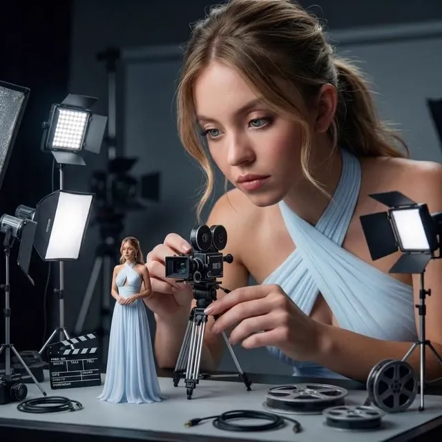
Why Your AI Visuals Look Great in the Generator and Soft on the Feed
Every image tool shows off its output on a generous canvas with a neutral background. The file looks crisp, the lighting feels intentional, the composition reads clearly. Then you upload it, and something quietly degrades. Edges turn mushy, the subject gets clipped at the chin, text baked into the image smears into unreadable shapes, and gradients develop ugly bands. The generation was not the problem. The file was simply never matched to its destination.
Sizing AI-generated visuals is not quite the same discipline as sizing photographs. A photo arrives with a fixed composition; your job is to crop around what already exists. A generated image is elastic. You can regenerate, outpaint, extend the frame, shift the subject, or re-render the same prompt at a different ratio without losing authenticity. That flexibility is a real advantage, but only when you decide the destination before you start generating.
This guide walks through the three variables that actually determine perceived quality — aspect ratio, pixel dimensions, and file format — then maps them to the places AI visuals usually live: social feeds, vertical video, websites, portfolios, and video thumbnails. You will also get a repeatable export workflow, a list of the mistakes that make strong images feel amateur, and answers to the questions that come up most often once you start publishing at volume.
The Three Levers: Aspect Ratio, Resolution, and Format
Most sizing problems trace back to one of three decisions. Get them right in the right order and almost everything else resolves on its own.
Aspect ratio decides composition, not just shape
Aspect ratio is the proportional relationship between width and height. It is the first decision because it governs where the subject sits, how much environment survives, and whether the image can be reused at all. A 1:1 square is forgiving and thumb-friendly. A 4:5 portrait gives you roughly 25 percent more vertical real estate in a feed and reads as more premium. A 9:16 vertical is designed for full-screen phone viewing and needs generous space at the top and bottom for interface overlays. A 16:9 landscape suits video, blog headers, and embeds.
The practical rule: generate in the ratio you will publish. If you genuinely need multiple ratios, generate the widest and tallest versions separately rather than cropping one master into shapes it was never composed for. If regenerating is not an option, generate with extra margin — a subject that occupies 60 percent of a 3:2 frame can survive a crop to 1:1, while a subject that fills the frame edge to edge cannot.
Resolution and pixel density are not the same as DPI
Resolution is measured in pixels: 2048 × 2048, 1080 × 1920, and so on. DPI, or dots per inch, describes print density and is largely meaningless for screens. Browsers and apps ignore the DPI tag in a file and display the pixels they are given, scaled to the layout. A 300 DPI label on a 600-pixel-wide image does not make it sharp.
What matters is having enough pixels for the largest place the image will appear, plus a buffer. Upscaling can smooth edges, but it cannot invent detail that was never generated. Downscaling, by contrast, is nearly always safe and often improves apparent sharpness. This is why the master file should be the biggest version you will ever need, and everything else should be derived downward from it.
A sensible baseline for a master: 2048 pixels on the long edge for most social and web placements, 2560 pixels when the image will appear as a full-width hero or on a high-density display. If your generator tops out lower, choose a composition that tolerates it — fewer fine details, less texture, no small text — rather than fighting the limit later.
File format changes weight more than quality
The format question is really about compression behavior. PNG is lossless and excels at flat color, line art, logos, and images with embedded text, but the files are heavy. JPEG handles photographic gradients efficiently and is still the safest universal choice for delivery, though aggressive compression creates blocking around edges and banding in skies. WebP delivers noticeably smaller files than JPEG at comparable quality and enjoys broad support across modern browsers and apps. AVIF compresses even better but decoding is slower on older hardware.
One habit matters more than format selection: never re-save a JPEG repeatedly. Each save re-compresses and compounds artifacts. Keep one lossless master and export fresh JPEGs or WebP files from it every time.
Platform-by-Platform Targets for AI Visuals
Treat the table below as starting points, not laws. Each platform adjusts its rendering over time, but the underlying proportions stay remarkably stable.
| Placement | Aspect ratio | Suggested master | Format | Notes |
|---|---|---|---|---|
| Square feed post | 1:1 | 1440 × 1440 | JPEG / WebP | Safest all-purpose crop |
| Portrait feed post | 4:5 | 1350 × 1688 | JPEG / WebP | More vertical presence in feeds |
| Stories / Reels / Shorts | 9:16 | 1080 × 1920 | JPEG / PNG | Keep subject out of top and bottom bands |
| Link preview card | 1.91:1 | 1200 × 630 | JPEG | Controls how shared links appear |
| Video thumbnail | 16:9 | 1280 × 720 | JPEG | Must read at 320 pixels wide |
| Blog hero image | 16:9 or 3:2 | 1920 px wide | WebP / JPEG | Serve responsive variants |
| Portfolio grid tile | 3:2 or 4:3 | 1500 px wide | WebP / JPEG | Consistent ratio across tiles |
| Vertical pin board | 2:3 | 1000 × 1500 | JPEG | Tall crops reward strong top-third |
Social feeds reward vertical bias
Feeds are consumed on phones, one thumb-width at a time. Portrait crops occupy more screen, which translates into more attention and slower scroll-past. Generate square or portrait masters and keep faces, hands, and any critical prop inside a central safe area. If the image will also run as a link preview, export a separate 1.91:1 crop instead of letting the platform choose one for you — auto-crops are the single most common source of awkward framing.
Vertical video needs headroom built in
In a 9:16 frame, interface elements cover the top and bottom portions of the screen. Everything that matters should live in the middle 60 to 70 percent of the height. When generating vertical visuals, prompt for space: negative space above the subject, breathing room below, and nothing important near the edges. Text baked into the image is a trap here — overlays move, and typography generated by an image model is unreliable at small sizes. Add real type in a layout tool after export.
Websites and portfolios need consistency above all
On a website, inconsistent ratios read as carelessness faster than imperfect color. Pick one ratio for card grids, one for hero banners, and stick to it across an entire section. Also plan for responsive delivery: the same image should be served in several widths so phones download a small file and large monitors get a sharp one. Portfolio pages benefit from a slightly larger master because visitors often zoom or open a lightbox.
Video thumbnails live or die at small sizes
Thumbnails are evaluated at roughly 300 pixels wide in a crowded grid. Fine detail vanishes, so the composition has to work as a silhouette. One clear subject, strong contrast against the background, and generous negative space for a title overlay will outperform a technically flawless but busy image every time. Generate thumbnails with the overlay area left deliberately empty.
A Repeatable Export Workflow
Ad hoc resizing is where quality leaks away. A short, consistent workflow prevents almost every problem described in this article.
Step 1: List destinations before writing the prompt
Write down every place the image will appear and the strictest ratio among them. If the same visual must serve a 9:16 vertical and a 16:9 header, you already know you need two generations rather than one aggressive crop.
Step 2: Generate the master at the largest sensible size
Aim for the biggest long edge you will ever need, in the ratio closest to the majority of placements. Generate extra variants of the same prompt — three or four candidates cost little and give you options if a crop later removes a hand or an important object.
Step 3: Fix the master before deriving anything
Correct color, contrast, and noise on the master while it is still large. Repair artifacts, stray limbs, or malformed props now, when there are more pixels to work with. Deriving crops from an uncorrected master means redoing every correction several times.
Step 4: Crop with a fixed focal point
Crop all variants around the same focal point so a series of images feels authored rather than assembled. Keep a single layered master file so every crop remains non-destructive.
Step 5: Export with a naming convention
Include project, subject, ratio, and pixel dimensions in filenames: launch-hero-16x9-1920.jpg, launch-hero-9x16-1080x1920.jpg. Six months later, this convention is the difference between reusable assets and a folder of mystery files.
Step 6: Verify in context, then compress
Preview each export at its real display size — not at 100 percent zoom — before final compression. Sharpness judged at full zoom is misleading; sharpness judged in a feed mockup is what viewers actually experience.
Making Underpowered Generations Hold Up
Sometimes the generator simply cannot produce the resolution a placement demands. There are three honest options, in order of preference.
Regenerate larger. If the model supports a bigger output, this is almost always the best answer. Detail is captured at generation time rather than guessed afterward.
Outpaint or extend. Expanding the canvas gives the model new area to fill and can effectively raise the usable resolution of a scene while adding compositional breathing room.
Upscale, carefully. Modern upscalers reconstruct plausible fine detail from a small image surprisingly well, but they also invent texture. Watch for plastic skin, melted foliage, and repeating patterns. Mild sharpening after upscaling helps; heavy sharpening produces halos along every edge and reads as fake immediately.
A useful trick for gradients that band after compression: add a very small amount of fine grain before export. Grain breaks up the flat areas and hides banding at a fraction of the file weight that a higher quality setting would cost.
Size, Speed, and Discoverability
Image weight affects page speed more than almost any other single asset type. A hero image that weighs a megabyte delays the largest contentful paint, drains mobile data, and increases bounce. Reasonable budgets: under 300 KB for a full-width hero, under 120 KB for in-article images, and under 80 KB for thumbnails. Modern formats make these targets easy without visible quality loss.
Three delivery habits matter alongside size. Serve multiple widths so the browser picks an appropriate file. Set explicit width and height attributes so layout does not jump while images load. Lazy-load anything below the fold, but never lazy-load the hero image, since that directly harms the metric you are trying to protect.
Discoverability has a sizing dimension too. Correct link preview dimensions determine whether a shared link appears as a clean card or a badly cropped sliver. Descriptive alt text serves accessibility and image search simultaneously, and it costs nothing but a sentence.
Common Mistakes That Wreck Otherwise Great Visuals
- Generating square and cropping to vertical. You lose the composition you carefully built and usually clip a head or a hand.
- Upscaling a tiny generation to a huge canvas. Interpolated detail looks waxy, and viewers notice even if they cannot name the problem.
- Exporting PNG for photographic images. You pay several times the file weight for no visible benefit.
- Letting the platform auto-crop link previews. Supply a dedicated 1.91:1 crop instead.
- Re-saving JPEGs repeatedly. Each save compounds artifacts until edges look polluted.
- Over-sharpening to compensate for softness. Halos are more distracting than mild softness.
- Mixing ratios in one grid. A single inconsistent tile makes the whole layout feel unintentional.
- Ignoring overlay zones in vertical formats. Important content ends up hidden behind interface elements.
- Trusting baked-in text. Generated typography frequently misspells or distorts at small sizes.
- Judging quality at 100 percent zoom. Always evaluate at the size viewers will actually see.
How to Choose a Target Size When You Are Unsure
Work backward from four questions. What is the largest place this will ever appear? What is the strictest ratio among its destinations? Will it be seen in a phone feed, where vertical wins, or on a desktop layout, where landscape wins? Does anything overlay it — captions, interface chrome, a title treatment?
The answers produce a simple rule: generate one master at the largest size and the strictest ratio, then derive every other version downward. Never crop upward from a small file, and never let a platform decide framing for you. When in doubt, generate larger and in a more square ratio — square crops gracefully into both portrait and landscape, while extreme ratios do not travel in either direction.
Frequently Asked Questions
What size should I generate AI images at?
Aim for 2048 pixels on the long edge as a general baseline, and 2560 pixels when the image will serve as a full-width hero or appear on high-density displays. Always generate at or above the largest size you will publish rather than upscaling afterward.
Does DPI matter for online images?
Almost never. Screens display pixels, not inches. A 72 DPI file and a 300 DPI file with identical pixel dimensions render identically in a browser. Reserve DPI considerations for print work.
Should I upscale or regenerate?
Regenerate when the model supports a larger output, since detail captured at generation time is genuine. Upscale when regeneration is impossible, and inspect closely for invented texture before publishing.
PNG or JPEG for AI art?
JPEG or WebP for anything photographic, including illustrated scenes with soft gradients. PNG for flat graphics, logos, screenshots, and images where crisp text must survive compression.
Why does my image look blurry after uploading to a social platform?
Usually because the upload was smaller than the platform's recommended dimensions, so the platform upscaled it. Upload a file at or slightly above the recommended size and let the platform downscale instead.
Can I use one image for both a feed post and a story?
You can, but you should not crop horizontally. Generate a 4:5 portrait master and a separate 9:16 vertical version so each composition is composed for its frame rather than squeezed into it.
How many variants should I export per image?
Two to four is usually enough: a square, a portrait, a wide crop for link previews, and a vertical version if stories or short-form video are involved. More than that creates maintenance overhead without meaningful reach.
Does file size still matter if my audience has fast connections?
Yes. Mobile networks fluctuate, page speed affects search performance, and oversized images cost real money on data plans. Compression is one of the few optimizations with no downside when done properly.
A Short Checklist Before Every Publish
Confirm the ratio matches the destination. Confirm the pixel dimensions meet or exceed the platform's recommendation. Confirm the subject survives the crop at thumbnail size. Confirm the file is exported from a lossless master in the right format. Confirm the weight fits the placement's budget. Confirm the framing leaves room for anything overlaid on top. Six checks, thirty seconds, and the difference between visuals that look generated and visuals that look designed.

Alexander
More Blogs
Read MoreVidu Q4 Alternatives: 4K AI Video Models Compared (2026)
Vidu Q4 alternatives compared: Kling 4.0, Seedance 2.5, Wan 3.0, and Runway Gen-4 — 4K support, input modes, durations, audio, and what each costs in credits on Domer.
Top 4K AI Image Generators in 2026: 5 Models Compared on Real Costs
The top 4K AI image generators on Domer compared: Flux 3 Klein, Nano Banana 2.1, GPT Image 2.5, GPT Image 2, and Nano Banana Pro — 4K credit costs, reference limits, and speed.
Nano Banana 2.1 vs GPT Image 2.5: Which Image Model Should You Use? (2026)
Nano Banana 2.1 vs GPT Image 2.5 Flare compared: credit costs per resolution, aspect ratios, reference images, text rendering, and which tasks fit each model.