
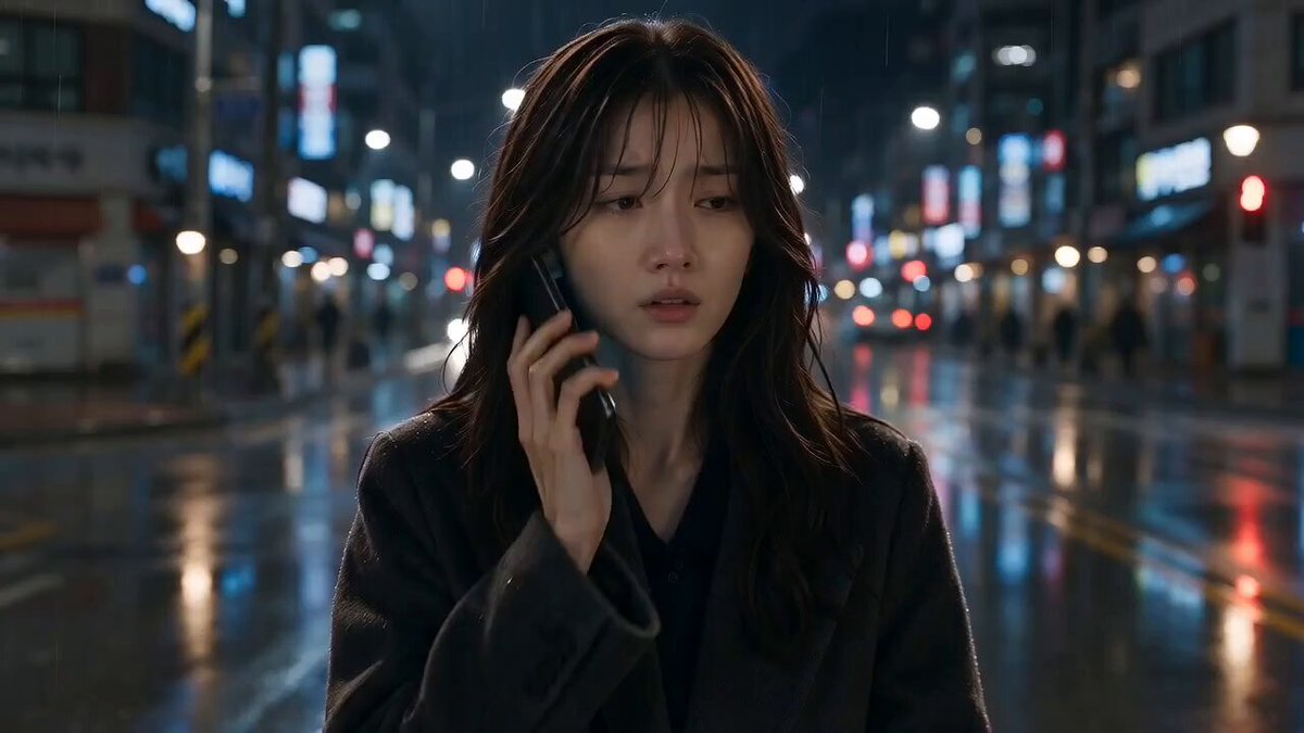
How to Create Text Effect Videos with AI Styling Workflows
Oct 13, 2026

Text inside a video is rarely just information. It is pacing, tone, and brand identity compressed into a few glyphs. Yet most creators still treat titles and captions as an afterthought: a font picked from a dropdown, a drop shadow, a fade-in, done. The result reads as a slideshow bolted onto footage rather than a designed layer that belongs to the frame.
AI-assisted workflows have changed what is possible here. Instead of manually keyframing every letter, you can describe the look you want, let a model analyze the scene, and iterate on placement, motion, and material properties in a handful of passes. This guide walks through that entire process — planning, prompting, animating, styling, quality-checking — with concrete parameters and decision criteria you can reuse on any project.
Why Text Effects Separate Amateur Video From Polished Video
Viewers process type faster than they process imagery. A caption appears and the brain has already judged it: is this professional, or is this a template? Three signals drive that judgment.
Integration. Does the text feel lit by the same source as the scene, or does it float on top like a sticker? Real integration means the type respects the scene's color temperature, contrast ratio, and depth of field.
Motion logic. Does the text move with the camera, against it, or independently? Text that drifts at a constant speed while the camera pans reads as an error. Text that eases in, holds, and exits on a beat reads as intent.
Restraint. The strongest text effects are usually one idea executed cleanly: a slow tracking title, a shadow that tightens as the subject approaches, a word that dissolves into particles at the exact frame of a cut. Stacking five effects produces noise.
The practical consequence: you should decide your typographic idea before you generate or edit footage, not after. A 12-second shot generated with text in mind saves an hour of retrofitting.
The Core Building Blocks of an AI Text Effect
Almost every AI-assisted typography workflow can be decomposed into three layers. Understanding them separately makes troubleshooting far easier, because when an output looks wrong you can usually trace it to one layer rather than all three.
Placement
Placement covers where the type sits and how it relates to composition. Good AI placement tools reason about negative space, subject position, and horizon lines. A title placed in the upper third of a wide landscape shot works; the same title centered over a face is a mistake.
When you instruct a model, be spatially explicit. "Place the title in the lower-left quadrant, aligned to the subject's eyeline, leaving the right third clear for the moving figure" outperforms "add a title." Reference distances in fractions of the frame — one-third, one-quarter — rather than pixels, because the model may be working at a different resolution than your final export.
Motion
Motion determines personality. Slow, linear movement feels documentary. Fast, overshooting movement feels promotional. Organic, slightly irregular movement feels handmade.
Useful motion vocabulary when prompting or keyframing: ease-in, ease-out, overshoot, settle, track, parallax, reveal by mask, type-on, scatter, dissolve. Pair each with a duration. A 0.4-second settle feels snappy; a 1.2-second settle feels luxurious. Most short-form vertical video lives between 0.25 and 0.6 seconds.
Material
Material is what the letters are made of — flat color, glass, brushed metal, fabric, liquid, neon tube, paper cutout. This is where AI styling earns its keep, because generating a believable glass letterform with correct refraction used to require a 3D render and a compositor.
Material should be justified by the scene. Glass type over a rainy street at night: coherent. Glass type over a sunny desert: confusing. If you cannot articulate why the material belongs, choose a simple solid with precise spacing instead.
Prepare the Scene Before You Style the Type
A frequent failure mode is generating footage first and then discovering there is nowhere clean to put text. Prevent it with a short pre-production pass.
- Write the copy first. Final wording, final line breaks. Line breaks matter more than people expect: a three-line block has a different visual weight than a two-line block, and it changes the whole composition.
- Decide the text's job. Is it a hook (first 1.5 seconds), a label (product name over a shot), a subtitle (spoken-word support), or a transition element (word that bridges two scenes)? Each role implies different size, dwell time, and motion.
- Reserve space in the shot. When describing a scene to a video model, explicitly ask for clear space: "wide shot with open sky in the upper half." Models generally respect negative-space requests if you state them.
- Lock a frame ratio. Vertical 9:16, square 1:1, and cinematic 2.39:1 demand different type scales. Decide before styling, because repositioning after the fact means re-rendering motion.
- Check legibility at thumbnail size. Preview the frame at 15% zoom. If the text is unreadable there, it is decoration, not communication.
A Step-by-Step Styling Workflow
The following sequence works whether you are using an integrated assistant inside a generative video tool or assembling the same effect across a generator plus a traditional editor. The order matters: each step constrains the next.
Step 1: Generate the base video with type in mind
Generate or select footage that has stable motion and a clear focal point. Rapid handheld shake makes precise text tracking painful. If a shot is essential but chaotic, stabilize it before adding type.
Keep generation passes small. A short clip you can re-render cheaply in different variants beats a long clip you are afraid to touch.
Step 2: Ask for a first-pass placement suggestion
Describe the frame, the subject's motion path, and the text's role. A useful instruction might read: "Wide 16:9 night city shot, subject walks left to right in the lower third. Place a two-line title in the upper-left, aligned to a 5% margin, scale roughly one-eighth of frame height, left-aligned, no rotation." Specific, measurable, and easy to critique.
Step 3: Fix placement before touching style
Resist the urge to add material effects while placement is still wrong. Adjust position, scale, and alignment in flat white type. Flat type exposes compositional problems instantly; styled type hides them.
Step 4: Animate to match the scene's motion
Match the text's easing to the camera's behaviour. If the camera drifts slowly right, drift the text slowly right at a fraction of the speed to create parallax. If the subject enters frame at speed, consider a delayed settle so the text lands after the movement resolves — motion landing on top of motion reads as clutter.
Step 5: Apply material and light
Now introduce texture. Start subtle: 10–20% opacity blend of a material layer, then increase. Ask for the material to inherit the scene's key light direction. If you can see the light source in frame, the type's highlights should agree with it.
Step 6: Refine with explicit controls
Most AI video tools expose sliders or numeric parameters for motion strength, style adherence, and prompt influence. The general rule: high style adherence produces a committed look but ignores your specific wording; low adherence respects wording but delivers a generic look. Start mid-range, then push in the direction of the problem. If the type is drifting off-model, raise style adherence. If it is ignoring your placement instructions, lower it.
Step 7: Render a short proof before the full sequence
Render three to five seconds. Watch it on a phone, at arm's length, with sound on and sound off. Only then commit to the full-length render.
Prompting Techniques That Actually Control Typography
Generic prompts produce generic type. These patterns consistently improve results.
Specify the typeface family, not the font name. "Condensed grotesque sans-serif, heavy weight" is more reliable than naming a commercial font the model has never seen. Add "generous letter spacing" or "tight tracking" for finer control.
Describe hierarchy in one sentence. "Headline at 100% scale in bold; subline at 35% scale in medium weight, positioned directly beneath with a 0.4-line gap." Hierarchy instructions reduce the model's tendency to make everything the same size.
State the reading order. "Eyes should land on the headline first, then the logo, then the subline." Models that support layout reasoning respond to this.
Anchor to scene elements. "Align the baseline of the text with the horizon line" or "match the title's color temperature to the window light in the frame."
Use negative instructions sparingly but precisely. Say what to exclude: "no glow, no bevel, no drop shadow." Long lists of prohibitions dilute the prompt; three or four are plenty.
Iterate in one dimension at a time. Changing font, color, motion, and position in a single pass makes it impossible to know what worked.
Matching Type Motion to Camera and Subject Motion
Kinetic typography lives or dies on this relationship. A short reference table helps:
| Scene motion | Recommended text behaviour | Notes |
|---|---|---|
| Slow dolly in | Very slow scale-up, 2–4% over the shot | Creates depth without competing |
| Fast whip pan | Hold text static or cut it out entirely | Text cannot track a whip pan convincingly |
| Constant lateral tracking | Lateral drift at 20–40% of camera speed | Produces parallax layers |
| Subject walks into frame | Reveal by mask following the subject | Text appears to be discovered, not pasted |
| Dialogue close-up | Static subtitle with syllable-level timing | Any movement competes with facial expression |
| Product turntable | Rotate with the object, then lock | Locks the type into the object's reality |
Sound design matters here too. A text animation with no audio cue feels arbitrary; add a soft whoosh, a low thud, or a short tick at the moment the type settles. If you are working faster than sound design allows, cut the animation shorter instead.
Styling Text With Material, Light, and Texture
Once placement and motion are settled, material work becomes a controlled experiment.
Match the key light. Identify the brightest highlight in the frame and place your type's specular highlight in a compatible direction. Mismatched lighting is the single most common reason styled type looks fake.
Sample colors from the scene. Pull two or three dominant colors and use them for the type, then introduce a single accent color that does not exist in the frame to make the type pop deliberately.
Consider depth of field. If the background is soft, a razor-sharp title can feel disconnected. Slight defocus or a mild glow can integrate it. Conversely, in a shallow-depth-of-field product shot, a crisp title foreground element can anchor the composition.
Keep texture resolution honest. Fine grain, subtle noise, and slight edge irregularity read as real. Perfectly uniform surfaces read as digital. Add 2–5% grain to match the footage's noise floor.
Test against a busy frame. Weak styling survives easy backgrounds and fails on complex ones. Check a version over the busiest frame in your sequence.
A Quality-Control Checklist Before Export
Run this before every final render. It catches most of the errors that viewers notice but creators do not.
- Type is fully inside the title-safe area and clear of platform UI zones.
- Contrast ratio between type and background is at least 4.5:1 in the worst-lit frame.
- No letterform is clipped by a cut, wipe, or transition.
- Dwell time is long enough to read comfortably: roughly one second for three to five words.
- Motion start and end frames hold for at least six frames, so easing is visible.
- Spelling, capitalization, and punctuation are consistent across all cards.
- Type does not cover the subject's face, hands, or product label.
- The style is consistent between the first and last title in the video.
- The animation lands on the beat when music is present.
- A phone-screen review at 100% brightness, then in dim light.
Common Mistakes and How to Avoid Them
Over-styling the first version. Start with the plainest possible treatment and add complexity only where the plain version feels weak. Most videos need two more hours of typography and two fewer effects.
Ignoring safe areas. Vertical platforms overlay interface elements on the lower portion of the frame. If your caption sits there, it will be covered.
Using the same scale for every card. Consistent size feels flat. Vary scale to create rhythm, then return to the base size for the closing card.
Animating everything. If three consecutive titles animate in the same way, change one. Repetition of motion is more tiring than repetition of color.
Forgetting audio. A text animation without a sound cue feels unfinished. Even a barely audible tick changes the perceived quality.
Rendering the full sequence to test an idea. Always test five seconds first. Full renders are the most expensive way to learn something small.
Treating the style guide as optional. If you are producing a series, lock font, weight, color, and motion timings in a short document. Inconsistency across episodes is what makes a channel feel amateur.
Choosing the Right Tool Stack for Text Effect Video
There is no single best tool; there is a best combination for your volume and skill level. Use these criteria to decide.
If you need speed and volume: an all-in-one AI video generator with built-in text styling handles placement, motion, and material in one pass. Best for social teams producing daily output. Limitation: fine control over kerning and exact timing is usually coarse.
If you need precision: generate footage with AI, then finish type in a compositor. After Effects, DaVinci Resolve's Fusion page, and similar environments give frame-accurate control, text animators, and expression-driven motion. Best for brand campaigns. Limitation: slower, steeper learning curve.
If you need a middle path: assemble type in a fast editor like CapCut or Premiere Pro, then push individual frames through an image model for material treatments. This hybrid keeps timing precise while borrowing AI styling for texture.
If you need 3D integration: use a real 3D renderer for type that must be physically embedded in a scene, then bring in AI-generated plates as backdrops. Purely generative text placement still struggles with hard occlusions — text passing behind a foreground object with correct parallax.
Decision questions to ask before starting: How many videos per week? Does the type need to match an exact brand font? Will text ever pass behind objects? How much time can you spend per video? If the answer to the last question is under ten minutes, choose the integrated path and accept lower fidelity.
Frequently Asked Questions
Can AI place text correctly without manual adjustment? Often close, rarely perfect. Expect to nudge position and scale. Treat AI placement as a strong first draft rather than a final layout.
Why does my animated text look cheap even though the effect is expensive? Usually a timing problem. If the ease is too linear or the animation is too slow, the type feels like a slideshow. Tighten the duration and add a slight overshoot.
How long should a title stay on screen? Long enough to read twice at a comfortable pace. For a five-word headline, that is roughly 1.5 to 2 seconds. Subtitles need to track speech; titles do not.
Should I generate video with the text baked in, or add it afterward? Bake it in when the text needs to interact physically with the scene — reflections, shadows, occlusion. Add it afterward when you may need to change wording, which is almost always.
What about matching the scene's lighting? Sample the dominant highlight direction and color temperature, then set the type's key light to match. If you skip this, no amount of texture will integrate the type.
How do I keep a series consistent? Build a template with fixed font, size, margin, motion duration, and easing curve. Save it as a preset and change only the copy between episodes.
Is motion blur necessary? For fast-moving type, yes — it prevents strobing. For slow type, it is optional and can even soften clarity.
A Practice Routine That Builds Real Skill
Pick one 10-second clip and style the same title five different ways: flat and static, flat with subtle tracking, glass material with parallax, paper-cutout with a scatter reveal, and neon tube with a flicker settle. Render each at five seconds. Compare them side by side at thumbnail size and at full size. The exercise teaches you which variables actually change perception, and it builds a mental library of moves you can deploy quickly under deadline.
From there, standardize. Keep a personal preset for hooks, labels, subtitles, and transitions. Save your prompt templates for placement, motion, and material. Document the parameter ranges that worked — motion strength, style adherence, grain amount, dwell time. Within a few projects, text styling stops being a per-video experiment and becomes a repeatable step in your production line, which is exactly where it should sit: predictable enough to plan around, expressive enough to define the look of everything you publish.

Alexander
More Blogs
Read MoreMontaggio video rapido: transizioni e software per l'AI
Guida pratica al montaggio video rapido con AI: transizioni fluide, software, workflow, coerenza visiva, errori da evitare e FAQ operative.
Building an AI Video Production Workflow From Concept to Cut
A practical guide to planning, generating, editing, and finishing AI-assisted videos with consistent characters, clear shot lists, and reliable review loops.
A Repeatable Post-Production Workflow for Polished AI Video
Build a repeatable AI video post-production pipeline: organize assets, cut story-first, design transitions, refine audio, and review versions calmly.