
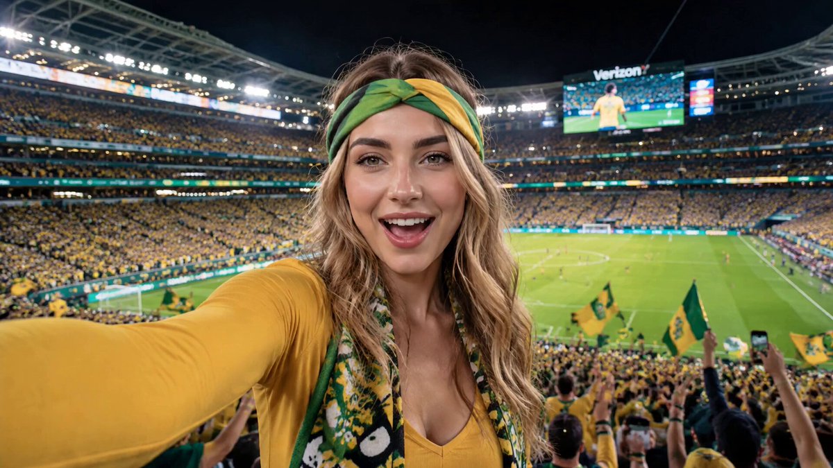
AI Thumbnail Generator: Build Viral Video Previews Fast
Oct 13, 2026


Why the Thumbnail Is Still the Highest-Leverage Frame in Your Video
A thumbnail is not decoration. It is the first three seconds of your video, compressed into a single still image and shown to someone who has no obligation to care. Before a viewer hears your intro, sees your edit, or evaluates your argument, they have already made a judgment about whether the next ten minutes of their life are worth spending. That judgment happens in a fraction of a second, based on shape, contrast, expression, and a handful of words.
This is why thumbnail work rewards iteration more than almost any other part of video production. A better script improves one video. A better thumbnail system improves every video you publish from now on. The good news is that modern image models have collapsed the cost of producing variants. What used to be a forty-minute Photoshop session per concept is now a batch of eight candidates in under a minute, which changes the economics of testing entirely.
The bad news is that cheap generation also produces cheap-looking results. Push a vague prompt into a capable model and you get something glossy, generic, and instantly forgettable. The craft has not disappeared; it has moved. It now lives in how you seed, prompt, constrain, and select images rather than in how well you can mask a layer.
This guide is a practical workflow for building thumbnails with AI image models: how the models work, how to write prompts that stay under control, how to keep a recognizable style, how to fold the process into your editing pipeline, and how to test results without fooling yourself.
How Image Models Actually Build a Thumbnail
Most people treat image generation as a magic box. Understanding the two dominant workflows makes you dramatically faster, because you stop asking the wrong tool to do the wrong job.
Text-to-image: starting from a blank canvas
A text-to-image model takes your written prompt and denoises random noise into a coherent picture. This is the right approach when you need something that does not exist in your footage: a stylized background, an exaggerated prop, a dramatic environment, or an illustrated version of a concept.
Text-to-image is powerful but slippery. Because nothing anchors the model, small prompt changes produce large visual changes. That is great for exploration and terrible for consistency. Use it for backgrounds, texture, abstract shapes, and concept art rather than for the hero subject of a channel that depends on a repeatable look.
Image-to-image: starting from a real frame
Image-to-image generation takes an existing image as a starting point and transforms it according to a prompt, usually with a strength setting that controls how far the model is allowed to drift. This is the workhorse for video thumbnails, because your best thumbnail is usually already inside your footage. A frame where the host's face shows genuine surprise, or where the product catches a rim light, is worth more than any synthetic composition.
The practical recipe is simple: scrub your timeline for expressive frames, export three to five candidates, then use image-to-image to relight, restyle, clean up the background, and add graphic elements. You keep the authenticity of a real moment and gain the polish of a designed image.
What actually matters when choosing a model
Four capabilities separate a model that is fun from a model that is useful for thumbnails:
- Text rendering. If your thumbnail needs a legible word or number, either the model renders it correctly or you add it afterward in a layout tool. Models that handle short text well save a step; models that mangle it waste batches.
- Face and hand fidelity. Thumbnails live or die on faces. Distorted eyes, melted fingers, or uncanny skin tones read as low quality even to viewers who cannot articulate why.
- Control mechanisms. Reference images, regional prompts, pose guidance, and inpainting let you direct the image instead of gambling on it.
- Upscaling and detail retention. A thumbnail is often displayed small but must survive being enlarged on a large screen, so generating at a resolution you can crop aggressively matters.
A Prompt Framework You Can Reuse Every Week
Prompting for thumbnails is different from prompting for art. You are not chasing beauty; you are chasing instant readability at the size of a postage stamp. That constraint should shape every word you write.
The four-slot prompt
Write prompts in four slots and keep the order stable so you can compare batches fairly:
- Subject. Who or what is the focal point, described physically: "a woman in her thirties wearing a mustard-yellow jacket, mid-laugh, looking slightly off camera."
- Framing. How close and from what angle: "tight chest-up crop, three-quarter angle, slight low camera position."
- Light and separation. What makes the subject pop from the background: "strong warm rim light from the left, soft fill on the face, background falling into shadow."
- Mood and palette. The emotional temperature and color logic: "energetic but clean, limited palette of amber, deep teal, and off-white."
A prompt built from these four slots is specific enough to be repeatable and short enough to iterate. When a batch fails, you can change one slot at a time and learn something, instead of rewriting everything and learning nothing.
Negative prompts, references, and cleanup passes
Negative prompts are the brake pedal. Useful entries include: cluttered background, extra fingers, warped text, harsh on-camera flash, watermark, low contrast, muddy shadows, duplicate limbs, plastic skin. Keep the list short and specific; a fifty-item negative prompt mostly teaches the model to ignore you.
Reference images do more work than adjectives. If you have a channel look, feed the model two or three past thumbnails that performed well. Style transfer from your own archive keeps the visual identity coherent across an entire year of uploads, which is worth more than any single clever image.
Finally, plan for a cleanup pass. Even excellent generations benefit from a two-minute adjustment: crop tighter, lift the subject's exposure, add a subtle vignette, and place text. Treat generation as the concept stage and layout as the finishing stage. Trying to make the model do everything is the most common reason AI thumbnails look synthetic.
Keeping Faces, Characters, and Brand Style Consistent
Consistency is the difference between a channel that looks like a channel and a feed that looks like a folder of unrelated experiments. Viewers recognize you by pattern before they read your name, and that pattern does most of the persuasion.
For recurring human subjects, define a character sheet: a handful of reference images, a written description of wardrobe and grooming, and a fixed lighting preference. Some workflows use trained personalization adapters; others rely on consistent references and prompt slots. Either approach works as long as you apply it identically across sessions. If your host's jacket changes color every week, the recognition effect evaporates.
For brand style, lock three variables and let everything else move. A palette of three colors, one typeface family for overlay text, and one recurring compositional habit — say, subject on the right third with negative space on the left — are enough to make a thumbnail unmistakably yours. Variation within that frame keeps things fresh; variation of the frame itself makes you invisible.
There is a temptation to let the model overhaul your look because a generated image looks impressive in isolation. Resist it. A thumbnail is judged in a grid next to twelve competitors, not in a gallery. Distinctiveness beats polish.
Composition Rules That Survive the Shrink Test
Thumbnails are consumed at roughly the size of a thumbnail icon on a phone. Squint at your candidate until the details disappear. If the message survives, the composition works.
Start with one idea per image. Two competing focal points means zero focal points. If you want to show a reaction and a product, decide which one carries the click and let the other be context.
Use contrast deliberately. The highest-contrast element in the frame will be the first thing seen, so make sure that element is the subject, not an accidental bright background or a busy logo. This is where image models help enormously: relighting a flat frame so the subject separates from the background is a single prompt away.
Protect the corners and edges. Platform overlays cover parts of the frame — duration stamps, progress bars, badges — so keep critical elements away from the bottom edge and avoid placing text in tight corners. Build with a safe margin in mind.
Simplify faces. An expression read at small size is closer to a cartoon than a portrait: wide eyes, open mouth, clear eyebrows. Subtle micro-expressions vanish. When generating, prompt for readable emotional extremes rather than nuanced realism.
A Repeatable Production Workflow
Collecting candidate frames from your video
Before generating anything, scrub your timeline and export eight to twelve frames where the subject is expressive, the camera is reasonably steady, and the lighting is not blown out. Name them by timecode so you can trace a thumbnail back to its source. This library becomes your raw material, and it grows cheaper and more valuable with every video.
Generating in batches, not one-offs
Generate six to ten variants per concept in a single session so you can compare them side by side. Keep the prompt skeleton fixed and vary one slot per batch: lighting in one pass, framing in the next, mood in a third. Log what you changed. Within a month you will have a personal style guide written in evidence rather than intuition.
Upscaling and exporting for each platform
Different surfaces crop differently: widescreen previews, square feed placements, vertical shorts. Export a master image at high resolution, then produce crops that respect each aspect ratio. Never let an automated crop decide where your subject's face lands.
Keeping an archive with metadata
Store every thumbnail with its prompt, its source frame, and its eventual performance. Two hundred lines of a simple spreadsheet will tell you more about your audience than any general best-practice list, because it describes your viewers specifically.
Testing Thumbnails Without Guessing
Designing a fair comparison
A useful test changes one variable at a time. If variant A has a different subject, different text, and different color grade than variant B, a win tells you nothing you can reuse. Run sequential tests that isolate expression, then text, then palette. It is slower, and it compounds.
Where the platform allows swapping thumbnails on a published video, use that to compare against a stable baseline rather than against another experiment. Where thumbnails are fixed at publish time, rotate tests across videos with similar topics and comparable traffic sources.
Which metrics tell you something
Impressions and click-through rate must be read together. A high click-through rate on tiny reach usually means you found a narrow, enthusiastic niche; a modest rate across huge reach means broad appeal. Watch for the first 24 to 48 hours separately, since early traffic is heavily influenced by your existing audience and notifications.
Retention after the click is the honesty check. Thumbnails that overpromise produce a spike in clicks followed by an immediate drop-off, which trains recommendation systems to slow your distribution. The best thumbnail is a promise the first thirty seconds actually keep.
Common Mistakes and How to Fix Them
Too many words. If the text needs to be read rather than recognized, it is too long. Aim for three to five words that work as a visual shape.
Ignoring the mobile preview. Always check your thumbnail at phone size, and at night-mode brightness. What looks crisp on a 27-inch monitor can look like mud in a busy feed.
Over-retouching. AI cleanup is excellent for backgrounds and lighting and dangerous for skin. When faces start looking airbrushed, viewers stop trusting the content.
Inconsistent identity. Randomly changing palette, framing, and typography every upload throws away the compounding value of recognition.
Chasing instead of testing. Copying a competitor's visual style imports their audience's expectations, not their results. Test your own hypotheses against your own baseline.
Skipping the source frame. Fully synthetic subjects often carry subtle wrongness that viewers feel without naming. Anchoring to real footage removes most of that risk.
Tool and Model Selection Criteria
You do not need one perfect tool; you need a chain that covers generation, editing, and layout. When evaluating options, weigh these factors:
- Control over the seed image. Strong reference and strength controls matter more than raw output quality for thumbnail work.
- Batch speed. Your iteration loop is the real product. Twenty images in a minute beats two beautiful images in ten.
- Resolution headroom. You want to crop in and still have pixels to spare.
- Inpainting quality. Removing a stray object or fixing a hand should be a click, not a restart.
- Text handling. Either reliable text rendering or an easy path to add type in a layout editor.
- Export flexibility. Aspect-ratio presets and clean file naming save time every single week.
- Cost predictability. Favor flat or generous plans over per-image pricing that punishes experimentation, because experimentation is the entire method.
A sensible stack is small: one image model for generation and relighting, one upscaler, one layout tool for type and final crops, and one spreadsheet for results. Adding a fourth generator rarely improves outcomes; tightening your prompt skeleton usually does.
FAQ
Can AI thumbnails actually compete with hand-designed ones?
Yes, when the process includes human selection and layout. The model handles relighting, background cleanup, and concept variants; you handle expression choice, cropping, and text. Fully automated pipelines produce sameness, which is the opposite of what a thumbnail needs.
How many variants should I generate per video?
Six to ten concepts, then pick two or three finalists for testing. Fewer than six and you are unlikely to see a genuinely surprising option; more than ten and selection fatigue makes you choose the first decent one.
Is it better to generate from scratch or from a video frame?
Start from a frame for anything involving your host or product. Use text-to-image for backgrounds, props, and abstract elements that you then composite behind the real subject.
How do I stop AI images from looking artificial?
Anchor to real footage, keep skin texture, limit the palette, avoid over-smoothing, and add a deliberate imperfection such as slight grain or an off-center crop. Perfect symmetry and uniform lighting are the most common giveaways.
What about text inside generated images?
Treat generated text as a draft at best. Generate the image clean, then place type in a layout tool where you control font, weight, spacing, and contrast. Legibility is not something to gamble on.
How often should I refresh my thumbnail style?
Keep the frame stable and refresh the surface: new color accents, updated typography, or a seasonal background treatment. If you reinvent the whole look, you reset the recognition you spent months building.
Do thumbnails affect search performance or only click-through?
Both, indirectly. Higher click-through signals relevance and can expand distribution, while poor retention after the click reverses the benefit. Thumbnails and content quality are one system, not two.
What to Do This Week
Pick one recent video and pull ten expressive frames from it. Run a single batch of six variants using the four-slot prompt framework, changing only the lighting slot. Crop all six to mobile size, squint at them, and choose two. Add text in your layout tool, publish the stronger one, and write down why you chose it. That note is the beginning of your own thumbnail playbook, and it is worth more than any list of generic rules.
Repeat the loop weekly. Within two months you will have a consistent visual identity, a prompt library tuned to your subject matter, and a record of what your specific audience responds to. The models will keep improving, but the advantage belongs to whoever has the tightest loop between generation, selection, and measurement.

Alexander
More Blogs
Read MoreMontaggio video rapido: transizioni e software per l'AI
Guida pratica al montaggio video rapido con AI: transizioni fluide, software, workflow, coerenza visiva, errori da evitare e FAQ operative.
Building an AI Video Production Workflow From Concept to Cut
A practical guide to planning, generating, editing, and finishing AI-assisted videos with consistent characters, clear shot lists, and reliable review loops.
A Repeatable Post-Production Workflow for Polished AI Video
Build a repeatable AI video post-production pipeline: organize assets, cut story-first, design transitions, refine audio, and review versions calmly.