
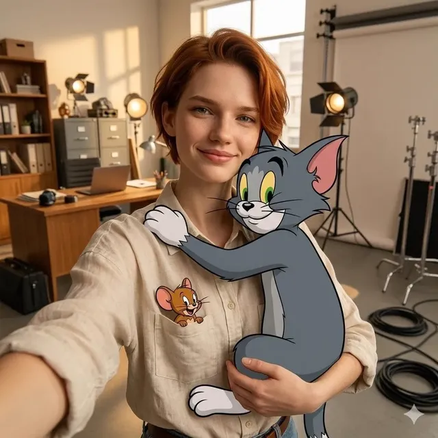
Create Thumbnail Photos That Convert with an AI Workflow
Oct 13, 2026

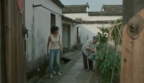
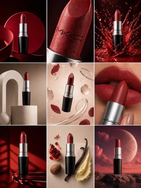
A thumbnail is the smallest deliverable in a video project and usually the one with the largest measurable effect on whether the video gets watched. An image that reads clearly at 160 pixels wide, triggers a question the viewer wants answered, and matches the promise of the title will beat a technically gorgeous image almost every time. AI art generation has made the first draft of that image dramatically faster, but it has also flooded every feed with glossy, generic-looking results. The creators who win are the ones who treat generation as one stage inside a deliberate workflow rather than as a slot machine that occasionally pays out.
This guide walks through the whole pipeline: how to translate a video idea into a visual hook, how to prompt for assets you can actually composite, how to choose between photoreal and stylized output, how to finish images in post, and how to test them without wrecking your channel's momentum. It is written for people who publish regularly and need a system, not a one-off trick.
Why the thumbnail is the highest-leverage design asset you own
Most platforms decide how much reach a video gets based on early engagement signals, and the first of those signals is the click. Impressions are cheap; clicks are earned. If the packaging underperforms, the algorithm stops showing the video to new people, and no amount of editing quality in the middle of the timeline can recover that.
The practical consequence is that thumbnails and titles should be treated as a single unit. Designers call this packaging. A title that says "I rebuilt my studio in 48 hours" and a thumbnail showing a wrecked room with a single surviving microphone are doing the same job from two angles: creating an information gap the viewer wants closed. When the two elements tell different stories, viewers feel the mismatch even if they cannot articulate it, and they scroll.
A useful exercise before any generation happens is to write a one-sentence hook: what does the viewer learn, feel, or see if they click? If you cannot state that in a sentence, the thumbnail is not the problem yet. The idea is.
The real shift: generation as a stage, not a solution
The traditional thumbnail process — find a stock photo, cut out the subject, add a gradient, drop in bold text — is not dead, but it is slow and it produces sameness. The reason AI generation matters is not that it removes the designer. It matters because it collapses the distance between concept and asset. You can explore ten visual directions in the time it used to take to find one usable reference.
What changes most is the order of operations. In a manual workflow, the concept is usually shaped by what imagery is available. With generation, the concept comes first and imagery follows. That inversion is the entire advantage, and it is also why so many AI thumbnails look interchangeable: people prompt for "epic cinematic shot of a man" instead of prompting for the specific visual argument their video is making.
Treat the model as a specialist asset producer. You still need art direction, composition decisions, type, and a final composite. The model does not know your audience, your series branding, or which of your last five thumbnails already covered a particular visual joke.
Anatomy of a thumbnail that earns the click
Before prompting, it helps to be explicit about the ingredients that consistently correlate with higher click-through rates. These are not rules, but they are the variables worth isolating when you test.
Visual hierarchy and negative space
A thumbnail has roughly one second to communicate. That means one dominant subject, one supporting element, and empty space where the eye can rest. Negative space is not wasted space; it is what makes the subject feel urgent. When an image is busy edge to edge, the brain cannot decide where to look and defaults to skipping.
Faces and emotion
Human faces, and especially eyes and mouths, are processed faster than almost any other visual information. A face with a legible emotion — surprise, concentration, delight, dread — gives the viewer something to read instantly. Expression matters more than beauty. A neutral, well-lit portrait is usually a weaker thumbnail than a slightly imperfect frame with a clear reaction.
Contrast that survives the feed
Your thumbnail will sit next to dozens of others, often on a bright interface. Test your image at small size against a light and a dark background. If the subject disappears into either one, add separation: a rim light, a bright colored element behind the subject, or a subtle outline. Warm subjects on cool backgrounds and vice versa remain the most reliable separation trick.
Text: three words, maximum
If you add text, keep it to three words and make it huge. Text that repeats the title wastes the image's communicative capacity. Text should add a second layer — a number, a stake, a contradiction. And it must be legible on a phone at thumbnail scale, which usually means a heavy weight and a strong stroke or shadow for separation.
A repeatable workflow from concept to export
This is the pipeline that scales across a weekly publishing schedule. Each stage has a clear output, so you always know what "done" looks like.
Step 1 — Write the visual brief before the prompt
One paragraph, plain language: subject, action, emotion, environment, focal point, mood, and where the text will eventually go. Note the empty zone explicitly. If the text will sit on the left, the prompt and the composition should reserve the left. This single habit prevents the most common rework loop, which is generating a beautiful image and then discovering there is no room for the title element.
Step 2 — Lock a look with references
Collect three to five reference images that match the tone you want: poster art, film stills, photos you shot yourself. Do not ask a model to invent a style when you can describe one precisely. Words like "moody," "cinematic," and "modern" mean very little on their own; specifying a light source, a lens character, a palette, and a texture produces far more consistent results.
Step 3 — Build prompts in layers
A workable structure is: subject and action, then emotion and pose, then environment, then lighting, then camera and lens language, then palette and texture, then output constraints such as aspect ratio and framing. Keep it to a coherent paragraph rather than a keyword pile. Keyword piles produce average-looking images because the model averages the concepts together.
Step 4 — Generate in batches of six to twelve
Small batches encourage you to fall in love with a mediocre result. Larger batches let you compare options honestly. Change one variable between batches — lighting direction, background color, camera angle — so you learn what actually moves the image instead of randomly re-rolling.
Step 5 — Select on hierarchy, not on prettiness
The right question is not "is this the best image?" but "which image makes the viewer ask the question my video answers?" Crop candidates to thumbnail size before deciding. Many images that look impressive full-screen collapse into mush at 160 pixels.
Step 6 — Refine rather than regenerate
Once you have a strong candidate, use inpainting or region-based editing to fix hands, swap a background, change an expression, or extend the canvas to make room for type. Regenerating from scratch usually loses the qualities that made the original work.
Step 7 — Composite in a real editor
Bring the generated asset into an image editor for the finishing pass: cutout cleanup, background replacement, color grading to match your series, sharpening, text placement, and export at the correct dimensions. This stage is what separates a thumbnail from a generated picture.
Step 8 — Publish, then test
Package decisions are hypotheses. Test them.
Prompt patterns that consistently produce usable frames
Below are patterns rather than magic phrases. Adapt the content, keep the structure.
Photoreal interview-style frame. "Medium close-up of a person mid-sentence, looking slightly off camera, natural window light from the left, shallow depth of field, 50mm lens character, muted teal and warm skin tones, clean dark background on the right third for text placement, 16:9 framing."
Dramatic action freeze. "Wide shot of a cyclist at the apex of a turn, motion blur in the background, hard late-afternoon sun, high contrast, dust in the air, subject positioned left of center, negative space on the right, cinematic color grade."
Conceptual metaphor. "A single cracked hourglass on a concrete floor, dramatic side light, deep shadows, minimal composition, centered subject, cool palette with one warm highlight, photographic realism."
Stylized illustration. "Flat vector illustration of a hand holding a phone showing a rising graph, limited palette of three colors, bold shapes, thick outlines, generous empty space, centered composition."
Two habits make these patterns work better. First, always state where the subject sits in the frame. Second, always state where the empty space is. Composition instructions are the highest-value tokens in the prompt.
Choosing the right model for the job
Image models differ in ways that matter for thumbnails, and the differences are usually about fidelity, prompt adherence, and editability rather than raw quality.
Photoreal models are the default for interview, documentary, tech, and fitness content, where the viewer needs to believe the image is a real moment. They handle skin texture, lens artifacts, and light falloff best. Watch for uncanny valley issues in eyes and hands.
Illustration and graphic models suit explainers, finance, education, and anything where a literal photo would be confusing or unrepresentative. They also produce cleaner shapes that survive downscaling, which is a real advantage at thumbnail size.
Video models used for stills are worth knowing about because they often produce more cinematic lighting and stronger sense of motion. Extract a frame from a short generated clip and you frequently get an image with better depth and atmosphere than a single-frame generation. It costs more time, so reserve it for hero thumbnails.
Editing-capable models with inpainting, outpainting, and reference-image conditioning are the ones that fit a production workflow, because they let you iterate on an asset rather than start over.
A practical decision rule: if the thumbnail needs to look like a real event, start photoreal. If it needs to explain a concept, start illustrative. If it needs atmosphere and scale, try a video frame. If you need consistency across a series, prioritize whichever tool gives you the most reliable character and style conditioning, even if its single-image quality is slightly lower.
Post-production: where generated images become thumbnails
Generation gives you raw material. The composite is where the click is won. Six finishing moves matter most.
Cutout and mask cleanup. Automated background removal is fast but ragged at hair, fur, and semi-transparent edges. Spend two minutes refining the mask; nothing looks cheaper than a halo around a subject's head.
Background replacement. Replacing a cluttered background with a controlled gradient, a blurred environment, or a bold solid color instantly improves separation and makes text readable.
Color grading for series consistency. If your channel has a palette, apply it. Repeated visual cues build recognition in a feed, and recognition drives clicks from returning viewers.
Local contrast and clarity. Add a moderate amount of contrast and micro-contrast to the subject. Avoid global saturation boosts, which push skin tones orange and make images look amateur at small sizes.
Text treatment. Heavy weight, tight tracking, high contrast stroke, and consistent placement across the series. If a viewer has to work to read it, it is failing.
Export discipline. Export at the platform's recommended dimensions and check the compressed result, not just the master file. Compression eats fine detail, so details that matter should be large and simple.
How to test without wrecking your channel
Testing thumbnails is a statistics problem disguised as a design problem. A few principles keep it useful.
Change one variable at a time: expression, background, text presence, composition. If you change everything, you learn nothing. Run tests on videos with similar topics and similar expected reach, because a test on an outlier video tells you nothing transferable. Give each variant enough impressions to reach a meaningful conclusion before judging — early results are notoriously noisy. And track click-through rate alongside average view duration, because a thumbnail that overpromises will raise clicks and lower retention, which is a net loss.
Keep a simple log: date, video, variant, CTR after a fixed impression threshold, and a one-line hypothesis. After twenty entries you will see patterns in your own audience that no general advice can give you.
Mistakes that quietly suppress click-through rate
Repeating the title in the image. It wastes the visual channel and makes the thumbnail feel redundant.
Too many subjects. Three faces competing for attention reads as noise at small size.
Low contrast against the interface. A dark image with dark edges vanishes in a dark feed.
Illegible small text. Anything under a certain visual weight turns into a smudge on a phone.
Inconsistency across a series. If every thumbnail looks like a different channel, you lose recognition value.
Overpromising. The fastest way to damage long-term reach is to earn a click the video cannot justify.
Ignoring the mobile crop. Check how your composition behaves when the platform crops or overlays duration badges, which frequently sit in the bottom-right corner.
Likeness, copyright, and disclosure
Two practical rules keep you out of trouble. First, do not generate recognizable real people without permission, and be especially careful with celebrities and public figures. Second, do not attempt to replicate a living artist's signature style in a way that misrepresents the work as theirs. Keep generation outputs as starting points and apply enough of your own compositing, grading, and typography that the final asset is genuinely yours.
Where a platform expects disclosure of synthetic media, disclose it. Where a brand client has guidelines about generated imagery, read them before you start, not after you have delivered.
Frequently asked questions
How many thumbnail variants should I generate? Six to twelve per concept for selection, then two or three finished variants for testing. More than that and you are procrastinating instead of publishing.
Do AI-generated thumbnails hurt click-through rate? No. Undirected, generic images hurt click-through rate. The audience responds to clarity and relevance, not to how the pixels were produced.
Should I always add text? No. Text helps when it adds a layer the title does not. If the image already communicates the hook, extra text dilutes it.
What if my face never appears in my thumbnails? That is fine. Objects, environments, and hands with clear action can carry the same load, as long as the emotion or stake is legible.
How do I keep a consistent look across a series? Fix three things: palette, lighting direction, and text placement. Vary subject and action, keep the frame language stable.
Can I use the same generated background repeatedly? Yes, and it often helps recognition, as long as the subject and composition change enough that viewers do not feel they have already seen the video.
How long should the whole thumbnail process take? With a locked template and a reference library, a finished thumbnail should take twenty to forty minutes, most of which is selection and compositing rather than generation.
A one-page checklist
Before you export, confirm: one dominant subject; clear emotion; separation from the background; empty space reserved for any text; text under four words and legible at small size; palette consistent with the series; the image checked at thumbnail scale against both light and dark backgrounds; corners clear of duration badges; the promise matched by the video itself.
AI generation removes the bottleneck of sourcing imagery. It does not remove the need for art direction, and it does not tell you what your audience finds interesting. The creators who get the most from it build a system: brief first, prompt second, select on hierarchy, finish in a real editor, then test one variable at a time and log what you learn. Do that consistently and the thumbnail stops being an afterthought and becomes the most efficient piece of marketing you produce each week.

Alexander
More Blogs
Read MoreMontaggio video rapido: transizioni e software per l'AI
Guida pratica al montaggio video rapido con AI: transizioni fluide, software, workflow, coerenza visiva, errori da evitare e FAQ operative.
Building an AI Video Production Workflow From Concept to Cut
A practical guide to planning, generating, editing, and finishing AI-assisted videos with consistent characters, clear shot lists, and reliable review loops.
A Repeatable Post-Production Workflow for Polished AI Video
Build a repeatable AI video post-production pipeline: organize assets, cut story-first, design transitions, refine audio, and review versions calmly.