
How to Create Superior Video Thumbnails In-Platform With AI
Oct 13, 2026
Why Thumbnail-First Thinking Beats Frame Grabbing
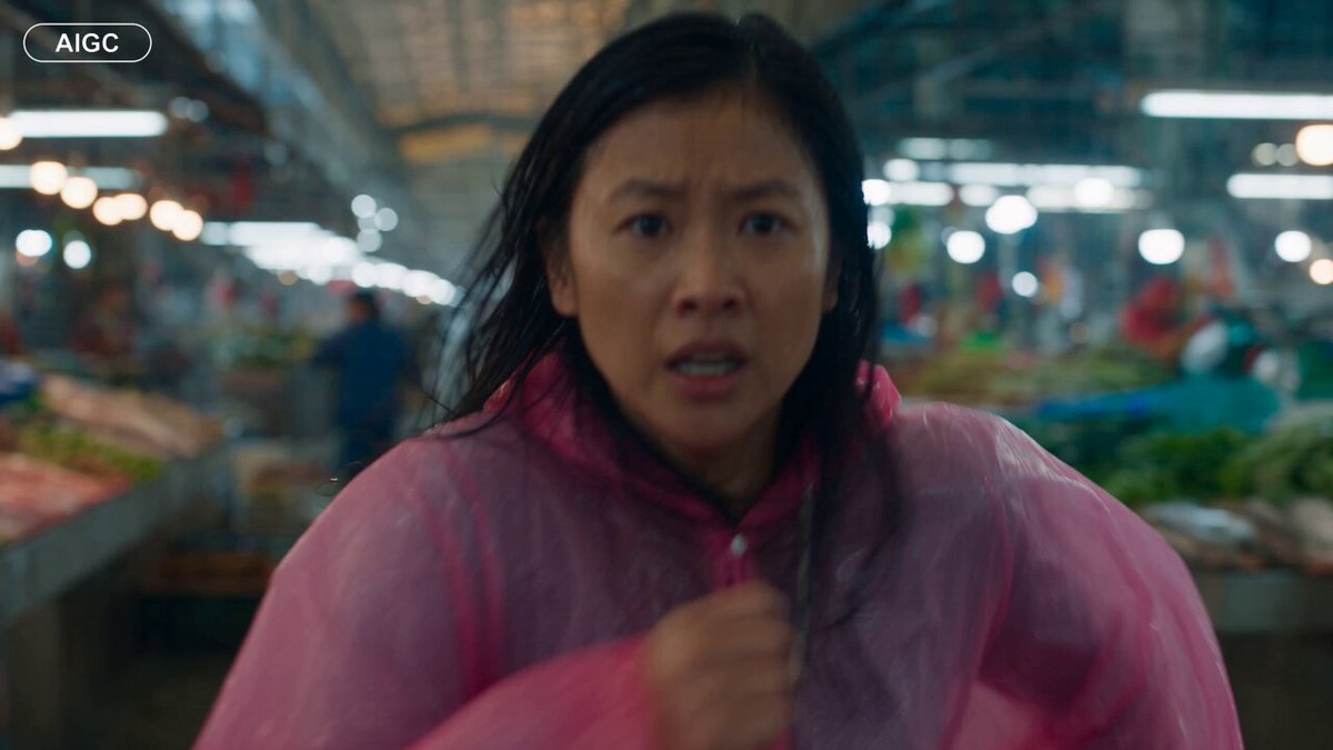
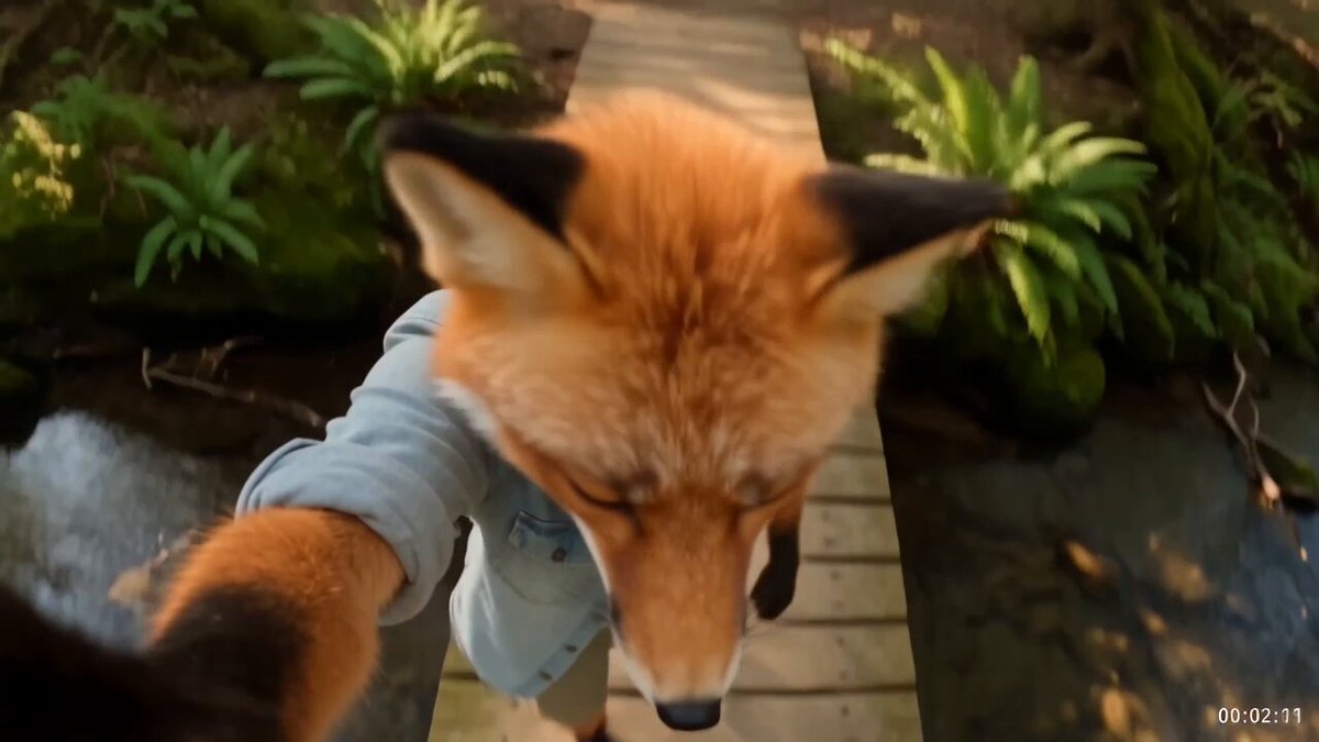
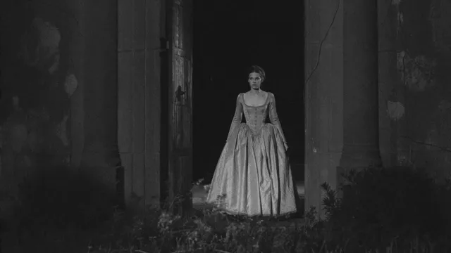
A thumbnail is a promise, not a decoration. It tells a scrolling viewer what they will feel, learn, or laugh at within two seconds, long before they hear a single word of your audio. In a feed where most viewing happens muted and at speed, the cover image carries the weight a headline once carried alone. The strongest channels plan cover art first and then edit the video so it delivers on what the image advertised.
Frame grabbing inverts that order. You finish the edit, scrub the timeline, and pick whichever moment happens to be sharp and not blinking. Sometimes it works. More often it produces a dim, mid-gesture still that reads as visual noise on a phone. The image does not match the promise; it merely exists.
A thumbnail-first workflow changes three things. The concept locks before production, so framing, lighting, and wardrobe are built around one readable image. The cover art is generated rather than scavenged, so you can iterate on expression and composition without reshooting. And the image gets validated at feed size, where it actually competes, instead of in a full-screen editor where everything looks acceptable.
That shift is the real alternative to hunting for a downloadable frame. You stop treating the thumbnail as a salvage operation and start treating it as the first deliverable of the project.
What a Frame Downloader Actually Gives You
Tools that pull a still from a published video solve a narrow problem: you have footage and you need an image from it. That is useful for archival reference or a quick screenshot, but it is a weak foundation for a cover.
Consider what comes back. The frame is already compressed by the platform, so fine detail is smeared. It is cropped to the video's aspect ratio, which rarely matches the dimensions a thumbnail needs. Lighting was chosen for motion, not for a frozen moment, so faces fall into shadow. The expression captured is whatever happened at that timestamp, often mid-blink or mid-word.
Then there is the strategic cost. A downloaded frame can only show what you already shot. If the most compelling version of your idea requires a different angle, a cleaner background, or an exaggerated reaction, the downloader cannot help. You are limited to the footage you have rather than the image you need.
There are practical risks as well. Frames from third-party videos carry ownership questions, and platform-compressed stills rarely meet the crispness standard of a cover competing against professionally designed ones. A downloader answers the question "what did this video look like?" It does not answer "what will make someone stop scrolling?"
The In-Platform AI Thumbnail Workflow, Step by Step
The alternative is to generate the cover inside the same environment where you produce or edit the video, so the asset stays visually consistent with the content. Here is a workflow that holds up across explainers, gaming clips, product demos, and comedy.
Step 1: Write the promise in one sentence
Before you touch a prompt, write the sentence a viewer should think: "This video shows X in a way I have not seen." If you cannot write it, no image will save the video. That sentence becomes both your prompt seed and your later A/B testing hypothesis.
Step 2: Generate candidates from a prompt, not from footage
Describe subject, action, environment, lighting, and mood. Generate six to ten variations rather than one, because the point is comparison. Keep a written record of the prompts that produced usable compositions so your process compounds instead of restarting every week.
Step 3: Lock character and style consistency
If your channel has a host, avatar, or recurring cast, define them once with a reference pack and reuse it. Consistent faces and color grading build recognition in a feed; a different-looking "you" every week resets viewer memory.
Step 4: Add text, contrast, and mobile legibility
Three to five words maximum, set large, placed away from the platform's overlay zones. Check contrast in grayscale. If the text disappears there, it will disappear on a bright screen outdoors too.
Step 5: Validate at three sizes before export
Preview at full width, at feed width, and as a small grid tile. If the subject is unreadable at tile size, simplify: fewer elements, bigger face, one stronger idea.
Prompt Patterns That Produce Usable Cover Art
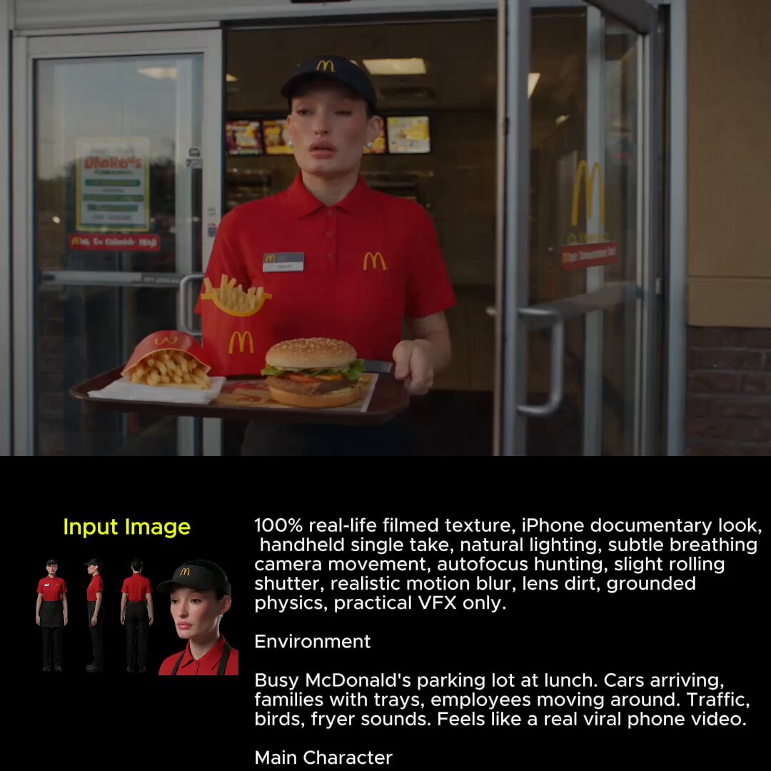
Effective thumbnail prompts read like a director's note, not a search query. They specify five things: subject, action, environment, light, and emotional tone. A prompt such as "robot hero lineup on a lunar base, Earth hanging in a starry sky behind them, cinematic rim light, exaggerated comedic expressions, high contrast, negative space on the right" gives a generator enough constraints to produce something usable while leaving room for text.
Three patterns are worth saving and reusing:
The reaction shot. One subject, one strong emotion, tight crop, blurred background. Best for commentary, reviews, and comedy, where the face is the hook.
The before-and-after split. Two states side by side with a divider. Best for tutorials, transformations, and comparisons, because the eye reads the difference instantly.
The scale shot. A small figure against a huge object or landscape. Best for storytelling, travel, and gaming, where curiosity comes from disproportion.
Two rules apply to all of them. First, describe the negative space you need for text instead of asking the generator to render text; most models still produce garbled lettering. Second, request high contrast and simple backgrounds, because busy detail turns to mud at small sizes.
Keep a prompt library sorted by content type. Within a few months it becomes the most valuable file in your production folder.
Consistency Systems: Keeping a Channel Recognizable
Recognition is a compounding asset. Viewers who spot your cover in a crowded feed before reading the title are already halfway to clicking. That only happens if your thumbnails share a visual grammar.
Decide on four recurring elements and hold them: a color palette (two dominant colors plus one accent), a typeface and text position, a framing convention such as keeping the subject on the left third, and a treatment for backgrounds. Then document them in a short style sheet you can hand to a collaborator.
Variation should live inside the system, not outside it. Change the subject, the expression, the environment, and keep palette and layout stable. This is the same principle behind recognizable magazine covers and album art: the template is the brand, the content is the news.
Reference packs make this practical with AI generation. Save approved images of your host, your recurring locations, and your color grading, then reuse them as style inputs. Without a reference, each generation drifts a little, and drift accumulates into a channel that looks like several different creators.
Audit monthly. Pull your last twelve covers into one grid and view them at small size. Patterns you did not intend, like the same pose or the same background, become obvious in a contact sheet and invisible in your editing timeline.
Technical Checklist: Sizes, Safe Zones, and Format Rules
Technical mistakes quietly cost performance, and they are the easiest category to eliminate:
- Dimensions. Produce a 16:9 horizontal version and a 9:16 vertical version of the same concept. Recompose rather than crop one into the other.
- Resolution. Export at the platform's recommended maximum, not the minimum; higher-resolution sources survive re-encoding better.
- File weight. Stay under the platform's file-size cap so the image is not recompressed aggressively.
- Safe zones. Leave the lower-right area and bottom strip clear for duration stamps, progress bars, and interface overlays.
- Text size. Nothing below roughly five percent of image height. If it needs squinting on a phone, it is decoration, not information.
- Contrast. Check in grayscale and under bright-light conditions.
- Faces. Crop so the eyes sit in the upper third; viewers read faces before anything else.
- Color space. Export in sRGB to avoid washed-out shifts after upload.
Build these into an export preset so they stop being decisions. A preset turns a fifteen-minute checklist into a single click and removes the most common cause of "why does my cover look worse after upload?"
Common Mistakes That Kill Click-Through
Most underperforming thumbnails fail for predictable reasons.
Too many ideas. Five objects, three arrows, and a text block all compete, and nothing wins. One subject, one emotion, one claim.
Text that repeats the title. The thumbnail and title should combine into one sentence, not say the same thing twice. Use the image for the emotional half and the title for the informational half.
Low contrast. Legibility comes from contrast, not brightness. A bright but flat image still disappears.
Unreadable at tile size. Zoom out to roughly 120 pixels wide. If you cannot tell what is happening, neither can a viewer in a fast scroll.
Mismatched promise. Covers that oversell produce clicks followed by immediate exits, and platforms read those exits as a quality signal. The image has to be honest, just more interesting than the video's opening minute.
Ignoring the mobile frame. Test how the cover sits next to interface elements rather than in isolation on a desktop monitor.
No iteration. One cover and done is a coin flip. Creators who win consistently treat thumbnails as a series of experiments rather than a single finished artwork.
Testing and Iterating After Publishing
Publishing is the start of the test, not the end of the design work.
Change one variable at a time: the face, the text, the color, or the composition. If you change three things and performance moves, you learn nothing reusable. Give each version enough impressions before judging, because early swings are mostly noise.
Track relative performance rather than absolute numbers. What matters is whether a cover beats your channel's typical rate for similar content, since audience size and topic both move the baseline.
Keep a dated log of concept, prompt, version, and outcome. After twenty entries, patterns appear: which faces work, which phrases land, which color combinations you should retire. That log is more valuable than any single winning thumbnail because it transfers to the next video.
Revisit old videos with weak covers as well. A library refresh is often cheaper than producing something new, and it compounds quietly in the background while you work on the next upload.
Where AI Generation Fits in Your Stack
AI image and video generation is a component, not a strategy. The most reliable setup looks like this: an idea stage where you write the promise, a generation stage where you produce candidates with a model that respects your style references, an assembly stage in a normal editor where you add type and polish, and a measurement stage where results feed back into the prompt library.
Choose tools by three criteria. First, consistency controls: can you reuse a character or style reference reliably? Second, iteration speed: how fast can you move from prompt to comparable variations? Third, export control: do you get clean, correctly sized files without fighting the interface?
For video-first projects, generate the cover from the same visual world as the footage so the two feel related. For talking-head content, generate reaction environments and composite the real face on top. For product work, generate settings and place the actual product image inside them, because accuracy matters more than style there.
The goal is a repeatable pipeline where every video arrives with cover art already drafted, checked at thumbnail size, and logged against a measurable outcome. Once that pipeline exists, the question stops being "where can I download a frame?" and becomes "which of these three covers deserves the traffic?"
FAQ
Do I still need a frame downloader at all?
As a reference tool, occasionally. If you want to study a competitor's composition or recover a moment for internal notes, a still is handy. As a production method for published covers, it limits you to footage you already have.
Can AI-generated thumbnails look like real photography?
Yes, when the prompt specifies lens, lighting, and depth of field, and when you avoid over-smoothing. Skin texture, slight imperfections, and directional light do more for realism than raw resolution.
How many variations should I generate per video?
Six to ten candidates, then narrow to two or three for a test. Generating more than ten rarely improves the final choice, because the constraint is judgment rather than volume.
Should text be baked into the generated image?
No. Add type in an editor. Generators still produce unreliable lettering, and editable text lets you reuse the same composition with a different headline later.
What if my face is central to the channel?
Generate the environment, lighting, and composition, then composite a real photo of yourself. It keeps recognition intact while removing the pressure of finding one perfect live frame.
How often should the thumbnail style change?
Refresh the template only when performance across several videos declines or your content shifts category. Changing it purely for novelty breaks the recognition you spent months building.

Alexander
More Blogs
Read MoreVidu Q4 Alternatives: 4K AI Video Models Compared (2026)
Vidu Q4 alternatives compared: Kling 4.0, Seedance 2.5, Wan 3.0, and Runway Gen-4 — 4K support, input modes, durations, audio, and what each costs in credits on Domer.
Top 4K AI Image Generators in 2026: 5 Models Compared on Real Costs
The top 4K AI image generators on Domer compared: Flux 3 Klein, Nano Banana 2.1, GPT Image 2.5, GPT Image 2, and Nano Banana Pro — 4K credit costs, reference limits, and speed.
Nano Banana 2.1 vs GPT Image 2.5: Which Image Model Should You Use? (2026)
Nano Banana 2.1 vs GPT Image 2.5 Flare compared: credit costs per resolution, aspect ratios, reference images, text rendering, and which tasks fit each model.