
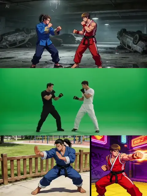
Best AI Anime Image Generators: A Practical Workflow Guide
Oct 13, 2026
Why Anime Fans and Creators Keep Coming Back to AI Image Generation
Anime art has a very specific visual grammar: crisp line work, flat or gently graded color fields, oversized eyes, dramatic hair silhouettes, and poses that read instantly even at thumbnail size. That grammar is exactly why text-to-image tools took hold in anime-adjacent communities so fast. A single prompt can produce a full illustration in seconds, and a disciplined workflow can turn that into a consistent character roster, a webcomic panel, a channel thumbnail, or a short animated loop.
The gap between “fun first result” and “art I would actually publish” is wide, though. Most people who bounce off AI anime art do so for one of three reasons: results look generic, characters change face between images, or the finished file collapses the moment it is animated, upscaled, or printed. None of those are model failures in isolation. They are workflow failures.
This guide covers how anime-focused image generation actually works, how to compare tools by what they genuinely do well, how to build prompts that survive iteration, and how to get from a grid of rough options to a finished piece you can post, print, or drop into a video edit.
How These Models Understand the Anime Aesthetic
Diffusion in plain language
Most current generators are diffusion models. Training teaches a network to take an image and progressively add noise until nothing recognizable remains; generation runs that process backward, starting from pure noise and denoising step by step toward an image that matches your text prompt. The prompt does not literally draw anything. It steers the denoising path, nudging each step toward patterns the model associates with your words.
Two practical consequences follow. First, prompt wording matters more than prompt length — a well-chosen noun phrase beats a paragraph of adjectives. Second, the number of denoising steps and the strength of prompt guidance control how literally the model follows you versus how natural the output looks. Push guidance too high and you get oversaturated, stiff, over-detailed images with burned edges. Push it too low and the model drifts into its own comfortable defaults and ignores half of what you asked for.
Why anime is a harder target than photorealism
Photoreal generation can hide a lot of small errors because real photographs are noisy, grainy, and irregular. Anime is unforgiving. Line weights are meant to be consistent and intentional. Faces are built from a small number of shapes, so a two-pixel error in eye placement reads as wrong instantly. Hair strands, fabric folds, and hands follow stylized conventions that vary by subgenre — 1990s cel animation does not look like modern digital illustration, and neither looks like chibi comedy art.
That is why generic prompts produce generic anime. The model averages every style it has seen unless you narrow the target with concrete style language, a reference image, or a specialized model trained on a narrower aesthetic. If you only remember one idea from this section, remember this: specificity beats length, and references beat adjectives.
Checkpoints, add-ons, and adapters explained
- Checkpoint: the base model file. Different checkpoints lean toward different looks — some are soft and painterly, others push sharp line art, others drift toward semi-realistic anime.
- Add-on model: a small file that nudges the base model toward a specific character, style, or concept. Stacking two of them (one for a character, one for a rendering style) is a standard technique.
- Adapter: a control module that feeds extra information into generation, such as a pose skeleton, a depth map, an edge map, or a reference image of a face or outfit.
- Upscaler: a separate pass that increases resolution while trying to preserve line clarity and avoid smeared outlines.
Understanding this stack is what separates people who fight their tools from people who get repeatable results. When a render fails, you can usually trace the failure to one specific layer: the checkpoint brought the wrong style, the add-on was too weak, the adapter pulled the pose off-model, or the upscaler crushed the lines.
Comparing the Main Tool Categories
Different categories solve different problems. Pick by output goal, not by hype.
| Category | Strength | Weakness | Best for |
|---|---|---|---|
| Hosted prompt-first platforms | Fast, polished, zero setup | Less control, subscription limits | Concept art, moodboards, quick posts |
| Local diffusion pipelines | Full control over models and settings | Needs decent hardware and patience | Series work, consistency, print |
| Mobile and browser apps | Instant and casual | Few controls, uneven quality | Sketches, jokes, layout tests |
| Hybrid stacks | Generate, clean up, then animate | More steps to manage | Shorts, trailers, looping backgrounds |
Hosted, prompt-first platforms
These are the easiest entry point. You type, you get options, you refine. They tend to have strong default aesthetics, which is both a gift and a trap: everything starts to look like the same house style. Use them for exploration and moodboards, then move the chosen direction into a pipeline where you control the details that matter — resolution, seed, line weight, and pose.
Local diffusion pipelines
Running models on your own machine unlocks the full range of community-trained checkpoints and add-ons. You choose the sampler, the step count, the seed, the adapter stack, and the resolution strategy. This is the most practical way to keep a character on-model across dozens of images, and the only way to keep working offline or in a hurry without waiting on a queue.
The trade-off is setup cost. Node-based interfaces are powerful but visually dense, and simpler front-ends hide options you will eventually want. Start simple, then migrate once you feel the ceiling.
Mobile and browser apps
Convenient, and genuinely useful for testing silhouettes and compositions while away from your desk. Treat the output as thumbnails to be rebuilt properly later, not as finished art. Screenshot quality and compressed uploads will strip the fine line detail you need for print.
Hybrid stacks
Most published anime-style work goes through at least three tools: one to generate, one to edit or inpaint, one to upscale or animate. Plan that chain before you start, because a file generated at the wrong aspect ratio or saved with baked-in compression can waste an hour later when you try to composite it.
Building Prompts That Hold Up Through Iteration
The five-block formula
A reliable anime prompt has five blocks. Keep them in a consistent order so you can swap one block at a time and see exactly what changed:
- Subject and action — a swordswoman mid-swing, two students sharing an umbrella, a courier sprinting across rooftops.
- Character specifics — hair color and length, eye color, outfit, signature accessory, age range.
- Style and rendering — cel shading, soft digital painting, 90s TV animation look, watercolor background, clean line art.
- Composition and camera — full body, three-quarter view, Dutch angle, close-up portrait, wide establishing shot.
- Lighting and atmosphere — rim light, dusk, rain-slicked neon, warm indoor lamplight, harsh midday sun.
Order matters because early tokens typically carry more influence. Putting the subject first keeps the model from spending its attention budget on texture.
Weighting and negative prompts
Weighting lets you emphasize or de-emphasize a word so the model stops averaging it away. Negative prompts are equally important for anime: listing artifacts you do not want — extra limbs, blurry line art, stamped text, distorted hands — consistently improves output. Keep negatives focused and short. A giant negative list often fights itself, because several of the excluded concepts sit close together in the model's internal representation.
Three worked examples
Portrait study. “close-up portrait of a teenage witch, short silver hair, amber eyes, oversized cardigan, cel-shaded anime style, soft rim light, dusk sky background, clean line art.”
Full-body character sheet. “full body reference of a tall knight in lacquered armor, three-quarter view, neutral pose, plain light background, flat anime shading, consistent line weight, symmetrical design.”
Scene. “two cyclists racing downhill at sunset, dynamic perspective, motion lines, warm orange sky, stylized anime background painting, wide shot, crisp outlines.”
Each example front-loads the subject, then layers style, then camera, then light. Notice that none of them name a real artist or a specific franchise; they describe visual properties instead, which is both safer and more controllable.
Prompt mistakes worth avoiding
- Style soup. Listing six artists and five franchises makes the model average them into mush.
- Contradictions. Photorealistic cel shading pulls in two directions; pick one aesthetic and commit.
- Vague subjects. A cool character gives the model nothing to anchor on.
- Ignoring aspect ratio. Vertical framing requested from a square generation always looks cropped.
- Copy-pasting other people's prompts. Their prompt encoded their references, not yours.
Keeping a Character Consistent Across Many Images
Consistency is the single biggest technical hurdle in anime series work, and it is where most projects quietly die.
Reference-based workflows
Adapter modules that accept a reference image let you feed a face, outfit, or color palette directly into generation. Build a small library of approved references: one neutral front-facing portrait, one side profile, one full-body pose. Reuse that library every session instead of hunting for a new reference each time, because swapping references mid-project is the fastest way to lose a character's identity.
Seed locking and controlled variation
Reusing the same random seed with small prompt edits gives you a family of related images rather than a random scatter. Change one variable at a time — outfit, then expression, then pose — and keep only the results that stay on-model. This is slow, deliberate work, and it is the difference between a character and a stranger who happens to share a hair color.
Training a small custom model
If a character appears in fifty or more planned images, a small dedicated add-on model trained on twelve to twenty clean reference images pays for itself. Keep training images consistent in style, crop, and lighting. Sloppy training data produces a model that can only reproduce the exact poses you fed it, which defeats the purpose entirely.
The character sheet method
Before producing story images, generate a one-page sheet: front, side, back, three expressions, and a color swatch strip. Approve it once and treat it as the source of truth. Every later image gets compared against it, and anything that drifts gets regenerated. This single habit prevents more rework than any setting tweak.
Controlling Pose, Composition, and Anatomy
Pose and structure guidance
Skeleton-based pose guidance lets you dictate limb positions precisely, which is essential when generating action scenes or matching a storyboard. Depth maps handle spatial relationships: a character clearly in front of a background element will stay in front rather than melting into it.
Line and edge guidance
Edge-based guidance is especially strong for anime because line art is already a high-contrast, low-noise signal. Feed a rough sketch and the model can paint inside your lines while keeping your composition intact. This is the closest thing to drawing alongside the model instead of hoping it guesses correctly.
Fixing hands, eyes, and small details
Do not regenerate an entire image for one broken hand. Crop the problem area, run a targeted inpainting pass with a tight prompt, and blend the edges. For eyes, generate at higher resolution rather than trying to sharpen a small face — upscalers cannot invent correct iris detail from four pixels of mush, and attempting it produces the glassy, lifeless stare that marks amateur output.
From Still Image to Motion
Subtle loops beat big animation
The easiest path to convincing motion is small, controlled movement: hair drifting, clouds sliding, a slow camera push, blinking eyes. These read as alive without exposing anatomy errors that full-body animation would reveal frame by frame.
Parallax and layered depth
Split the illustration into layers — foreground character, midground props, background sky — and move them at different speeds. Even a few pixels of differential movement creates convincing depth for short-form video, and it takes minutes rather than hours.
Character animation pitfalls
Full character motion requires either rigging a clean, layered character or using video models that predict motion from a single frame. Both approaches punish inconsistent line work and inconsistent proportions. Lock your character design first; animate second. If the design still shifts between frames, no animation technique will save it.
Pacing, sound, and edit rhythm
A three-second loop with a strong beat is more watchable than a fifteen-second clip with no sound design. Cut to the music, keep the first frame interesting, and avoid a slow fade-in that eats your hook before anything happens. Motion composition is its own craft, separate from illustration.
Upscaling, Cleanup, and Delivery
Resolution strategy
Generate at the largest size your hardware handles comfortably, then upscale in stages rather than in one jump. Two moderate passes preserve line quality better than one extreme pass, which tends to produce waxy textures and haloed edges.
Cleanup pass
Once upscaled, do a manual pass: repair stray lines, unify eye highlights, correct color drift between images in a series. Small manual fixes are what make AI-assisted work look finished rather than assembled.
Color grading and export
Grade for the destination. Vertical social video wants higher contrast and saturation; print wants a softer, wider-gamut profile. Export at the platform's native resolution and keep a lossless master for future reuse, because re-encoding a finished vertical clip for a horizontal platform destroys the line work.
Archiving your best outputs
Save prompts, seeds, model names, and adapter settings alongside the final file. Six weeks later, when you want a matching image for the same character, that metadata is worth more than the image itself.
A Repeatable End-to-End Workflow
- Write a one-line brief. Who, what, mood, format.
- Collect references. Two to four images maximum: one for style, one for character, one for lighting.
- Generate a wide rough batch. Low effort, many options, same prompt with small variations.
- Pick a direction. Choose composition and pose before polishing detail.
- Lock the seed. Iterate outfit, expression, and lighting one variable at a time.
- Fix local errors with inpainting instead of full regeneration.
- Upscale in stages. Check line integrity after each pass.
- Animate only if it earns its keep. Layer and loop rather than animating everything.
- Edit and grade. Match contrast and color across the whole set.
- Archive metadata. Prompt, seed, model, adapter settings, date.
This loop takes roughly the same amount of time regardless of tool choice. What changes is where the time goes: hosted platforms spend it on retries and waiting, local pipelines spend it on setup and configuration. Either way, the ceiling on quality is set by how disciplined your process is, not by which app you opened.
Mistakes, Ethics, and Community Norms
Common beginner mistakes
- Chasing a new model every week instead of learning one stack properly.
- Generating at tiny resolutions and blaming the tool for soft detail.
- Skipping the reference stage, then wondering why characters drift.
- Editing a compressed export instead of the original file.
- Ignoring aspect ratio until the final step.
- Publishing the first acceptable result instead of the best one from a batch.
Attribution and honest disclosure
Anime communities care about provenance. Label AI-assisted work, keep your process notes, and be transparent when a piece is heavily generated. This is not only an ethical point — audiences reward creators who explain their workflow, and that explanation is often the most engaging part of a post. Process transparency also protects you when someone assumes the worst.
Style mimicry and living artists
Copying a living artist's signature style and presenting it as your own is where most community backlash originates. Build a style from broad, historical, or generic descriptors — cel shading, watercolor backgrounds, 90s TV animation — instead of naming an individual creator. You get more original results and fewer arguments.
Publishing and licensing basics
Before commercial use, review the terms attached to every model, add-on, and adapter in your chain. Rules differ between community-trained models and commercial platforms, and rules change over time. Keep a simple record of what you used for each finished piece so you can answer questions later without digging through folders.
FAQ
Do I need an expensive GPU?
Not to start. Hosted platforms and browser tools need no local hardware. Local pipelines benefit from a modern GPU with plenty of video memory, but mid-range cards handle standard resolutions fine if you keep batches small and upscale afterward.
Which tool is best for a total beginner?
Start with whichever hosted platform has the aesthetic you like most, spend a week learning how prompt order changes results, then move to a pipeline that gives you seed and adapter control when you hit its limits. The limit always arrives; plan for it.
How do I stop extra fingers and warped faces?
Generate at higher resolution, keep the subject large in frame, add targeted negative prompts, and inpaint problem areas rather than rerolling the whole image. Hands are consistently the hardest region — fix them last, deliberately, and check them at full zoom before exporting.
Can I sell AI-assisted anime art?
Often yes, but it depends on your tool chain and your platform's rules. Review every model's license, avoid copying a living artist's style, and disclose your process where your audience expects it.
Why do my images all look the same?
Default settings push every prompt toward a similar average. Change the checkpoint or add-on, vary the camera block, and introduce specific lighting. Sampling different seeds within one composition also adds visual diversity without breaking consistency.
How long does one finished piece take?
A polished standalone illustration is usually one to three hours including selection, inpainting, and upscaling. A consistent multi-image set takes longer because you invest time up front in references and a character sheet, but that investment pays back across every later image.
Should I animate stills or generate video directly?
If your scene needs precise expressions and poses, generate stills first and animate subtly. If you need continuous motion and can accept less control, video generation from a single frame is faster. Many creators use both: stills for hero moments, generated motion for transitions and backgrounds.
Bringing It Together
The strongest anime-style results come from a boring, repeatable process: define the character, lock the reference, control the prompt in blocks, fix problems locally, upscale carefully, and only then add motion. Tools matter, but the workflow matters more — and the workflow transfers when the next model generation arrives and everyone starts arguing about it again.
Pick one stack, run three complete projects through it end to end, and write down what worked. That documentation, not the newest release, is what will make your next illustration faster and your characters recognizable.

Alexander
More Blogs
Read MoreMontaggio video rapido: transizioni e software per l'AI
Guida pratica al montaggio video rapido con AI: transizioni fluide, software, workflow, coerenza visiva, errori da evitare e FAQ operative.
Building an AI Video Production Workflow From Concept to Cut
A practical guide to planning, generating, editing, and finishing AI-assisted videos with consistent characters, clear shot lists, and reliable review loops.
A Repeatable Post-Production Workflow for Polished AI Video
Build a repeatable AI video post-production pipeline: organize assets, cut story-first, design transitions, refine audio, and review versions calmly.