
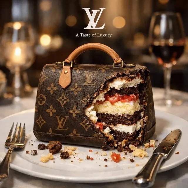
Photorealistic AI Image Generation: A Practical Creator's Guide
Oct 13, 2026
Photorealistic image generation has moved from a novelty to a genuine production tool. Agencies use it for mood boards and client comps, solo creators use it for thumbnails and cover art, and product teams use it to produce placeholder visuals that look finished enough to test with real users. Output quality has improved enormously, but the gap between an impressive demo and a usable asset is still mostly a workflow gap. One well-crafted prompt can produce a striking image; a repeatable process produces a hundred consistent ones.
This guide covers the mechanics behind photorealistic generators, the vocabulary that reliably steers them, and a five-stage workflow you can run on almost any tool. It treats photorealism as a craft with controllable inputs rather than a slot machine you keep pulling.
What Makes an Image Read as Photorealistic
Your brain decides whether an image is a photograph in a fraction of a second, long before you consciously inspect details. That judgment comes from a handful of cues, and understanding them tells you what to fix when an image feels artificial.
Micro-texture and detail density
Real photographs are noisy in a structured way. Skin has pores, fabric has weave, wood has grain, concrete has pits. Generators that produce smooth gradients across every surface look like 3D renders even when the geometry is correct. The fix is rarely "more detail" in the abstract; it is localized detail. A face needs texture in the T-zone and around the eyes, not uniformly across the whole cheek. A leather jacket needs grain in the highlights where light grazes the surface.
Light and optics behave a specific way
Photographs contain optical artifacts that our visual system expects: depth of field falloff, slight chromatic fringing at high-contrast edges, lens flare, subtle vignetting, and motion blur on fast-moving subjects. When those cues are missing, the image feels sterile. When they are overdone, it feels like a filter. The sweet spot is usually restrained: a shallow depth of field that isolates the subject without turning the background into mush, and highlight rolloff that does not clip to pure white.
Anatomy and material consistency
Hands, ears, teeth, and hair remain the classic failure points. So do materials: metal that reflects like plastic, water that has no refraction, glass that casts no shadow. Photorealism depends on the physics of how surfaces interact with light, and consistency across an entire frame matters more than any single element being perfect. A perfect face on a body with impossible shoulders will still read as fake.
How Photorealistic Generators Actually Work
Understanding the pipeline helps you debug it. You do not need the math, but knowing which stage is failing saves hours of random prompt editing.
Diffusion, latent space, and denoising
Most modern image generators are diffusion models. The system starts with pure noise and removes it step by step, guided by your prompt, until an image emerges. That denoising happens in a compressed representation called latent space, which is why small prompt changes sometimes produce large output changes and vice versa. The number of steps and the guidance strength control how aggressively the model follows your instructions versus how naturally the image renders.
Conditioning: text, images, and control signals
Your prompt is only one input. Image-to-image conditioning lets you start from a reference or a rough sketch. Control signals such as depth maps, pose skeletons, edge maps, and segmentation masks constrain composition while leaving style free. The practical consequence is that text alone is the weakest way to control a photorealistic image. The strongest workflows combine a short text prompt with at least one structural control.
Why models still struggle with hands, text, and symmetry
These failures are structural, not random. Hands involve many overlapping small forms at odd angles, which is statistically rare in training data. Text requires precise glyph reproduction that a diffusion process approximates rather than draws. Symmetry requires global consistency across a frame, while the denoising process works locally. Knowing this tells you when to stop retrying and switch to a repair tool instead.
Choosing the Right Tool for the Job
Tool selection is a decision matrix, not a loyalty question. Match the tool to the constraint that matters most for your project.
Hosted generators versus local pipelines
Hosted tools win on speed to first result, model variety, and zero setup. They are the right choice for exploration, client comps, and any project where you need twenty variations fast. Local pipelines win on reproducibility, privacy, cost predictability at high volume, and fine control over samplers and checkpoints. They are the right choice for serial production work, sensitive content, and consistency across a large set.
General models versus specialized models
A general-purpose model handles portraits, landscapes, products, and architecture competently. Specialized models or fine-tunes beat it decisively within a narrow domain: a portrait-tuned model renders skin and eyes better, a product-tuned model handles reflective packaging better. If your project lives inside one domain, a specialized model plus a good workflow will outperform a general model plus heavy post-processing.
Resolution, aspect ratio, and delivery constraints
Decide the final aspect ratio and resolution before you generate, not after. Cropping a 1:1 image into a 9:16 vertical for social loses composition and often severs limbs. Generate at the native aspect ratio you need, then upscale. If the deliverable is print, plan for a final resolution that survives at 300 DPI at the intended physical size, which usually means generating at the model's native resolution and upscaling in a controlled pass rather than attempting everything in one shot.
Prompt Architecture for Lifelike Results
A good photorealistic prompt is a structured description, not a paragraph of adjectives. Build it in layers so you can adjust one variable at a time when iterating.
Layer one: subject, setting, and action
Be concrete. "A woman" is weak. "A woman in her thirties in a canvas work jacket, crouching to inspect a motorcycle engine" gives the model geometry, wardrobe, and a reason for her posture. Include what the subject is doing, where they are, and what surrounds them. Vague subjects force the model to invent details, and invented details are where artificiality creeps in.
Layer two: camera and lens language
Camera vocabulary is the most efficient way to control perspective and depth. Naming a focal length implies a distance and a compression of space: a wide angle exaggerates foreground and pushes the background away, a telephoto compresses layers and isolates the subject. Aperture language implies depth of field. Shot framing language implies crop and composition. Even without naming specific hardware, phrases describing lens behavior give the model useful constraints.
Layer three: lighting vocabulary
Lighting does more for perceived realism than any other single element. Useful vocabulary includes the direction of light, its quality, and its source. Direction: side-lit, backlit, overhead, underlit. Quality: soft, hard, diffused, dappled, directional. Source: window light, overcast daylight, golden hour, practical lamps, on-camera flash. Combining a direction with a quality and a source produces far more control than the word "cinematic" ever will.
Layer four: medium and processing cues
A short, specific cue about capture or processing resolves a lot of ambiguity. Documentary photography, editorial portrait, film stock styles, analog grain, medium format, or phone camera each imply a different color response, contrast curve, and noise profile. Use one cue, not five. Stacking contradictory medium cues produces an over-stylized image that reads as digital art rather than a photograph.
Layer five: exclusions
Negative guidance works best on categories, not on long lists. Excluding illustration, painting, cartoon, and 3D render removes an enormous amount of stylistic drift. Excluding specific defects like extra fingers, warped hands, or floating objects helps but does not guarantee anything; structural problems usually need structural fixes.
The iteration rule
Change one layer at a time. If you edit the subject, the lighting, and the camera simultaneously, you learn nothing from the result. Lock the composition with a seed, then adjust lighting. Lock the lighting, then adjust the lens. This is slower per step and dramatically faster overall.
A Repeatable Five-Stage Workflow
This workflow scales from a single hero image to a series of fifty. It assumes you have a generator, an editor with inpainting, and an upscaler.
Stage one: build a reference board
Collect eight to twelve real photographs that match your target look. Do not collect AI images as references; you will inherit their artifacts. Look for the specific qualities you want: the light, the color palette, the framing, the texture level. Write down three adjectives that describe the shared qualities. Those adjectives become your medium cue later.
Stage two: the blocking pass
Generate at low-to-medium resolution with a simple composition. You are solving for layout, pose, and light direction, not detail. Produce twenty to forty variations quickly and pick the two or three with the strongest bones. Do not fall in love with a beautiful image that has bad structure; you will fight it for hours.
Stage three: the refinement pass
Take your chosen composition into an image-to-image pass with a moderate strength setting so the structure survives but the render quality improves. Add lighting and material detail in the prompt here. If you have access to structural controls, apply a depth map or pose skeleton now to lock anatomy while the model re-renders surfaces.
Stage four: targeted repair
Fix problems locally instead of regenerating the whole frame. Inpaint the hands, the eyes, the logos, the edge where the subject meets the background. Outpaint if you need more headroom, more environment, or a different crop. Small, surgical edits preserve everything you already got right.
Stage five: finishing and delivery
Upscale in a controlled pass, then apply a light grade. Add grain deliberately, and add it last. Check the image at 100 percent, at fit-to-screen, and at thumbnail size. Photorealistic images that hold up at thumbnail size usually hold up everywhere, because that is the scale where composition and lighting dominate over detail.
Control Tools That Separate Hobbyists From Pros
The difference between a casual user and a professional is rarely prompt length. It is the use of structural controls and repair tools.
Pose, depth, and edge control
Pose skeletons lock limb positions. Depth maps lock the relative distance of objects from the camera. Edge maps preserve silhouettes and architectural lines. Any one of these eliminates most anatomy and perspective errors before they appear. If your tool supports them, use them for anything involving people, products, or architecture.
Inpainting and outpainting
Inpainting replaces selected regions without disturbing the rest of the frame. Outpainting extends the canvas beyond the original boundaries, which is invaluable for adapting one composition to multiple aspect ratios while keeping the core image intact. Both are cheaper in time than another round of full generation.
Upscaling and face restoration
Upscaling a diffusion output is a distinct process from generating it. Controlled upscalers preserve texture; aggressive ones hallucinate detail and produce the telltale plastic look. Face restoration helps at small scales and hurts at large ones, because it tends to smooth skin into a uniform surface. Use it selectively and at low strength.
Consistency across a set
Series work requires a fixed style anchor. Keep a seed, a reference image, and a locked prompt template where only the subject changes. Generate the whole set in one session, on one model, with one sampler configuration. Batch consistency is a logistics problem, not a prompting problem.
Common Mistakes and How to Fix Them
| Symptom | Likely cause | Fix |
|---|---|---|
| Plastic skin | Over-smooth detail, over-strong face restoration | Add texture cues, reduce restoration strength, add grain at the end |
| Wrong hands | Small-structure failure | Inpaint the hands, or add a pose control for anything with visible hands |
| Flat lighting | No direction or quality specified | Name a direction, a quality, and a source |
| Over-stylized result | Too many medium cues stacked | Keep exactly one medium cue |
| Inconsistent series | Model or seed changed mid-set | Lock model, seed, and template for the whole batch |
| Awkward crop | Generated at the wrong aspect ratio | Generate natively at the delivery ratio, then outpaint if needed |
Beyond the table, the most expensive mistake is regenerating the whole frame to fix a local flaw. The second most expensive is accepting a beautiful image with broken anatomy because the lighting is nice. Both are cured by discipline: fix locally, verify structurally.
Ethics, Rights, and Professional Standards
Photorealism creates obligations. If an image includes a real, identifiable person, you need consent or a licensed likeness. If it imitates a living artist's signature style for commercial work, you are in murky territory regardless of what the tool permits. If it depicts a plausible news event, it should be labeled as synthetic.
For commercial work, keep a record of the generation settings, the model used, and the source of any reference images. Clients increasingly ask whether assets are AI-generated and what rights attach to them, and a short documentation trail answers those questions without a scramble. Also check the platform terms for the specific tool you use: commercial-use terms vary, and the differences matter for anything client-facing.
Finally, disclose when disclosure is expected. Advertising, editorial, and product photography have different norms. Erring toward transparency costs you little and protects you considerably.
FAQ
How many prompts does it take to get a truly photorealistic image?
Plan for fifteen to forty generations to reach one final asset, and considerably more if the image involves complex hands, text, or precise product geometry. The number drops sharply once you start using structural controls and local repair instead of pure text prompting.
Do I need a powerful GPU to work this way?
No. Hosted tools handle generation and often upscaling. A local machine becomes worthwhile when you produce high volumes, need strict privacy, or want fine control over samplers and model versions. A mid-range laptop plus a hosted generator is a perfectly professional setup.
Why does adding more detail words make images look worse?
Because detail words compete for the model's attention and often push the render toward an illustrative aesthetic. Specificity in subject, light, and camera beats volume of adjectives every time. Cut your prompt by half and see what happens.
Can I get a consistent character across many images?
Yes, with constraints: a fixed seed, a reference image or identity control, a locked prompt template, and the same model configuration for the entire batch. Text alone will drift. Expect to repair faces and hands in a small fraction of frames.
Is upscaling always necessary?
Only if your delivery requires it. Upscale deliberately, at low strength, and inspect the result at 100 percent. If the upscale introduces plastic texture, you went too far and should reduce the strength rather than accept the artifact.
What is the fastest way to improve at this?
Change one variable at a time and keep notes. A simple log of prompt, seed, model, and outcome will teach you more in a week than a month of undirected experimentation. Photorealism is a craft; the craft rewards deliberate practice.

Alexander
More Blogs
Read MoreVidu Q4 Alternatives: 4K AI Video Models Compared (2026)
Vidu Q4 alternatives compared: Kling 4.0, Seedance 2.5, Wan 3.0, and Runway Gen-4 — 4K support, input modes, durations, audio, and what each costs in credits on Domer.
Top 4K AI Image Generators in 2026: 5 Models Compared on Real Costs
The top 4K AI image generators on Domer compared: Flux 3 Klein, Nano Banana 2.1, GPT Image 2.5, GPT Image 2, and Nano Banana Pro — 4K credit costs, reference limits, and speed.
Nano Banana 2.1 vs GPT Image 2.5: Which Image Model Should You Use? (2026)
Nano Banana 2.1 vs GPT Image 2.5 Flare compared: credit costs per resolution, aspect ratios, reference images, text rendering, and which tasks fit each model.