
Utwórz
Social Media Image Sizes: The Complete Platform Guide
Oct 13, 2026
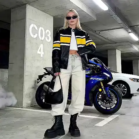

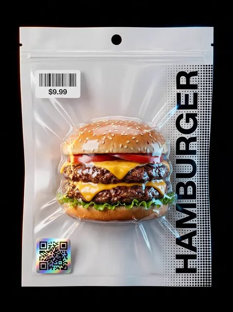
Static images never went away. They just moved into the places video cannot fully cover: profile photo, cover banner, thumbnail, carousel slide, story frame, ad creative, link preview card. Every one of those surfaces has its own canvas, its own crop behavior, and its own compression pipeline. Get the dimensions wrong and the platform decides for you — usually by cutting the top of a head off, letterboxing a landscape shot into a vertical slot, or squeezing a sharp photo into a blurry thumbnail.
The practical goal of this guide is simple: give you a single reference you can return to whenever you export an image or a still frame from a video. You will find recommended pixel dimensions, the aspect ratios they belong to, safe zones for interface overlays, file format and weight guidance, and a workflow you can repeat across a whole content calendar without reinventing it every week.
Treat the numbers below as strong defaults rather than permanent laws. Platforms quietly adjust their renderers, and a layout that crops at one point in time may crop differently after a redesign. What stays stable is the logic: choose a ratio first, design inside a safe zone, export at a generous resolution, and compress deliberately.
The Four Numbers That Define Every Post
Almost every sizing problem traces back to one of four measurements. Understand them and you can reason your way through any new platform instead of hunting for an updated cheat sheet.
Pixel dimensions
Pixel dimensions are the raw canvas: width by height. They matter because platforms re-encode whatever you upload. If you upload below the recommended width, the platform upscales and you get softness. If you upload far above it, the platform downscales and you often get a second round of compression artifacts on top. Uploading at or slightly above the recommended width is the sweet spot — typically 1.5x to 2x the largest display size for future-proofing without absurd file weights.
Aspect ratio
The ratio is the shape. A 1080 x 1350 image and a 1080 x 1080 image have the same width but completely different social behavior. Ratios are what the feed actually respects, and the crop happens along the ratio boundary. Learn to think in ratios and you stop memorizing numbers.
| Ratio | Common shorthand | Typical use |
|---|---|---|
| 1:1 | Square | Grid posts, avatars, product tiles |
| 4:5 | Portrait feed | Maximum vertical space in a feed |
| 9:16 | Full-screen vertical | Stories, short-form video, reels |
| 16:9 | Widescreen | Video thumbnails, link previews, banners |
| 2:3 | Tall portrait | Visual search boards, print-style pins |
| 3:1 or wider | Banner | Profile headers and page covers |
Safe zone
The safe zone is the interior region that interface elements will not cover. On full-screen vertical formats, the top strip holds account names and progress indicators, and the bottom strip holds captions, buttons, and navigation. Anything essential — faces, text, logos, product labels — belongs in the middle band. On banners, the safe zone is the centered area that survives on mobile, where headers are cropped aggressively.
File weight
File weight affects load time, and load time affects whether anyone sees your image at all. Most platforms cap uploads somewhere between a few megabytes and a few tens of megabytes depending on format, and they compress further on delivery. A clean 1080-pixel-wide JPEG usually lands between 150 KB and 400 KB. If you are shipping 8 MB PNGs for a photo, you are paying a tax in reach for no visible benefit.
Feed Posts: Square, Portrait, or Landscape
Feed surfaces are the most contested space in social media, because the amount of vertical room an image claims directly influences how much attention it earns while scrolling.
Portrait 4:5 is the default for reach
A 4:5 portrait image at 1080 x 1350 occupies more screen height than a square at the same width, which means more dwell time before a thumb moves on. It is also the format most tolerant of being reused elsewhere, because it crops cleanly to square and to a horizontal card without losing the subject.
Design rule: keep the subject in the central 80 percent, leave a thin margin at top and bottom, and never place text closer than about 60 pixels to any edge.
Square 1:1 is the default for grids and catalogs
Square remains the safest format for profile grids, product catalogs, and anywhere images sit in a uniform tile layout. Export at 1080 x 1080. If you are building a grid, plan the composition so the outer 5 percent of the image can be trimmed without consequence, since some interfaces round corners or apply slight zooms on hover.
Landscape 16:9 and 1.91:1 for previews and ads
Landscape images work best where the image is contextual rather than the main event: link preview cards, blog headers, article thumbnails, and horizontal ad placements. Export at 1200 x 628 or 1600 x 900. In preview cards, remember that the platform often overlays the headline and domain at the bottom — keep that strip visually calm.
A note on mixed-ratio carousels
Many feeds now normalize carousel slides to the ratio of the first image. If your first slide is 4:5, every following slide will be cropped to 4:5 whether you designed it that way or not. Pick the first slide's ratio deliberately and build the rest to match.
Vertical Canvases: Stories, Shorts, and Full-Screen Video
Full-screen vertical is the highest-engagement format and also the least forgiving. A single element in the wrong place disappears under an interface overlay.
The standard canvas
Design at 1080 x 1920, which is 9:16. This is the common denominator for story frames, short-form video covers, and vertical ad placements across nearly every major app.
Where the interface eats your design
Expect roughly the top 12–15 percent and the bottom 18–20 percent of the canvas to be obscured or visually crowded on most apps. In practice that means:
- Keep faces and headline text between roughly y=250 and y=1550 on a 1920-pixel-tall canvas.
- Place the primary call to action above the bottom overlay zone, not in it.
- Avoid placing small text near the bottom edge, where captions and progress bars stack up.
- If a platform adds its own caption box, your lower third is effectively gone — plan for it.
Stills exported from video
A common workflow is pulling a still frame from a vertical video and using it as a cover or a static post. Export the still at 1080 x 1920 and check that motion blur has not softened the subject. If the best moment is mid-motion, export a few frames around it and compare at full size rather than in a thumbnail preview.
4:5 versus 9:16 for stills
If the image will live in the feed, 4:5 performs better than 9:16 because vertical formats get cropped or padded in feed contexts. If the image will live in a story or a full-screen viewer, 9:16 wins. When you need one master file to cover both, build at 4:5 and extend the background upward and downward so a 9:16 crop is possible later.
Cover Images and Thumbnails
The thumbnail is a frame inside a frame: it is both its own image and a preview of something longer. It has to survive being reduced to the size of a postage stamp next to a headline.
Video thumbnails
A 16:9 thumbnail at 1280 x 720 is the standard for widescreen video platforms. Practical rules that matter more than the exact pixels:
- One subject, one idea. Compound thumbnails lose all meaning at small sizes.
- High contrast between subject and background. Muted shots vanish in a crowded grid.
- Text of three to five words maximum, sized so it remains readable at 25 percent zoom. Test by shrinking your file to 320 pixels wide and looking at it.
- Keep critical content out of the bottom-right corner, where duration badges often sit.
Profile banners and header covers
Banners are the most commonly botched asset because the upload interface and the rendered layout are different shapes. The standard approach is to export at a large widescreen size — 2560 x 1440 for channel banners, 1500 x 500 for profile headers — and keep all essential content inside a centered safe rectangle that is roughly 60 percent of the width. Everything outside that rectangle is decorative bleed.
Circular and rounded display
Avatars and logos are usually rendered in a circle or a heavily rounded square. Upload a square image at 800 x 800 minimum, center the mark, and leave a 10 percent margin so nothing touches the circular crop boundary. Never upload a rectangular logo and hope the crop is kind.
Professional and Visual Search Platforms
Two categories behave differently enough to deserve their own rules: professional networks, where the tone is restrained, and visual search platforms, where tall images dominate.
Professional networks
For feed posts, 1200 x 627 for link shares and 1080 x 1350 for native portrait posts cover most situations. For page covers, design wide and center-weighted, because the mobile crop is far narrower than the desktop crop. For logos, export a square around 400 x 400 and keep the mark simple — small, detailed logos turn to mush.
Professional feeds are also the least tolerant of over-designed graphics. Clean margins, restrained type, and a single clear message outperform busy layouts here even when the busy layout wins elsewhere.
Visual search and inspiration boards
Tall 2:3 images — commonly 1000 x 1500 — dominate boards and search results. Because these images are often viewed without surrounding context, they need to communicate instantly: clear subject, readable overlay text, strong vertical composition. Avoid ultra-tall ratios for primary content; they get truncated in the feed with a truncated preview that hides half your work.
Board covers behave like banners: a wide strip that gets displayed small, so they should read as a texture or a color story rather than a detailed composition.
File Formats, Compression, and Color Consistency
Format choice is the difference between a crisp image and a muddy one after the platform re-encodes it.
When to use each format
- JPEG: photographs and any image with continuous tone. Export at quality 80–90. Higher quality mostly adds weight, not visible detail.
- PNG: graphics with transparency, sharp-edged text, screenshots, and flat-color illustrations. Keep it under a few megabytes, or convert to JPEG if transparency is not needed.
- WebP: excellent size-to-quality ratio and broadly supported. A good default for web properties; check that your target platform accepts it for uploads.
- MP4 or WebM stills: not a thing. Always export a still frame as an image file rather than uploading a one-frame video.
Color and gamma
Export in sRGB unless you have a specific reason not to. Wide-gamut files can shift noticeably when a platform converts them, and brand colors are the first casualty. Test your brand's primary color after upload — if it looks different on the platform than in your editor, the conversion pipeline is the culprit, not your monitor.
Sharpening and resizing order
Resize first, then sharpen lightly, then export. Sharpening before a downscale produces halos that get amplified by compression. A single gentle unsharp mask pass at the final resolution is almost always enough.
A Repeatable Export Workflow
Ad hoc exporting is where consistency dies. The fix is a small, boring system that produces predictable files.
Step 1: Build a master
Create one master composition per concept at the largest reasonable size — 2700 pixels wide is a comfortable ceiling — with the subject centered and generous bleed on all sides. This master is your single source of truth.
Step 2: Define a preset set
Create export presets for the four or five formats you actually use. A workable starting set:
| Preset | Size | Ratio | Use |
|---|---|---|---|
| Feed portrait | 1080 x 1350 | 4:5 | Main feed posts |
| Square | 1080 x 1080 | 1:1 | Grids, avatars, tiles |
| Vertical | 1080 x 1920 | 9:16 | Stories, full-screen |
| Wide card | 1600 x 900 | 16:9 | Previews, ads |
| Thumbnail | 1280 x 720 | 16:9 | Video covers |
Step 3: Crop with intent, not with the crop tool
Instead of grabbing the crop handle and hoping, position the subject on a thirds line and crop so the subject occupies the same proportion of the frame in every version. The viewer should recognize the image instantly across formats.
Step 4: Name files so you can find them later
Use a convention like campaign-topic-ratio-version. Six months from now, launch-hero-4x5-v3.jpg will save you an hour.
Step 5: Run a final check at real size
View the export at 100 percent, then at thumbnail size. If it fails either test — soft edges at full size, unreadable at small size — fix it before publishing, not after.
Adapting AI-Generated Visuals to Platform Frames
Generated images and video stills add a specific complication: they arrive in whatever ratio the generation request used, and they often have a slightly different visual logic than a photographed scene — softer depth cues, denser detail, sometimes unexpected artifacts at the edges.
Start with the ratio you need
Request the target ratio at generation time rather than cropping afterward. If you need 4:5, generate 4:5. Cropping a square generation into 4:5 throws away pixels you paid for and frequently cuts the most interesting part of the composition.
When you must crop, crop from the center outward
Generated subjects tend to sit near the center. Crop symmetrically where possible, then check the result at small size. Detail-rich AI images can look busy when shrunk; that busyness hurts in thumbnail contexts where clarity matters most.
Watch for edge artifacts
Generated imagery sometimes produces warped geometry, extra fingers, or repeating textures near borders. Cropping inward by 3–5 percent is a fast, effective fix and costs nothing visually.
Upscale before you crop, not after
If a generation is smaller than your target export size, upscale first to the export dimensions plus margin, then crop. Cropping first and upscaling second locks in softness you cannot recover.
Use stills from video as a design asset
If your video pipeline produces vertical clips, pull hero frames from those clips and reuse them as static posts, story covers, and thumbnails. This creates visual continuity between your video and image content at almost no extra cost.
Common Mistakes and a Quick Audit Checklist
Most errors repeat in predictable patterns. Here is what to look for before you hit publish.
The recurring mistakes
- Designing at the exact display size with no bleed, so any small zoom crops your headline.
- Putting the call to action in the bottom 15 percent of a vertical asset, under a caption bar.
- Uploading a 6 MB PNG of a photograph and accepting the resulting compression wreckage.
- Mixing ratios within a carousel and letting the platform pick the crop.
- Stretching an image to fit a ratio instead of cropping or extending the background.
- Using thin, light type over a busy background, which becomes unreadable at small sizes.
- Forgetting the mobile crop on banners, where the left and right thirds vanish.
- Exporting text-heavy graphics as JPEG at low quality, producing visible ringing around letters.
The two-minute audit
- Is the ratio one the platform natively displays without padding?
- Does the file weigh less than about 1 MB for a still image?
- Is every critical element inside the safe zone?
- Does the image read clearly at thumbnail size?
- Is the file named so a teammate can identify the campaign and ratio?
- Is the color still on-brand after a test upload?
- If the image came from a video, is it free of motion blur at 100 percent?
If all seven answers are yes, publish. If any answer is no, fix it now — re-cropping takes a minute, and a bad first impression on a feed post cannot be edited away.
FAQ
Do I need separate files for every platform?
No. Build a small set of master ratios — 4:5, 1:1, 9:16, and 16:9 — and adapt from those. Four well-made masters cover the overwhelming majority of placements without creating a file-management nightmare.
What is the single most important rule?
Keep essential content inside the safe zone. Wrong aspect ratio gets noticed by you; a cropped headline or a hidden logo gets noticed by everyone.
Is higher resolution always better?
Not always. Uploading far above the platform's recommended width increases processing time and can trigger heavier recompression. Match the recommendation, add a modest margin, and stop there.
Should I use PNG or JPEG for graphics with text?
PNG for text-heavy graphics on flat backgrounds, JPEG for anything photographic. If a large PNG is slowing down your workflow, export as JPEG at quality 90 and check for ringing around letter edges.
How do I handle platform updates that change crop behavior?
Test once per quarter. Upload a calibration image with marked margins to each platform you use, screenshot the result, and note any changes in your preset documentation. It takes ten minutes and prevents a month of quiet cropping problems.
What about dark mode?
Design for contrast that works on both light and dark backgrounds. Avoid pure white text on transparent PNGs — it disappears in light mode. A thin outline or a subtle background plate solves it without changing the design.
How much bleed should I leave?
Around 5 percent on all sides for feed images and 10 percent on banners. This absorbs small zooms, rounded corners, and mobile crops without damaging the composition.
Can I reuse a thumbnail as a feed post?
Yes, if you rebuild it at the target ratio rather than stretching it. The crop from 16:9 to 4:5 usually requires repositioning the subject and re-setting type, so plan for a few minutes per asset.
Sizing is not the exciting part of content work, but it is the part that decides whether the exciting part gets seen. Choose ratios deliberately, respect safe zones, export clean files, and build a preset library you can reuse every week. That combination removes almost every visual failure before it reaches an audience.

Alexander
More Blogs
Read MoreVidu Q4 Alternatives: 4K AI Video Models Compared (2026)
Vidu Q4 alternatives compared: Kling 4.0, Seedance 2.5, Wan 3.0, and Runway Gen-4 — 4K support, input modes, durations, audio, and what each costs in credits on Domer.
Top 4K AI Image Generators in 2026: 5 Models Compared on Real Costs
The top 4K AI image generators on Domer compared: Flux 3 Klein, Nano Banana 2.1, GPT Image 2.5, GPT Image 2, and Nano Banana Pro — 4K credit costs, reference limits, and speed.
Nano Banana 2.1 vs GPT Image 2.5: Which Image Model Should You Use? (2026)
Nano Banana 2.1 vs GPT Image 2.5 Flare compared: credit costs per resolution, aspect ratios, reference images, text rendering, and which tasks fit each model.