

Thumbnail Design That Wins the Feed: A Practical Guide
Oct 13, 2026
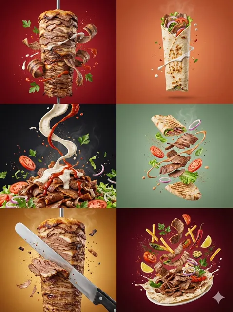

The thumbnail is the product decision, not the decoration
Most creators treat the thumbnail as the last five minutes of an edit session. They export the video, scrub to a decent frame, add three words, and upload. Then they wonder why a well-produced video dies at a few hundred views while a sloppier one with a strange, high-contrast image breaks out.
The thumbnail is not packaging around the product. In a feed, the thumbnail is the product as far as the viewer is concerned. Nobody clicks a video they cannot see the value of. The image and title are the entire pitch, delivered in a fraction of a second, in competition with a dozen other pitches stacked directly above and below it.
That changes how you should think about production. If you shoot a video without knowing what its thumbnail will look like, you are gambling. If you design the thumbnail concept before you shoot, you can deliberately capture the frame, expression, prop, or lighting setup that carries the image. The best channels work this way: the thumbnail is storyboarded alongside the script.
This guide covers the psychology behind fast feed scanning, the composition rules that survive at thumbnail scale, the platform-specific constraints that matter, and a practical workflow — including where AI image and video tools genuinely help rather than just add noise.
How viewers actually scan a feed
The first glance is not reading
When someone opens a feed, their eyes move in a rapid pattern rather than settling on one item. They register shape, color mass, and human faces before they register text. A thumbnail with a strong central subject and a clear color identity gets a micro-pause. That micro-pause is the only thing you are competing for. Everything else — retention, watch time, subscriptions — happens after the click, and none of it happens if the pause never occurs.
This is why busy thumbnails underperform. Detail is invisible at small sizes. A thumbnail rendered at roughly the size of a postage stamp on a phone cannot communicate five characters, a background location, a logo, and three lines of text. It can communicate one idea.
Curiosity gap versus confusion
The strongest thumbnails create a small, specific question. A hand reaching toward something off-frame. A face mid-reaction to something the viewer cannot see. A before/after split with the "after" partially occluded.
The failure mode is confusion, which looks similar in a design document but behaves completely differently in a feed. A confused viewer does not click to resolve the confusion; they scroll past because resolving it costs effort. The test is simple: show the thumbnail to someone unfamiliar with the video for two seconds and ask what they think it is about. If their answer is "I'm not sure," you have confusion. If their answer is "something about X, and I want to know what happened," you have a curiosity gap.
Faces, eyes, and direction of gaze
Human faces are processed quickly and reliably. Eyes in particular pull attention. But there is a trap: a face looking straight into the camera competes with the viewer, while a face looking toward a focal object directs the viewer's attention to that object. If your thumbnail has two elements — a person and a thing — orienting the person's gaze toward the thing usually beats a direct stare, unless the emotional expression is the whole point.
Composition rules that survive compression
Design at 10 percent scale
A practical habit: build your thumbnail at full working resolution, then shrink it to 10 percent and look at it on a phone. If you cannot tell what the subject is, what the emotion is, and roughly what the topic is, the design has failed regardless of how good it looks on a large monitor.
The silhouette test
Convert the thumbnail to pure black and white mentally, or literally desaturate the subject layer. Ask whether the subject's outline is distinctive. A person standing with arms at their sides has a generic silhouette. A person mid-lean, mid-throw, or holding an unusual object has a readable one. Distinctive silhouettes are the fastest thing your eye can categorize, which is why action poses beat static poses almost every time.
Contrast: subject versus everything else
Contrast is doing two jobs at once. It separates the subject from the background, and it separates your thumbnail from the surrounding feed. Both matter.
- Internal contrast: rim or edge lighting, a bright subject against a dark background, or a complementary color pairing between subject and background.
- External contrast: what does your thumbnail look like next to competitors on the same topic? If every thumbnail in a niche is dark blue with yellow text, a bright, clean, high-key image will stand out simply by breaking the pattern.
External contrast is the most neglected and often the highest-leverage move. Trend-following tends to homogenize a niche, and homogenized niches create openings.
Color: fewer hues, more saturation control
Three-hue palettes read better than six. Pick a dominant color that owns about 60 percent of the image, a secondary that supports the subject, and an accent used sparingly for the single most important element — often the eyes, a prop, or one word of text.
Avoid defaulting to maximum saturation on everything. When everything is loud, nothing is. A slightly desaturated background makes a saturated subject pop harder than two fully saturated elements fighting.
Face size and crop
At feed scale, a face should generally occupy 20 to 40 percent of the frame height to be legible and emotionally readable. Cropping tight on the eyes and mouth communicates emotion; a full-body shot communicates context but sacrifices emotional signal. If you need both, consider a split composition or a foreground/background layering where the face is large and the context is a smaller secondary element.
Text discipline
Text on thumbnails should add information the image cannot. Three to five words is usually the ceiling. Rules that hold up:
- Heavy, condensed, high-contrast typefaces outperform thin or script faces at small sizes.
- Text needs a clear separation from the background — an outline, a drop shadow, or a solid block behind it.
- Never repeat the title verbatim. The thumbnail text is a hook fragment; the title carries the full statement.
- Left-align or center, but keep the text block away from the bottom-right corner, where duration badges and interface elements frequently sit.
Platform constraints you should actually design around
Long-form horizontal feeds
These feeds show large thumbnails, so you have more room for detail — but also more room for clutter. Aspect ratios vary, and the practical consequence is that important elements should live inside a safe central area. Anything near the extreme edges risks being cropped or obscured by overlays.
Vertical short-form feeds
Vertical feeds change the equation entirely. Thumbnails function more like a cover frame, and the feed often auto-plays. Your cover must work as a still and must not contradict the first frame of motion. A jarring cut from a hyper-designed cover to a flat talking-head shot hurts retention even when the click happens.
Search result previews
Search previews are often smaller than feed thumbnails and appear next to text instead of other images. Here, clarity beats intrigue. If your thumbnail is a dense cinematic composition, it may read as noise in search. A cleaner variant — larger subject, fewer elements — often performs better in search contexts even when it underperforms in the trending feed.
This suggests a simple operating principle: you are not designing a thumbnail, you are designing a set of assets for different surfaces.
Where AI tools genuinely help
AI image and video generation has changed thumbnail work in three concrete ways, and it is worth separating the useful from the gimmicky.
1. Generating backgrounds and impossible scenes
You no longer need a photoshoot to place your subject in a dramatic environment. You can generate a background pass — a stormy sky, an abstract gradient, a stylized studio — and composite the subject onto it. This is fast, cheap, and gives you control over contrast and color harmony.
2. Producing expression and pose variants
Expression changes drive enormous differences in click-through rate. Instead of reshooting, you can generate variations, or use image-editing models to adjust lighting and expression on an existing frame. Always keep the result believable; subtle uncanny artifacts at thumbnail scale read as "off" even if the viewer cannot articulate why.
3. Upscaling and relighting
Upscaling models turn soft video frames into crisp thumbnail-ready stills. Relighting tools let you add rim light or change the direction of the key light so your subject separates from the background. These are unglamorous uses of AI and they are the ones that most reliably improve results.
A caution: generating a thumbnail with a completely different visual identity from the video itself is a short-term win and a long-term loss. Mismatched thumbnails raise clicks and destroy retention, and platforms weight retention heavily. The thumbnail should be the most dramatic version of the truth.
A repeatable thumbnail workflow
Step 1: Write the hook before the script
State in one sentence what makes this video worth someone's time. If you cannot do this, the video has a content problem, not a thumbnail problem.
Step 2: Storyboard the shot list for the image
Identify two or three moments in the video that could produce a strong frame. Plan to shoot them with thumbnail framing in mind: tight, well-lit, with a clean background.
Step 3: Capture or select the base frame
Pull frames at full resolution rather than screen-grabbing the preview. Look for frames with clear eye lines, open body posture where appropriate, and a background that does not compete.
Step 4: Build the composite
Isolate the subject, place it on a new or enhanced background, and establish the three-hue palette. Add rim light if the subject is merging into the background.
Step 5: Add the text layer last
Place text only after the image reads clearly on its own. Adding text to rescue a weak image rarely works.
Step 6: Run the small-size and grayscale checks
Shrink to 10 percent, view on a phone, and desaturate. Fix whatever breaks.
Step 7: Ship a test set, not a single file
Create three to five genuinely different concepts — not color variations of the same idea. Different subject, different emotion, different composition.
Step 8: Measure and codify
After the test has enough impressions to be meaningful, record what won and why. Over a few months, this log becomes your channel's design language.
Testing without fooling yourself
Thumbnail testing is where most creators draw wrong conclusions. A few guardrails:
- Change one big variable per test. Three concepts that differ in subject, color, and text tell you nothing about which factor mattered.
- Wait for volume. Small impression counts produce noisy results. Let the test accumulate sufficient exposure before deciding.
- Judge by the full picture. A thumbnail that wins clicks but loses retention has not won. Look at click-through rate alongside average view duration and, ideally, returning viewers.
- Separate surfaces. Impressions from search and impressions from the trending feed behave differently. When possible, evaluate them separately.
- Keep a control. Occasionally leave the current thumbnail unchanged in the test pool so you have a baseline for seasonal shifts.
Common mistakes and how to fix them
Everything is important, so nothing is. If the composition has four focal points, the viewer has none. Fix: delete elements until one thing dominates.
Text in the corner that gets covered. Interface badges and overlays obscure predictable locations. Fix: keep essential elements in the central third.
Dark thumbnail in a dark niche. A moody image may be beautiful and still invisible. Fix: raise the subject's luminance or add a bright accent.
Repeating the title word for word. Redundant text wastes the most valuable real estate you have. Fix: make the thumbnail text a question or a fragment the title answers.
Using a frame that only makes sense after watching. Inside jokes and context-dependent imagery fail with cold audiences. Fix: evaluate thumbnails with people who have not seen the video.
Ignoring mobile. A large share of viewing happens on small screens, often in bright environments. Fix: always check on an actual phone, outdoors if you can.
Over-relying on generated imagery. If every thumbnail in your niche is glossy AI surrealism, the format itself becomes wallpaper. Fix: mix in photographic frames, text-led designs, or minimal compositions.
Building a sustainable design system
Once you have tested enough thumbnails, patterns emerge. Write them down as rules:
- A fixed primary palette with one accent reserved for emphasis
- Two or three approved type treatments with consistent weight and spacing
- A defined subject placement grid that survives platform cropping
- A standard set of background treatments
- A naming convention that tracks concept, variant, and result
Consistency does two things. It makes every new thumbnail faster to produce, and it makes your content recognizable in a feed before anyone reads the title. Recognizability is compounding; a viewer who has clicked three of your thumbnails and enjoyed them starts treating your image style as a signal of quality.
The corollary is that you must occasionally break your own system. A design language that becomes too rigid turns into wallpaper. Plan deliberate exceptions — an all-text thumbnail, a deliberately low-fi image, a black-and-white composition — and test whether the break helps or hurts.
A note on iteration cadence
Thumbnails are not permanent. Long-form content in particular often benefits from revisiting older videos: the audience has changed, the niche has changed, and your design skills have improved. A quarterly pass over your back catalog, refreshing the weakest covers, is one of the highest-return activities available to a creator because it improves performance on content that already exists.
For short-form, iteration is faster and more disposable. Produce several covers per clip, ship, observe, and do not become emotionally attached. The volume of testing matters more than the perfection of any single image.
FAQ
How long should I spend on a single thumbnail?
For a serious long-form video, one to three hours including concept, composite, and checks is reasonable when you are producing a test set. As your system matures and you have reusable templates and palettes, that drops considerably. Spending ten minutes is almost always a false economy given how much of your reach depends on the image.
Does AI-generated art hurt channel credibility?
It depends on execution. Subtle AI use — background extension, relighting, upscaling, cleanup — is invisible and universally beneficial. Obvious AI surrealism can work as a deliberate style, but it becomes generic fast when everyone does it. The risk is not the tool; it is the sameness.
Should the thumbnail always include a person?
No. Product shots, diagrams, bold text, and object-focused compositions all work in the right niche. Faces are a reliable default because they carry emotion efficiently, but reliability is not the same as optimality. Test against a non-face concept before assuming.
How many concepts should I test?
Three to five genuinely distinct concepts is a practical range. More than five and you dilute exposure across variants so much that none reaches a confident result. Fewer than three and you are not really testing, you are guessing.
What if a thumbnail gets clicks but retention drops?
That is a mismatch problem, not a thumbnail problem. The image promised something the video did not deliver, or set an emotional tone the content does not maintain. Either adjust the thumbnail to reflect the video more accurately, or adjust the video's opening so it delivers on the promise quickly.
Can I reuse the same thumbnail style across every video?
You can reuse the system — palette, type, layout grid — but not the exact composition. Repeating an identical layout is fine for a series and confusing across unrelated topics. The goal is recognizability with differentiation, which is a subtler balance than either extreme.
Do small details like borders matter?
Sometimes more than you would expect. A thin border or outline can separate your thumbnail from a similarly colored neighbor in the feed. It is a cheap, testable variable. Treat it as a hypothesis to verify rather than a rule to follow.
What to do next
Pick one video you are about to publish. Before you edit, write the one-sentence hook, plan the shot that carries it, and sketch three thumbnail concepts. Build them, shrink them to 10 percent, look at them on your phone, and delete anything that does not read instantly. Ship the best concept as your primary and hold the others for testing.
Then do it again on the next video. The compounding effect of a deliberate thumbnail practice is not linear — it changes how the recommendation systems treat your channel, because early engagement signals shape how widely everything you publish is distributed. The image is small. The consequences are not.

Alexander
More Blogs
Read MoreVidu Q4 Alternatives: 4K AI Video Models Compared (2026)
Vidu Q4 alternatives compared: Kling 4.0, Seedance 2.5, Wan 3.0, and Runway Gen-4 — 4K support, input modes, durations, audio, and what each costs in credits on Domer.
Top 4K AI Image Generators in 2026: 5 Models Compared on Real Costs
The top 4K AI image generators on Domer compared: Flux 3 Klein, Nano Banana 2.1, GPT Image 2.5, GPT Image 2, and Nano Banana Pro — 4K credit costs, reference limits, and speed.
Nano Banana 2.1 vs GPT Image 2.5: Which Image Model Should You Use? (2026)
Nano Banana 2.1 vs GPT Image 2.5 Flare compared: credit costs per resolution, aspect ratios, reference images, text rendering, and which tasks fit each model.