
Generating AI images that look exactly the way you picture them — a cartoony mascot one moment, a crisp photograph the next — used to mean juggling scattered tools, endless prompt tweaks, and a lot of luck. That is changing quickly. Newer image-generation models have moved past the era of mushy fingers and inconsistent characters. They now give creators genuine control over style, subject, framing, and even motion. This article walks through the practical side of that shift: picking the right model for the look you want, keeping characters consistent across a series, and reshaping results until they match your vision.
The goal here is not to push a single app. It is to give you a reusable decision framework so that whatever software you use, you can reliably produce tailored, on-brand images without burning hours on trial and error.
Choosing between cartoon and photorealistic output
The first decision you face is the hardest one: what look are you actually going for? Many tools default to a middle-ground "generated" aesthetic that satisfies nobody. The trick is to be explicit about your target early, because the model you pick and the prompt you write both depend on it.
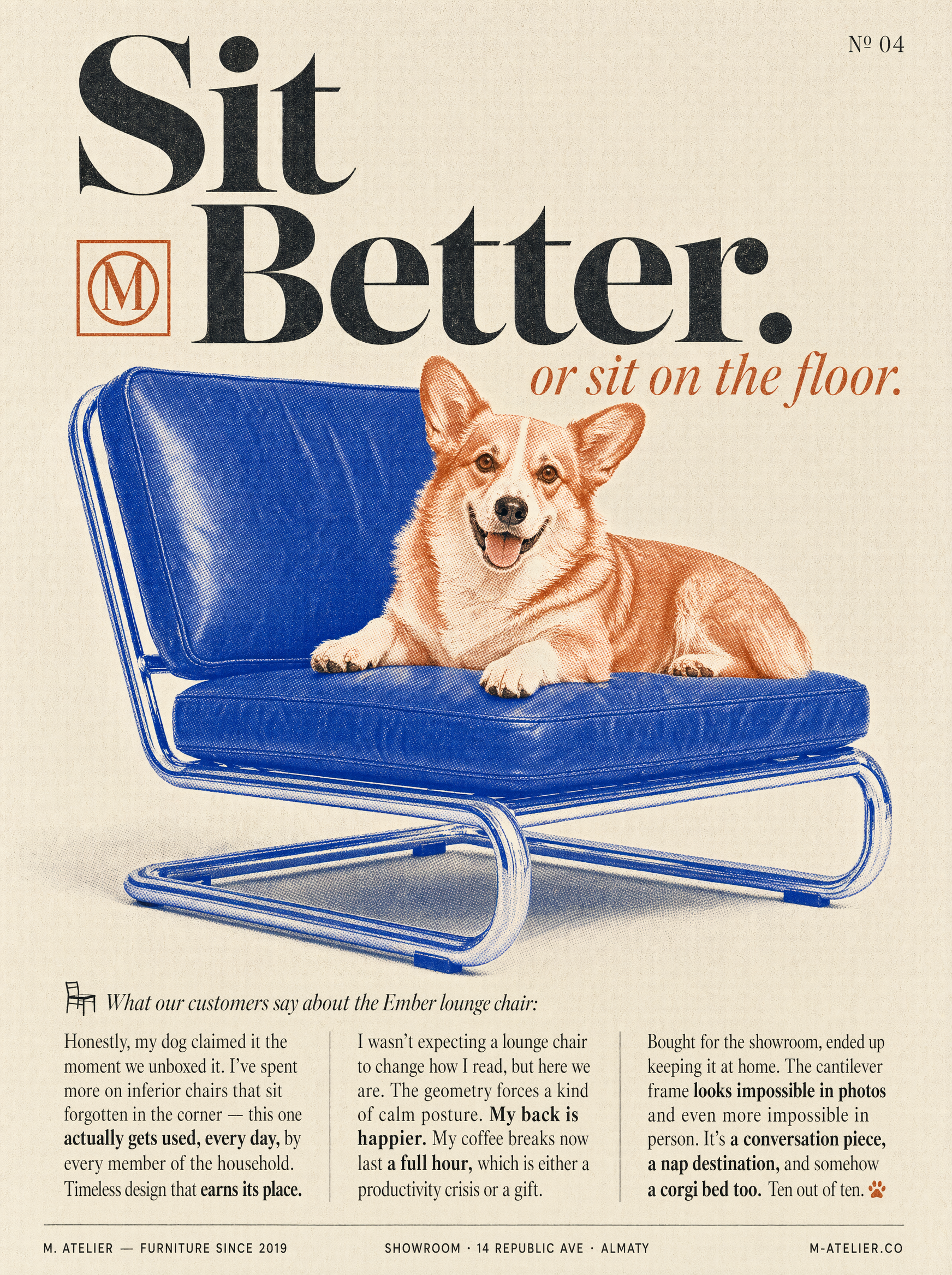
Cartoon and illustration styles live at one end of the spectrum. Here the model is being asked to translate your prompt into flat color, clean linework, and exaggerated proportions. These models shine with descriptive language about art direction: "thick black outlines," "cell shading," "limited palette," "children's picture book style," "graffiti illustration," "chunky geometric mascot." Success depends on describing the visual language, not just the subject. Saying "a fox mascot" is weak; saying "a cheerful red fox mascot in modern flat vector style, thick outlines, soft gradient background" gives the model something concrete to build on.
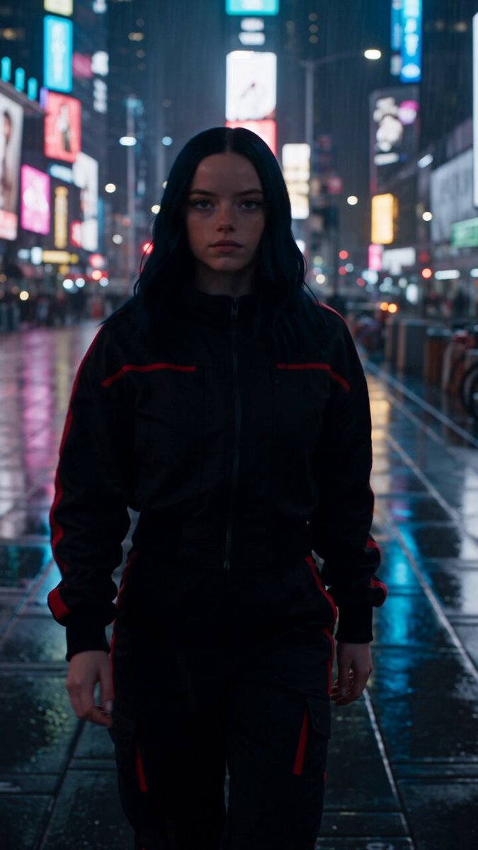
Photorealistic output sits at the opposite end. Here the model is tuned to reproduce lighting, texture, skin detail, lens behavior, and depth of field. The prompt should lean on photography terms: "80mm portrait lens," "golden hour," "shallow depth of field," "raw film grain," "studio key light with softbox," "shot on a medium-format camera." Adding this vocabulary dramatically improves realism because it tells the model which photographic cues to simulate.
A useful mental model is to think of the style words as the "camera and art director" and the subject words as the "script." Both matter, and neither works well alone. Spend a moment naming the visual language you want before you describe the content, and your results will be far more intentional.
Basics of crafting prompts that hold up
Prompting is the single most underrated skill in modern image generation. Small wording changes produce wildly different images, so it pays to be systematic rather than random.
A reliable structure is subject, action, setting, style, and technical details. Start with the core subject and what it is doing, then place it in a context, then layer the style and camera parameters. Resist the urge to write one giant run-on sentence. Short, comma-separated phrases tend to be parsed more reliably than dense prose.
Negative prompts remain one of the strongest controls available. If a model keeps adding hands, text, or a busy background you do not want, tell it what to avoid. Common negatives include duplicate fingers, blurry faces, watermark, low resolution, extra limbs, and unwanted text. Spending a line on what you do not want is often as valuable as the positive prompt.
Iterate in small steps. Change one variable at a time — swap the lens, adjust the lighting, change one style word — and keep the rest fixed. That discipline lets you see exactly which parameter moves the result in which direction. It also stops you from drifting into a prompt so tangled that you cannot reproduce a good result later.
If you want a particular brand color or palette, name the hex values or describe tones explicitly. "Candy pink and mint green, pastel gradient" beats "nice colors." The more concrete your language, the more the model can honor your intent.
Keeping characters and style consistent across a series
The moment you need an entire character sheet, a thumbnail series, or a marketing set with the same mascot, consistency becomes the real challenge. A single generated image can look great, but five images of the "same" character that all look different break the illusion immediately.
The most reliable technique is reference-driven generation. Instead of describing the character from scratch each time, lock in the look using a source reference so every new image carries forward the same face, outfit, and color scheme. Think of the first strong result as the canonical version of your character, then use that as the anchor for everything that follows.
Whatever mechanism your tool uses for this — reference images, character presets, or style seeds — the principle is the same: establish the design once, then reuse it. Changing the character's proportions, outfit details, or palette between generations is the fastest way to lose the audience's trust in the visual.
For style consistency specifically, keep your style block identical across all prompts in a set. If you keep changing "flat vector" to "semi-realistic" between frames, you will get a mismatched set. Copy the style fragment verbatim from your first working prompt, and only vary the subject, composition, or lighting.
Control beyond the still image
Modern tools do not stop at static pictures. Many now accept image-to-image workflows where you start from an existing image and ask for edits, outpainting, resolution increases, or style transfer. This is where fine customization really comes alive.
You can start from a rough sketch and ask the model to finish it as a polished illustration, or take a photographic still and restyle it into a particular art direction. You can also use a generated image as a seed to produce a short animated sequence, or place a consistent character into new scenes without redrawing it.
Outpainting extends an image beyond its original borders, which is handy when you need a wider composition than the model produced. Inpainting lets you replace a specific region — swap the background, fix a face, remove an unwanted object — while everything else stays untouched. Together these are the closest thing to a direct manipulation tool, and they give you far more surgical control than generating from scratch.
Matching the tool to the job
There is no single best model; there are models that suit particular jobs. Broadly, you can think about five categories even across different applications:
Premium generalists produce the highest overall quality for complex, artistic, or advertising-grade imagery. They are what you reach for when a client-ready hero image matters and the prompt is ambitious.
Fast and budget-friendly models prioritize speed and cost. They are ideal for drafts, storyboards, thumbnails, and early iteration where you will discard most outputs anyway. Iterate cheaply here, then spend up on the final render.
Specialist models pin a specific look — anime, painting, pixel art, architectural visualization, and so on. If your project lives in one aesthetic lane, a specialist beats a generalist at that single style.
Motion-capable models add video generation. Useful when you decide an image story would be stronger as a short clip with limited motion.
Edit-first models are tuned for image-to-image changes, inpainting, and style transfer rather than fresh generation.
Matching the job to the right category saves both time and money. Ask yourself what the final deliverable actually needs before you reach for the most powerful option.
Fine-tuning composition and technical quality
Once the model understands the style and subject, the next lever is composition. Framing terms shape the final result just like a real camera operator would: "tight close-up on the eyes," "wide establishing shot," "low-angle hero pose," "rule-of-thirds composition," "centered symmetrical framing." These cues tell the model where the subject sits and how much context surrounds it.
Resolution upscaling has become almost invisible in modern workflows but remains valuable. Start at a working resolution for speed, then upscale the chosen winner at the end. Upscaling a good image improves its usefulness most; upscaling a mediocre one only makes the mediocrity sharper.
Consistent lighting across a set matters as much as consistent style. Nominate a single light setup — golden hour sun from the left, or a flat studio key — and repeat it in every prompt of the series. Audiences register mismatched lighting instantly, even when they cannot say why.
Building a repeatable production workflow
The biggest productivity gains come not from any single prompt but from a repeatable process. Treat your first version as a draft, always. Generate a small batch of candidates, shortlist the strongest one or two, then refine with edits and negative prompts rather than starting over each time.
Keep a library of working prompts organized by purpose. Save the style blocks, negative-prompt sets, and reference settings that performed well. Reusing a proven style block for a new character is dramatically faster than rediscovering it from scratch.
Document the parameters that mattered: which model, which seed or reference, what upscale settings. This makes your work reproducible weeks later, which matters the moment a client asks for "more like the thing we did last month."
Finally, set a quality baseline and stop when you hit it. Chasing perfection on a draft wastes effort; the value is in shipping the chosen render and moving to the next creative problem.
Common mistakes and how to avoid them
A few patterns cause the most frustration. Vague style language gives mush. Naming a style explicitly, as described above, fixes it.
Overloading the prompt with too many conflicting ideas produces a confused average of all of them. Simplify and prioritize the few things that matter most.
Ignoring negative prompts leaves the model free to add hands, text, and noise you did not ask for. Use them deliberately.
Changing many variables between attempts makes it impossible to tell what worked. Iterate one variable at a time.
Skipping the reference anchor ruins consistency across a set. Lock the character or style in once, then reuse it.
Expecting a perfect result on the first try sets you up for disappointment. Budget for iteration and you will be pleasantly surprised.
Frequently asked questions
How long should a prompt be? Long enough to be specific, short enough to stay coherent. A few sentences of comma-separated phrases generally beat both a single vague line and a wall of text.
Do I need a high-end model for everything? No. Save premium models for final renders and complex briefs; use fast models for drafts and exploration.
Why do my character images keep looking different from each other? Almost always a consistency problem. Anchor the character with a reference and keep the style and lighting blocks identical across generations.
Can I reuse one image and restyle it? Yes. Image-to-image workflows let you take an existing image and apply a new art direction, which is the fastest way to explore looks without regenerating the subject.
How do I remove an unwanted object without regenerating the whole thing? Use inpainting to replace only the offending region while the rest of the image stays intact.
Should I worry about resolution? Generate at working size for speed, then upscale the final pick. A great image upscales cleanly; a poor one does not get better.
A small example end to end
Suppose you need a mascot for a coffee brand. You want it cute, flat-vector, and consistent across three posts. A strong start is: "a cheerful round coffee cup mascot with a smiling face and tiny arms, modern flat vector cartoon, thick clean outlines, cream and brown palette, soft pastel background, centered, simple composition." Generate four options, pick the friendliest face, then turn that image into your reference.
For the second post you reuse the exact style block and reference, change only the action: "the same coffee cup mascot waving and holding a steaming latte, modern flat vector cartoon, thick clean outlines, cream and brown palette, soft pastel background." The character stays identifiable because the reference and style stayed fixed. Now you have a consistent set you can extend with new scenes, emails, stickers, or a short animated loop — all without re-plumbing the character design each time.
Wrapping up
Modern AI image generation rewards a disciplined, repeatable approach far more than raw enthusiasm. Decide your style up front, write prompts as explicit collaborations between script and art director, lean on reference anchors for consistency, and iterate one variable at a time. Match the model to the job instead of always reaching for the biggest option, and you will produce tailored, on-brand images reliably.
The tools will keep evolving, but the underlying craft — naming the look, locking the character, controlling the composition, and working a repeatable loop — stays valuable no matter which application you open. Start with one small themed set, build your prompt library as you go, and the results will compound quickly.
