
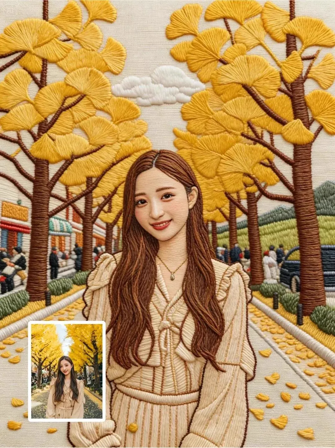


The appeal of making everything look like blocks and pixels
There is a reason distinctive visual styles travel further than generic realism. A perfectly ordinary photo of a cafe is forgettable; the same cafe rendered as a field of chunky colored blocks is instantly recognizable and worth sharing. That underlying shift — from conventional pixels to a structured, grid-based look — is what people increasingly call pixel-style or block-art transformation.
This guide is for creators who want to use that look deliberately: to understand why it works, how to keep it consistent across a series, how to bring it into motion, and how to avoid the pitfalls that make blocky effects look cheap instead of intentional. You do not need to be a designer or an illustrator to get started, but you do need a clear plan.
Why an unusual style beats realism for retention
Realistic content competes with every other realistic photo and clip already in the feed. A strong stylization does the opposite: it is different, so it stands out at the moment of the scroll. That differentiation is exactly what creative teams and advertisers use when they want a campaign to feel cohesive and authored rather than scraped from stock.
How block-style rendering actually works
At its core, this effect reinterprets an image as a set of discrete tiles or blocks. Instead of millions of smooth pixels, the result is composed of a limited grid of larger units, each carrying one recognizable color or shape. The lower the resolution of that grid, the more abstract and playful the result; the finer the grid, the closer it gets to ordinary realism.
From smooth pixels to structured blocks
Think of the process like pixelating an image on purpose and then rebuilding it with intention rather than by accident. A normal photo has continuous gradients. Block transformation quantizes those gradients into steps, so a highlight becomes a single square and a shadow becomes another. The charm comes from this visible construction: viewers can see the building blocks that make up the picture.
Why structure is a feature, not a flaw
Because the result is composed of discrete units, it is inherently stylized and consistent. That consistency is valuable. Two separate images run through the same block style will feel like they belong to the same world, which is exactly what you want when producing a series of posts, a character set, or an animated sequence.
Keeping a consistent look across a whole series
The hardest part of any strong style is holding it together over many pieces. Here is how to make blocky visuals feel like one deliberate body of work.
Fix your reference rules first
Decide the grid density, the palette, and the block thickness before you start. Write them down as your style spec. When every image follows the same rules, a ten-post series reads as a single designed identity rather than ten random experiments.
Use a limited color palette
A block look thrives on restraint. A tighter palette makes the grid read more clearly and ties the collection together. Choose a core set of colors for the look — highlights, mids, shadows — and stick to them across every frame.
Protect the subject while you stylize it
The block effect should enhance the subject, not bury it. Keep the most important element — a face, a product, a logo — recognizable. If you push the abstraction too far, audiences stop seeing the thing you wanted them to see and see only the effect.
Bringing blocky images into motion
Static block art is nice; moving block art is compelling. Once the look is locked as stills, the natural next step is animating it, and that requires the same discipline that video projects do.
Start from a consistent still frame
Motion is easier to hold steady when it starts from a reliable keyframe. Render the hero frame in the block style first, then let the motion expand around it. A strong start prevents drift in the seconds that follow.
Design the camera movement for the medium
Blocky worlds feel right with deliberate, slightly mechanical motion — a slow dolly, a steady push. Fast, chaotic handheld wobble fights the crispness of the grid. Choose movement that celebrates the blockiness instead of fighting it.
Guard frame-to-frame stability
Small instabilities in shape or color across frames are the most common break in a block-animated piece. Same block, same palette, same pose in the next frame — anything that wobbles will be noticed. Many tools let you iterate on specific control frames to keep the geometry and colors locked.
Working with specialized control models
Not every generator handles a block look equally well, but the ones with strong frame control tend to outperform the rest. Look for tools that let you steer:
- camera movement (pan, dolly, push-ins),
- the placement of key shapes,
- per-frame color and style parameters,
- the transition from one reference image to the next.
When you have a tool that exposes these controls, the block look stops being a happy accident and becomes a repeatable style you can deliver on demand. That repeatability is what separates a one-off demo from a real design product.
A practical workflow for a block-style image
Ready to test the look? Here is a simple loop you can run in an afternoon.
- Pick one subject, ideally with a strong silhouette.
- Choose your grid density and palette.
- Render your hero still and adjust the abstraction to taste.
- Generate a few style variations and pick the most legible one.
- If you want motion, animate from the chosen still and review frame stability.
- Lock the winning settings as your reusable style spec.
Step six is the one most people skip, and it is the most important for producing a series instead of a single image.
Common mistakes to avoid with blocky visuals
- Pushing abstraction too far until the subject disappears.
- Using too many colors, which muddies the grid and the palette.
- Inconsistent grid density between images in one series.
- Over-fiddling with motion so the blockiness feels jittery.
- Copying the look without a rulebook, so nothing in the collection feels cohesive.
Ideas for using block art in real content
The style is not just a novelty; it has concrete uses.
- Brand campaigns that need a consistent visual signature across posts.
- Social content where differentiation drives engagement.
- Product mockups that should feel stylized rather than literal.
- Character sets and mascots that must stay identifiable frame to frame.
- Moving headers or animated intros built on a strong, locked style.
For each use, the same rule applies: establish the style spec once, then reuse it.
A concrete example: turning a product photo into a block-style series
Let us walk through a realistic use so the workflow feels concrete rather than abstract. Imagine you run a small homeware brand and want a month of themed posts, each built around one product in a block-art style.
First, choose the hero product — a ceramic teapot with a strong, recognizable silhouette. You decide the style spec: a medium grid density, a warm three-color palette of cream, terracotta, and deep teal, and square blocks with rounded edges. You render the hero still and adjust the abstraction until the teapot remains clearly legible. That image becomes your reference.
Next, for a series of posts, you re-inject that reference into every new configuration: the teapot in a kitchen, in a hand, in a stylized garden. Because the palette and grid density never change, all the images feel like one collection even though the scenes differ. When you add motion — a gentle zoom on the teapot — you build it from the same reference so the identity holds.
Finally, you save the style spec alongside the reference. Next month, when you pick a new product, you can either reuse the look or evolve the palette deliberately. Either way, the process is repeatable because the rules were written down.
Working with block art and color theory
The palette does a lot of the heavy lifting in a block look, so understanding a little color theory pays off.
Contrast is your friend
Block styles compress detail into flat fields, so contrast becomes the main thing that separates elements. Put light objects on dark fields and vice versa, and use colored blocks against neutral backgrounds to keep the eye on the subject.
Limit the range to preserve the grid
The more distinct colors you introduce, the muddier the grid becomes. A tight palette — a highlight, a mid, a shadow, plus one accent — keeps the architecture of the blocks visible and the piece coherent.
Use accent color deliberately
A single accent color can carry brand recognition or emotional tone. Keep it consistent across the series so the accent itself becomes part of the identity.
Block art across different mediums
The same style spec can be applied to stills, to short animations, and to short-form video, and each medium has its own rhythm.
- Stills: a block look shines in feeds and galleries where a striking frame stands alone.
- Micro-animations: small motions — a block sliding, a color shifting — add life without leaving the grid.
- Short video: steady camera moves flatter the style, while the same reference holds the frame stable.
- Print and packaging: because the look is graphic, it transitions cleanly into printed material and merchandise.
Designing with one style spec across all these gives a brand a coherent visual voice rather than a pile of experiments.
How to assess whether a block style fits your brand
Not every brand should go blocky. Run a simple test.
- Does the style reflect your personality? Cheerful, playful, or independent brands fit block art naturally.
- Does it preserve your product's recognition? If the effect buries the product, it fails its purpose.
- Can you hold it across formats? A style you cannot repeat everywhere is not a brand asset.
- Does it differentiate you? If every competitor already uses a similar look, revisit the palette or the grid density to stand out.
If most answers are yes, the block look is worth adopting as a deliberate design direction rather than a passing filter.
The line between stylistic and amateur
A block look that is applied with discipline reads as intentional design; the same look applied carelessly reads as a glitch.
- Discipline means consistent rules across every piece: same density, same palette, same abstraction.
- Carelessness means resetting the grid or the palette for each image, so nothing matches.
- Discipline means respecting the subject so it stays legible.
- Carelessness means pushing the abstraction so far that the subject disappears.
Treating the look as a considered system, not a one-click filter, is the difference between a designed campaign and a random effect.
When block art is a distraction rather than an asset
There are briefs where realism wins: a photo-real product showcase, a faithful documentary-style piece, or any content where the viewer needs to trust exactly what they see. In those cases, stylization works against the goal. Choose the block look for editorial impact, not as a default cover for weak design.
A short checklist before you commit to a block look
- Have you written the style spec down?
- Did you pick a limited, deliberate palette?
- Is your subject still legible at the chosen abstraction?
- Will you reuse the same reference across the series?
- Can you hold the style in stills, motion, and video?
- Does the style genuinely fit your brand and differentiate you?
Working through the checklist keeps the block look a strength instead of an accident.
FAQ
Do I need design skills to use block-style transformation?
No. The tools do most of the work; your job is choosing a subject, a palette, and a clear style rule.
Why does my blocky image look messy instead of clean?
Usually too many colors or an inconsistent grid density. Tighten your palette and fix your block size, then re-render.
Can I keep the same character in multiple block images?
Yes. Use the same reference frame and style spec, and re-anchor the key features so the identity stays intact.
Is the block style good for motion?
Yes, especially with deliberate, steady camera moves. Fast or hand-held motion often fights the crispness of the blocks.
How do I build a recognizable collection rather than random images?
Write down one style spec — density, palette, and block size — and apply it to everything in the series.
