

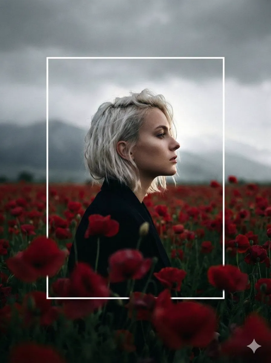

In a feed crowded with clips, the first thing a viewer sees decides most of the rest. A strong thumbnail and a film-like treatment are the difference between a video that gets clicked and one that scrolls past, regardless of how good the content inside is. Creators who understand this treat the visual surface as seriously as the edit.
This guide covers the practical craft behind both halves: how to design thumbnails that earn attention, and how to apply a cinematic color and framing treatment that makes the rest of the video feel deliberate. Along the way you will see where automation can accelerate the process without removing your judgment.
Why the Thumbnail Decides So Much
People often think of the thumbnail as a still image. In practice it is the first scene of your video and the strongest driver of click-through. Studies of viewing behavior keep showing that audiences react to the right visual signals within a second, so the thumbnail has almost no time to make its case.
The signals that work are reliably physical rather than decorative. Faces, especially direct eye contact, draw attention better than almost anything else. High contrast and a clear focal point guide the eye to the subject. Short, readable text layered near the subject reinforces the promise of the title.
The practical takeaway is that a thumbnail should be legible at a glance, often summarized as understandable at the size of a coin. If the image needs a close look to parse, it has already lost most of its potential viewers.
Reading the Visual Hook Mechanism
A thumbnail works through a small set of psychological levers borrowed from how our eyes and attention behave. Understanding them lets you design on purpose instead of guessing.
Curiosity gaps are the most reliable. Offer just enough information to make the viewer wonder what happens next. A subject doing something unexpected, or a composition that hides part of the story, invites a click to resolve the tension. Emotion, whether surprise, humor, or intensity, beats neutrality every time. And motion and energy, captured in a single frame through posture, blur, or dynamic angle, suggest the clip will be lively.
Placement matters too. The human eye tends to land somewhere predictable, so position your subject and any text where they will be seen first. Leave breathing room around the focal elements so the thumbnail does not feel cluttered at small sizes.
The Clarity Rule: Legible at a Glance
An underrated habit is testing every thumbnail tiny before it ships. Collapse it to a small size on your phone or editor, blur your eyes, and ask whether the subject, the promise, and the emotion still read. If they do not, simplify. Fewer elements, larger shapes, and stronger contrast always win at small scale. The thumbnail that looks good on your computer at full size is not the one that earns the click in a crowded feed.
Making the Thumbnail Easier With AI Assistance
You do not need to hand-craft every element. Generative image tools can turn a text idea into a candidate thumbnail fast, which is ideal for exploring directions before committing time to a polished design.
The smart workflow is to generate multiple variants, then narrow them against your hook criteria. Keep a shortlist of the ones that are emotionally clear and quickly legible, then refine the winner. Use the tool for drafts and alternates, and reserve your attention for the judgment calls: does this actually represent the video, and will it stand out in a feed?
Because continuity matters, generate thumbnails from the same reference library as your video, especially if characters appear in both. A thumbnail that looks like a different show than the footage it represents confuses viewers and reduces trust.
Building a Cinematic Treatment
The thumbnail wins the click, but a cinematic treatment earns the watch. Treatment is the coherent look of your video, defined by consistent color, purposeful framing, and a mood that matches the story.
Start with a color story. Decide the dominant palette before you edit, and keep it consistent across clips so the piece feels like one film rather than a collection of shots. Warm tones can feel inviting or nostalgic, cool tones distant or technical, and high contrast dramatic. Choose for the emotion you want the audience to feel.
Framing should support the narrative too. Reserve wide establishing shots for setting the scene, use medium shots for action and dialogue, and save close-ups for emotional beats. Consistent framing tells viewers what to pay attention to and gives the video a considered rhythm.
Applying Treatment Efficiently
To apply a treatment across a long project, standardize it once and reuse it rather than tuning every clip by hand. Build a preset that captures your color story, then verify it holds up across the different lighting conditions in your footage. Batch the adjustments, spot-check the transitions between scenes, and adjust only where the story changes tone. Automation that keeps a look consistent frees you to focus on cuts and pacing.
Letting AI Do the Repetitive Film Work
Cinematic automation can handle the repetitive parts of a treatment. Agent-style tools can take a loose idea and help structure a shot plan, propose framing, and keep visual identity stable from scene to scene.
This is practical for larger projects. A series or campaign that shares characters and a look benefits enormously from an assistant that holds those threads across many episodes. The human still sets the direction the same way a director would; the automation executes the tedious consistency work.
Camera and lens parameters are a good example. Expressing the look in concrete terms, such as a 35mm lens with a particular depth of field or a slight anamorphic feel, gives the automation exact guidance. The more precise the brief, the more reliably the output matches the intended treatment.
Choosing Models to Match Quality and Budget
Thumbnails have different quality needs than full footage. A single still can afford a premium render because there is only one frame to inspect. Video, by contrast, runs many frames, so cost and speed matter more there.
Spend on the frames that carry the piece. Thumbnails, hero shots, and mood-setting establishes deserve the best model available because they define the impression. Supporting transitions and background footage can use lighter, cheaper models without hurting the final result.
Keep in mind the balance of quality versus cost as a constant decision. The creators who manage it well are not those with the biggest budget, but those who spend purposefully on the moments the audience will actually register.
A Workflow for Consistent Visual Identity
Pull the pieces together into a repeatable process so every video looks like it belongs to the same channel.
Define the color story and the thumbnail hook before production. Prepare reference assets for any recurring characters or sets. Generate and select thumbnail candidates early, testing them at small size. Apply the cinematic treatment consistently across the edit. Then review the whole piece once, checking that the click-face and the film-face agree on the promise of the video.
The loop is small but it compounds. Channels that follow a consistent visual identity build recognition over time, and recognition quietly raises every future click-through.
Frequently Asked Questions
Do thumbnails really matter more than the video itself?
They matter most at the moment of the click. No video, however good, gets watched through a thumbnail nobody opens. They are both essential, and a great thumbnail is worthless if the content does not deliver on its promise.
Should I use faces in every thumbnail?
Faces and eye contact are powerful attention magnets, but they are not mandatory. The principle is to have a strong focal point. If your subject is not a person, use contrast, motion, or an unexpected object to lead the eye instead.
How much should I use AI for thumbnails?
Use automation for drafts and exploration, and keep the final judgment on the human side. The tool is fastest at producing options and alternates; you are still the one who knows whether a thumbnail honestly represents and sells the video.
Does a trailer-like color grade help every genre?
No. The treatment should match the emotional register of the content. A serious documentary and a lively comedy call for different palettes. Choose the look that serves the story, not a fashionable grade.
Testing What Actually Drives Clicks
Designing a strong thumbnail is part art and part measurement. Once you have a working style, testing turns opinion into evidence and keeps your click-through rising.
Change one variable at a time. If you swap the background color on a thumbnail, keep the subject, text, and composition identical so you can read what moved the numbers. Comparing across a single change is the only way to know which element earns the extra click.
Test in small, controlled batches rather than flipping your whole approach. Vary the emotional hook, the presence or absence of a face, the amount of text, or the color temperature. Give each variant enough impressions to be meaningful, then drop the losers and study the winners for the pattern.
Keep a rolling record of what wins. A simple table that lists the subject, the hook, the palette, and the result becomes a private playbook. Over months, it reveals the stable preferences of your audience that no single test would show.
The process does not stop once you find a winning formula. Feeds change, scrolling habits shift, and audiences fatigue on repeated motifs. Schedule a light testing cycle into your production rhythm so the thumbnail style evolves with the content instead of ossifying.
Common Thumbnail and Color Mistakes
Designers fall into the same traps again and again. Naming them helps you avoid paying tuition twice.
Crowding is the first mistake: too many elements, heavy textures, or long text that turns to noise at small sizes. Simplicity is not lazy design; it is the design that survives the size reduction. The second mistake is relying on pretty rather than communicative images, choosing what looks nice over what actually states the video's promise.
Mismatched promise is the costliest error. A dramatic thumbnail that promises a twist the video never delivers earns one click and a disappointed return, which hurts channel trust every time. The thumbnail must honestly represent the moment, or the audience learns to stop believing it.
On the color side, the mistakes are palette overload, too many competing hues, and treating the grade as decoration rather than mood. Choose a restrained palette that supports the story, and let contrast do the attention work instead of color chaos.
A Creator's Checklist Before You Publish
Bring the craft together with a short checklist. Run it on every piece before you hit publish and the before-and-after quality is immediate.
Does the thumbnail state the promise of the video at a glance, and survive a small-size test? Is there a clear focal point and enough contrast to lead the eye? Does the palette support the mood rather than fight it? Is the framing consistent with the rest of the piece, so the click-face and the film-face tell the same story? And does the whole video hold its visual identity from the first frame to the last?
A minute with this list at the end of each project catches the compromises that quietly lower performance. The craft of attention, thumbnail, treatment, and consistency, is what turns a technical production into a video an audience actually sees and remembers.
The Payoff of Consistency Over Time
None of this is about a single breakthrough. The gains accumulate from producing many pieces with the same standards, so each one reinforces the identity of your channel and the trust of your audience.
A viewer who recognizes your look, clicks a thumbnail that delivered on its promise, and stays for a video that felt like one film is the product of repeated, deliberate choices. Automation removes the labor; your judgment supplies the taste. Keep measuring, keep reviewing, and keep the promise honest, and the work compounds into a body of content that earns attention rather than borrowing it.
