
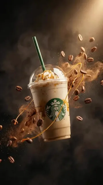
Thumbnail Design Hacks to Make Every Video Clickable
Nov 6, 2026

Why the thumbnail decides whether your video gets watched
A viewer scrolling a feed makes a judgment about your video in roughly a quarter of a second. Before a single frame of footage plays, before a title is read, before the topic is understood, the thumbnail has already done most of the persuading. Industry studies on video performance keep arriving at the same conclusion: the overwhelming majority of clicks are driven by the still image and the short title next to it, not by the video description, tags, or even the channel name.
That creates an uncomfortable asymmetry. You can spend three days on editing, sound design, and pacing, then lose the entire audience to a thumbnail that looked fine on a 27-inch monitor but turned to mush at 120 pixels wide on a phone. The good news is that thumbnail design is one of the highest-leverage skills in content production. Small, deliberate changes — a stronger value contrast, a tighter crop, one fewer word — routinely move click-through rates by double-digit percentages.
This guide is a practical workflow rather than a list of abstract rules. It covers the psychology of attention, platform-specific constraints, composition techniques, AI-assisted concepting, and a testing loop you can run every week. Treat each section as a checklist item you can apply to your next upload.
Start with the psychology of attention
A thumbnail is not a piece of art. It is a decision aid. The viewer is asking one question — "is this worth thirty seconds of my life?" — and your image has to answer it faster than conscious thought allows. Effective thumbnails work on three layers simultaneously: visual salience (something in the frame grabs the eye), meaning (the eye finds a recognizable subject), and curiosity (the brain identifies a gap it wants closed).
Contrast and visual hierarchy
Contrast is the trigger that fires before reading happens. It comes in several flavors, and they stack:
- Luminance contrast. A bright subject against a dark background, or the reverse. This is the single strongest predictor of whether an image survives being shrunk into a feed.
- Hue contrast. Complementary pairs — warm yellow against deep blue, orange against teal — pop because they sit on opposite sides of the color wheel. Be careful with saturated red-and-green combinations, which vibrate unpleasantly and read as harsh on OLED screens.
- Semantic contrast. A familiar object in an unexpected context. A pristine kitchen with one smashed plate. A calm face with a chaotic background.
Visual hierarchy is the discipline of deciding what the eye hits first, second, and third. Pick one primary subject and make everything else support it. If your thumbnail has three equally loud elements, the viewer's eye bounces and the scroll continues. A quick test: blur the image in your editor until detail disappears. Whatever remains legible at that blur level is your actual hierarchy.
Emotion and expression as click magnets
Human faces outperform almost everything else, but not any face — expressive faces. Neutral portraits read as generic stock imagery. Genuine surprise, focused concentration, mild disgust, or visible delight give the viewer a social cue about what the video will feel like.
A few practical notes:
- Crop close. A face filling 30–40% of the frame with a clear eye line is usually stronger than a full-body shot.
- Direct the gaze. If the subject looks toward text or an object inside the frame, the viewer's eye follows that line. If they look off-frame, attention leaks out of the image.
- Use one dominant emotion. Mixed signals feel accidental. If the video is a tense reveal, don't use a laughing still.
- Avoid the exaggerated-shock cliché unless it fits your brand. It still works at very high volume, but it trains viewers to expect hype and undermines credibility for educational or B2B channels.
Minimal text and mobile readability
Text on thumbnails is a multiplier when it is short, and a liability when it is long. The practical limit is three to four words — ideally two. Text should add information the image cannot convey on its own (a number, a verdict, a named tool) rather than repeat the subject you can already see.
Mobile readability rules are stricter than most designers assume:
- Design at 1280×720, then preview at 168×94 pixels. If the text is unreadable at that size, it is unreadable in the feed.
- Keep a stroke, shadow, or solid shape behind the text so it survives a busy background.
- Avoid thin weights. Semi-bold or bold sans-serif at large sizes wins.
- Never place text in the bottom-right corner — duration badges and platform UI overlay it.
- Leave a safe margin of about 5% on all sides; some surfaces crop edges.
Platform-by-platform thumbnail requirements
"One thumbnail for every platform" is a tempting shortcut and a consistent underperformer. The same video needs different crops, different aspect ratios, and sometimes a different hook depending on where it appears.
Long-form video platforms
The classic 16:9 thumbnail at 1280×720 remains the baseline. Upload at that resolution or higher — platforms compress aggressively, and downscaling a sharp source produces a cleaner result than upscaling a small one. Test the thumbnail at the smallest size it will appear, which is often a sidebar recommendation, not the main feed. You can usually upload three variants and let the platform rotate them automatically; use that feature consistently rather than sporadically, because the comparison only becomes meaningful after a few thousand impressions per variant.
Short-form vertical feeds
Vertical surfaces are a different design problem. The first frame of the video often serves as the thumbnail, and it appears in a grid at roughly 108×192 pixels. In that context:
- The subject should be centered and cropped tight — text near the top or bottom gets covered by captions and UI.
- Choose a first frame with motion blur or an unusual gesture rather than a static, neutral pose.
- Add a short overlay title in the first 0.3 seconds of the video itself, not just in the cover image, so the hook survives autoplay.
- Keep the composition readable without sound; the cover cannot rely on context the viewer has not heard yet.
Podcast, streaming, and embedded surfaces
Audio-first and library-style platforms often show artwork in a square or even circular crop. If your content lives on multiple surfaces, maintain a layered source file: a 16:9 master, a 1:1 square version, and a 9:16 vertical version derived from the same composition rather than recreated from scratch. Circular crops in particular punish anything placed in the corners.
Build a repeatable thumbnail design workflow
Ad-hoc thumbnails produce inconsistent branding and slow turnaround. A four-step workflow keeps quality high without turning each thumbnail into an afternoon.
Step 1: Write a one-line promise
Before opening any design tool, write the single sentence the thumbnail must communicate. For example: "This export setting is costing you quality." The promise determines the subject, the emotion, and the text. If you cannot write the sentence, you do not yet know what the image is for.
Step 2: Compose in grayscale first
Block out shapes and values without color. If the composition works in grayscale — clear focal point, obvious hierarchy, readable text block — color will only improve it. If it fails in grayscale, no amount of saturation will rescue it.
Step 3: Set type last and lock the system
Define a type style once: one font family, two weights, a fixed maximum character count, and standard placement zones. Save it as a template with editable text layers. Consistency here is what makes a channel recognizable in a crowded feed — viewers learn to identify your visual signature before they read your name.
Step 4: Export, downscale, and sanity-check
Export at 2× the target resolution, then view the downscaled version on an actual phone at arm's length. Check three things: is the subject identifiable, is the text readable, does the image contrast with the surrounding feed? That last check matters more than people expect — a dark thumbnail surrounded by dark thumbnails disappears regardless of its internal quality.
Using AI in the thumbnail process
AI image and video tools have changed thumbnail production, but not in the way most hype suggests. They are strongest at exploration and asset generation, and weakest at final composition decisions.
Concept ideation and variation
Use a generative model to produce 20–30 rough directions from a detailed prompt: subject, camera angle, lighting, color palette, mood. You are not looking for a finished thumbnail; you are looking for a composition idea you would not have sketched yourself. Screenshot the two or three strongest directions and rebuild them properly in your design tool. Rebuilding is important — generated images often carry artifacts, garbled text, and inconsistent anatomy that become obvious at thumbnail scale.
Backgrounds and supporting assets
Where AI genuinely saves time is in producing clean plates: abstract gradients, studio lighting setups, textured backdrops, and atmospheric environments that would otherwise require a photo shoot. Generate several at high resolution, keep a small library organized by palette, and reuse them across a series so your thumbnails look related rather than random.
Guardrails that keep quality high
- Never let a model write your on-image text. Generate imagery only; add type manually.
- Check hands, teeth, ears, and reflections. These are the four places artifacts cluster.
- Match your brand palette with a color grade, not a filter. A consistent grade across AI-generated and photographed assets makes them feel like one family.
- Document your prompts. A saved prompt library is a reusable asset, and it prevents weeks of inconsistent visual direction.
- Disclose where required. Some platforms and jurisdictions expect transparency about synthetic imagery; check the rules for your niche.
Composition hacks that deliver impact
Rule of thirds and negative space
Place your primary subject on a third line rather than dead center, and use the remaining two-thirds for a text block or a secondary element. Negative space is not wasted space — it is what makes a busy subject feel clean. A common mistake is filling every corner because the canvas feels empty. Resist it. A thumbnail with 40% breathing room usually reads faster than one packed with detail.
Depth cues that survive compression
Flat images die at small sizes. Add separation with a blurred foreground element, a rim light, a cast shadow, or a slightly out-of-focus background subject. Strong depth also lets you place text over a soft area without losing readability.
Color as a series system
Assign a palette per content series rather than per video. A tutorial series in cool blues, a reaction series in warm oranges, and a case-study series in muted neutrals lets regular viewers self-select instantly. Keep one accent color available for the single most important element — a number, an arrow, a warning shape.
Arrows, circles, and other annotation layers
Annotation works when it directs attention and fails when it decorates. One arrow, drawn thick enough to survive at 120 pixels, pointing at something genuinely surprising is effective. Three arrows and a red circle look like a template from a decade ago. If you use annotation, use it once and make it big.
Testing and iterating with data
Thumbnail design improves fastest with a simple comparison loop:
- Produce three genuinely different concepts — not three recolors of one layout.
- Launch with one, then swap after a fixed impression threshold (often 5,000–10,000 views) rather than after an hour.
- Record click-through rate alongside average view duration. A thumbnail that gets clicks but tanks retention is a promise mismatch, not a win.
- Keep a swipe file of every concept, including losers, with a note on what hypothesis you were testing.
- Every quarter, review which visual patterns correlated with your best-performing videos and fold them into your template.
Be cautious with small samples. A 2% difference after 400 impressions means nothing. Also separate platforms — a pattern that wins on long-form video may lose badly in a vertical feed.
Common mistakes to avoid
The most frequent failure is designing for the editor window instead of the feed. Others worth naming:
- Text that repeats the title. Redundant text wastes the strongest real estate you have.
- Low contrast between subject and background. A subject in a mid-tone shirt against a mid-tone wall is invisible at small scale.
- Too many focal points. One subject, one message, one accent.
- Ignoring the surrounding context. Check the thumbnail in an actual feed next to competitors.
- Inconsistent branding. If every thumbnail has a different typeface and palette, viewers cannot recognize you.
- Skipping the vertical version. Cropping a horizontal thumbnail to 9:16 usually cuts off the face and the text.
- Never testing. The only reliable way to know what works for your audience is to run comparisons.
FAQ
How much text should a thumbnail contain?
Two to four words. Three is a good default. If the image needs more explanation, the concept is not clear enough yet.
Do faces always outperform other subjects?
Not always, but they are the safest starting point, and expressive faces consistently beat neutral ones. Objects win when the object itself is the promise — a device, a dish, a tool.
Should I design separate thumbnails for each platform?
Yes, at minimum a 16:9, a 1:1, and a 9:16 variant of the same composition. Reusing one crop across all surfaces guarantees that at least one placement will be compromised.
How often should I update a thumbnail?
For evergreen content, revisiting a thumbnail every few months is reasonable, especially if a video is still receiving traffic. For new uploads, test variants within the first week while impressions are still climbing.
Can AI generate a finished thumbnail?
It can generate compelling raw material. Final composition, typography, and brand consistency still need human judgment, and generated text should always be replaced manually.
What is the fastest improvement most creators can make?
Increase luminance contrast between subject and background, then cut on-image text in half. Those two changes alone fix the majority of underperforming thumbnails.

Alexander
More Blogs
Read MoreAI Video Production From Concept to Final Render: A Workflow
A practical guide to AI-assisted video production, from brief and shot list to prompt design, audio, editing, and final quality control.
Free Video Transcription and Editing Workflow: A Practical Guide
Build a reliable free video transcription and editing workflow with practical tool choices, caption tips, quality checks, and AI handoff points.
Automated Video Transcription: A Practical AI Workflow
Learn a reliable automated video transcription workflow with AI, from audio prep and speaker labels to quality checks, captions, and searchable transcripts.