
Why AI Art Generators Changed Creative Work
A few years ago, generating a polished illustration meant either years of drawing practice or a commission budget. Today, a designer can describe a scene in a paragraph and get a usable visual in under a minute. That shift has not just changed who can make images, it has changed how creative teams think about the entire production pipeline.
The interesting part is not that the tools exist. It is that the creative decisions have moved. Instead of spending most of your time on execution, you now spend it on direction: choosing a style, describing a mood, deciding what to keep and what to regenerate. The work has become an editorial and directorial job as much as a technical one.
This guide covers what is actually changing in AI art generation, which styles are trending and why, how to structure prompts that produce reliable results, and the workflow habits that separate people who get consistent output from people who get lucky once and never again.
What Actually Changed: From Single Images to Directed Sequences
The biggest shift in this space is not image quality. Quality improved quickly and then kept improving. The real change is that generation has moved from isolated pictures to sequences, and from text-only prompts to reference-driven control.
Text-to-image is now the baseline, not the feature
Text-to-image was the headline capability for years. It is now table stakes. Any serious tool does it, and the differences between them show up in narrower places: how well they handle text inside images, how faithfully they render hands and complex geometry, how consistently they respond to the same prompt across multiple runs.
When evaluating tools, stop asking whether they can generate a good image from a prompt. Ask whether they can generate the same image repeatedly with small variations, because that is what real projects require.
Reference images and structural control matter more than raw resolution
A tool that produces beautiful images you cannot steer is nearly useless for a real project. What creative teams actually need is control. That need has driven the rise of features like reference image input, pose and depth conditioning, region-based editing, and multi-image fusion.
The practical implication: when you compare tools, weight controllability heavily. A slightly less polished model that respects your references and follows composition instructions precisely will beat a more polished model that ignores half of what you asked for.
Video generation borrowed the same architecture
Video generation arrived with the same ingredient list: a text prompt, optional reference frames, and a control signal. This matters because it means the prompt skills you build for images transfer almost directly to video. A well-structured image prompt is usually a well-structured video prompt with a motion clause added.
The quality-versus-cost tradeoff got sharper
Premium generation tiers produce noticeably better results on difficult subjects, especially text rendering, precise hands, and coherent lighting. Lower-cost or lighter-weight models are often good enough for rapid concept exploration, mood boards, and internal drafts.
The practical rule most teams land on: explore cheap, finalize expensive. Run twenty rough variations on whatever is fast and inexpensive, then take only the two or three strongest directions to the higher-quality model for the final render.
Trending Styles and Why They Are Working
The visual styles dominating creative work right now are not arbitrary. Each one solves a specific production problem.
Cinematic realism with intentional imperfection
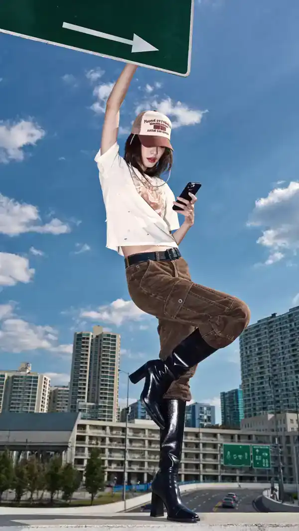
Full photorealism is technically impressive but often looks sterile. The trend has moved toward a film-still look: shallow depth of field, visible grain, slight lens distortion, and lighting that suggests a specific time of day rather than studio neutrality.
The reason this works is that imperfection reads as authenticity. A perfectly clean render looks generated. A render with a small amount of grain and a warm rim light looks photographed. Prompt cues follow that logic: shot on 35mm film, soft window light, shallow depth of field, subtle grain.
Stylized illustration with strong shape language
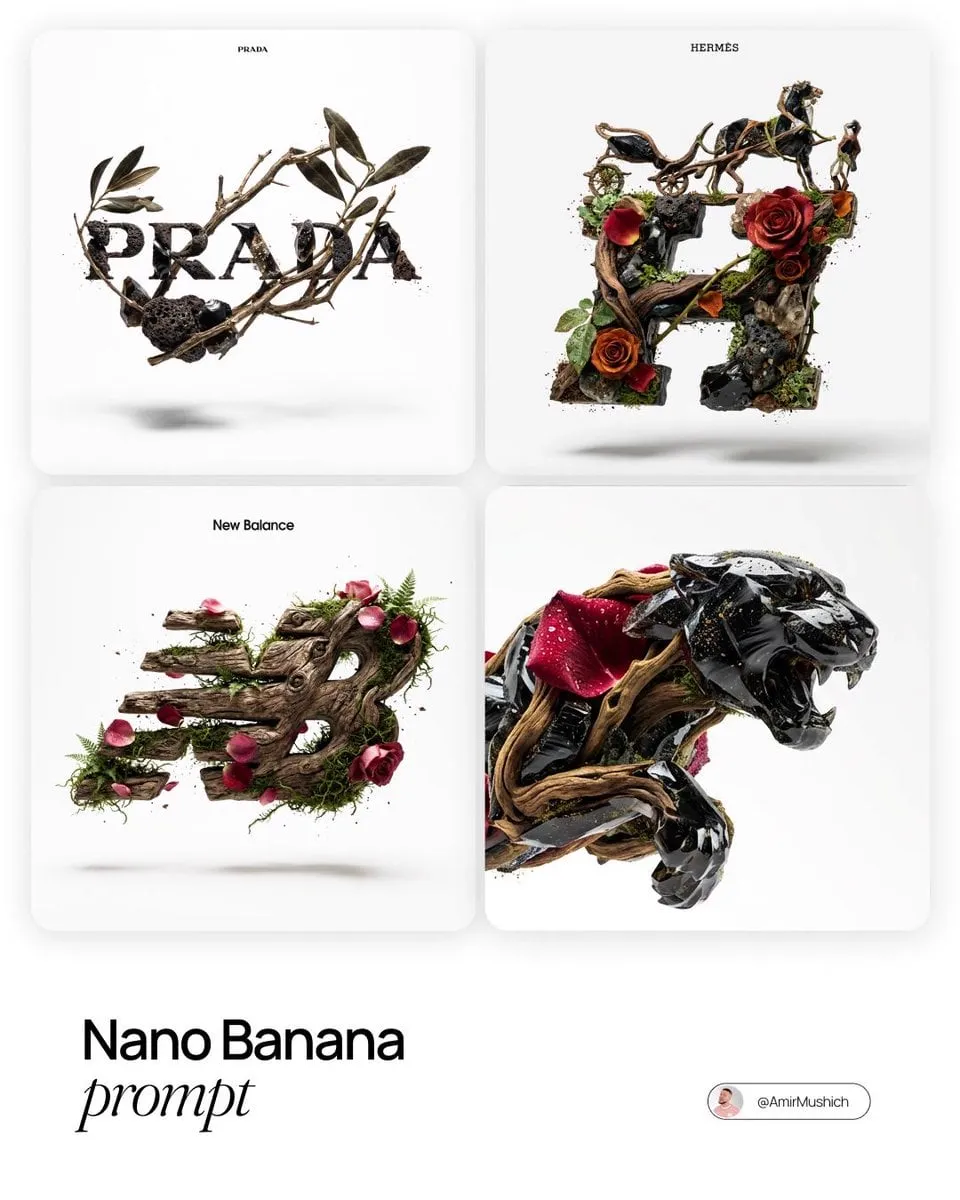
On the opposite end, heavily stylized illustration continues to grow, particularly styles with bold silhouettes, limited palettes, and clear shape hierarchies. Flat vector illustration, editorial line art, and textured gouache looks all fall here.
This style works well for anything that needs to stay legible at small sizes: icons, article headers, social cards, app illustrations. The constraint is a feature, not a bug, because a strong silhouette survives every size reduction.
Retro and analog revivals
Film photography looks, risograph-style color separation, vintage print textures, and hand-drawn animation aesthetics have all gained ground. The appeal is partly nostalgia and partly differentiation. When everyone has access to the same clean modern output, deliberate roughness becomes a way to stand out.
These styles also have a practical advantage: they absorb small generation errors. A slightly odd hand in a clean photorealistic render is a flaw. The same hand in a rough risograph-style illustration is just part of the aesthetic.
Product and architectural visualization
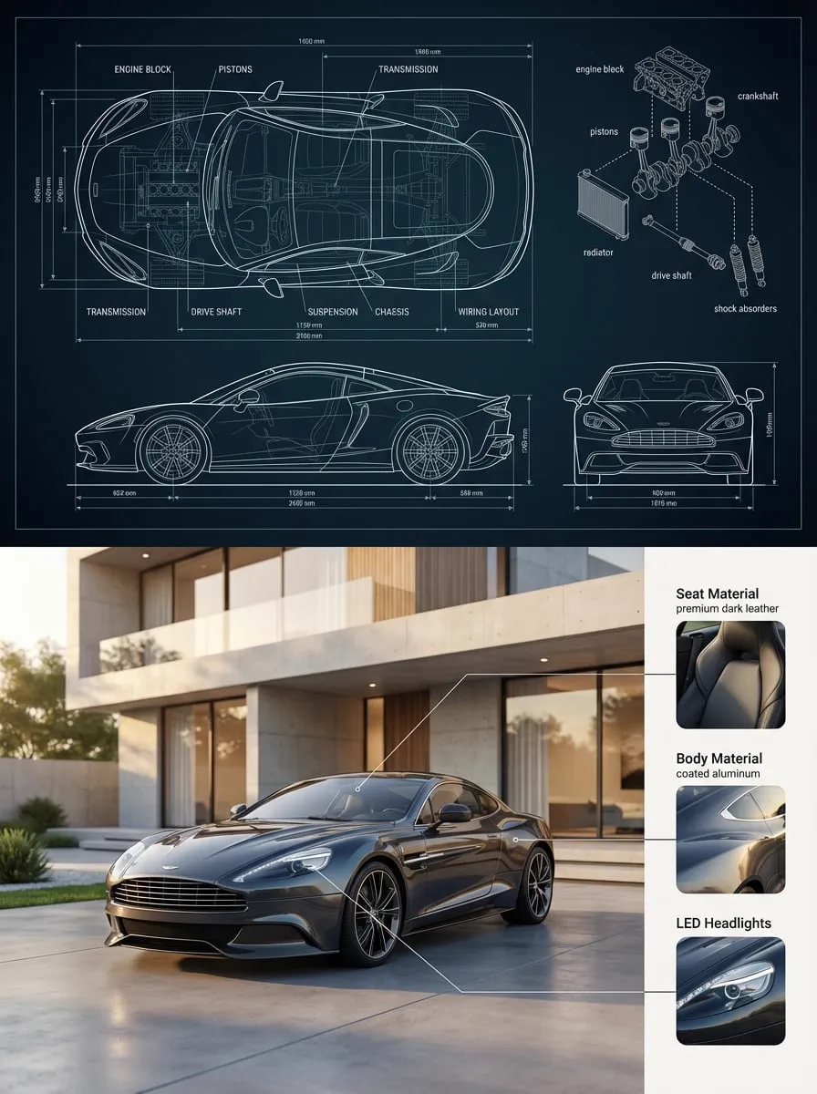
Commercial work has moved heavily into AI-assisted product renders and architectural concepts. The reason is straightforward economics: a client can see five lighting treatments and three material variations before any physical prototyping happens.
These styles demand more precision than artistic work, which is why control features matter so much here. Consistent geometry, accurate reflections, and stable materials across a set of images are the whole point.
Motion-first visuals designed for video
A newer pattern is generating images specifically to be animated. Instead of composing a still and hoping it moves well, teams now design for motion from the beginning: clear foreground and background separation, strong focal subjects, and simple compositions that give a motion model something clean to work with.
If you plan to animate an image, keep backgrounds uncluttered and avoid multiple competing subjects. Motion models perform far better on a composition with one obvious focus.
Prompt Structuring That Actually Produces Reliable Results
Most prompt advice is about magic keywords. The more useful approach is structural: build prompts in layers, so when something is wrong you know exactly which layer to adjust.
The five-layer prompt
A reliable prompt has five parts, roughly in this order:
- Subject — who or what, described concretely. Not a woman but a woman in her sixties with close-cropped silver hair.
- Action or state — what the subject is doing or how it is positioned.
- Setting — location, time of day, environment, weather, background detail.
- Style and medium — photograph, oil painting, risograph print, 3D render, editorial illustration.
- Technical and lighting notes — lens, lighting direction, color grading, depth of field, aspect ratio.
Here is the same idea as a concrete example:
An elderly watchmaker repairing a brass pocket watch at a cluttered wooden workbench, magnifying loupe over one eye, warm afternoon light through a dusty window, shot on 50mm lens, shallow depth of field, muted film color palette, subtle grain
Every clause does work. If the result is too dark, the issue is in layer five. If the subject is wrong, the fix is in layer one. This is why layered prompts beat keyword soup: they are debuggable.
Order and emphasis signals
Models tend to weight early tokens more heavily. Put the most important element first. If you absolutely need a specific color or a specific object, place it early and mention it once, clearly, rather than repeating it five times in different phrasings.
Some tools support explicit weighting syntax, and some support negative prompts. Use negatives sparingly and specifically. A long negative list often confuses the model more than it fixes, and it is usually better to describe what you want than to enumerate what you do not.
Specificity beats adjectives
This is the single highest-leverage habit. Vague adjectives produce averaged results. Concrete nouns produce specific ones.
Compare:
- Weak: a beautiful modern house with nice lighting
- Strong: a concrete and glass house on a cliff edge, floor-to-ceiling windows facing west, sunset light raking across an empty interior, architectural photography, wide angle
The strong version could still come out wrong, but it can come out right. The weak version only ever produces generic output.
Keep a reusable prompt library
Once a prompt produces something good, save it. Not just the text, but the seed, the model, the settings, and the date. Over a few months you build a personal style library that lets you reproduce a look on demand.
An efficient format is a simple spreadsheet with columns for prompt text, model, seed, aspect ratio, and a thumbnail. Searching your own successful prompts is far faster than rebuilding them from memory.
Multi-Image Fusion for Character and Style Consistency
The hardest practical problem in AI art is consistency. A character that looks right in one image and completely different in the next cannot carry a narrative, a brand, or a series.
Why single-image approaches drift
When you generate from text alone, small variations in the random seed compound. Hair length shifts, eye color drifts, clothing details change. For a one-off illustration this is fine. For a twelve-panel comic, it is fatal.
The reference-image workflow
Multi-image fusion addresses this by feeding the model previous outputs as visual anchors. A typical workflow:
- Generate a clean, well-lit, front-facing reference of your character against a plain background.
- Save that image as your primary identity reference.
- For each new scene, provide the identity reference plus a fresh text prompt describing pose, setting, and action.
- Optionally add a second reference for style, such as a color script or a previous panel you liked.
- Review each output and reject anything with identity drift immediately, rather than letting errors accumulate.
The key discipline is step five. A small inconsistency in panel three becomes a glaring problem by panel eight.
Balancing identity and variety
Push identity strength too high and every image becomes the same stiff pose. Push it too low and the character drifts. Useful practice is to start at a moderate identity weight and raise it only for critical shots like close-ups and hero panels, while allowing more variation for wide shots where the face is small.
Building a style reference set instead of a style prompt
Describing a visual style in words is imprecise. If you have three images that already look the way you want, use them as a style reference set instead. This is faster and dramatically more accurate than any combination of style adjectives.
From Still to Motion: Turning Generated Images Into Video
Image generation and video generation share most of their prompt structure, but video adds new constraints and new failure modes.
Add motion deliberately, not accidentally
A motion prompt should specify what moves and how. Camera motion and subject motion are separate decisions. A slow dolly-in with a static subject produces a very different feeling from a locked-off camera with a subject walking into frame.
Useful motion vocabulary: slow push in, gentle pull back, static camera, handheld drift, subject turns slowly toward camera, steam rising from a cup, curtains moving in a light breeze.
Design images for animability
If you know an image will be animated, generate it differently. Keep the composition simple, keep the subject large in frame, keep the background readable but uncluttered, and avoid delicate fine detail that motion models tend to smear.
Expect and manage temporal artifacts
Flickering textures, morphing hands, and backgrounds that shift shape are common. Practical mitigations: shorter clips, simpler motion, lower motion strength for the first pass, and generating multiple short takes rather than one long one. A four-second clip that works beats a twelve-second clip that breaks at second five.
Build in shot-level thinking
Storyboarding with AI generation moves fast if you think in shots rather than scenes. Write out your shots first in plain text: wide establishing, medium on the character reacting, close-up on hands, cutaway to the environment. Then generate each shot independently. This keeps prompts simple and makes re-generation cheap when one shot fails.
Creative Direction Tips That Raise Output Quality
These are the habits that consistently separate strong output from average output, regardless of which tool you use.
Plan the visual before you prompt
Spend two minutes writing what the image needs to communicate. Not what it looks like, but what it has to do. A header image for a technical article has to communicate competence and clarity. A hero image for a storytelling post has to communicate mood and narrative tension. These require completely different visual approaches, and starting with the purpose makes the style choice obvious.
Iterate on one variable at a time
When an image is almost right, change one thing. If you rewrite the entire prompt, you lose the ability to know what improved it. This is slower per iteration and much faster overall.
Use composition language, not just subject language
Most beginners describe objects and forget framing. Adding terms like rule of thirds, centered symmetrical composition, low angle, top-down flat lay, or negative space on the left changes images dramatically and costs nothing.
Consider the crop before you generate
Generate at the aspect ratio you actually need. Generating a square image and cropping to a tall banner destroys your composition. If the final use is a 16:9 hero, generate 16:9.
Keep a rejection log
When a prompt fails, write down why. Too busy, wrong lighting, subject too small, wrong palette. After twenty entries you will see your own recurring mistakes. Most people repeat the same three or four prompt errors for months without noticing.
Batch similar work together
If you need eight illustrations for one article, generate them in a single session with a shared style reference and a consistent palette. Doing them all at once produces a visually coherent set. Doing them across two weeks produces eight images that look like they came from eight different projects.
How to Choose the Right Tool for a Job
Rather than hunting for a single best tool, match the tool category to the task.
- Fast concept exploration: prioritize speed and low friction over quality. You want to see twenty rough directions in five minutes.
- Final commercial renders: prioritize control features, reference support, and detail accuracy on hands, text, and materials.
- Character consistency work: prioritize multi-image reference support and the ability to hold identity across a sequence.
- Text inside images: only use models that are specifically strong at typography, and keep text short.
- Video from stills: prioritize motion quality and camera control over image fidelity, since the source image already provides detail.
- High-volume social content: prioritize batch generation and consistent style output across many images.
A useful evaluation exercise: pick one difficult prompt with a specific character, specific lighting, and specific composition, then run it through three tools. Judge them on how closely they follow the composition instructions and how consistent repeated runs are. That comparison tells you more than any feature list.
Common problems and how to fix them
Output looks generic. Your prompt is too abstract. Add concrete nouns, a specific time of day, and a named medium.
Subject drifts between images. You are relying on text for identity. Move to a reference-image workflow with a fixed identity anchor.
Composition ignores instructions. Move framing terms earlier in the prompt and remove competing subject descriptions. Some models respond better to composition described as camera position than as layout instruction.
Image looks over-processed. Remove quality-boosting adjectives like hyperdetailed or ultra sharp and replace them with a specific medium and lighting description.
Video flickers or morphs. Reduce motion strength, shorten the clip, and simplify the composition so there is less to track between frames.
Text renders as nonsense. Shorten the text drastically, place it by itself in the composition, and expect to add complicated typography in a layout tool instead.
FAQ
Do I need art skills to get good results from an AI art generator?
Not drawing skills, but visual judgment matters enormously. Knowing why an image works, spotting a broken composition, and articulating what needs to change are the skills that separate strong results from random output. Those skills come from studying images, not from practicing brushwork.
How many words should a good prompt be?
There is no fixed number, but most effective prompts land between 20 and 60 words. Shorter prompts leave too much to chance. Much longer prompts start to contain contradictions that the model resolves unpredictably.
Why does the same prompt give me different results every time?
Because most models start from a random seed. If you want reproducibility, fix the seed. If you want variety, leave it random and generate multiple versions at low cost before refining the best one.
Can I use generated images commercially?
This depends on the specific tool's terms and on your jurisdiction. Check the license terms of the exact model you use, and be especially careful with anything that closely resembles a real person, a protected character, or a recognizable brand.
How do I keep a character consistent across many images?
Build a clean identity reference image first, then use it as a reference in every subsequent generation. Keep the reference simple: front-facing, even lighting, plain background, no occluding objects. Consistency comes from the reference, not from increasingly detailed text.
Is video generation worth using for stills-only projects?
Often yes, because motion adds attention in formats where a static image gets scrolled past. But if your output format is genuinely static, the extra time and iteration are better spent on composition and consistency.
What is the fastest way to improve my prompts?
Keep a log of prompts that worked and prompts that failed, with a note on why. Reviewing your own history teaches more than any generic keyword list, because your recurring mistakes are specific to how you describe things.
Putting It Together
The practical version of all of this is straightforward. Describe your subject concretely, decide the medium and lighting explicitly, use reference images whenever consistency matters, iterate on one variable at a time, and build a prompt library so good results are reproducible rather than accidental.
The tools will keep changing and new models will keep appearing. The underlying discipline does not change: know what the image needs to do, describe it specifically, control what matters, and keep a record of what worked. That is what makes AI art generation a reliable creative practice instead of a slot machine.
