

Why Generative Tools Are Reshaping Logo and Artwork Production
A decade ago, a small brand that needed a logo plus a matching visual identity had two realistic options: pay a studio a meaningful sum, or accept something generic. Generative design has changed that arithmetic. A single designer can now produce dozens of structured concepts in an afternoon, explore directions that would once have been too expensive to test, and carry a finished mark into posters, packaging mockups, and animated idents without leaving the same workspace.
The important shift is not that machines can draw. Plenty of software could draw before. The shift is that generation has become controllable. You can hold a composition steady while changing the palette. You can keep a mascot's proportions while swapping the drawing style. You can generate forty variations of a wordmark around one structural idea instead of forty unrelated pictures. That control is what turns a novelty into a professional tool.
This guide is a practical workflow, not a manifesto. It covers what image, vector, and motion models are genuinely good at, how to prompt for logo concepts instead of pretty illustrations, how to move from sketch to deliverable files, and how to keep an entire artwork system coherent once the mark exists. It is written for designers, brand owners, and motion artists who want a repeatable process rather than a pile of lucky outputs.
What Image Models Do Well — and Where They Fall Short
Generative image models excel at three things that used to be expensive: volume, stylistic range, and fast iteration on a fixed idea. Ask for twenty interpretations of a fox built from geometric arcs and you will get them in minutes. Ask to see the same mark in flat vector style, engraved woodcut style, and soft gradient style, and you can compare directions side by side before committing.
They are weaker at four things that matter enormously in identity work:
- Exact geometry. Perfect circles, consistent stroke weights, and mathematically aligned counters are approximate at best. Models produce shapes that look like a circle to the eye but fail a measurement check.
- Legible typography. Long words and uncommon letter combinations often arrive with warped glyphs, invented letters, or inconsistent spacing. Text should almost always be set separately in a real typeface.
- Negative space logic. Clever dual-reading marks — where a gap forms a second symbol — require deliberate design. Models can stumble into a good accident, but they cannot reliably engineer one.
- Reproducibility. Small prompt changes produce large visual jumps. Without a disciplined system, you cannot return to a concept next week and regenerate something close to it.
Understanding this split is liberating. Treat the model as a concept generator and a texture engine, and treat vector software as the place where precision happens. That division of labor removes most of the frustration people feel when their first AI logo turns out to be unusable at 16 pixels.
Matching the Tool to the Task: Image, Vector, and Motion
There is no single best tool. There is a best tool per stage, and the stages are genuinely different.
Diffusion models for concept exploration
General-purpose diffusion models are the strongest option for mood boards, illustrative marks, mascot designs, badge layouts, and textured backgrounds. They handle painterly and photographic references well, which makes them ideal when the brand direction is organic rather than geometric. Their weakness is precision, so use them to explore and then redraw.
Vector and logo-specific generators
Tools built specifically for marks tend to output cleaner silhouettes, simpler palettes, and more symmetrical compositions. They are useful when you need a large quantity of simple icon-style options quickly. Expect to refine curves manually afterward — automatic vectorization still produces excess anchor points and slightly lumpy arcs on small details.
Video models for animated marks
Video generation is the newest and most surprising part of the stack. Short, controlled clips are now good enough to animate a logo reveal, build a looping motion background, or produce a social teaser with a consistent art direction. The trick is to animate from a strong still frame rather than describing the entire scene in text. Image-to-video workflows keep the brand consistent; pure text-to-video invites drift.
A sensible default stack for most projects: one general diffusion tool, one vector editor, one image-to-video tool, and a shared folder where prompts and reference images live. Add specialized tools only when a specific brief demands them.
Prompting for Logo Concepts That Actually Work
The difference between a useful batch and a useless one is almost always the prompt structure.
Describe the structure, not the vibe
Prompts like "modern tech logo, minimal, professional" produce generic results because they describe a feeling. Prompts that describe geometry produce usable results: "A monogram built from two overlapping rounded rectangles, 45-degree diagonal cut where they intersect, single color, thick uniform strokes, centered composition, generous padding." Describe shapes, angles, and relationships, not adjectives.
Use constraints and negative space
Every strong prompt has a short exclusion list. Typical exclusions for identity work: no gradients, no drop shadows, no photorealism, no extra text, no watermark, no 3D bevels, no busy background textures. Negative prompts do more work in logo generation than positive ones, because the default aesthetic of most models is decorative.
Keep a prompt library
Save every prompt that produced something usable, along with the seed or reference image, model name, and settings. Over a few projects this becomes your real competitive advantage: a personal library of structures that reliably yield workable directions. It also makes handoff easier, since a teammate can reproduce a concept months later.
Iterate in one dimension at a time
When refining, change one variable per batch. Same composition, different palette. Same palette, different stroke weight. Same everything, different negative-space treatment. Multi-variable changes produce chaos and teach you nothing about which input caused which effect.
A Step-by-Step Logo Workflow from Brief to Delivery
Here is a workflow that holds up on real deadlines.
Step 1: Write a one-page brief
Before opening any tool, write down the brand name, the audience, three adjectives that should describe the mark, three that should not, required formats, and the intended primary use. This single page prevents the most common failure mode: generating beautiful images that have nothing to do with the business.
Step 2: Generate in wide batches
Run batches of at least twenty images per direction, and explore three to five distinct directions. Diversity at this stage is more valuable than polish. Group outputs by structural idea rather than by aesthetic quality — a rough sketch with a great underlying structure beats a polished image with no idea behind it.
Step 3: Shortlist with a scoring grid
Score each shortlisted concept on four axes from one to five: distinctiveness, legibility at small size, fit with the brief, and production cost to finish. Anything scoring below three on legibility should be dropped immediately, no matter how striking it looks at full resolution.
Step 4: Vectorize and clean up
Redrawing is usually faster than cleaning up auto-traced output. Use the generated image as a visual reference on a locked layer, then rebuild with real curves. Standardize stroke weights, align to a grid, and reduce the palette to one or two colors before introducing accents. This is where an AI-assisted concept becomes an actual mark.
Step 5: Test at real-world sizes
Export the mark at 512, 128, 32, and 16 pixels, and place it on light, dark, and photographic backgrounds. Check favicon legibility, embroidery feasibility, and single-color printing. Problems that are invisible at 2000 pixels are obvious at 32, and it is far cheaper to fix them now than after delivery.
Step 6: Document the system
Record the final color values, clear-space rules, minimum sizes, and approved variations. Include the typeface used for the wordmark and the exact spacing between mark and text. A short, accurate brand sheet prevents years of drift.
From One Mark to a Full Artwork System
A logo is rarely the deliverable by itself. Most projects need a small family of assets: social avatars, presentation covers, packaging mockups, poster layouts, and increasingly, motion.
Keep color, type, and composition consistent
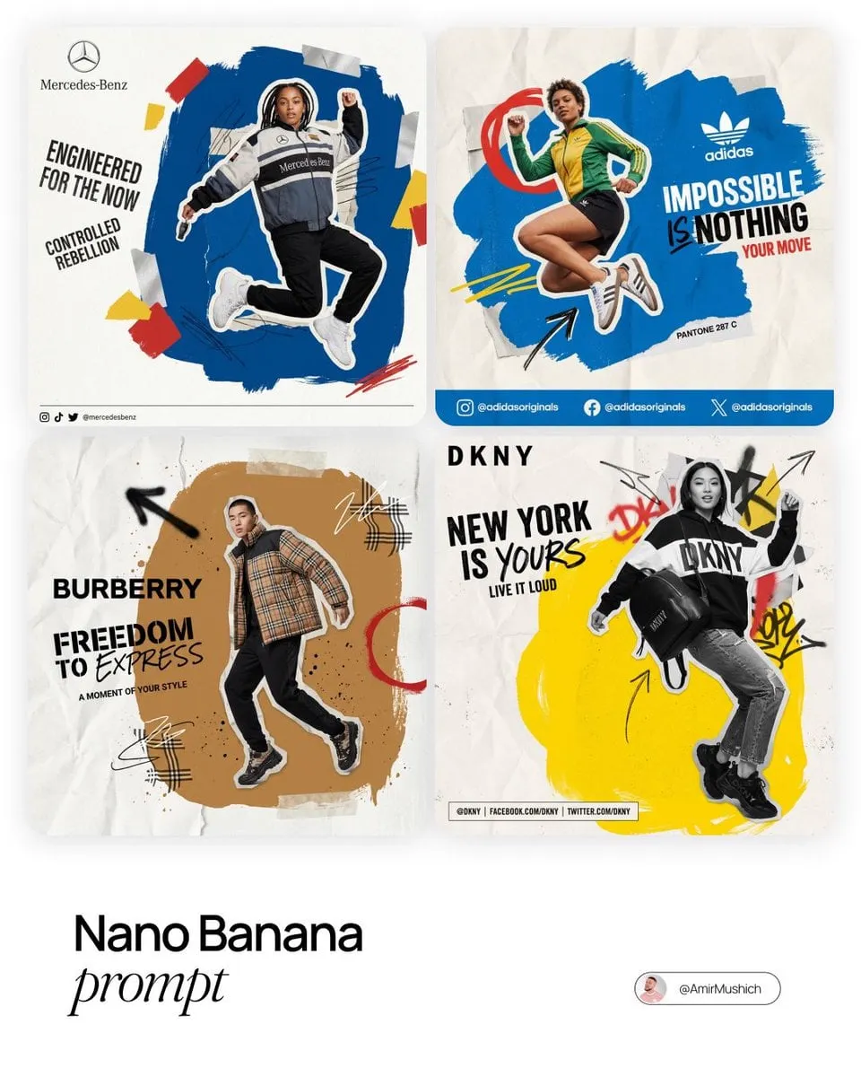
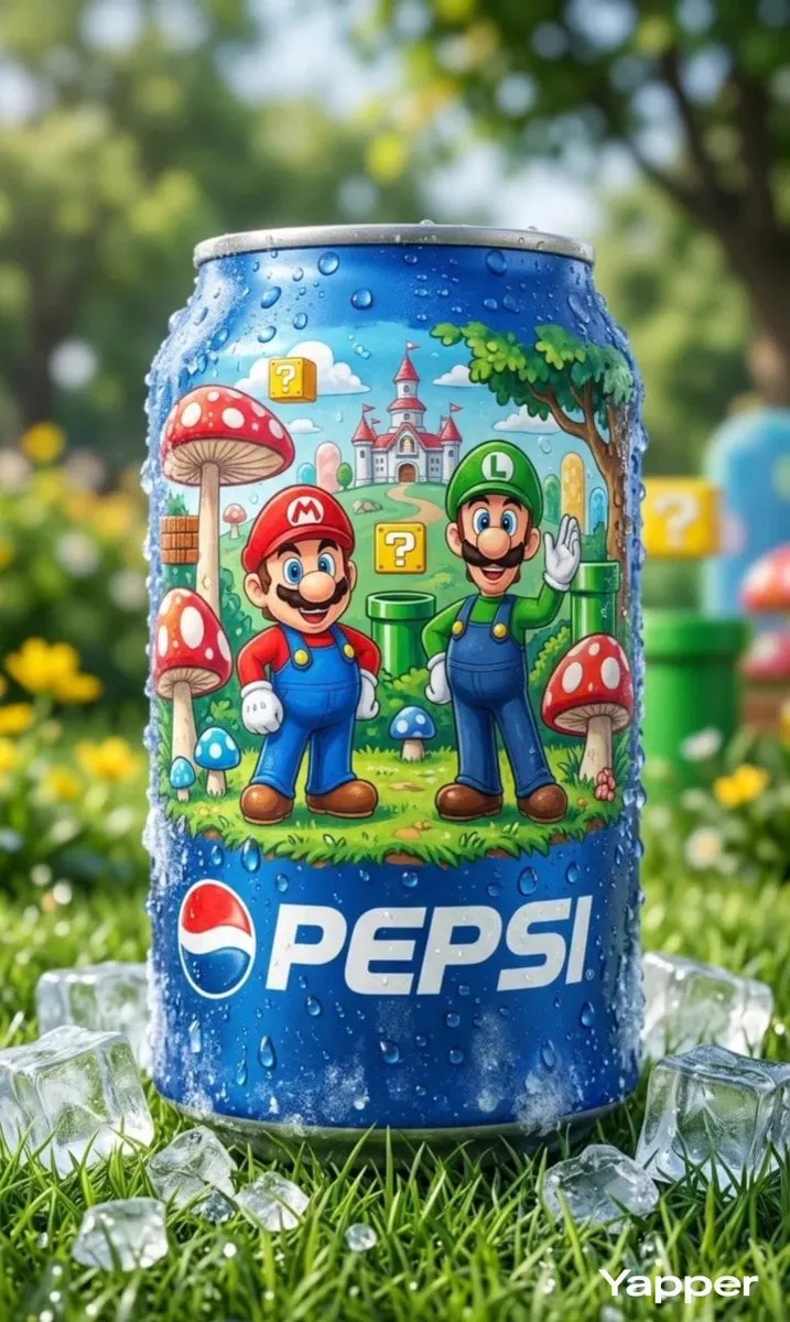
Once the mark is fixed, generate supporting artwork around it rather than from scratch. Feed the finished logo in as a reference image and ask for backgrounds, patterns, or illustrative elements that share its palette and geometry. Fixed variables — two or three brand colors, one typeface family, one compositional grid — are what make a set of images feel like a system rather than a mood board.
Build simple motion from strong stills
For animated logos, start with a clean, high-resolution still of the mark on a plain background, then use an image-to-video tool to add a restrained reveal: a wipe, a scale-up, a light sweep. Keep clips short, usually two to four seconds, and loop them seamlessly. Restraint reads as premium; spinning, exploding, and morphing overload reads as amateur. Export in the formats each platform needs, and always keep a static fallback for accessibility and printing.
Extend into illustration and texture
Illustrative brand elements — spot icons, hand-drawn accents, repeating patterns — are where generative tools shine most, because precision matters less. Generate them in batches, then edit the best ones into a consistent set by normalizing stroke weight, corner radius, and color.
Building a Repeatable Production Pipeline
Creative work becomes reliable when the boring parts are standardized.
Naming, versioning, and handoff
Use a predictable naming convention: project, asset type, variation, and version number. Keep prompts, reference images, and generation settings in the same folder tree as the outputs, ideally in a plain text file that travels with the project. When a client asks for "the third option from the first round, but warmer," you will be able to reproduce it instead of guessing.
Human review gates
Insert explicit checkpoints where a person must approve before work continues. Typical gates: after concept selection, after vectorization, after the system is applied to real layouts, and before final export. Automation should never carry a mark straight from generation to delivery, because the failures that matter — an unintended symbol, a cultural misreading, a shape that resembles a competitor — are exactly the ones a model will not flag.
Track time honestly
Measure how long each stage actually takes. Most teams discover that generation is a small fraction of total effort and that selection, redraw, and testing dominate. That knowledge is what lets you price and schedule AI-assisted work realistically instead of promising impossible turnaround.
Common Mistakes and How to Avoid Them
Chasing polish too early. Beautiful renders hide weak structures. Keep concepts rough until the structure is right.
Generating text in the image. Let the model render a mark, then set the brand name in real type. Warped glyphs are the fastest way to make an identity look unprofessional.
Skipping the small-size test. A mark that works only on a large screen is not a logo, it is a poster.
Overusing gradients and glow. These date quickly and complicate print, embroidery, and single-color use.
Losing the prompt trail. Without records, iteration becomes guesswork and revisions become expensive.
Letting style replace strategy. A consistent aesthetic is not the same as a positioned brand. The mark still has to say something about the business.
Ignoring accessibility. Check contrast ratios, provide alt text, and ensure the mark works for people with low vision or color-vision differences.
Legal, Ethical, and Practical Considerations
Before commercial use, confirm the license terms of every model and every reference image you used. Outputs from some tools carry restrictions; others are broadly usable but come with no warranty of originality. If a generated concept closely resembles an existing trademark, discard it — the cost of a dispute far exceeds the cost of another generation round.
Be thoughtful about style imitation. Asking for a living artist's signature style is, at minimum, ethically contentious and in some jurisdictions legally risky. Ask for stylistic attributes instead: heavy outlines, limited palette, geometric abstraction, woodcut texture.
Finally, disclose AI involvement where it matters. Many clients appreciate transparency, and some markets and platforms now require it. Written agreements should specify who owns the final artwork and whether the underlying generated files are included in the handoff.
FAQ
Can AI design a complete logo on its own?
It can generate strong raw concepts, but a finished, production-ready mark almost always needs human vector work, typography, and testing. Treat it as a fast concepting partner.
Which is better for logos: image models or vector tools?
Use image models for exploration and vector tools for production. Trying to force one tool to do both usually costs more time than it saves.
How many concepts should I generate before choosing?
Three to five distinct structural directions, each with roughly twenty variations, is a practical baseline. Fewer than that and you risk anchoring on the first idea you saw.
Can I use generated artwork commercially?
Often yes, but it depends on the specific tool's license and your jurisdiction. Read the terms, keep records, and check for similarity to existing trademarks before launch.
How do I keep an AI-assisted brand consistent over time?
Lock the fundamentals: exact color values, one typeface family, a defined grid, and a saved folder of prompts and reference images. Consistency comes from fixed inputs, not from repeated luck.
Is animated logo work worth the extra effort?
When video and social channels matter, yes. A two-second looped reveal built from a clean still is inexpensive to produce and significantly extends where the identity can live.
A Closing Checklist
A one-page brief exists. Three to five structural directions were explored in wide batches. Concepts were scored on distinctiveness, legibility, fit, and finish cost. The winner was redrawn in vector software with standardized strokes and colors. The mark was tested at 16 pixels, in single color, and on photographic backgrounds. Supporting artwork and at least one short motion asset were generated from the finished mark, not in parallel with it. Prompts, settings, and source files were archived with a predictable naming scheme. License terms were reviewed, accessibility was checked, and the deliverables were documented in a short brand sheet.
Do that consistently and generative tools stop being a gamble. They become what they should be: a fast, controllable front end to a design process that still ends, as it always has, with human judgment.
