
Free online AI image generators have quietly become one of the most practical tools in a content creator's kit. A marketer needs a hero image before lunch. A solo video producer needs five consistent frames for a storyboard. A teacher needs a diagram that does not look like clip art. Where a photoshoot or a stock subscription used to be the only route, a clear prompt and twenty minutes of iteration now produce something you can actually publish.
This guide is a workflow document, not a tool ranking. It explains how these generators work under the hood, how to choose between them, how to write prompts that survive the constraints of free access, and how to carry finished stills into a video pipeline. Everything below assumes you have no budget, a browser, and a deadline.
Why free tools are good enough for real work
The gap between a free generator and a paid one is narrower than most people expect. The difference is rarely whether an image is possible at all. It is usually resolution, refinement controls, queue time, and whether the output carries a watermark or a restrictive license.
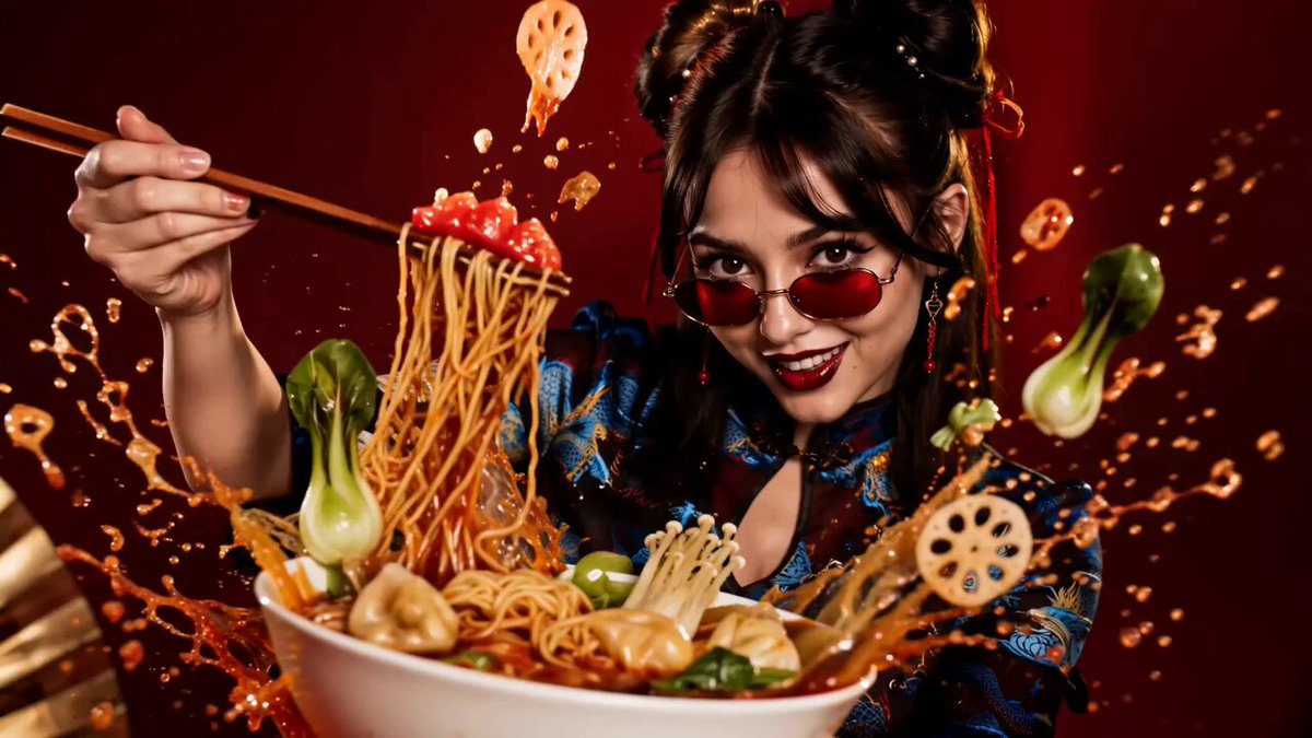
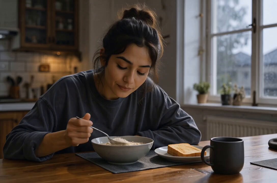
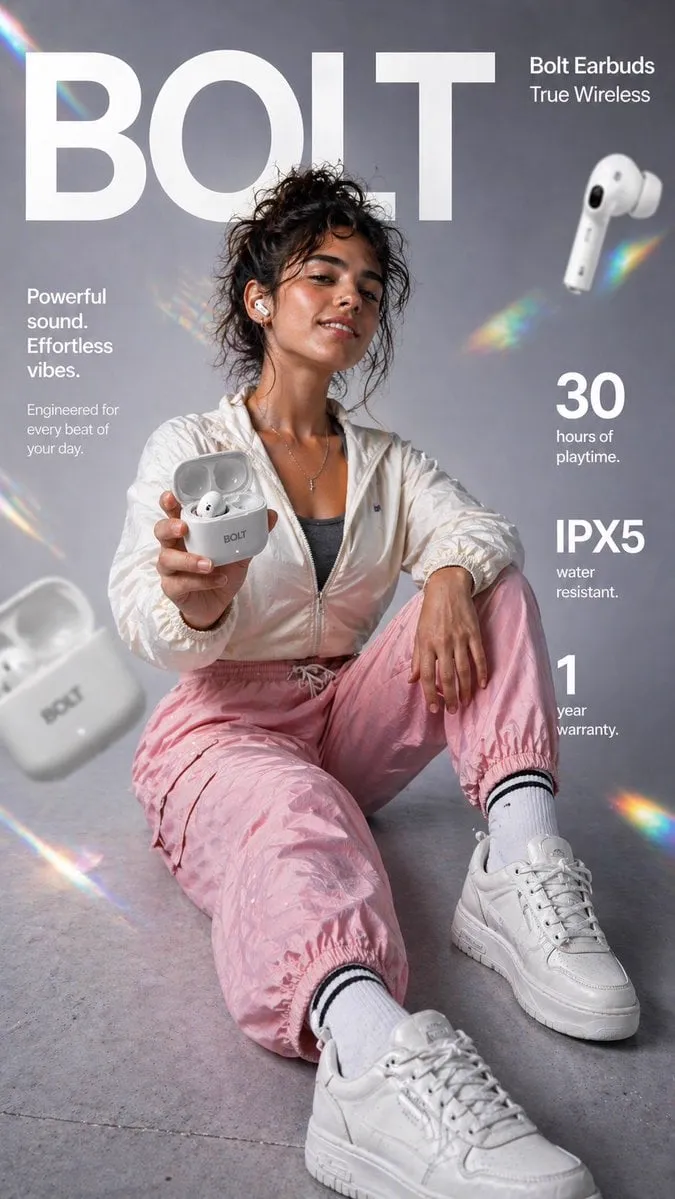
Composition, lighting, and subject accuracy come from the underlying model, and most free tools today route to the same generation of diffusion models that powered premium products a couple of years ago. That means a free tool can produce an advertising-quality concept, a believable product mockup, an editorial portrait, or a stylized landscape. What it may struggle with is 4K output, surgical edits, or generating two hundred variations in a single batch.
For most content work, that trade is fine. Blog headers, social posts, thumbnails, presentation slides, and storyboard frames typically need between 1024 and 2048 pixels on the long edge. Free tiers handle that comfortably.
The real constraint is not quality. It is discipline. Free access rewards people who plan their shot before they type, and punishes people who type a vague sentence and hope.
How text-to-image generation actually works
Understanding the mechanism changes how you write prompts. You do not need to read research papers, but you do need a rough mental model.
Diffusion in plain language
A diffusion model learns by taking millions of images and adding noise to them until nothing recognizable remains. Then it learns the reverse process: given a noisy image and a text description, remove the noise in the direction that matches the description. At generation time you start from pure random noise and let the model denoise it step by step, guided by your prompt.
Two consequences follow. First, every generation is a controlled hallucination, not a search through a database, so the same prompt can produce different results each run. Second, the prompt acts as a weak steering signal applied repeatedly across many steps rather than a direct instruction. That is why word order, phrasing, and emphasis matter so much.
Text encoders and why phrasing matters
Before denoising begins, your prompt is converted into numerical embeddings by a text encoder. Words that appear together in training data end up close together in that space. This is why conventional phrasing works better than clever phrasing. Write image captions, not commands.
Compare these two:
- Weak: make me a cool futuristic city with lots of neon and it should be night and there should be a person
- Strong: a lone figure in a translucent raincoat standing on a wet rooftop, neon signage reflecting in puddles, dense cyberpunk skyline in the background, night, cinematic wide shot, shallow depth of field
The second version reads like a caption because that is exactly the kind of text the model was trained on.
What free access usually includes
Practically speaking, free access tends to include a daily generation cap, standard resolution output, a queue during peak hours, and basic controls such as aspect ratio and style presets. Advanced features — high-resolution upscaling, region-specific editing, and batch variation — are sometimes limited. The workflow below is designed around those constraints rather than against them.
Choosing a generator: decision criteria
Rather than asking which tool is best, ask which tool fits the job. Four criteria resolve most decisions.
Output resolution and refinement controls
If your final use is a printed poster, resolution is the deciding factor. If it is a social post or a video overlay, it is almost irrelevant. Beyond resolution, look for two controls: an aspect ratio selector and any form of inpainting or region editing. A tool that lets you fix one bad hand is worth more than a tool that renders slightly sharper textures.
Style range and consistency
Some models excel at photorealism, others at illustration, anime, 3D renders, or graphic design. Test each candidate with the same three prompts: a portrait, a product on a plain background, and a stylized landscape. The tool that handles all three acceptably is more useful than the one that nails only one category.
Consistency matters too. If you need a recurring character or a branded look, check whether the tool supports reference images or style anchors. Without them, every generation drifts.
Licensing and watermarking
Read the terms before you publish. Key questions: Do you own the output? Is commercial use permitted? Is there a visible watermark, and can it be removed? Are there restrictions on depicting real people or trademarks? Free tools vary widely here, and the answer affects whether an image is usable in client work at all.
Speed, queue behavior, and batch generation
A tool that returns an image in eight seconds lets you iterate twenty times in a session. A tool that takes two minutes kills experimentation. If you are exploring, prioritize speed. If you are refining a final asset, prioritize control. Many creators keep two tools for exactly this reason: a fast one for ideation and a slower, more precise one for finishing.
Prompt structure that gets more out of a free tool
A prompt is a specification. Treat it like a shot list for a photographer who has never met you.
Subject, action, environment, lighting, lens
Build prompts in layers, in this order:
- Subject and action — who or what, doing what
- Environment — where, at what time of day, in what weather
- Lighting — soft window light, harsh midday sun, neon glow, rim light
- Camera and lens — wide angle, 85mm portrait, macro, drone shot, low angle
- Mood and style — muted documentary, vibrant editorial, grainy film
Example: a ceramic coffee mug on a linen tablecloth, steam rising, morning kitchen window behind it, soft directional light from the left, 50mm lens, shallow depth of field, warm muted tones.
Each layer narrows the distribution of possible images. Three or four layers is usually enough. Six or more and the model starts dropping the least emphasized one.
Emphasis and word order
Put the most important element first. Models tend to weight the beginning of a prompt more heavily because of how attention is distributed. If the subject is a person, do not bury them behind three paragraphs of atmosphere.
When a tool supports weighted syntax, use it sparingly. Doubling the emphasis on one element often works better than weighting every element at once.
Negative prompts
Negative prompts tell the model what to steer away from. Useful entries include: text, watermark, extra fingers, distorted hands, blurry, low contrast, oversaturated, mutated anatomy, duplicate limbs, cluttered background.
Use negatives as a repair mechanism, not a default. If your images look plastic, add oversaturated and glossy. If they look busy, add cluttered and busy composition. Targeted negatives beat a long generic list.
Aspect ratio and composition planning
Decide the crop before you generate. A 16:9 frame forces a wide composition, which is perfect for video overlays and blog headers. A 9:16 frame suits vertical video and mobile stories. A 1:1 frame works for product shots and avatars.
If you generate a square image and crop it to widescreen later, you lose the edges of the composition — often the most interesting part. Generate at the target ratio and compose inside it.
The iteration loop: from rough draft to final frame
Serious results come from loops, not single prompts. A typical loop looks like this: generate four variations, pick the closest, refine it, then fix local problems.
Image-to-image refinement
Feed your best draft back in as a reference image and ask for a variation at moderate strength. At low strength you get small changes; at high strength you get a reinterpretation. This is the fastest way to explore a concept without losing the composition you liked.
A practical routine: keep strength low, adjust one variable at a time — lighting, then color palette, then background complexity. Changing three variables at once makes it impossible to know what improved the image.
Inpainting for detail repair
Inpainting masks a region and regenerates only that area. This is how you fix a malformed hand, replace a distracting background object, or change the color of a jacket without touching the rest of the image.
Two habits make inpainting reliable. First, mask generously — a tight mask creates seams. Second, keep the prompt for the masked region short and specific, describing only what belongs inside the mask.
Outpainting to change format
Outpainting extends the canvas beyond the original frame. It is the standard fix for turning a square image into a wide banner or a vertical story asset. Extend in stages rather than all at once; two moderate extensions produce fewer artifacts than one dramatic one.
Upscaling and cleanup
Once the composition is final, upscale for print or high-resolution display. Most free pipelines offer a basic upscaler. If sharpening introduces halos or plastic textures, apply a light denoise afterward or reduce the upscale factor. For web use, downscaling a slightly oversized image usually looks cleaner than upscaling a small one.
Turning stills into motion: image-to-video workflows
Stills are often the beginning, not the end. Image-to-video generation animates a finished frame, which makes it the most controllable way to produce short clips.
Plan shots from a still
Start with a frame that already reads well: clear subject, uncluttered background, visible depth cues. Motion amplifies whatever is in the frame, including mistakes. A slightly awkward pose becomes very awkward when it moves.
Camera moves and motion prompts
Describe camera behavior separately from scene behavior. Slow dolly in, gentle parallax, drifting fog, hair moving in a light breeze. Keep the list short. Two or three motion cues produce a coherent clip; six produce chaos.
Consistency across shots
If you need multiple shots of the same character or product, lock your visual anchors first: clothing, color palette, lighting direction, lens choice. Reuse the same reference image and the same descriptive block across every shot, changing only the action and camera angle. Consistency comes from repetition, not from describing things better.
Practical limits
Short clips — two to five seconds — are where still-to-video shines. Longer sequences usually need editing: cut several short clips together in a timeline editor, add transitions, and let the edit hide the seams.
Common mistakes and how to fix them
Overstuffed prompts
More words do not mean more control. If a prompt exceeds roughly sixty words, start cutting. Remove adjectives that do not change the image and keep the structural layers.
Ignoring aspect ratio
Generating square and cropping later is the most common source of weak compositions. Fix it by generating at the final ratio and planning the empty space deliberately.
Chasing detail instead of composition
A technically sharp image with a dull composition loses to a slightly soft image with strong framing. Before you upscale, check the silhouette, the negative space, and the focal point. If the composition is weak, regenerate rather than refine.
Forgetting the publish pipeline
An image that looks great in the generator can fall apart once it is compressed, resized, and placed next to text. Always preview the final asset in context — inside the post layout, the slide, or the video timeline — before you commit.
Treating the first output as final
The most reliable predictor of quality is how many iterations you allowed yourself. Plan for at least four rounds: rough concept, composition lock, detail repair, final polish.
A pre-publish quality checklist
Run through this before exporting:
- Composition: clear focal point, intentional negative space, nothing important near the crop edge
- Anatomy and objects: hands, eyes, reflections, and text-free zones checked at full zoom
- Consistency: palette, lighting direction, and style match the rest of the project
- Resolution: long edge matches the target placement, with headroom for cropping
- Licensing: commercial use confirmed, watermark removed or accounted for
- Context test: viewed inside the final layout, not just in the generator preview
- File hygiene: sensible filename, correct format, reasonable file size
Frequently asked questions
Do free generators produce commercial-quality images?
Yes, for most digital placements. The limiting factors are usually resolution and licensing rather than visual quality. Check the terms of the specific tool before using an image in client work, and keep documentation of how each asset was produced.
Why does the same prompt give different results every time?
Generation starts from random noise, so each run follows a slightly different denoising path. Some tools let you fix a random seed to reproduce a specific result. If yours does not, save the exact prompt and reference image so you can approximate it later.
How long should a good prompt be?
Between twenty and sixty words works for most subjects. Write in layers — subject, environment, lighting, lens, style — and stop when adding a new layer no longer changes the output.
Is image-to-image better than text-to-image?
They solve different problems. Text-to-image is for exploration and fresh concepts. Image-to-image is for controlled variation and refinement once you know what you want. Most professional workflows use both in sequence.
How do I keep a character consistent across many images?
Lock a reference image, describe the character in a fixed sentence you reuse verbatim, and change only the action, environment, or camera angle between generations. Consistency is a repetition problem, not a prompting problem.
What do I do about hands and faces that look wrong?
Generate more variations before you edit. If most outputs have correct anatomy and only one detail is off, inpaint that region with a short, specific prompt. If the anatomy is wrong in every attempt, simplify the pose or the framing.
Can I use generated stills in a video project?
Yes, and this is one of the strongest use cases. Generate a frame at the target aspect ratio, animate it into a short clip, and assemble several clips in an editor. Keep camera moves minimal so the clips cut together cleanly.
How many generations should I expect to need?
Budget at least ten to twenty attempts for a polished hero image, and fewer for simple product or background shots. Speed is your friend here: fast tools let you iterate more, and more iterations reliably beat better prompts.
Where to go next
Pick one tool, run the same three test prompts you would use to compare any competitor, and build a small personal library of prompts that reliably work. From there, the workflow compounds: faster ideation, tighter iteration, and a repeatable path from a written idea to a finished frame and, when you need it, a moving shot.
The tools will keep changing. The discipline — plan the shot, layer the prompt, iterate deliberately, verify in context — will not.
