
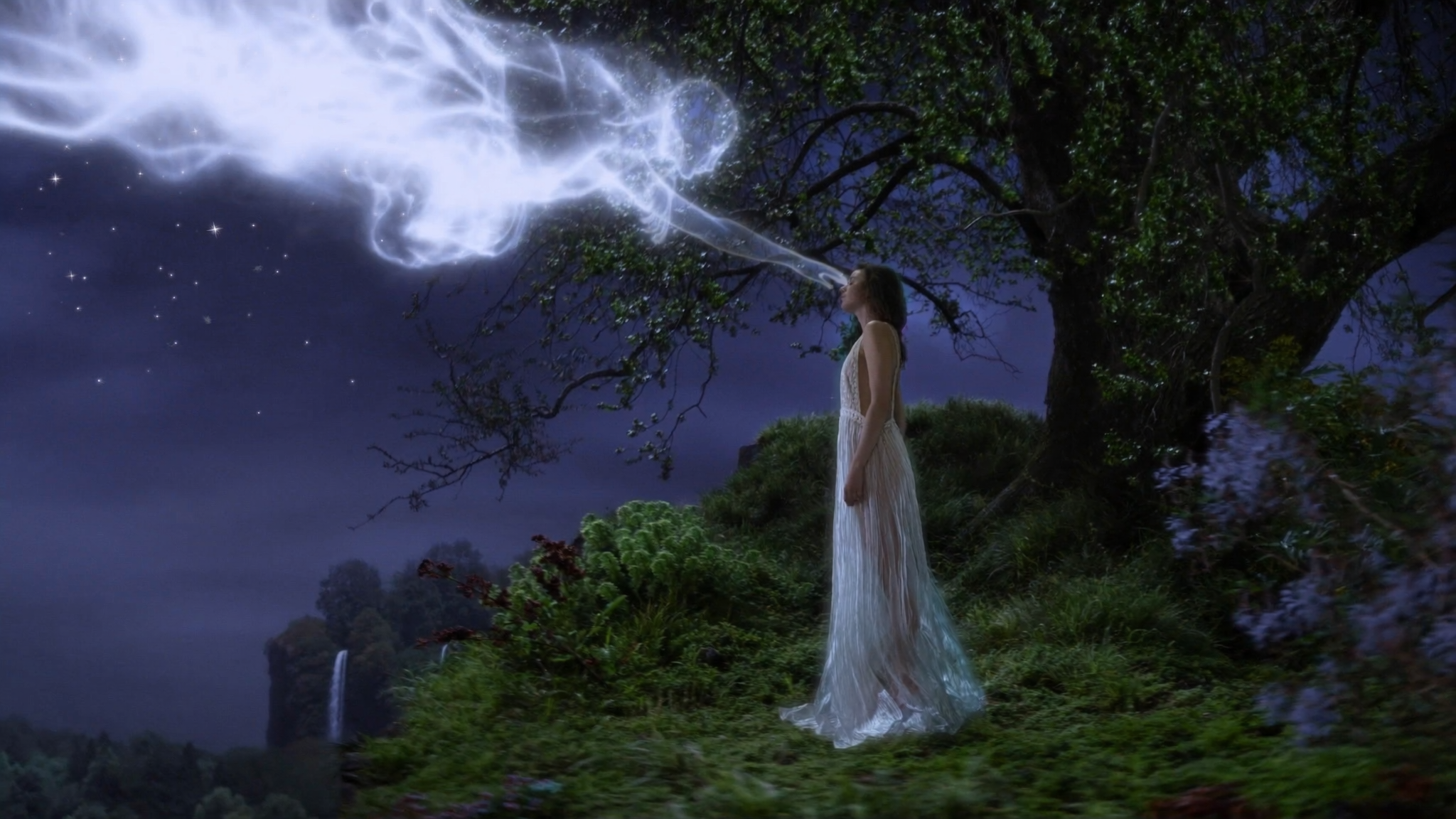

Photorealism Has Become the Baseline, Not the Wow Factor
A few years ago, a convincing AI-generated photograph was a talking point. Today it is a delivery requirement. Art directors ask for photorealistic key visuals on Monday and expect three directions by Wednesday. E-commerce teams want forty product variations before a shoot is even booked. Motion designers want a still that can be pushed into a five-second video loop without falling apart under scrutiny.
The change is not only about speed. It is about where images come from. Instead of a linear pipeline that starts with a location scout and ends with a retoucher, visual production now loops directly into strategy. A campaign concept can be tested visually the same afternoon it is written. A packaging idea can be seen on a shelf before the mold exists. A storyboard can look like a film frame instead of a sketch.
That shift raises the bar rather than lowering it. When credible imagery is cheap and fast, the differentiator becomes direction: the precise idea, the correct light, the believable material behaviour, the exact moment that makes someone stop scrolling. This guide walks through a repeatable workflow for producing photorealistic AI imagery for design, advertising, product work, and video, plus the failure modes that quietly ruin otherwise good results.
What "Photorealistic" Actually Means in an AI Output
Photorealism is not a single property. It is the sum of several independent things that viewers check unconsciously. When one of them fails, the whole image reads as artificial even if the viewer cannot explain why.
Optical plausibility
Real photographs are made by glass. They have depth of field, controlled focus falloff, subtle chromatic aberration near the edges, lens flare where a bright source hits the front element, and a slight vignette. AI output that is technically sharp everywhere and perfectly flat across the frame looks like a render, not a photograph. Adding a lens description and an aperture value does more for believability than any amount of extra detail keywords.
Material and texture fidelity
Skin has pores, subsurface scattering, and a slightly uneven tone. Fabric has a weave and behaves differently under tension. Metal reflects its environment; matte plastic does not. Water refracts. These behaviours are what separate a good generation from a bad one, because the eye reads material cues long before it reads subject matter.
Narrative plausibility
This is the most overlooked layer. A photorealistic image of a person holding a cup needs the hand to grip it convincingly, the fingers to have correct joint structure, the liquid level to make sense, and the shadow to match the light source. Objects need to belong to the scene: a chair that is the right height for the table, reflections that align with the environment, clothing that folds under gravity.
The Technology Stack in Plain Language
You do not need to understand the mathematics to get better output, but a working mental model helps you choose the right tool and the right controls.
Diffusion models and latent space
Most current image generators work by starting with noise and progressively denoising it toward an image that matches your instructions. The process happens in a compressed representation of the image rather than raw pixels, which is why small changes in wording can produce large changes in composition. It also explains why generation is iterative: the model is making decisions at every step, and controls can steer those decisions at different points.
Conditioning: text, image, depth, pose
Text prompts are only one way to steer a generation. Reference images influence style and subject. Depth maps and pose skeletons lock composition and anatomy. Control networks for edges and segmentation let you define exactly where an object sits while the model invents the rest. For design work, this is the difference between hoping for a layout and specifying one.
Specialized models, upscalers, and finishing tools
A general-purpose model is a good starting point and rarely the final step. Dedicated upscalers restore micro-detail at large sizes. Face restoration tools repair small features. Relighting and material tools let you change the light direction on a finished image. Compositing software still does the work of combining elements and correcting colour. Treat the generator as the first stage of a pipeline, not the whole pipeline.
A Repeatable Photorealistic Workflow, Step by Step
This sequence works for a single hero image, a campaign set, or a product catalogue. It is deliberately front-loaded: the more you decide before generating, the fewer rounds you spend guessing.
Step 1 — Write the brief before the prompt
Write one paragraph describing the image in plain language: who or what is in frame, where the camera stands, what the subject is doing, what the emotional tone is, and where the image will be used. Include the format and crop. A prompt written from a clear brief is shorter and more consistent than a prompt built by stacking adjectives.
Step 2 — Build a reference board
Collect eight to twelve real photographs that match the light, palette, and material feel you want. These are not for copying; they are for calibration. If the tool supports image references or style conditioning, use them. If not, describe the shared qualities in words: soft north-facing window light, neutral grey background, shallow depth of field, muted teal and sand palette.
Step 3 — Generate wide, then narrow
Produce a large batch at low or medium resolution with varied composition, camera angle, and light. Resist the urge to perfect the first image. Look for one that has the right structure, then generate variations around it. Iterating on a strong base is far more efficient than fixing a weak one.
Step 4 — Repair and composite
Fix hands, text, and reflective surfaces with inpainting rather than regenerating the whole frame. Composite separate elements when a single generation cannot satisfy all constraints: one pass for the person, one for the product, one for the background, then merge with matched perspective and light. Keep each element on its own layer so revisions stay cheap.
Step 5 — Upscale, grade, and finish
Upscale in stages rather than jumping straight to maximum size. Grade with a consistent colour pipeline so the set feels like it came from one camera. Add the final touches that real photographs have: mild grain, a touch of halation on highlights, and slightly soft corners. These small imperfections do more for realism than any prompt trick.
Step 6 — Extend a still into motion
If the asset will appear in video, plan for motion from the start. Choose compositions with a clear focal subject, uncluttered edges, and depth separation between foreground and background, because parallax and camera moves need layers. Generate a short clip, check stability across frames, then treat the still as the master reference so the motion stays consistent with the approved frame.
Prompt Anatomy for Believable Photographs
A good photorealistic prompt reads like a shot note from a director of photography. It is specific, ordered, and free of contradictions.
Camera and lens language
Name the format and the optics. "Shot on a 50mm lens at f/2, chest-height camera, slight downward tilt" communicates more than "professional photo." Add film stock or sensor character if it suits the brand, and specify aspect ratio early so composition is not an afterthought.
Lighting vocabulary
Describe the source, direction, quality, and colour. "Large softbox from camera left, cool daylight through a window behind, warm bounce from a wooden floor" gives the model a physically coherent scene. Avoid stacking contradictory lighting terms; they produce flat, evenly lit images that read as synthetic.
Material and environment cues
Mention the materials that matter in the frame and how they should behave: brushed aluminium with soft directional highlights, cotton knit with visible fibres, wet asphalt reflecting signage. Environment cues set the scene without overloading the prompt: an empty studio, a tiled bathroom, a windy rooftop at dusk.
Constraints that prevent common artifacts
State the negative conditions explicitly: no text, no logos, no extra fingers, no duplicated limbs, no blown highlights, no plastic skin. Keep the list short and relevant. If the tool supports a separate negative field, use it there instead of cluttering the main prompt.
Failure Modes and How to Fix Them
| Symptom | Likely cause | Fix |
|---|---|---|
| Everything is sharp | No depth cue in prompt | Add aperture, focal length, and a foreground or background element |
| Waxy skin | Over-smoothing during upscale | Reduce restoration strength, add grain, generate at higher base resolution |
| Wrong object scale | No reference for proportions | Add a familiar object to the scene for scale reference |
| Floating objects | Missing contact shadows | Specify shadow direction and surface contact in the prompt |
| Text looks scrambled | Generative text is unreliable | Remove text from generation and typeset it later |
| Set looks inconsistent | Varying light descriptions | Lock one lighting setup across the whole batch |
| Motion jitters in video | Single-layer composition | Separate foreground and background, reduce move speed |
Most of these problems come from under-specification rather than model limits. Before blaming the tool, check whether the brief actually described the light, the lens, and the material behaviour you wanted.
Where Photorealism Pays Off in Design and Business
Advertising and campaign production
The biggest gain is concept volume. A team can test twenty visual directions before committing budget, then produce the chosen direction at scale. The practical workflow is to use AI for exploration and variation, then combine it with real photography or 3D where accuracy is non-negotiable, such as products with specific branding requirements.
Product design and prototyping
Photorealistic rendering lets designers see how a form reads in context: on a shelf, in a hand, on a desk under office lighting. This is useful long before a physical prototype exists, especially for colour and finish decisions that only make sense when light interacts with the surface.
Editorial and visual storytelling
Publications use photorealistic imagery for concepts that are impossible or unethical to photograph. The key discipline is art direction: consistent framing, a defined palette, and a recurring visual grammar so a set of images feels authored rather than generated.
E-commerce and catalogue work
For catalogue-scale production, consistency beats novelty. Build a template prompt with locked camera, lighting, and background, then vary only the product and pose. Automate the boring parts and reserve human attention for the shots that carry the brand.
Ethics, Disclosure, and Rights
Photorealistic capability carries obligations. If an image could be mistaken for documentary evidence of a real event or a real person, it needs clear disclosure. Many platforms now require labelling of synthetic media, and some markets regulate it directly.
Beyond disclosure, be careful with likeness. Do not generate a recognisable person without consent, and avoid prompts that name living individuals for commercial work. Check the licensing terms of the models and datasets you rely on, particularly for client deliverables, and keep a record of which tool produced which asset so you can answer questions later. Finally, avoid training-style imitation of a specific photographer's signature work; take inspiration from lighting and palette, not from a named artist's identity.
Building a Scalable Team Workflow and QA Checklist
The difference between a hobbyist setup and a production pipeline is repeatability. Document your prompts, your settings, and your finishing steps so any team member can reproduce an approved look.
Before anything leaves the team, run this check: does the light agree across every element in the frame; do shadows land on a plausible surface; are hands, eyes, and teeth anatomically correct; is the perspective consistent between subject and background; is the material behaviour right for each surface; is the colour grade consistent across the set; has any generated text been replaced with typeset copy; and does the final file meet the delivery specification for resolution, aspect ratio, and colour space. Keep an approved reference image alongside the checklist so reviewers compare against a fixed standard rather than personal taste.
FAQ
How many generations does a usable photorealistic image usually take?
For a simple subject with a clear brief, a strong result often appears within ten to twenty attempts when composition and lighting are specified precisely. Complex scenes with multiple interacting elements usually need compositing rather than more attempts.
Can AI photorealism replace a product photographer?
For catalogue variation and concept work, it can reduce the number of shoots. For hero images where exact product accuracy, texture, and legal claims matter, physical photography still wins. The strongest results usually combine both.
Why do my images look like renders instead of photographs?
Usually because the prompt describes subject detail but not optics. Add a lens, an aperture, a light source with a direction, and a small amount of imperfection such as grain or a soft falloff at the frame edges.
Should I use one model or several?
Several. Use one for exploration, another for anatomy or texture accuracy if it performs better on your subject, and dedicated tools for upscaling and finishing. Pipelines beat single tools.
How do I keep a campaign visually consistent?
Lock the camera, lighting, colour palette, and background treatment in a written template, then vary only the subject and pose. Approve one reference image and treat it as the standard for every subsequent generation.
What resolution should I generate at?
Generate at a moderate size where the model composes well, then upscale in stages. Generating at maximum size immediately often produces softer detail and more artifacts than a staged upscale from a clean base.
Is photorealistic AI output safe for client work?
It can be, provided you disclose synthetic imagery where required, avoid unauthorised likenesses, verify model licensing, and keep a record of the tools and steps used for each asset.
