
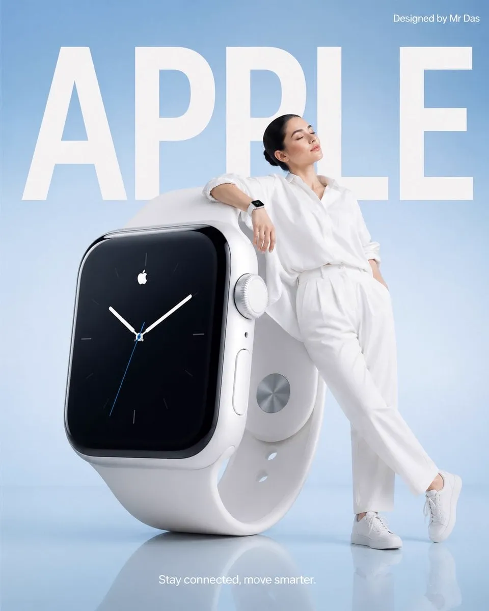
Short video advertising now absorbs the majority of paid social inventory, and the campaigns that win are rarely the ones with the biggest production budget. They are the ones where the words and the images do the same job at the same time. When copy and picture disagree, contradict each other, or fight for the same half-second of attention, viewers scroll. When they reinforce each other, a two-second glance turns into a full watch, a rewatch, and a tap.
The hard part is that text and image are usually produced by different people, at different moments, with different instincts. A copywriter writes a hook. A designer picks a font. A video editor drops a stock clip underneath. Nobody checks whether the sentence and the frame are actually saying the same thing to the same person at the same speed. This guide is a practical system for fixing that — a repeatable workflow for planning, generating, layering, testing, and scaling short video ads where typography and imagery are designed as one object.
Why text–image integration decides short-form performance
Short-form feeds are hostile environments. Sound is often off. The viewer's thumb is already loaded. The only guaranteed delivery channel is the frame itself, which means every ad is effectively a silent film with subtitles baked in.
That changes the economics of creative work. In a thirty-second television spot you could spend eight seconds establishing mood before the product appeared. In a six-second vertical ad, mood and message have to arrive together, or the ad never gets the second frame.
The most common failure pattern is what I call a split message: the visual says one thing and the text says another. A clip of a laughing group at a rooftop party sits under the line "Cut your monthly software spend by 40 percent." Both halves are fine. Together they create a small cognitive stumble, and a stumble in a feed is a scroll. Fixing that stumble is not about better writing or better footage — it is about designing the pairing.
A second failure pattern is redundancy, the mirror image of the first. The text reads "Fresh coffee, delivered" over an obvious shot of a coffee bag. The viewer gains nothing from either channel because each one repeats the other. Effective integration means the two channels carry complementary information: the image supplies context, emotion, texture, and proof; the text supplies specificity, numbers, names, and the ask.
A third pattern is legibility collapse. The copy is technically present but unreadable — white text over a blown-out sky, a bouncing word that lands on a busy background, a font weight too light for a phone screen at arm's length. The ad gets watched and not understood, which is the most expensive outcome of all.
The dual-coding principle: how people actually read a vertical ad
Human attention splits visual and verbal processing into two streams that run in parallel and then merge. This is why a well-integrated ad feels effortless: the viewer is not choosing which channel to follow, they are absorbing both and building one meaning.
The practical implications are concrete:
- Deliver the concept visually before the words confirm it. The image should raise the question the text answers. A shot of an overflowing inbox, then the line "Zero inbox in ten minutes."
- Keep one idea per beat. Two sentences on screen at once force serial reading. One sentence plus one image is a single beat.
- Match the emotional register. A playful script over a stern visual reads as sarcasm or as a mistake. Tone mismatch is more damaging than tone blandness.
- Use the image for what text is bad at. Text is terrible at conveying texture, scale, warmth, motion, and human expression. Images are terrible at conveying numbers, product names, offers, and deadlines.
A useful exercise: cover the text and watch the clip. Can you describe the intended message? Now cover the video and read the text. Does it still make sense? If either half can stand alone completely, you are probably wasting one channel.
Building the visual hierarchy for a silent-first ad
Hierarchy is the order in which the eye moves through the frame. In short vertical video you have roughly three tiers and about two seconds to establish them.
Safe zones and platform furniture
Every vertical platform reserves edges for interface elements: profile names, captions, action buttons, progress bars. A layout that ignores those zones will lose copy to a heart icon. The pragmatic approach is to design inside a centered band roughly 80 percent of the frame width and to keep the primary headline in the upper-middle third, above the region where captions and buttons typically land. Test your layouts with the interface overlay visible before you commit to a final export.
Type scale, weight, and line breaks
On a phone, at viewing distance, anything under roughly 30 pixels of cap height starts to require effort. That effort is a scroll trigger. Build your type scale around three levels only: a headline level, a supporting level, and a legal or disclosure level. More than three levels in a six-second ad is decoration, not communication.
Weight matters more than size on small screens. A medium-weight or semibold sans-serif at a generous size outperforms a thin display font at a huge size, because thin strokes disappear against moving backgrounds. Reserve display fonts for single words — a price, a category name, a punchline — and use your workhorse face for everything else.
Line breaks are a design decision, not a text-wrapping accident. Break lines where the meaning breaks. "Save 40% on your / first three months" reads better than "Save 40% on / your first three months," even though the character counts are similar, because the first version keeps the number and its object together.
Contrast, panels, and motion trails
Contrast is the single highest-leverage fix in short-form advertising. If your copy struggles against a background, you have three options: darken or blur a region behind the text, place the text on a semi-transparent panel or shape, or delay the text until the background settles. A soft gradient scrim under a headline is cheap, invisible when done well, and dramatically more readable than a drop shadow.
Motion trails matter when type animates. A word that slides in at speed leaves a perceptual smear, and if the next word starts before the previous one lands, the viewer reads a blur. Give each animated line a settle time of at least 200–300 milliseconds before the next element enters.
Reading speed and on-screen duration
Average silent reading speed for short on-screen text is roughly 200–250 words per minute, but the effective rate drops in an ad because the viewer is also processing the image. Budget generously: a five-word line needs about 1.2 to 1.5 seconds on screen, plus whatever time the eye needs to travel to it. In a fifteen-second ad, that means roughly eight to twelve distinct text moments at most. Anything beyond that becomes a teleprompter.
A step-by-step production workflow
Step 1 — Write the script as a text architecture
Start by writing the ad as on-screen text only, with no imagery at all. Strip it to the bone: hook, tension, proof, offer, call to action. Read it aloud at the pace it would appear. You are not writing a script for a voice actor; you are designing the verbal layer of the frame.
Then mark each line with a function label: attention, context, benefit, proof, or action. If you have three benefit lines and no proof, the structure is unbalanced, and this is the cheapest possible moment to find that out.
Step 2 — Storyboard frames and mark text moments
Build a simple shot list where each row contains a timecode range, a visual description, and the text that occupies that range. Keep a strict one-to-one relationship: one visual idea and one verbal idea per row. When a row has two visuals or two sentences, split it.
For a fifteen-second ad, ten to fourteen rows is a workable granularity. For six seconds, aim for four to five.
Step 3 — Generate or shoot the base visuals
This is where the visual channel gets its content. You have three broad sources, and the right answer is usually a mix:
- Generative video models for concept shots, stylized environments, abstract motion, and anything expensive or impossible to film. Text-to-video handles mood and texture beautifully; image-to-video gives you far more control when the frame must match a product or a layout.
- Product or lifestyle footage for anything that must be literally accurate — packaging, a screen UI, a person's face in a close-up.
- Graphic motion for data, price comparisons, and interface walkthroughs, where clarity beats realism.
Generate more variants than you need. Three to five takes per shot, then choose the frame whose composition leaves natural empty space for your copy. Never generate a shot and then hunt for somewhere to put the words; brief the empty space as part of the shot.
Step 4 — Control keyframes so motion serves the copy
Keyframe control is the difference between a generated clip you accept and a clip you direct. Pick the frame where your text lands and make that frame the visual's clearest composition — subject centered or offset cleanly, background calm, contrast high. Then keyframe the motion so that the clip either settles into that frame or moves away from it, never through it.
Practical rules that hold up across most models: avoid fast camera pushes during a headline; avoid subject motion that crosses the text region; prefer slow lateral or gentle parallax moves behind static type; and end each shot on a held frame if the copy needs to be read twice.
Step 5 — Animate the text layer
Text animation should express hierarchy, not personality. Three moves cover almost everything: a quick fade or rise for supporting lines, a masked reveal or type-on for the hook, and a scale or color change for the offer. Keep easing consistent across the whole ad — one easing curve, applied everywhere, is what makes a montage feel designed rather than assembled.
Two technical habits pay off. First, animate in the same timeline as the video so you can nudge type in response to motion rather than guessing in a separate graphics tool. Second, keep every text element on its own layer so you can export alternate language versions without rebuilding the composition.
Step 6 — Mix audio and export platform variants
Sound is a bonus channel, not the primary one, but it still influences perception. A subtle whoosh under a text entrance, a low bed with no vocal, and a clear rhythmic hit on the call to action all increase retention without requiring the viewer to hear anything specific.
Export in three ratios — vertical, square, and landscape — from the same composition. If you follow the safe-zone guidance above, the vertical version will survive intact; for square and landscape you will need to reposition type rather than simply crop, because the text block is the element that breaks first.
Choosing a generation approach for each shot type
Not every shot deserves the same tool. A quick decision framework:
- Concept or mood shot, no specific product: text-to-video, generate broadly, choose on composition.
- Shot that must match a real object or brand asset: image-to-video from a reference frame, or a photographed still animated with subtle parallax.
- Talking-head or demonstration: shoot it. Generated humans still struggle with the micro-expressions that make a testimonial credible.
- Data, price, or comparison: build it in motion graphics. Generation adds unpredictability to content that must be exact.
- Transition or texture insert: generative abstract motion is fast and forgiving here.
One more criterion: iteration speed. A model you can re-run three times in the time another takes to render once is often the better choice for a campaign where you will test twenty hooks.
Platform formatting rules that change your layout
Every feed applies its own constraints, and the differences are large enough to change your design decisions rather than just your export settings.
Aspect ratio drives type position. In a 9:16 frame, the eye lands near the vertical center; in 1:1 it stays near the middle band; in 16:9 the viewer scans horizontally, so a left-aligned text block reads faster than centered type.
Caption overlap drives safe zones. Feeds with burned-in or auto-generated captions effectively reserve the lower third. If your ad relies on a lower-third call to action, it will be covered on at least one major placement.
Loop behavior drives endings. Feeds that loop seamlessly punish ads that end on a hard cut back to a black frame. Designing the last frame to resemble the first creates a subtle continuous loop that inflates view counts and holds attention longer.
Mute-by-default drives everything. Assume no audio for the first pass and treat the mix as an enhancement for viewers who opt in.
A testing framework that isolates text and image
Most creative testing changes too many variables at once. To learn something useful, isolate the channels.
Test 1 — Text swap, same visual. Keep the footage identical and change only the headline. This tells you whether your message or your imagery carries the ad.
Test 2 — Visual swap, same text. The inverse. If performance barely moves, your copy is doing all the work and your visuals are decoration.
Test 3 — Timing shift. Same copy, same visuals, but move the headline two seconds earlier or later. Timing changes frequently outperform both copy and creative changes, and it is the cheapest variable to control.
Test 4 — Legibility variant. Add a scrim or increase type size with no other change. This is your control for comprehension, not persuasion.
Measure at the level that matches the test. For hook tests, look at three-second retention and thumb-stop rate. For message tests, look at completion rate and click-through. For offer tests, look at conversion and cost per acquisition. Judging a hook test on conversions wastes spend; judging an offer test on retention wastes insight.
Common mistakes that flatten performance
- Text over busy motion. The eye cannot read and track simultaneously. Give type a calm region to live in.
- Front-loading the brand. Nobody stays for a logo. Lead with the tension, earn the brand mention.
- Reading the copy aloud verbatim. Dubbing exactly what is on screen doubles cognitive load and consumes the audio channel for nothing.
- One monolithic export. A single ratio with the type hard-coded for vertical will fail on other placements.
- Ignoring the second read. Viewers often rewatch. Make sure your densest information — price, offer, name — sits where a rewatch will land on it.
- Over-animating. Every bouncing, sliding, spinning word steals attention from the one word that matters.
- No held frame. If the call to action appears and the ad cuts instantly, the viewer never had time to act on it.
Scaling without losing coherence
Once a structure works, scale it by templating the invisible parts. Fix your type scale, your scrim treatment, your easing curve, your transition style, and your ending frame. Then vary only the hook, the visual subject, and the offer.
Build three asset libraries:
- Hook bank — twenty written openings mapped to your five highest-performing angles.
- Visual bank — generated and shot clips tagged by composition type: center-clear, left-clear, busy, calm, motion-heavy. When a new hook needs empty space on the right, you already know which clips qualify.
- Motion bank — saved text-animation presets so a new ad takes minutes to assemble rather than hours.
This is also how teams localize efficiently. Because the text lives on separate layers over a language-neutral visual base, a translated version is a text pass, not a re-shoot.
FAQ
How much text is too much text in a six-second ad?
A practical ceiling is fifteen to twenty words in total across the whole ad, split into three to five short moments. If you need more, either extend the runtime or accept that most viewers will retain only the hook and the call to action.
Should the on-screen text match the spoken script?
No. Let the voice carry nuance, tone, and personality, and let the on-screen text carry the hard information: numbers, product names, deadlines, and the ask. They should complement, not duplicate.
Is AI-generated footage good enough for paid ads?
For concept, mood, environment, and abstract inserts, yes — frequently indistinguishable at feed resolution and much cheaper to iterate. For faces in close-up, packaging accuracy, and anything legally sensitive, shot footage or heavily controlled image-to-video remains safer.
How do I keep text readable over moving footage?
Three layered defenses: a gently darkened or blurred backdrop region, a subtle gradient scrim behind the type, and a settle frame where the motion slows exactly when the words land. Any one of these helps; all three together make the copy essentially unmissable.
What is the first thing to fix in an underperforming ad?
Legibility, then timing, then copy. Poorly readable text and mistimed reveals suppress performance more often than a weak message does, and both cost nothing to change.
How many variants should I produce per concept?
Three to five, built from the same structure with different hooks and visual subjects. Beyond that, you are spending production time on variants that will never receive enough impressions to produce a statistically meaningful signal.
Where to start this week
Pick one live ad and rebuild it as a silent film. Write the on-screen text first, storyboard one visual per line, generate or select footage with deliberate empty space for the type, keyframe the motion so it settles under the words, and export three ratios from a single composition. Then run the text-swap and timing tests and let the data tell you which channel was carrying the ad all along.
The teams that internalize this do not just make better ads. They make faster decisions, because every disagreement about a campaign becomes a testable question about a specific pairing of words and frames — and that is a far shorter argument than a debate about taste.
