
Why Thumbnails Decide Whether Your Video Gets Watched
A thumbnail is not decoration. It is the first half of a promise, and on most platforms it is the only part of your video a viewer will ever consciously evaluate before deciding to spend time on it. In a crowded feed, the thumbnail competes with dozens of other rectangles for a fraction of a second of attention. If it loses that micro-contest, nothing else matters: not your script, not your lighting, not the twenty hours you spent in the edit.
This is why click-through rate deserves the same seriousness you give to retention. A thumbnail that lifts click-through from three percent to six percent does not just double your views on a given impression count — it also feeds the recommendation system more signals that your content is worth distributing. The thumbnail and the algorithm are not separate problems. They are the same problem viewed from two angles.
The practical challenge is that thumbnail design is usually treated as an afterthought. You finish the video, export it, and then scramble to grab a frame and slap on some text. That order guarantees mediocre results. Strong covers are designed with a workflow: a defined promise, a deliberate composition, a controlled text layer, and a testing loop that turns guesses into decisions. What follows is that workflow, from the writing stage through export and iteration, plus the places where AI genuinely helps and the places where it quietly makes covers worse.
The Visual Anatomy of a Thumbnail That Earns the Click
Before tools and templates, it helps to understand what the eye actually does when it hits a grid of covers. It does not read. It scans for contrast, faces, and meaning. Everything below serves those three instincts.
Contrast Is More Important Than Color Choice
Beginners obsess over which colors look nice. Experienced designers obsess over whether the subject separates from the background. A cover can use the most tasteful palette imaginable and still fail because the subject blends into the environment.
The fix is not more saturation. It is separation: value contrast (light against dark), hue contrast (warm against cool), and edge contrast (sharp detail against soft blur). A quick test is to squint at your thumbnail until it turns into a blurry shape. If you can still identify the subject instantly, your contrast is working. If it becomes a muddy rectangle, no amount of text will save it.
A useful constraint: pick two dominant colors and one accent. Use the accent only on the element you want noticed first — the face, the object, or a single word. When everything is loud, nothing is loud.
Composition: One Focal Point, One Direction
Amateur covers usually contain three or four competing ideas: a person, an arrow, a logo, an emoji, three lines of text, and a busy background. The viewer's eye has nowhere to land, so it moves on.
Professional covers commit to one focal point. Everything else is support. That means deciding early what the single most interesting visual element is — a facial expression, a reaction, an unusual object, a before-and-after split — and building the frame around it.
Composition rules that survive contact with real feeds:
- Follow the rule of thirds loosely. Place the subject slightly off-center so text has room, but do not let the subject drift so far that it feels accidental.
- Reserve a text zone. Decide where words will live before you pick the frame, not after.
- Lead the eye inward. Diagonal lines, gaze direction, and pointing gestures should push attention toward the center of the frame, not out of it.
- Leave breathing room. Cropping a face tightly can intensify emotion, but clipping it at the edges makes the cover feel broken when the platform rounds the corners.
Faces, Emotion, and the Direction of a Gaze
Human faces are the strongest available attention magnet, and emotion is what makes a face worth looking at. Neutral expressions are almost invisible. Exaggerated but genuine expressions — surprise, disbelief, delight, concentration — read even at very small sizes.
Eye direction matters too. A subject looking at the camera creates a direct challenge: look at me. A subject looking toward an object or a text block invites the viewer to follow the gaze and find out what is so interesting. Both work; mixing them without intent does not.
One caveat: not every video needs a face. Tutorials about objects, comparisons, results, and satisfying processes often perform better with a clean product shot or a bold graphic. The question is whether a face adds curiosity or just adds clutter.
A Repeatable Thumbnail Workflow, Start to Finish
The workflow below is designed to run in roughly thirty to sixty minutes once you are practiced, and it works for long-form videos, shorts, and course modules alike.
1. Write the Promise Before You Design
Open a blank file and finish this sentence in under ten words: "This video shows you ___." If you cannot finish it, your thumbnail has nothing to say, and no design trick will fix that.
Next, identify the emotional gap: what does the viewer not yet know or not yet believe? Curiosity gaps work because they create an open loop the brain wants closed. A cover that answers its own question has no reason to be clicked.
2. Pick the Keyframe Instead of Inventing One
Many creators try to design a cover from scratch. It is usually faster and more honest to find it inside the footage. Scan your timeline for moments with strong expression, clear gesture, or a visually striking setup. Export five to ten candidate frames rather than one.
When you review candidates, ask:
- Is the subject distinct from the background at thumbnail size?
- Is the expression readable, or is it frozen in a blink or mid-word grimace?
- Is there negative space where text can live?
- Does the frame hint at the payoff without giving it away?
This is where AI-assisted shot ranking can help. Tools that score frames for sharpness, face visibility, and composition can surface candidates you would have skimmed past in a twenty-minute timeline. Treat their output as a shortlist to review, never as a final answer.
3. Build the Composition on a Grid
Drop your chosen frame into a canvas that matches the platform's aspect ratio — 16:9 for standard video, 9:16 for vertical. Add a grid overlay at thirds. Position the subject so the eyes sit near an upper third intersection, then adjust until the frame feels balanced rather than centered.
If the subject was shot against a cluttered background, simplify it. Options in order of preference:
- Reframe and crop to exclude the clutter.
- Blur or darken the background to push it back.
- Replace the background using a matte or segmentation tool.
- Composite in a new background generated or photographed specifically for the cover.
Background replacement is where AI image tools shine, because they can generate a plausible environment that matches the lighting direction of your subject. The failure mode is obvious mismatch: a warm-lit face placed on a cool blue background looks like a cutout, and viewers register that wrongness even if they cannot name it.
4. Add Text as a Second Voice
The text layer should not repeat what the image already shows. If the image shows a shocked face in front of a broken machine, the text should not say "shocked." It should say something the image cannot: "Two-minute fix" or "I was wrong."
Aim for three to five words. Two words are often stronger. Use a heavy, geometric sans-serif that stays legible when scaled down, and add a subtle outline, shadow, or backing shape so the text survives against any background. Never let text sit directly on a busy area without separation.
5. Test at Real Size, Then Export
Before you export, shrink your cover to the size it will actually appear in a feed — often smaller than a postage stamp — and look at it on a phone screen, not a 27-inch monitor. Most bad thumbnails were approved at full size.
Export at the platform's recommended resolution, use a compression setting that keeps text edges crisp, and keep a layered source file so you can revisit the design later without starting over.
Where AI Helps — and Where It Hurts
AI has become a genuine productivity layer in cover design, but it is not a substitute for a visual idea. Here is a realistic division of labor.
Backgrounds, Props, and Mood
Generative image models are excellent at producing backgrounds, textures, props, and atmospheric lighting that would otherwise require a shoot. Describe the shot in terms of camera angle, lighting direction, and mood rather than vague adjectives. "Low-angle shot, hard side light from the right, dark workshop, shallow depth of field" produces far more usable output than "cool background."
Generate several variations, then pick the one whose light direction matches your subject. Consistency of lighting is what makes a composite look real.
Keyframe Selection and Shot Ranking
Automated analysis can flag frames with open eyes, sharp focus, clear subject separation, and strong expression. On long recordings — interviews, livestreams, game sessions — this saves real time. The discipline is to treat the ranking as a filter, not an editorial decision. A technically perfect frame can still be emotionally empty.
Cleanup: Upscaling, Relighting, Cutting Out Subjects
Three AI-assisted cleanup tasks consistently pay for themselves:
- Upscaling a frame pulled from compressed footage so it survives enlargement without mush.
- Relighting a subject so the light on the face matches the new background.
- Matting to isolate a subject with clean edges, especially around hair.
A warning that applies to all three: heavy processing creates a plastic look. Viewers may not identify why a cover feels off, but they feel it. Keep enhancement subtle and compare against the original at thumbnail size.
The Temptation to Generate Everything
Fully generated covers with no real footage often underperform because they lack specificity. Audiences have learned to recognize generic AI imagery, and a cover that could belong to any channel builds no trust. The strongest results usually come from a real frame, a deliberate crop, and AI used to solve one specific problem.
Text on Thumbnails: Fewer Words, Sharper Hooks
Text is the most misused element in thumbnail design. The instinct is to explain. The better instinct is to provoke.
Patterns that consistently earn clicks:
- The unfinished statement. "This should not work" invites the click; "This technique works" does not.
- The specific number. "3 settings" is more credible than "some settings."
- The contrast pair. "Cheap vs. expensive" gives the eye two things to compare in one glance.
- The direct address. "You are doing this wrong" creates personal stakes.
Patterns that consistently fail:
- Repeating the video title word for word.
- Sentences longer than six words.
- Thin or decorative fonts that vanish at small sizes.
- Text placed over the subject's face.
- Multiple text blocks competing for the same glance.
One practical habit: write the text first, then design around it. Choosing the words after the composition is finished forces compromises that weaken both.
How to Test Thumbnails Without Guessing
Testing is where most creators leave performance on the table. A few rules make it useful rather than noisy.
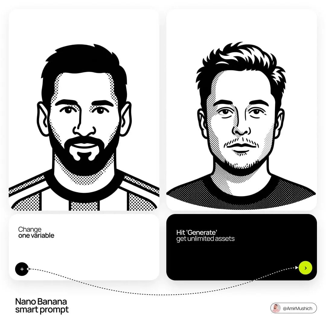
Change one variable at a time. Test the expression, the crop, or the text — not all three. Otherwise you learn nothing about cause.
Judge on click-through, not on your own preference. The thumbnail you like best is often not the one that performs best. Let the data decide.
Run tests long enough to be meaningful. Early clicks are noisy. Give each variant enough impressions to produce a stable comparison before you declare a winner.
Segment by traffic source. Browse-feed performance and search performance reward different things. A cover that wins in search may lose in recommendations because search viewers arrive with intent while browse viewers need to be intrigued.
Keep a swipe file. Save covers that made you stop scrolling — yours and other people's — and note the specific mechanic that worked: the framing, the color break, the word choice. Over time this file becomes your personal design language.
Mistakes That Quietly Kill Click-Through
Most underperforming thumbnails fail for boring, fixable reasons.
Too much detail. A cover packed with small elements looks busy at full size and becomes noise at feed size.
Low contrast with the interface. A dark thumbnail disappears into a dark feed; a white thumbnail disappears into a light one. Check how your cover reads against both.
Clickbait that lies. A cover that promises something the video never delivers wins one click and loses a subscriber. The thumbnail must be a compressed, honest version of the content.
Inconsistent series design. Viewers should recognize your channel at a glance. Consistent typography, color accents, and layout make a series feel like a body of work rather than random uploads.
Ignoring the mobile crop. Vertical and square crops of the same cover often need separate compositions, not automated resizing.
Designing last. A cover designed after the edit can only use the footage that happens to exist. Planning key visual moments during shooting gives you far better raw material.
A Pre-Publish Checklist
Run every thumbnail through this list before scheduling the upload:
- Does it read clearly at the smallest size it will appear?
- Is there exactly one focal point?
- Does the subject separate from the background through value, hue, or edge contrast?
- Is the text under six words, and does it add information the image does not carry?
- Is the text legible against its immediate background?
- Does the cover promise something the video actually delivers?
- Does it look like it belongs to your channel without reading the channel name?
- Have you compared it side by side with two competing covers in your niche?
If any answer is no, fix it before publishing. Two minutes of review beats a week of weak impressions.
FAQ
How long should thumbnail design take?
Once you have a template and a keyframe, thirty to sixty minutes is realistic. The first version of a new series takes longer because you are establishing a visual language.
Do I need professional design software?
No. Any editor that supports layers, text effects, masks, and export at full resolution will do. What matters is control over layers and text rendering.
Should every thumbnail include a face?
No. Faces help when emotion is the hook. Comparison, result, and object-focused videos often do better with clean product shots or bold graphics.
How often should I update my thumbnail style?
Review your visual language periodically, but change it for a reason — declining click-through, a new content format, or a clearer channel identity. Constant reinvention erodes recognition.
Can AI generate thumbnails from scratch?
It can generate imagery, but a fully generated cover usually lacks the specificity that makes viewers trust a channel. Use AI for backgrounds, cleanup, and candidate selection, and keep the final composition decision human.
What if my click-through drops after a change?
Revert, then isolate the variable you suspect. If the drop followed a text change, test text variants on the original image rather than rebuilding everything.
Turning One Good Thumbnail Into a System
The real leverage is not a single great cover. It is a system that produces consistently strong covers without heroic effort every time. That system has four parts: a written promise for every video, a keyframe selection habit during editing, a layered template that locks typography and safe zones, and a testing loop that turns results into rules.
Build it once and the work shifts from "how do I make this look good?" to "which of these three strong options is best?" That is a much easier question to answer — and a far more profitable one.
