


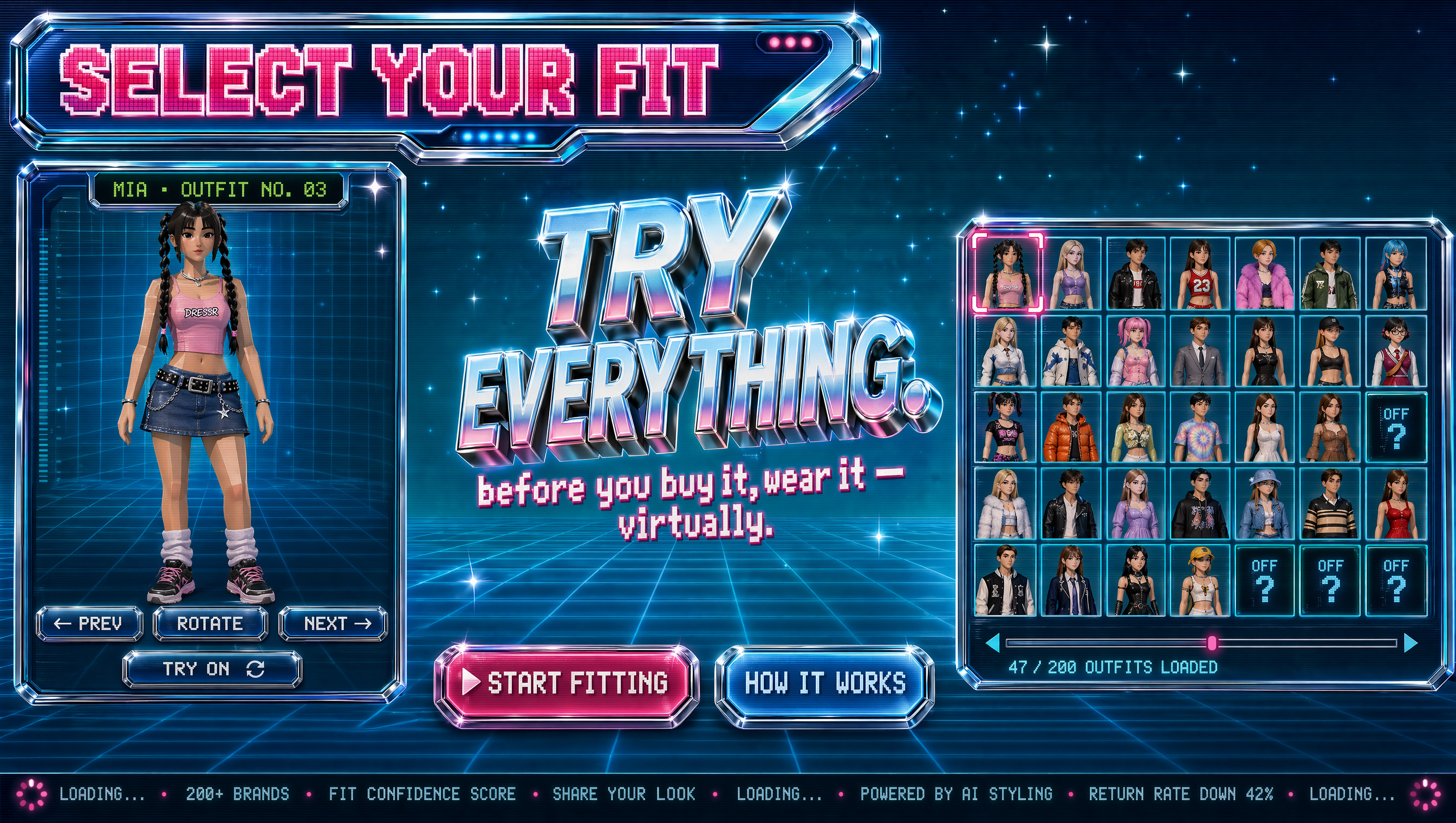
Thumbnails are the first frame of a negotiation with a viewer. In a crowded feed, a thumbnail has a fraction of a second to answer three questions: Is this for me? What will I get? Why should I care right now? The strongest thumbnails use visual trends not as decoration but as shorthand for emotion, clarity, and promise. This guide breaks down the thumbnail patterns that consistently earn attention, explains why they work, and gives you a repeatable workflow for designing thumbnails that attract clicks without misleading your audience.
Why Thumbnails Still Decide Video Performance
The three-second rule is really a three-step decision
Viewers do not study thumbnails. They scan, predict, and choose. During the scan, the eye registers color, contrast, and human faces before it reads any words. During the prediction, the brain asks whether the image matches a need, a curiosity, or an emotion. During the choice, the viewer commits a click or moves on. Your thumbnail must support all three steps at once. If the image is beautiful but confusing, the viewer never reaches the choice phase. If it is clear but boring, the viewer predicts no payoff. The goal is not to cram more into the frame; it is to remove friction from that rapid decision.
CTR is a system, not a sticker
Click-through rate is not a single number you fix with one image. It is the result of topic demand, title promise, thumbnail clarity, audience familiarity, and surface placement. A thumbnail that performs well on browse may underperform in search because search users have different intent. A thumbnail that wins with loyal subscribers may confuse new viewers. Treat the thumbnail as one part of a conversion system. When you test, change one major variable at a time: the focal subject, the text, the background, or the emotional expression. Otherwise you learn nothing from the result.
What changed in viewer behavior
Mobile viewing and sound-off browsing have made visual hierarchy more important than ever. Many viewers see thumbnails at a size smaller than a postage stamp. They are also trained by short-form feeds to expect immediate clarity. That means small details, thin fonts, and subtle color shifts disappear. Strong thumbnails now rely on big shapes, bold contrast, readable faces, and a single idea. The trend is not toward more complexity; it is toward faster comprehension.
Visual Trends That Shape Modern Thumbnails
Hyper-realistic AI-assisted imagery
AI image tools have made it easier to create polished scenes that would once require a full production. Creators use them for backgrounds, concept shots, and impossible perspectives. The trend works when the result still feels connected to the video. A hyper-realistic robot hand reaching for a coffee cup can be a great thumbnail if the video is about automation and daily life. It fails if the image is generic and could belong to any channel. Use AI to extend your idea, not to replace it. Keep skin tones natural, shadows consistent, and edges clean. Viewers may not know a tool was used, but they will notice when an image feels artificial or disconnected.
Minimal text and dynamic typography
Thumbnail text is a caption, not a transcript. The most effective text adds context the image cannot show: a number, a contrast, a warning, or a result. Two to four words are usually enough. Dynamic typography, which uses scale, angle, and weight to create motion, can make static text feel energetic. Use a heavy sans-serif for mobile readability. Keep the text away from the bottom-right corner where the duration stamp appears. If the title already says it, the thumbnail should not repeat it. Repetition wastes space and makes the viewer process the same idea twice.
Emotional and reactive faces
Human faces attract attention because viewers instinctively read emotion. Surprise, delight, skepticism, focus, and relief are all useful. The mistake is using the same exaggerated expression in every thumbnail. Over time, the audience learns to ignore it. Match the expression to the video's emotional arc. A tutorial may work better with a focused, curious expression than a wide-open mouth. A reaction video may need a strong reaction. If you use a face, make it large enough to read on mobile. Crop tightly, keep eyes visible, and avoid covering the face with text.
Bold color separation and optical depth
High-performing thumbnails often use complementary colors or strong light-dark contrast to separate the subject from the background. This is not about using every color. It is about creating one clear visual break that guides the eye. A warm subject against a cool background, or a bright object against a dark scene, can make the focal point pop. Optical depth, created through blur, scale, and layering, helps the viewer understand what is close and what is background. Use depth to emphasize the main subject, not to show off effects. If the viewer has to search for the subject, the thumbnail is already losing.
Mobile-first visual hierarchy
Design for the smallest screen first. A good test is to shrink the thumbnail to 120 pixels wide. Can you identify the subject, the emotion, and the main text? If not, simplify. The hierarchy should be: focal point, supporting context, optional text, and background. Backgrounds should support the subject without competing. Patterns, textures, and gradients can add atmosphere, but they should not create visual noise. Negative space is not wasted space; it gives the eye a place to rest and makes the important elements more noticeable.
How to Build a Thumbnail That Earns the Click
Start with the video promise
Before opening a design tool, write one sentence that states what the viewer will get. For example: I will show you how to edit faster with three shortcuts. Or: I tested a popular camera trick and here is what happened. That sentence becomes the creative brief. The thumbnail should express the most visual part of that promise. If the video is about a surprising result, show the result. If it is about a process, show the moment of transformation. If it is about a comparison, show both sides. When the thumbnail and the video promise align, viewers feel rewarded rather than tricked.
Choose one focal point
Every thumbnail needs a clear hero. It might be a face, a product, a before-and-after split, a number, or a single object. Once you choose it, make it the largest, brightest, or most contrast-rich element. Everything else is supporting cast. A common mistake is treating the thumbnail like a movie poster with multiple characters and plot points. That can work for entertainment, but it usually fails for tutorials and commentary because the viewer cannot tell what the video is about. If you cannot describe the thumbnail in one short sentence, it has too many focal points.
Create contrast that reads at 120 pixels
Contrast is more than color. It includes size, shape, texture, and brightness. Use a light subject on a dark background or a crisp subject on a blurred background. Make the text large enough to read at a glance. Check the thumbnail on a phone, not just on a desktop monitor. If you use a busy background, add a subtle shadow or outline to separate the subject. If you use a dark scene, avoid placing dark text on it. The best thumbnails often look almost too simple when viewed large because they are optimized for small size.
Design for sound-off discovery
Many viewers browse with sound off. Your thumbnail and title must work together as a silent pitch. The thumbnail should carry emotion and visual proof. The title should carry specificity and search-friendly language. Avoid inside jokes that only loyal subscribers understand unless the video is aimed at them. For broader reach, show the outcome or the conflict in the image. A viewer should be able to guess the topic category within one second. That does not mean the thumbnail should be generic; it means it should be instantly legible before it becomes clever.
Add curiosity without deception
Curiosity is powerful when it creates an open loop the video can close. Deception creates a loop the video never intended to close. A thumbnail that shows a shocking result must deliver that result or explain why it did not happen. A thumbnail that promises a secret must reveal a real insight. The difference matters because trust compounds. A channel that repeatedly delivers on its thumbnails trains viewers to click again. A channel that tricks viewers may get one spike, then suffer lower returns and weaker comments. The best thumbnails are honest exaggerations: they highlight the most interesting true element.
A Practical Workflow From Idea to Upload
Research and reference
Collect 10 to 20 thumbnails from your niche and adjacent niches. Look for patterns in color, composition, facial expressions, and text. Do not copy them. Instead, note what the audience seems to respond to. Save them in a mood board with labels such as high contrast, before-and-after, face close-up, object hero, or diagram. Also review your own top-performing thumbnails. Your best reference is often your own history because it reflects your audience, not a generic trend report.
Sketch and compose
Sketch three to five rough layouts before you open a photo editor. Use rectangles and circles to represent the subject, text, and background. Decide where the eye should travel first, second, and third. Try a few compositions: centered hero, rule of thirds, split screen, foreground-background, and text-led. The sketch phase is fast and prevents you from falling in love with a polished image that has a weak structure. If a layout does not work as a rough sketch, it will not work with better lighting.
Generate or shoot assets
You can shoot original photos, capture stills from the video, or generate images with AI tools. For video stills, choose frames with clear expressions and minimal motion blur. For original photos, use soft, directional light and a background that separates the subject. For generated images, write a prompt that describes the subject, angle, lighting, mood, and background. Generate several options and choose the one with the strongest silhouette. Keep a consistent style across a series when the videos belong to a playlist or series.
Assemble in layers
Build the thumbnail in layers: background, midground, subject, effects, text, and polish. Keep the subject on a separate layer so you can reposition or scale it. Use masks to clean edges. Add subtle shadows to create separation. Adjust contrast and saturation, but avoid over-processing. Skin tones should remain natural, and whites should not blow out. If you use text, keep it on its own layer and check the spelling. A typo in a thumbnail is a small error that can make the whole video feel less trustworthy.
Test at real size
Export the thumbnail and view it on a phone. Shrink it to the size it appears in a feed. Ask someone who does not know the video topic to describe what they see. If they mention the wrong subject or cannot read the text, revise. You can also use an A/B testing tool to compare two versions. Test one variable at a time: expression, background, text, or color. Give each version enough impressions to produce meaningful data. A difference of a few dozen views is not a trend.
Publish and learn
After publishing, note the thumbnail version, title, topic, and performance. Over time, you will build a personal pattern library. Maybe your audience responds to warm colors and close-up faces. Maybe they prefer clean product shots with a single number. Maybe your tutorial channel performs better with a simple before-and-after. The goal is not to find one magic style; it is to understand which visual tools work for which video types.
Tools and Techniques for Faster Iteration
AI image and video tools
AI tools can help you mock up backgrounds, create concept art, remove objects, upscale images, and generate variations. Popular options include image generators for stills and video generators for short motion references. Use them to explore ideas quickly, then refine the best direction with manual editing. Avoid using AI output without checking hands, eyes, text, and edges. Small artifacts become obvious when the thumbnail is viewed at full size. Also respect platform policies and disclosure rules when synthetic media is used.
Editing and layout tools
Traditional editors like Photoshop, Affinity Photo, and GIMP remain excellent for precise compositing. Figma and Canva are useful for text layout and template systems. After Effects or similar motion tools can help when you need to preview how a thumbnail concept might work as a short intro. The tool matters less than the process. A simple editor with layers, masks, and text controls is enough for most thumbnails.
Testing and analytics tools
YouTube Studio provides impressions, click-through rate, and traffic sources. Third-party A/B testing tools can rotate thumbnails and report performance. Spreadsheets are still the most flexible way to track tests. Record the date, video, thumbnail version, impressions, CTR, and average view duration. View duration matters because a high CTR with low retention can signal a mismatch between the thumbnail and the video. The best thumbnail tests improve both the click and the viewing experience.
Common Thumbnail Mistakes That Kill CTR
Too many ideas
A thumbnail that shows three people, five objects, and four words is not rich; it is noisy. The viewer cannot decide where to look, so they look away. Choose one main idea and support it with one secondary element at most. If the video has multiple topics, pick the most clickable one for the thumbnail and let the title clarify the rest.
Text that repeats the title
The title and thumbnail are teammates, not twins. If the title says How to Bake Sourdough Bread, the thumbnail does not need to repeat those exact words. It could show a dramatic crumb shot with the text 3 mistakes or 24-hour rise. The text should add a new angle, not duplicate what the viewer already read.
Low contrast or muddy colors
Muddy colors, low shadows, and similar tones make the subject blend into the background. Increase separation with lighting, color, or blur. Avoid placing a dark subject on a dark background unless you add a rim light or outline. Check the thumbnail on multiple screens because phone displays vary. A thumbnail that looks fine on a calibrated monitor may look flat on a budget phone.
Clickbait that breaks trust
Clickbait can win a click, but it loses the next one. If the thumbnail promises something the video does not deliver, viewers leave early, comments turn negative, and the platform may reduce recommendations. Honest curiosity is sustainable. Manipulation is not. Ask whether the thumbnail accurately represents the most interesting part of the video. If the answer is no, redesign it.
Ignoring mobile crop and safe zones
The bottom-right corner often contains the duration stamp. The lower edge can be covered by platform interface elements. Keep important text and faces away from those areas. Also check how the thumbnail looks in different placements: home feed, search results, suggested sidebar, and channel page. A composition that works in one placement may fail in another.
Measuring, Testing, and Improving
Metrics that matter
Click-through rate is the headline metric, but it is not the only one. Look at impressions, views, average view duration, and returning viewers. A thumbnail that increases CTR but reduces retention may be attracting the wrong audience. A thumbnail that lowers CTR but increases retention may be attracting a smaller, more engaged audience. The right balance depends on your channel goals, whether that is reach, watch time, or community growth.
A simple testing framework
Pick one video or a small group of similar videos. Create two thumbnails that differ in one major way. Run them for a set period or until each receives enough impressions. Compare CTR and retention. Record the result in a spreadsheet. Over time, you will learn which variables matter most for your audience. Avoid testing during unusual traffic periods such as major holidays or breaking news cycles, because those can distort results.
What to do when CTR drops
A sudden CTR drop can come from many causes: a weaker topic, a confusing thumbnail, seasonal attention shifts, or increased competition. Check the first 24 to 48 hours separately from the long tail. If the thumbnail is the likely issue, try a new version with a clearer focal point and stronger contrast. If the topic is the issue, no thumbnail can fully fix it. In that case, use the video as a learning experience and apply the insight to the next upload.
FAQ
How often should I change thumbnail style?
Change style when the data tells you to, not on a fixed schedule. Review your thumbnails every quarter or after a series of uploads. If CTR is stable and retention is healthy, keep the current direction. If performance declines, test one new element at a time. Gradual evolution is safer than a complete rebrand because it preserves recognition.
Can AI-generated thumbnails look authentic?
Yes, if they are directed carefully. AI works best for backgrounds, concepts, and compositing support. For faces and hands, inspect closely and fix artifacts. The most authentic thumbnails usually combine AI elements with real footage, real screenshots, or real photos. The audience cares about relevance and clarity more than whether a tool was used.
Should I use faces in every thumbnail?
No. Faces are powerful, but they are not mandatory. Product channels, finance channels, and tutorial channels often perform well with objects, charts, or text-led designs. Use a face when emotion is the core of the video. Use an object when the result or product is the core. The best choice depends on the video promise and the audience's expectations.
How much text is too much?
If the viewer cannot read the text at a glance on a phone, it is too much. Aim for two to four words. Use large, bold typography. Avoid sentences, paragraphs, and small captions. The thumbnail is not the place for detailed explanation. It is the place for a visual hook and a short verbal cue.
What size should a YouTube thumbnail be?
The recommended dimensions are 1280 by 720 pixels, with a 16:9 aspect ratio. Keep the file size under the platform limit and use a common format such as JPG or PNG. Always preview at small sizes because the thumbnail will often be seen much smaller than the original file.
Do thumbnails affect recommended traffic?
Thumbnails influence click-through rate, and click-through rate is one signal among many that platforms use to evaluate whether viewers want to see a video. A compelling thumbnail can increase initial clicks, but retention and satisfaction determine whether the recommendation expands. The strongest strategy is to pair an honest, high-contrast thumbnail with a video that delivers on its promise.
Final Thoughts
Thumbnail design is not about chasing every trend. It is about reducing the distance between a viewer's attention and the value inside your video. Use bold composition, readable text, emotional clarity, and mobile-first hierarchy. Test deliberately. Learn from your own data. Keep your promises. When you treat the thumbnail as the first useful frame of the video rather than a decorative cover, you give every upload a better chance to be seen by the right people.
