

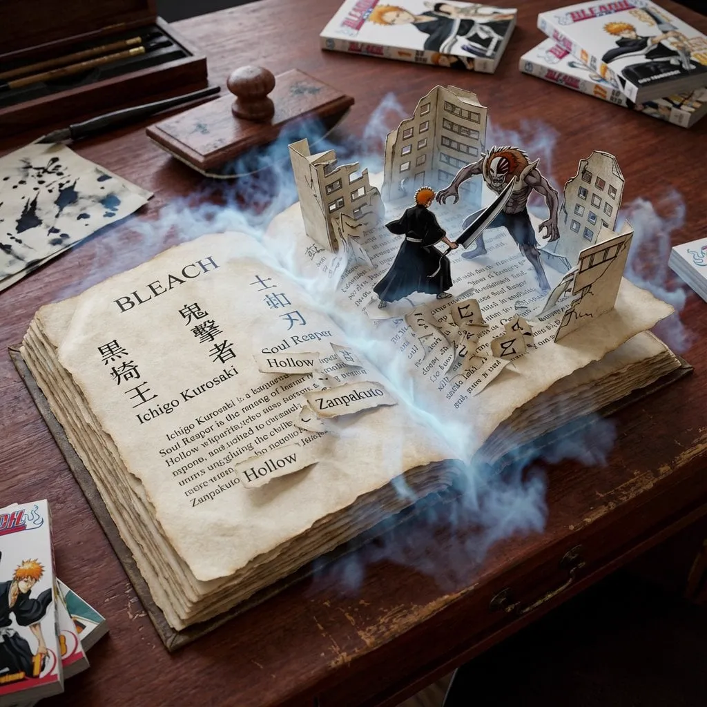
Video thumbnails are the doorway to your content. On crowded feeds where hundreds of videos compete for the same swipe, a thumbnail often decides whether a viewer clicks, scrolls, or lingers. In a visual economy where attention spans have collapsed, that single frame is now the difference between a video that travels and a video that disappears.
This guide walks through a modern, repeatable workflow for creating attractive video covers with AI. It covers choosing the right image model, keeping a character consistent across a series, handling lighting and composition, adding readable text, and testing results. Whether you are a solo YouTuber, a short-form creator, or someone managing a brand channel, the process here is designed to be practical and to scale.
Why Artificial Intelligence Changed Thumbnail Design
Not long ago, making a good thumbnail meant either hiring a designer, digging through stock photos, or opening up a heavy editing suite and wrestling with layers for an hour. AI flipped that on its head. With modern text-to-image models, you can describe a scene in plain language and receive a high-quality visual in under a minute. Image-to-video pipelines even let you generate a still that matches the first frame of your clip, so the thumbnail feels seamlessly connected to the content that follows.
The opportunity is not only speed. AI gives you almost infinite variations. You can generate ten different concepts, swap lighting moods, change the character's expression, or push the composition in completely different directions without ever hitting a blank page. That means the creative risk moves from "can I make it?" to "which concept deserves the audience's attention?"
What Makes a Thumbnail Worth Clicking
Before you touch a generator, it pays to recall what an effective cover actually does. A great thumbnail typically delivers on five things:
- Clarity at small size. Most people first see your cover on a phone, literally a few centimeters wide. The main subject must read instantly.
- Curiosity, not clickbait. The best covers promise something specific. They raise a small question that the video answers honestly.
- A single focal point. One strong subject beats a collage of competing elements every time.
- Emotion. An expressive face, a dramatic expression, or a striking contrast of color conveys feeling faster than words.
- Consistency. If your channel or series has an established style, viewers should recognize your content immediately in a feed.
Keep these principles in mind as you prompt. An AI generator will happily produce a noisy image full of clutter; your job is to direct it toward focus and intention.
Choosing the Right Image Model for Covers
Modern generation libraries offer many image models with different strengths. The right pick depends on your subject and the look you want.
- Photorealistic models are ideal for talking-head channels, product reviews, and content that needs to feel real and trustworthy. They handle skin texture, fabric detail, and natural lighting well.
- Stylized and cinematic models suit trailers, dramatic storytelling, and artistic branding. They deliver bold color grading and strong mood.
- Anime and illustration models fit gaming, animation news, and heavily branded content where a hand-drawn aesthetic matches the channel.
Do not chain yourself to one model. Many creators keep a shortlist: one photorealistic workhorse for faces, one cinematic option for moody beauty shots, and one illustration model for distinctive character art. Matching the model to the subject dramatically reduces the amount of retouching you need later.
Keeping a Character Consistent Across a Series
One of the biggest frustrations creators report is that the same character looks different in every cover. A channel review series loses its identity when the host's face changes each week. AI has gotten much better at this, but it still needs help.
The three techniques that work best are:
- A stable text description of the character, written the same way every time. Include hair color, eye color, age range, skin tone, clothing, and any distinguishing traits.
- Reference images. Many generators accept reference or index images that anchor the look of a person or object across generations.
- Style locking. Keep your lighting setup, color palette, and lens language consistent across all covers so the series reads as a single visual identity.
When you find a prompt that reliably produces the character you want, save it. Build a small "character sheet" library so every future cover starts from the same foundation rather than from memory.
Guiding Composition, Lens, and Lighting
Composition is where many AI covers go wrong. Without guidance, generators produce busy, oddly framed images. Your prompt can steer the camera and the scene.
- State the framing explicitly. Use terms like close-up, medium shot, wide angle, low angle, or eye level.
- Suggest a lens feel. Shallow depth of field that blurs the background is a common, effective choice for focus.
- Describe the lighting mood. Golden hour, neon, softbox, harsh rim light, or dramatic backlight all produce visibly different results.
- Teach the model negative space. If you plan to add action text later, ask for clear space on one side of the frame where the words can sit without overlapping the subject.
A useful trick is to generate covers at a 16:9 or 3:2 composition first, then crop to the platform's thumbnail size. This gives you room to reposition the subject in post if the platform's cropping is aggressive.
Adding Readable, On-Brand Text
Text overlays are a double-edged sword. Used well, a short, punchy label can double the click-through of a cover. Used badly, it looks like clutter. A few rules help:
- Keep it to a handful of words, ideally five or fewer.
- Use a heavy, legible font with strong contrast against the background.
- Place text in a stable zone that survives feed cropping.
- Echo a color or accent from the image so the text feels designed, not pasted on.
- Never cover the subject's face.
Modern image generators can bake text into the image, but spelling is still unreliable. The safest path is to generate a clean image with reserved negative space and add the wording in a simple editor where you control typography exactly.
Turning Covers into a Faster Creative Pipeline
Speed becomes an advantage when you treat generation as a pipeline rather than a one-off task. Many creators structure their process like this:
- Brainstorm six to eight concepts per video based on the strongest moment in the content.
- Generate a first pass of all concepts quickly, without polishing.
- Pick two or three winners based on the rules above.
- Refine those: fix composition, vary expressions, lighten or darken mood.
- Export final files, add text, and run a quick contrast check.
- Test the top two in rotation if your platform supports thumbnail testing.
Because generation is cheap and fast, you can afford to explore aggressively in step two and commit only in step three.
Testing and Measuring Click-Through
A beautiful cover that nobody clicks is still a failure. Treat thumbnail design as an experiment with real data.
Where possible, use a platform's built-in A/B testing to compare two covers on the same audience. Track not only click-through rate but also watch time after the click, because a great cover that promises the wrong thing will inflate clicks and hurt retention. Small changes matter: a brighter background, a bigger expression, or a different text label can move metrics by several percent.
Keep a running log of which cover styles outperform for your audience. Over time, that log turns into a private playbook more valuable than any generic advice.
Local Language and Culture Considerations
If you publish for an international audience, remember that what reads as eye-catching in one market can feel off in another. Emoji-heavy collage covers dominate in some regions, while clean, minimal, typographic covers win in others. Colors also carry meaning, and a symbol that looks playful in one culture can be confusing or worse in another.
Generate localized variants when you can. Keep the core subject and layout, then swap the wording, accent colors, and any culturally specific cues to match the market you are targeting. This extra step consistently improves performance for creators with multilingual channels.
A Quick FAQ on AI Thumbnails
Do AI covers hurt my channel's authenticity?
No, most viewers judge the result, not the tool used to make it. The key is that the cover accurately represents the video.
What resolution should I generate at?
Generate at the largest size your tool supports, ideally at least 1920 pixels wide, then export a compressed version the platform wants.
Can I use one generator for everything?
Yes, but mixing a photographic model and a stylized model usually gives you more range across different video types.
How do I avoid the "AI look" everyone can spot?
Aim for natural skin detail, avoid too many fingers, and spend a minute on lighting and composition prompts. A well-directed image passes as professional photography far more often than a generic one.
Should text always be generated in the image or added later?
Adding it later in an editor is safer and gives you full control over spelling, legibility, and responsive cropping.
Learning from a Full Thumbnail Workflow
Seeing the rules in action is more useful than reading them in the abstract. Here is a realistic walkthrough of a single cover produced with AI from start to finish.
Step one: define the promise
Imagine a video about "five overnight desk setups." The promise is a specific, reward-shaped message, so the cover should show a clean, ambitious desk and the number bringing the curiosity. The emotional angle is aspiration mixed with practicality.
Step two: write a working prompt
You craft a prompt around a single subject, a clear framing, and a lighting mood. Something like: "a bright, modern home office desk with a large monitor, minimalist design, warm natural light from a window, shot on a 35mm lens, shallow depth of field, empty space on the left for text." One subject, one mood, and reserved negative space in one sentence.
Step three: generate variations
Generate a first pass of four or five variations without polishing anything. Look at each as a tiny, low-res thumbnail before judging detail. Which one reads clearly? Which has the strongest focal point? Most creators eliminate most candidates on this first, fast pass rather than by fixing every flaw.
Step four: refine the winners
Take one or two survivors and refine. Adjust the desk's arrangement, refresh the light, try a wider or closer frame, or swap a small prop. This is where generation's real value shows: you iterate in minutes where a designer might take an hour.
Step five: add the text, then test
Drop in a short label in a heavy, legible font, check it survives feed cropping, and export. If the platform lets you, run an A/B test of this cover against a second concept. The data decides, not your taste.
Practical Considerations When You Scale
Once one cover works, the temptation is to repeat the same prompt forever. That is a mistake, because audiences notice repetition and stop reacting. Instead, keep the underlying process (subject, framing, lighting, reserved space, text zone) and vary the surface each time so every cover still feels fresh but unmistakably yours.
Building a reusable style library
As you refine, organize what works: a saved set of consistent prompts, a character sheet, a few lighting recipes, and a shortlist of text fonts and accent colors. A small library like this turns a one-off process into a repeatable system. The next cover starts from the strongest known starting point, not from a blank prompt.
Knowing when not to use AI
AI is not always the right tool. If a cover depends on a real product that must be captured accurately, a photograph is still better than a generation that invents details. If a brand requires pixel-perfect logos and official artwork, hand-assembled graphics win. Recognize these exceptions and keep a compositor or camera in your toolkit alongside the generators.
Frequently Asked Questions About AI Covers
How much should I spend on tools?
Start free or low-cost and upgrade only when a specific limitation appears. More budget rarely fixes a weak concept; it shortens the gap between an idea and a finished file.
How do I avoid a thumbnail looking spammy?
Restraint is the answer. One subject, one emotion, and a few words of text beat a crowded design. If a cover could pass for a meme or a clickbait ad, simplify it.
Can AI match my established brand style?
Yes, if you feed it reference material and keep prompts consistent. Style transfer and reference inputs let new covers inherit the palette, lighting, and typography you already use.
What about other languages in a cover?
Keep text minimal and localized where possible. Generate layout and imagery first, then add localized wording in the editor so spelling stays reliable.
A Last Few Pro Tips
Set a hard time limit for design and treat the export as the moment of commitment. Compare every cover against both a tiny thumbnail and the live feed before publishing. And once a video has a winner, save the prompt and the outcome together so your playbook grows with every release.
Covers are a small slice of your production time but a large share of your reach. By pairing a disciplined process with modern AI image tools, anyone can produce thumbnails that stop the scroll without hiring a full design department. Start with one video, test two concepts, and let your audience's behavior show you the way forward.
