
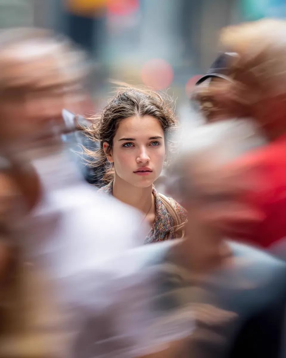
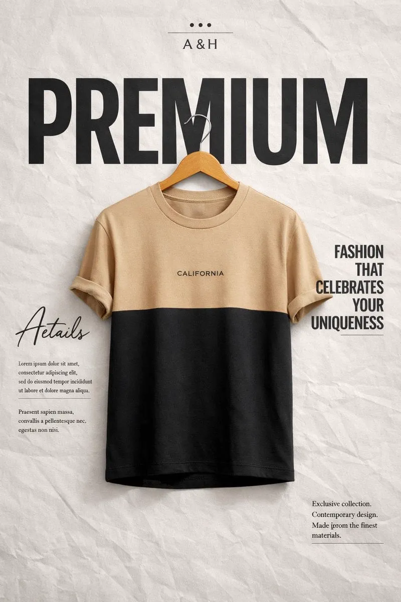
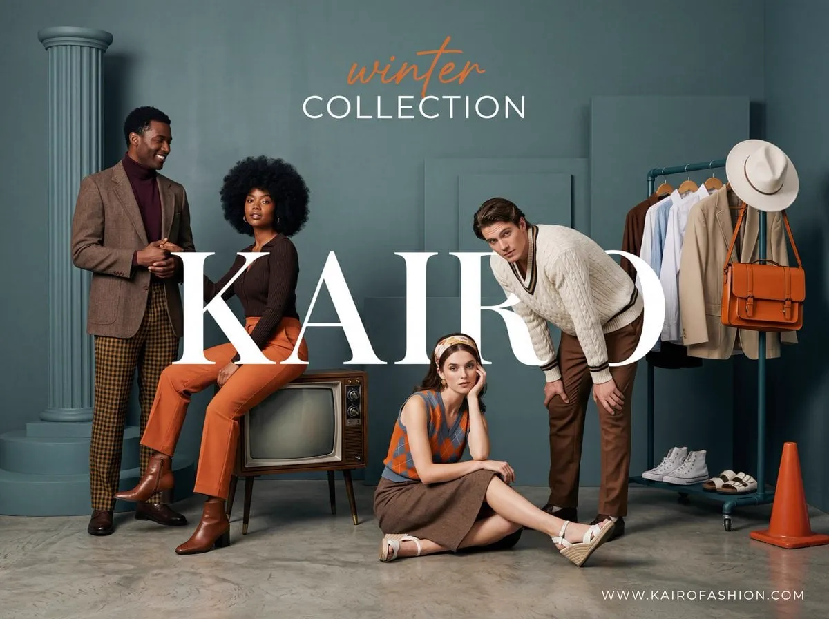
A single photorealistic image can do more for a campaign than ten paragraphs of copy. When a product is shown as a perfect studio shot, lit like an advertisement and detailed enough to feel touchable, viewers stop scrolling. This is the essence of "high-lumen" marketing imagery: visuals so bright, clean, and realistic that they act as an unspoken trust signal.
Until recently, producing photorealistic visuals meant renting a studio, hiring a photographer, and managing a complex shoot. Today the same result is available through generative AI. Designers and marketers can produce believable product scenes, lifestyle imagery, and architectural previews in minutes. This guide walks through how to use AI to create photorealistic visuals that hold up in real campaigns, how to keep a consistent look across a set of images, and how to turn stills into motion when you need it.
Why Realism Carries So Much Weight in Marketing
Audiences have become expert at tuning out obvious fabrication. Badly composited images, artificial-looking renders, and generic stock photos all read as cheap. Photorealism works because it does the opposite: it signals that whoever produced the image cared about craft and took the subject seriously.
There is a measurable reason this matters. Attention spans are short, and the first visual is the only chance most content gets. A viewer decides in a fraction of a second whether something is worth their attention. Realistic, well-lit imagery earns that moment far more often than stylized or obviously synthetic alternatives. In feeds crowded with noise, fidelity is a filter that helps the good work survive.
Photorealism also supports conversion. Product images that look credible reduce uncertainty for a buyer. If a customer can see exactly how the product looks, how it falls, how light plays across its surface, they make a faster and more confident decision. E-commerce and advertising results consistently reward this kind of visual confidence.
None of this requires a big brand or a big budget. The skill is now accessible to anyone who can describe a scene and iterate on an image.
The Building Blocks of a Convincing AI Render
A photorealistic image from AI is the product of a few controllable inputs working together. Understanding each one makes the difference between a plastic-looking render and an image people believe.
Lighting is the single largest factor in realism. Real photographs are defined by their light — where it comes from, how hard or soft it is, what color it carries. Describe light the way a photographer would: "soft window light from the left," "hard afternoon sun casting long shadows," "cool studio fill with a warm key light." When the light sounds like a real situation, the model produces a correspondingly real surface response.
Material and texture come next. Photorealistic results depend on surface behavior — the way glass catches a reflection, the way fabric folds, the way skin absorbs light. Naming the material explicitly ("matte ceramic," "brushed aluminum," "linen") tells the model what physical response to render. Generators now handle these surfaces well when you ask for them specifically.
Resolution of detail is the third pillar. The eye accepts an image as real when the small things are right — slight imperfections, natural asymmetry, a hint of dust or grain. Perfect results look fake because real life is not perfect. Asking for natural detail and avoiding the instinct to polish everything will produce images that look more authentic, not less.
Finally, composition and context anchor the realism. A product floating in white void can look staged; the same product on a table near a window with a coffee cup out of focus feels like a candid photograph. Environment gives the light a source and the subject a story.
Crafting Prompts for Photorealistic Results
Prompting for realism is a craft, and it follows a reliable pattern.
Open with the subject and its material. Be specific about what it is and what it is made of. "A matte black ceramic coffee mug" is a better start than "a mug."
State the environment concretely. Name the location and the surfaces around the subject. "On a light oak table, near a large window, blurred kitchen background" gives the model the setting it needs to render believable reflections and depth of field.
Describe the light next. This is where realism is won or lost. "Soft golden morning light from the window, gentle shadows, warm tones" produces a fundamentally different image than "harsh fluorescent overhead lighting."
Then name the camera and lens behavior. "Shot on a 50mm lens at f/2.8, shallow depth of field, looks like a professional product photograph." This frames the optical feel of the image, including bokeh and focus falloff.
Close with a small set of style qualifiers at most. One or two words, like "photorealistic" or "editorial," is enough. A tightly described scene with realistic light beats a string of fancy adjectives every time.
Iterate rather than regenerate from scratch. When a first result is close but not right, keep the image and refine the prompt around the specific problem — asking for softer light, a different angle, or more texture detail. Small, targeted changes converge to a great result far faster than starting over.
Keeping a Cohesive Look Across an Entire Set
Campaigns need more than one good image. They need a family of images that look like they came from the same shoot. This consistency is where AI workflows often fall apart, and it is also where a few discipline moves solve the problem.
Lock the subject's appearance first. If a character, mascot, or product appears across multiple images, generate a reference view and reuse the exact same description everywhere. A product should have the same finish, color, and orientation cues in every frame.
Fix the look before generating the batch. Decide your palette, lighting motif, and lens signature up front, and include them consistently in every prompt. A set of images that shares the same warm window light and shallow depth of field will read as a single campaign even if each image is a different scene.
Style transfer and reference blending let you take this further. You can feed one master image — your approved hero shot — into the pipeline for the rest of the set. The model reproduces the same lighting and mood on new subjects or scenes. This is how teams keep a brand feel intact across dozens of deliverables.
Generate a few options per scene and choose deliberately. Consistency comes partly from curation. Picking from a small set per scene, always against the same brief, keeps the final collection coherent while giving your eye a choice.
From Stills to Motion: Making It Feel Like a Production
Once you have an approved photorealistic still, the natural next step is motion. Image-to-video converts a single hero frame into a short, living clip, which extends the reach of one strong visual into both feeds and video placements.
The workflow is straightforward. Generate the still, approve it, then animate it with a motion prompt that describes only what should move. "The steam rises from the mug, the curtains drift in the breeze, the subject turns to the camera" — the rest stays static. Letting the background remain fixed keeps the motion believable and prevents the warping that happens when too much moves at once.
Sequence continuity uses the same discipline. If you are turning a still into a product reveal or a scene transition, decide the opening frame and the closing frame of the motion, and let the generation bridge between them. The destination stays precise rather than improvised.
Treating stills and motion as one pipeline multiplies the use of every dollar of creative effort. One strong image becomes a poster, a video ad, a social post, and a presentation hero.
Integrating Image Processing Into the Workflow
The transition from a rough generation to a polished asset rarely ends at the generator. A small amount of traditional image work brings an AI render to final quality.
Finishing touches like a subtle color grade unify the image with your brand palette. Cropping to a 4:5 or 1:1 format repositions the subject for the platform. Sharpening and a gentle exposure adjustment make the render feel like a photograph rather than a digital artifact.
Upscaling matters when you need large-format results. Generate, upscale, and restore fine detail so a hero image holds up on a full-screen display or print. Generators get better at this internally, but keeping an upscale pass in your pipeline guarantees consistent quality at every size.
Keep your approved master images organized and versioned. Teams that reuse a small set of trusted hero assets across products and campaigns save enormous time and keep the brand intact. A tiny library of well-made masters outperforms an endless pile of one-off generations.
Avoiding the Common Telltale Signs
Photorealistic AI imagery is convincing, but a few habits give it away. Recognize them to fix them.
Hands and fingers remain a classic weak point. Check them closely and regenerate or fix any that merge or distort. An otherwise perfect image is ruined by a mangled hand in frame.
Over-perfection. Images that are too clean, too symmetrical, or too consistent in texture read as artificial. Introduce natural imperfection deliberately — a stray hair, a slight tilt, an uneven edge.
Inconsistent light. If two images in a set have different light sources, the campaign breaks. Keep the lighting language identical across the batch.
Duplicate or repeated objects. Sometimes a model will fill a scene with copies of the same item. Proofread the image for repetition before you publish.
Text in the frame. Generated imagery still struggles with legible text. Avoid prompts that include on-screen wording, and add typography afterward in an editor where you control it exactly.
A Step-by-Step Example: A Product Hero Shot
Seeing the whole process in action makes the technique concrete. Let us walk through a typical deliverable: a photorealistic hero shot of a leather bag for an e-commerce campaign.
Start by defining the subject and material. "A tan full-grain leather weekend bag with brass buckles" fixes the object and its finish. From here we build the scene around it.
Choose the environment. "Resting on a wooden bench near a large arched window" places the bag in a believable setting that gives light a source. Adding "a soft linen throw over the bench" introduces a secondary texture for depth between the bag and the background.
Describe the light as a photographer would. "Soft, diffused late-afternoon light through the window, warm shadows falling across the bench" sets the mood and the source. This single line does more for realism than a dozen style adjectives.
Fix the camera feel. "Shot on a 50mm lens at f/2.8, shallow depth of field, background softly blurred" creates the optical signature of a real product photograph, pulling the eye to the bag.
Now iterate. The first pass is rarely perfect. Maybe the brass looks too shiny or the bench reads as plastic. Refine with a targeted change rather than a wholesale rewrite: "slightly matte brass hardware, natural grain." Each small, specific edit converges the image toward something you would publish.
When the still is approved, keep it as the master. Use the same lighting and wide describe-the-bag phrase across the rest of the campaign set so the look carries. Then add "gentle steam from a nearby cup" or "the bag's handle moving slightly, background still" to animate it into a short clip for social video placements.
Measuring Whether It Is Working
Visual work benefits from honest measurement. Aesthetics are subjective, but engagement is data, and treating photorealism as a hypothesis you test changes how you iterate.
Compare like for like. Test a photorealistic hero against your previous style on the same placement, with the same headline, for the same audience. The difference in click-through and conversion tells you what fidelity is actually worth for your category.
Track the numbers that matter to the goal. For e-commerce, watch conversion and time-on-page around the hero image. For brand campaigns, watch engagement and saves. A beautiful image that does not move the metric you care about is beautiful noise.
Test variants. Photorealistic comes in many moods — bright and airy, moody and cinematic, warm and editorial. Run two or three approved looks against each other and let the audience choose. The winner becomes your default for the quarter.
Let the data refine the look. Over time you accumulate a set of photorealistic looks that perform, and you stop guessing about lighting or palette. Measurement turns taste into a repeatable system, which is exactly how teams build a reliable visual engine.
Scaling a Photorealistic Practice
Once you can produce a strong single image, the goal becomes volume with consistency. A few practices let you scale without watching quality drop.
Build a library of approved masters. Maintain a small set of hero shots, lighting presets, and palette languages you can reuse. A tight library of trusted assets beats an ever-growing pile of one-off generations.
Standardize the prompts. Write your subject, environment, light, and camera lines once as a template, then vary only the subject descriptor. Standardization is what makes a large set stay coherent and cheap to produce.
Parallelize with a queue. Dispatch a batch of variant images in one go and proof the results together. Batch production is faster and lets you compare options in context rather than one at a time.
Keep the brand voice sign-off in the loop. Even with automation, one person approves the look. Guard the consistency checkpoint and preserve versioned masters as the source of truth.
FAQ
How real do AI images look now?
Modern generators can produce imagery that is indistinguishable from photography at a glance, especially for well-lit, well-described scenes. The skill is consistency and curation, not waiting for a better model.
Do I need a designer to use AI generatively?
Not necessarily. Composition and lighting judgment help enormously, but strong prompting and good taste in choosing results can carry a marketer or small business to usable, professional-looking visuals.
Can I use AI visuals for paid advertising?
Many platforms accept and even reward high-quality AI imagery. Always verify asset and usage policies for both the generator and the advertising platform before you invest in a campaign.
How do I make a set of images that match?
Lock the subject, palette, lighting, and lens signature, and reuse them in every prompt. For maximum consistency, blend a single approved master image across the set using style transfer or reference tools.
Should every visual be photorealistic?
No. Photorealism suits products, lifestyle, and credibility-driven content. Abstract or artistic campaigns may call for deliberate style. Choose realism when you need trust, and style when you need attention.
Wrapping Up
Photorealistic visuals are one of the most reliable ways to make marketing content feel credible and premium. The discipline is not complicated: describe light and material like a photographer, keep a consistent look across your set with locked references and shared visual language, iterate on strong stills, and convert approved images into motion when a campaign calls for it.
Start with a single product scene. Light it like a real shoot, refine it until it looks like a photograph, and then build a matching set around it. Once the still is camera-ready, turn it into a short clip and watch the asset work harder across every channel. Measure the results honestly, let the data shape the look, and build a pipeline that scales. The tools are democratized; the judgment is still yours, and it improves quickly with practice from one scene to the next.
