

Social Media Video Ad Conversion: A Practical Optimization Guide
Oct 15, 2026

Why Social Video Ads Reward Systems Over Isolated Tricks
Most teams do not fail at social video because they cannot shoot footage. They fail because every ad is a one-off experiment: a new script, a new edit style, a new audience setup, and no shared learning between launches. Cost per acquisition then drifts upward and nobody can explain why.
A working system has three parts that feed each other. Production creates a steady supply of genuinely different concepts. Distribution decides who sees which concept, in which placement, at which moment. Measurement decides which concepts earn more budget and which get retired. When one part runs ahead of the others — a fast production pipeline with no measurement discipline, or a detailed audience structure fed by two recycled videos — performance flattens.
A concrete example. A subscription skincare brand produces six concepts a month instead of one: three direct-response demos, two testimonial-led pieces, one offer-led promotion. Each is cut in vertical and square. After two weeks, one demo is producing signups at roughly half the cost of everything else. The team stops inventing unrelated ideas and instead builds five variations of that demo — new openings, same core promise, same proof. That is the system working.
The rest of this guide follows the decisions in order: creative structure, production workflow, format, targeting, testing, measurement, mistakes, and a repeatable optimization loop you can run every month.
The Anatomy of a Converting Video Ad
High-performing social video tends to share the same skeleton, even when the surface style differs wildly. Understanding that skeleton lets you diagnose a losing ad instead of guessing at fixes.
The opening two seconds carry the most weight
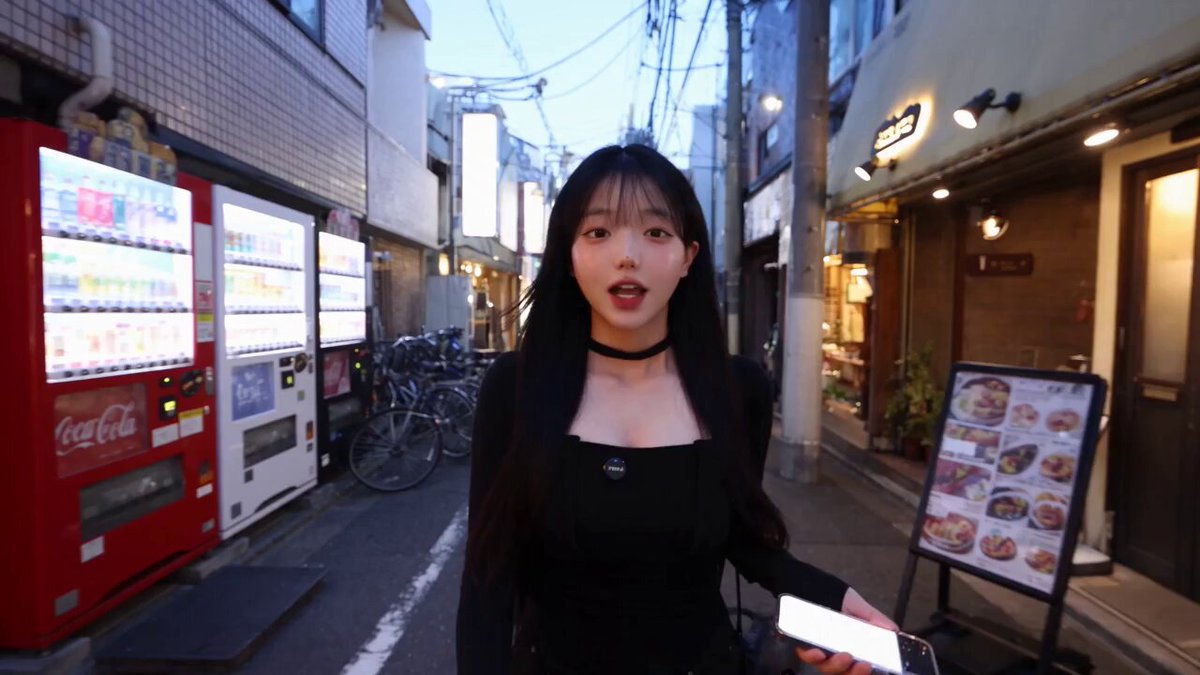
The first frame has one job: interrupt an established scrolling habit. It does not need to explain the product. It needs to create a small information gap the viewer wants closed. Effective openings include a visual pattern break (an unexpected object, an unusual angle, a person mid-action), a spoken claim that sounds slightly unfinished, or on-screen text that asks a question the viewer cannot answer instantly.
Weak openings look like everything else in the feed: logo animation, a smiling person in a bright office, generic b-roll of a city skyline. These are not bad images; they are forgettable ones. The practical test is to place your opening frame next to four competitor frames. If a viewer could not say which brand each belongs to, the opening is not doing its job.
Proof lands before the offer
Viewers resist offers until they trust the claim behind them. Proof can be a number (results in a specific timeframe), a demonstration (product visibly doing the thing), a comparison (before and after, side by side), or a specific person describing a specific frustration. Broad social proof such as thousands of happy customers is far weaker than one precise story: a named situation, a named obstacle, a named outcome.
The mistake here is stacking proof. Three testimonials in nine seconds cancel each other out. One piece of proof, delivered clearly, leaves room for the offer.
One unmistakable offer
Every ad should answer three questions without effort: what exactly is being offered, what it costs in effort or money, and what happens in the next ten seconds if the viewer acts. If a viewer has to infer any of those, the ad loses conversions it otherwise earned.
Ambiguity appears in predictable places. Discount language without an end date. A free trial that does not say what happens afterwards. A download that does not say what the download does. Each ambiguity adds friction, and friction in a two-tap funnel is expensive.
The closing frame does quiet work
Many ads end on the logo, which is wasted space. The last second is a second chance for anyone who watched the whole thing. Put the action, the destination, and a reason to act now on that final frame — and keep it on screen long enough to read. A rule of thumb: if a viewer cannot read the closing text twice, it is too fast.
A Production Workflow You Can Repeat Every Week
Creative burnout is usually a process problem, not a talent problem. Here is a workflow that keeps a small team supplied with fresh material without turning every launch into an event.
Step one: write the brief before the script
A one-page brief forces clarity early. It should state the audience, the single insight about their situation, the proof, the offer, the primary placement, and the one metric that determines success. Anything not in the brief does not belong in the video. Teams that skip this step end up with beautiful ads that argue with themselves — a price-led hook followed by a lifestyle message followed by a feature list.
Step two: script for the ear, not the page
Read every line aloud. Sentences that work on a page often collapse when spoken. Keep lines short. Put the most important word at the end of the sentence. Where possible, let the voiceover and the on-screen text carry different information so the two reinforce rather than duplicate each other.
A useful structure for a 20-second ad looks like this: three seconds of interruption, four seconds that name the problem in the viewer's own words, five seconds of demonstration or proof, four seconds of offer, four seconds of action. Adjust the timing, keep the order.
Step three: generate supporting visuals with AI tooling
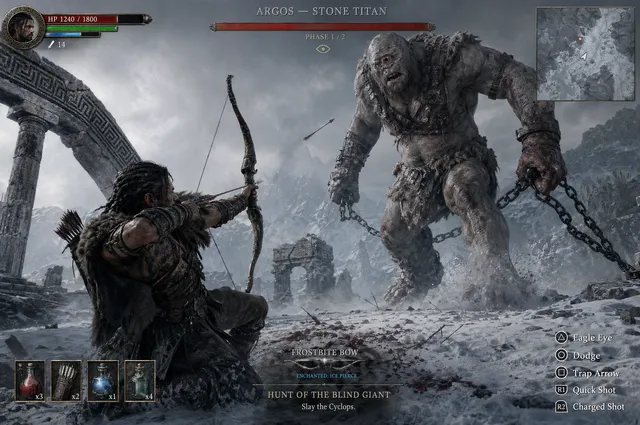
AI video generation has changed the economics of the middle of the funnel. Instead of booking a shoot for every concept, you can produce establishing shots, abstract transitions, product-in-context scenes, and alternate backgrounds from text prompts. This is most valuable for the parts of an ad that are expensive to film but cheap to imagine: a warehouse at night, a person using the product in a rental kitchen, a stylized comparison sequence.
Where AI-generated footage genuinely earns its place:
- Concept testing, where you need five visually distinct versions fast and cannot justify five shoot days.
- Rapid iteration on hooks, where you swap the first three seconds while keeping the rest of the edit intact.
- Localization and variants, where the same scene needs to appear with different text overlays or aspect ratios.
- Fill material, such as background plates and transitions that would otherwise eat a production day.
Where it does not: faces delivering direct testimonials, hands performing precision tasks, and anything that needs to match a real product shot exactly. Use generated footage for the surrounding frame and real footage for the proof. Mixing the two is what makes a video feel intentional rather than synthetic. Most AI video tools also give you control over camera motion, aspect ratio, and duration, which matters more than raw resolution for feed performance.
Step four: edit in variants, not final cuts
Every edit session should produce a set of variants that share a body but differ in the opening and closing frames. This gives you hook variants, offer variants, and placement variants from one afternoon of work. Name files consistently — concept, hook identifier, aspect ratio, version number — so that performance data can be traced back to a specific edit. Teams that skip naming discipline accumulate dozens of near-identical files and lose the ability to learn from them.
Format and Placement Decisions That Change Results
Aspect ratio and safe zones
Vertical dominates feed and story placements, but it is not the only useful ratio. Square often performs well in feed placements on wider viewports and gives you more room for text. Landscape still has a role in certain in-stream and audience network placements. Plan for two ratios from the start rather than cropping later, because cropping usually breaks the composition and cuts off captions.
Safe zones matter more than most teams expect. Interface elements cover the bottom quarter and the outer edges of vertical video. Any essential text placed there will be hidden on some devices. Keep critical information in the central band.
Length by objective
Short does not automatically mean better. Length should match the amount of persuasion the offer requires. A simple discount on a known product can convert in six seconds. A considered purchase with a price objection usually needs 30 seconds or more to establish proof before the offer. The correct approach is to test two lengths of the same concept rather than assume one wins.
Look at completion and click-through together. A 45-second ad with high completion and strong click-through is outperforming a 10-second ad with a slightly higher click-through and negligible completion, because the longer ad is doing more persuasion per view.
Sound-off is the default
Assume no audio until proven otherwise. Captions, on-screen text, and visual storytelling should carry the ad alone. When audio is added, it should add emphasis rather than introduce new information. A useful check: watch the ad muted, then listen to it without looking at the screen. If either version fails to communicate the offer, the edit is unbalanced.
Targeting in a Privacy-Constrained Environment
Restricted signal availability means audience definition has become a creative problem as much as a technical one. The old approach of stacking narrow interest layers is now less reliable than feeding a broader audience a wider variety of creative and letting the delivery system find the match.
Build on first-party signals
Website events, app activity, email engagement, and offline purchase data are the strongest inputs available. The practical work is making sure these signals are captured accurately: consistent event naming, correct value parameters, and a clean distinction between browsing and purchase behaviour. An audience built on a misconfigured event will be retrained on a misconfigured event for months.
Build lookalikes on value actions, not clicks
A lookalike seeded from homepage visitors will resemble people who browse. A lookalike seeded from completed purchases at a specific value band will resemble buyers. They behave differently and the second is usually more efficient. If your data volume is thin, start broad and let the delivery algorithm learn from conversions rather than forcing precision with small seeds.
Exclusions matter as much as inclusions
Excluding recent purchasers from acquisition campaigns is the most common fix for wasted spend, and it is frequently overlooked. Build exclusion lists for recent buyers, active trialists, and support-seeking users. Then layer in frequency control: someone who has seen your ad twelve times this week is not a prospect anymore, they are an annoyance.
Match creative to placement context
Reels and story placements reward energy, native-feeling footage, and immediate movement. Feed placements tolerate more structured narrative and heavier text. Rather than forcing one edit everywhere, produce two edits from the same shoot or generation session and assign them deliberately. Placement-specific creative is one of the few levers that still reliably improves efficiency without touching the offer.
A Testing Framework That Produces Decisions
Test concepts first, details second
Concept-level differences — different promise, different proof, different format — produce far larger swings than detail-level differences such as button colour or a single word change. Test concepts until you find a winner, then test details inside that winner. Teams that test details first spend months optimizing a losing idea.
Size the test before you launch
Decide in advance how long the test runs and what volume it needs. A useful rule: do not judge a variant until it has accumulated enough conversions for the difference to be meaningful, and do not stop early because a variant had one good day. Judging on partial data is how promising concepts get killed prematurely.
Write the decision rule in advance
Before launch, write one sentence: if variant A produces a lower cost per acquisition than the baseline over the test window, it becomes the primary and the baseline is paused. This removes the temptation to reinterpret results after the fact, which is the most common form of self-deception in paid social.
Keep a creative library with results attached
Log every concept with its hook type, proof type, format, and outcome. Over six months this becomes the most valuable document on the team. New briefs start from patterns that already worked rather than from a blank page.
Measurement: What to Watch and What to Ignore
The primary metric should match the business goal
Conversions, cost per acquisition, and return on ad spend are the metrics that decide budget. Engagement metrics are useful only as leading indicators that explain movement in the primary metric.
Leading indicators worth tracking
Three-second view rate tells you whether the hook works. Completion rate tells you whether the middle holds attention. Click-through rate tells you whether the offer lands. When cost per acquisition rises, these three tell you where the break happened: weak hook, sagging middle, or unconvincing close.
Blended views and incrementality
Platform-reported numbers do not know what would have happened without the ad. Compare platform data against blended acquisition cost across all channels. Where budget allows, run holdout tests on a small audience segment to estimate what the ads actually caused rather than what they claimed. This is not academic; it is how you avoid scaling a campaign that is mostly harvesting demand you already had.
Common Mistakes and How to Fix Them
Producing one concept per month. Fix: batch production. Generate multiple concepts in a single session, with shared assets and different openings.
Optimizing the offer before the hook. Fix: run hook tests first. No offer overcomes an opening that nobody watches.
Treating AI-generated footage as a full replacement for real product shots. Fix: define clear boundaries. Generated footage for context and transitions, real footage for proof and product detail.
Ignoring the closing frame. Fix: extend the final card and put the action on it. Add a two-second hold after the voiceover ends.
Micro-targeting with small audiences. Fix: broaden the audience and let creative variety do the segmentation work.
Judging tests on two days of data. Fix: set a minimum conversion threshold and a fixed test window before launch.
Skipping exclusions. Fix: build and maintain exclusion lists for recent buyers and active users as a standing task, not a one-time cleanup.
Letting filenames drift. Fix: adopt a naming convention and enforce it. Unnamed variants cannot teach you anything.
Ignoring placement differences. Fix: assign creative to placements deliberately instead of running one edit everywhere.
A Thirty-Day Optimization Loop
Week one — inventory and hygiene. Audit active creative. Pause anything that has run too long at high frequency. Check that conversion events fire correctly and that exclusion lists are current. This week rarely produces exciting results, but it prevents the rest of the month from being built on bad data.
Week two — concept production. Write briefs for four to six concepts. Script each to a single promise. Produce supporting visuals using AI generation for context shots and existing footage for proof. Edit in two aspect ratios with two hook variants each.
Week three — launch and monitor. Launch with a fixed test window and a written decision rule. Resist the urge to change creative mid-flight. Monitor the leading indicators daily, but change nothing until the window closes.
Week four — decide and double down. Apply the decision rule. Promote the winning concept and build three to five variations around its structure, changing only the hook or the proof type. Archive everything else with its data attached. Then start the next cycle from what you learned.
Run this loop consistently and the compounding effect is significant: a tested library of hooks, proofs, and formats that new campaigns can draw from immediately.
FAQ
How long should a social video ad be?
Match length to the amount of persuasion required. Simple offers on known products can work in six to ten seconds. Considered purchases usually need 25 to 45 seconds to establish proof before the offer. Test two lengths of the same concept rather than guessing, and judge them on completion and click-through together.
How many creative variants should I launch at once?
Four to six distinct concepts per test cycle is a practical range for a small team. More than that and you cannot accumulate enough data per variant within a reasonable window. Fewer than that and you learn too slowly to react to rising acquisition costs.
Can AI-generated video replace filming entirely?
For context, transitions, and stylized sequences, yes. For testimonials, precise product demonstrations, and anything that must match real product photography exactly, no. The strongest results come from combining the two: generated footage for the frame, real footage for the proof.
Should I test the hook or the offer first?
Always the hook. If viewers stop watching in the first two seconds, the offer never gets evaluated. Once you have a hook that reliably holds attention, test offers and proof inside that structure.
How long should I let a test run before deciding?
Set a minimum conversion threshold and a fixed time window before launch — commonly one to two weeks depending on volume. Stop early only if a variant is clearly and consistently underperforming on leading indicators, and even then confirm it is not a tracking problem first.
What is a good cost per acquisition?
There is no universal number. The meaningful benchmark is your own historical performance and your unit economics. Work backwards from margin: if your average order value and margin allow a certain acquisition cost, that is your ceiling, and you should treat it as a hard constraint rather than a target to be beaten by any means necessary.
Why do my ads perform well for a week and then collapse?
Creative fatigue is the usual cause. Frequency rises, the same hook stops interrupting habitual scrolling, and efficiency drops. The fix is a production pipeline that ships new hooks continuously rather than a single epic launch. Rotate creative before performance forces you to.
Do captions actually matter?
Yes, substantially. A large share of feed views happen with sound off. Captions and on-screen text are not an accessibility afterthought, they are the primary communication channel. Burn them in and check that they sit inside the safe zone on every placement.
How do I know whether an ad is creating demand or just capturing it?
Compare platform-reported conversions against blended acquisition cost across all channels, and where possible run a holdout test. If pausing the campaign barely moves total signups, most of the reported conversions were demand you already had.
What is the single highest-leverage change most teams can make?
Shipping more distinct concepts per month, with disciplined naming and a written decision rule. Everything else — targeting refinements, bid adjustments, budget shifts — is secondary to having enough genuinely different creative to learn from.

Alexander
More Blogs
Read MoreVidu Q4 Alternatives: 4K AI Video Models Compared (2026)
Vidu Q4 alternatives compared: Kling 4.0, Seedance 2.5, Wan 3.0, and Runway Gen-4 — 4K support, input modes, durations, audio, and what each costs in credits on Domer.
Top 4K AI Image Generators in 2026: 5 Models Compared on Real Costs
The top 4K AI image generators on Domer compared: Flux 3 Klein, Nano Banana 2.1, GPT Image 2.5, GPT Image 2, and Nano Banana Pro — 4K credit costs, reference limits, and speed.
Nano Banana 2.1 vs GPT Image 2.5: Which Image Model Should You Use? (2026)
Nano Banana 2.1 vs GPT Image 2.5 Flare compared: credit costs per resolution, aspect ratios, reference images, text rendering, and which tasks fit each model.