
作成
Video Thumbnail Software: A Creator's Complete Workflow Guide
Oct 13, 2026
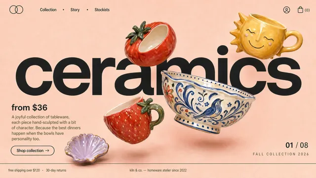
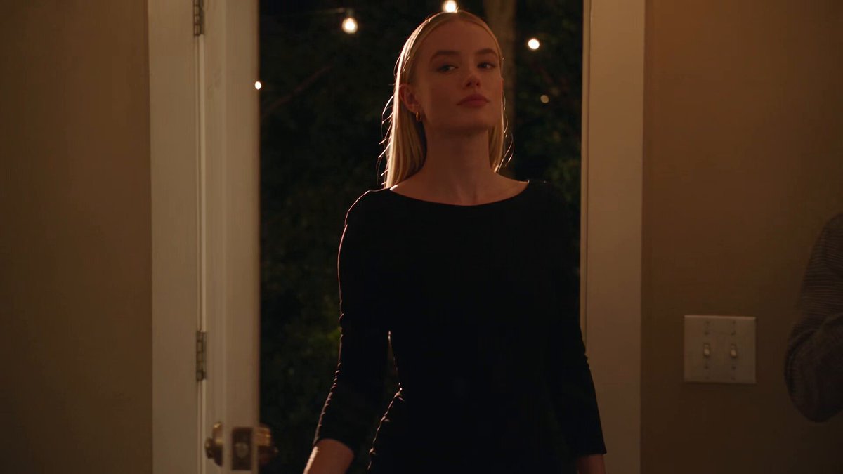
Thumbnails Are the Real First Frame of Your Video
Long before a viewer hears your opening line, they have already made a decision about your video. That decision happens in a fraction of a second, on a crowded screen, at a size no bigger than a postage stamp. The thumbnail is not packaging that sits next to your content; functionally, it is the first frame of your video, and it does more work than any single shot inside the edit.
This is why thumbnail software matters more than most creators admit. A brilliant edit, a perfect script, and pristine audio can all be undone by a cover image that reads as noise. Conversely, a modest video with a clear, well-composed thumbnail can outperform a stronger competitor simply because more people clicked. Click-through rate compounds: more clicks produce more watch time, more watch time produces more recommendations, and recommendations produce the audience that makes the next upload easier.
The market has responded with a confusing array of options. There are full graphic design suites, browser-based editors, single-purpose AI image generators, and video platforms that now ship thumbnail tools as part of the editing pipeline. This guide walks through what each family of tools does well, how to choose between them, and how to build a repeatable workflow that produces strong covers without consuming your entire production week.
What Modern Thumbnail Software Actually Needs to Do
Basic cropping and a text overlay are table stakes. The tools that genuinely earn a place in your workflow tend to share a specific set of capabilities.
The core capability checklist
- Frame extraction at full resolution. You should be able to pull a clean still from any timestamp without losing sharpness, including from high-bitrate footage.
- Non-destructive layering. Text, subject cutouts, background gradients, and borders should live on separate layers you can toggle, reorder, and revisit later.
- Subject isolation that respects hair and edges. Automatic background removal has improved dramatically, but the difference between a usable cutout and a jagged one is usually in edge refinement.
- Typography that stays legible at small sizes. Font pairing, stroke, shadow, and letter spacing controls matter far more than exotic typefaces.
- Template and brand consistency. Saving a layout with locked colors and fonts keeps a channel recognizable across dozens of uploads.
- Safe-zone guides for each platform. Duration badges, profile icons, and progress bars all cover parts of your image.
- Fast export at platform-native dimensions. You should be able to output a 1280×720 landscape cover, a 1080×1920 vertical cover, and a square variant from the same project without rebuilding.
Signals that separate good tools from adequate ones
Beyond the checklist, look for tools that support iteration speed. Can you duplicate a project, swap one variable, and export in under a minute? Can you preview the thumbnail at actual display size, not just zoomed in at full resolution? The single most common cause of weak thumbnails is that creators design them at 4x the size viewers will ever see them. A tool that offers a true-to-life preview panel prevents that mistake.
Predictive features are increasingly common as well. Some platforms analyze your cover and estimate how it will perform against similar content, often by scoring contrast, face presence, and text density. Treat these scores as directional feedback rather than verdicts. They are useful for catching obviously weak compositions, not for predicting a specific result.
The Three Families of Thumbnail Tools
Almost every option on the market falls into one of three groups. Each solves a different problem, and most serious creators end up using two of them.
Traditional design suites adapted for video
Full design applications were built for print and web, then gradually grew video-friendly features: video frame import, artboards at multiple sizes, and export presets for common platforms. Their strength is control. If you can imagine a composition, you can build it, including custom illustration, texture work, and precise type manipulation.
The trade-off is time. A polished cover in a general design tool typically takes twenty to forty minutes for someone experienced, and considerably longer for a beginner. Templates reduce that, but template fatigue is real - audiences start recognizing the same three layouts across a niche. These tools work best for creators with a design background, or for channels where the cover image is itself part of the artistic product.
Dedicated AI thumbnail generators
AI-first tools take a different approach: you describe the cover, supply a few references, and the tool produces several options. Most combine a text prompt with either a video frame, a photo of yourself, or an extracted subject. The best implementations let you upload a reference image to lock in style, then generate variations that keep the same lighting, palette, and composition logic while changing expression, background, or framing.
Where these tools shine is throughput. Generating ten credible options in a couple of minutes changes the psychology of the process - instead of agonizing over one design, you compare and refine. Where they struggle is precision. Text rendering inside generated images is still unreliable, so plan to add headlines and labels in a separate layer. Compositional intent can also drift; if you need an exact crop of a specific expression, expect to iterate.
A practical pattern is hybrid: generate or isolate the visual layer with AI, then finish the composition, typography, and safe-zone alignment in a manual editor. You get the speed of generation and the control of hand assembly.
Built-in tools inside video editing and publishing platforms
The third family embeds thumbnail creation directly into the video pipeline. You are already working with your footage, your color grade, and your project timeline, so exporting a still frame as a starting canvas requires no context switch. Some platforms go further, offering layout tools, subject extraction, and template libraries inside the same interface.
The obvious advantage is continuity: the frame you choose matches exactly what viewers will see when they press play. The limitation is depth. Built-in tools rarely match dedicated design software for typography, and they rarely match AI generators for variation speed. But for creators publishing on a tight schedule, the reduced friction often beats theoretical capability.
How to Choose the Right Tool: A Decision Framework
Rather than chasing the most feature-dense option, match the tool to your actual constraints.
Questions to answer before you commit
- How many covers do you produce per week? One or two per week justifies a slower, higher-control tool. Daily publishing demands speed and template systems.
- Do you appear on camera? Channels built around a person benefit enormously from expression-driven covers and reliable subject isolation. Faceless channels need strong graphic hierarchy and background design instead.
- How consistent is your visual identity? If your brand relies on a fixed palette and type system, prioritise tools with locked templates and shared asset libraries.
- Who else touches the file? Collaborations and editors require shareable project files, comments, and version history.
- What is your design skill floor? A tool that demands taste you do not yet have will slow you down. Preset-driven options with sensible defaults beat blank canvases for most beginners.
Matching tool type to workflow stage
A useful mental model is to treat cover production as three stages: source, compose, and finish. Source is where you get the raw visual - a frame, a photo, or a generated image. Compose is where you arrange elements and set hierarchy. Finish is where you add text, align to safe zones, and export.
AI generators dominate the source stage. Manual design suites dominate the compose and finish stages. Integrated platform tools are strongest when you want all three in one place and can accept slightly less polish. Choose based on which stage currently costs you the most time.
A Repeatable Thumbnail Workflow From Brief to Publish
The creators who consistently produce strong covers are not more inspired than everyone else. They follow the same sequence every time, which removes decision fatigue.
Step 1: Write the one-sentence promise
Before opening any software, write a single sentence describing what the viewer will get. "I rebuilt a broken chair using only hand tools." "This is why your exports look muddy." The thumbnail must visualise that promise, not summarise the whole video. If your sentence contains three ideas, your cover will contain none.
Step 2: Collect references before you create
Gather five to ten covers from your niche that performed well, plus two or three from outside your niche that use interesting composition or colour. Do not copy them; extract principles. Note where the subject sits in frame, how much text appears, and which colours dominate. This reference set becomes the input for AI generation and the benchmark for your own layout.
Step 3: Build the source visual first
Pick or generate the hero image before thinking about text. Options include a sharp frame with an expressive face, a generated scene that is impossible to film, or a clean cutout of the subject placed against a graphic background. Whatever you choose, ensure the subject occupies a meaningful portion of the frame - roughly a third to a half in most successful covers - and that the visual reads clearly when reduced.
Step 4: Compose with contrast and directionality
Arrange elements so the eye has an obvious path. Common patterns include a left-aligned subject with text on the right, a centered subject with a headline above and below, or a diagonal split between two contrasting states. Increase contrast between subject and background rather than relying on outlines. Directional cues - a gaze, a pointing hand, an arrow - should lead toward the text, not away from it.
Step 5: Add text like a headline writer, not a caption writer
Three to five words is the sweet spot. Use heavy weights, generous letter spacing for small caps, and a subtle stroke or drop shadow to keep the type readable against busy backgrounds. Never place text over a high-detail area. If the words do not add information the image already conveys, cut them.
Step 6: Check the display-size preview and safe zones
Shrink your canvas to roughly the size it will appear in a feed. If you cannot identify the subject and read the headline instantly, revise. Then verify that nothing important sits under the duration badge, the progress bar, or platform overlays.
Step 7: Export variants and make a decision
Export two or three genuinely different directions, not minor colour tweaks. Publish one, keep the others, and compare performance after a reasonable window. Over time you build a private library of what works for your specific audience - far more valuable than generic best-practice advice.
Advanced Techniques for Reference-Driven Design
Locking style with a reference image
When you supply a reference image to an AI generator, be specific about what should carry over. Prompt for lighting direction, colour temperature, lens character, and mood separately from subject description. Style transfer works best when the reference and the target share a rough compositional similarity; forcing a portrait reference onto a wide action shot usually produces mush.
Batch generation with brand consistency
Generate five to eight variations at once, then pick the best two. Keep a saved prompt template with your channel's palette and framing rules written into it. This turns generation from a creative gamble into a repeatable production step, and it keeps covers visually related across a playlist or series.
Closing the loop with analytics
Track click-through rate per cover, not per video, and note which visual variables changed. After twenty or thirty uploads, patterns emerge: maybe your audience responds to close-up faces, or maybe high-contrast text blocks outperform environmental shots. Feed those findings back into your prompt templates and layout presets. The workflow gets sharper every month without requiring more time per cover.
Platform-Specific Rules That Change Your Layout
Landscape video platforms
Standard thumbnails render at 1280×720. A duration stamp sits in the lower right, so keep that corner clean. Because the image is often shown at a quarter of its resolution, thin lines and small text disappear. Bold shapes and heavy type survive.
Vertical and short-form feeds
Vertical covers are displayed in full-bleed tiles, which means the top and bottom edges may be partially covered by interface elements and captions. Design with a generous central band for your subject and headline. Vertical covers also tend to perform better with fewer words, since the format is consumed faster.
Podcast, course, and streaming platforms
These platforms usually impose stricter aspect ratios and often overlay titles or episode numbers beneath the image. Leave breathing room at the edges, and avoid placing critical text near the bottom. Square formats are common here, so building your layout on a square artboard and cropping outward saves considerable rework.
Social distribution and community posts
When you share a video link in text-based feeds, the cover is often cropped to a wide banner. Test your design under a heavy crop. If the meaning collapses, create a companion banner variant that emphasises the headline over the subject.
Common Mistakes and How to Fix Them
Too much text. If your cover reads like a sentence, reduce it to a phrase. The video title carries the detail; the thumbnail carries the emotion.
Designing at full zoom. Always check the reduced preview. If you cannot parse the image in under a second, start removing elements.
Low subject-background contrast. A person in a dark shirt against a dark wall becomes a silhouette. Light the subject, lighten the background, or add a rim of contrasting colour.
Reusing one template indefinitely. Familiarity helps recognition but hurts curiosity. Rotate two or three layouts rather than one.
Ignoring mobile dominance. The majority of impressions happen on small screens. Preview on a phone before publishing.
Mismatched promise. A dramatic cover with a calm video produces clicks and immediate drop-off, which suppresses future reach. The thumbnail must honestly represent the content.
Skipping the archive step. Save layered project files. Rebuilding a cover from a flattened export because you need to change one word is a waste of an hour.
Building a Small, Sustainable Tool Stack
Most creators do not need five subscriptions. A practical minimum is one source tool, one composition tool, and one place to store templates and prompts.
- Source: a generator or isolation tool for hero images and cutouts.
- Composition: a layered editor with saved templates and safe-zone guides.
- Library: a shared folder containing your prompt templates, font files, colour values, and reference board.
If your publishing platform already handles composition and finishing adequately, you can skip the second tool and reinvest that time into testing more variants. The goal is not the most sophisticated stack; it is the shortest path between an idea and a published cover that accurately represents your video.
Frequently Asked Questions
Can AI-generated thumbnails match hand-designed ones? For imagery, yes - often closely. For typography and precise composition, manual finishing still wins. The most reliable approach combines generation for visuals with manual assembly for text and layout.
How many thumbnails should I test per video? Two or three genuinely distinct directions is enough to learn something. Testing variations that differ only in font weight rarely produces useful insight.
Do faces always improve click-through rate? Not always, but expressive faces usually outperform neutral ones because they convey emotion quickly. If your channel is faceless, compensate with strong graphic hierarchy and clear text.
What resolution should I export? For landscape covers, 1280×720 is standard. Export vertical and square variants at their native sizes rather than cropping a finished landscape file, which distorts layouts.
How often should I update my templates? Review quarterly. If every cover from the last three months looks identical, it is time to rotate layouts while keeping your palette and type system intact.
Is it worth learning a full design suite? If you publish frequently or want precise control, yes. If you publish sporadically, a template-driven tool plus an AI generator will cover most needs with far less learning time.
How do I keep covers consistent across a series? Lock the colour palette, typeface, and text position, then vary only the subject and one accent colour. Viewers should recognize the series before they read the title.
The Bottom Line
Thumbnail software is not the differentiator; the workflow around it is. Pick a source tool, a composition tool, and a system for storing what works. Write the promise before you open the app. Compose for contrast, keep text short, and always judge the result at feed size. Then measure, adjust, and repeat.
Do that consistently and the tools fade into the background, which is exactly what you want. The covers get faster to produce, the click-through rate trends upward, and the energy you save goes back into the videos themselves - the part your audience actually came for.

Alexander
More Blogs
Read MoreVidu Q4 Alternatives: 4K AI Video Models Compared (2026)
Vidu Q4 alternatives compared: Kling 4.0, Seedance 2.5, Wan 3.0, and Runway Gen-4 — 4K support, input modes, durations, audio, and what each costs in credits on Domer.
Top 4K AI Image Generators in 2026: 5 Models Compared on Real Costs
The top 4K AI image generators on Domer compared: Flux 3 Klein, Nano Banana 2.1, GPT Image 2.5, GPT Image 2, and Nano Banana Pro — 4K credit costs, reference limits, and speed.
Nano Banana 2.1 vs GPT Image 2.5: Which Image Model Should You Use? (2026)
Nano Banana 2.1 vs GPT Image 2.5 Flare compared: credit costs per resolution, aspect ratios, reference images, text rendering, and which tasks fit each model.