

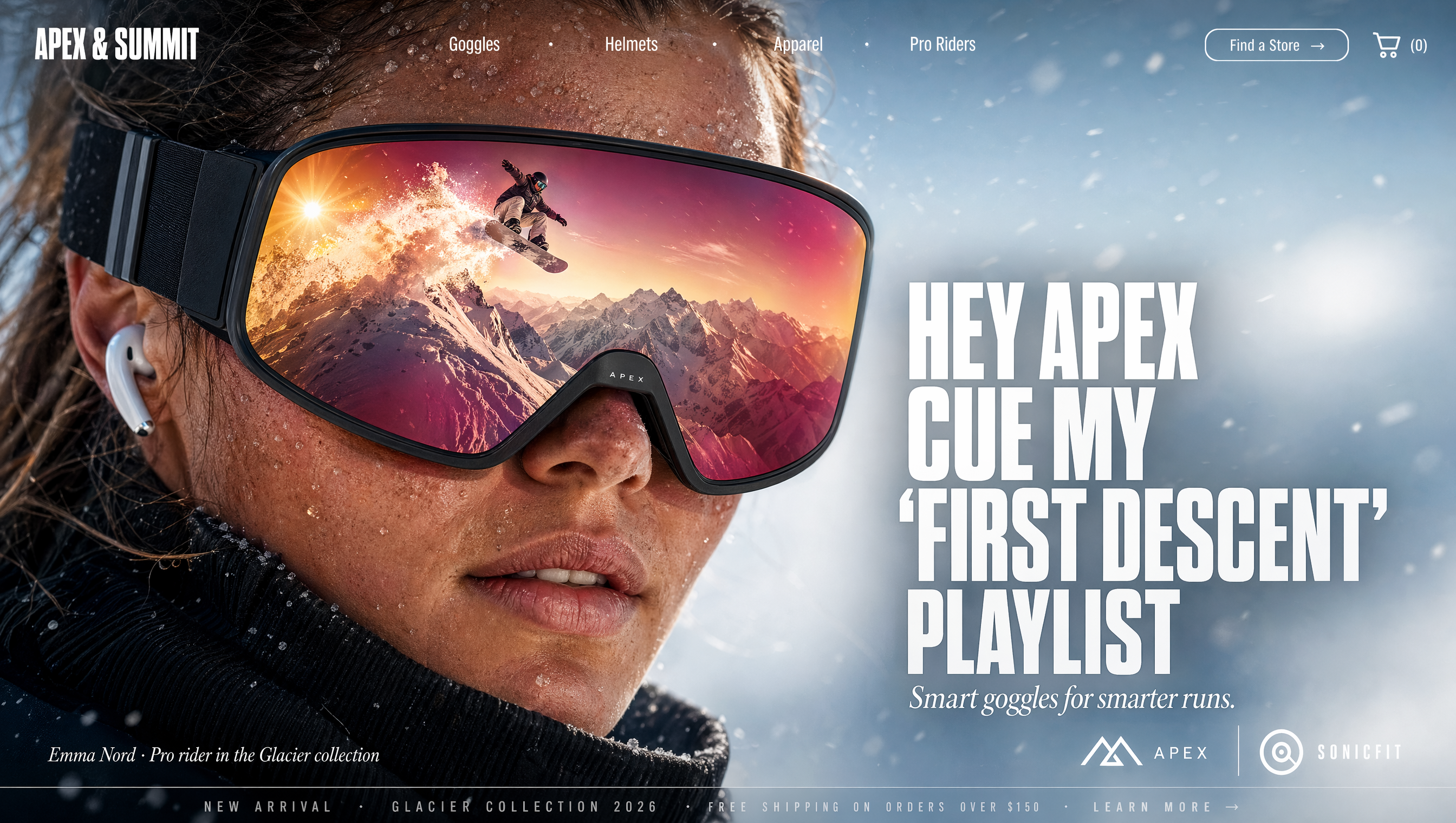
There has never been a better time to be a visual content creator. The old gatekeepers of image production, the illustrator, the stock photo agency, the expensive designer, have all been forced to share the stage with something much more patient: a generative AI that turns a sentence into a finished image in seconds. For bloggers, social media managers, and small brands, that means a creative surplus that did not exist two or three years ago. The hard part is no longer getting a picture made. The hard part is making the right picture, consistently, and weaving it into content that stands out rather than blends in.
This guide is a working manual for choosing and using AI image generators well. We will walk through how the technology evolved, how to get controllable output rather than lucky output, how to keep style consistent across a whole set of assets, and how to fit these tools into a realistic budget and workflow. You will end with a practical decision framework and a set of tips you can apply the same day.
From Lab Curiosity to Everyday Tool
Generative AI imagery did not arrive fully formed. It is worth understanding the arc, because that arc explains why some tools feel magical and others feel frustrating.
The breakthrough that changed everything was the diffusion approach. Instead of the model trying to invent an image directly, it learns to remove noise. Training shows the model millions of images being progressively blurred, and the model learns the reverse: how to de-blur, or denoise, starting from random static and refining it toward a recognizable picture. That iterative refinement is why modern generators can produce such detailed and coherent results compared with the first generation of text-to-image attempts.
Early diffusion models were impressive but rough around the edges. Hands rendered with too many fingers, eyes slightly off, backgrounds that collapsed into mush. The next wave added better understanding of composition and language, so prompts describing a scene, a style, and a subject began to be honored more faithfully. Then came resolution and speed gains, and finally the quality that turned these tools from novelties into production assets.
The takeaway is that current tools sit on a mature base. The differences you experience between platforms are largely differences in how that base is tuned, how much control the interface exposes, and how well the model understands style and context.
What Actually Controls the Output You Get
Here is the most useful mental model for working with an AI image generator: you are not describing a picture, you are compiling an instruction set. Every word in your prompt is a tiny clamp on the model's imagination. The richer and more specific the clamp, the more the output converges on something usable.
A weak prompt like "a robot dog" gives the model almost nothing to work with, so it assembles a generic robot dog out of whatever training data it favors at that moment. A strong prompt does several jobs at once. It names the subject and what it is doing. It describes the environment, the lighting, the camera or framing. It states the style, the mood, and any explicit constraints like "no text" or "minimalist composition."
A productive prompt pattern reads almost like a shot list:
Subject and action first. What is in the frame, and what is it doing? "A small white robot dog sitting beside a potted fern on a sunlit wooden floor."
Environment and light next. Where and why it looks the way it looks. "Soft morning light through a large window, gentle shadows, cozy minimal room."
Style and finish. "Photorealistic, shallow depth of field, high detail" or "flat 2D illustration, muted pastel palette, clean linework."
Negative constraints where they matter. "No text, no watermark, no extra limbs."
You will learn your tool's dialect. Some respond best to photography vocabulary like "shot on 85mm lens" or "golden hour." Some respond to art-historical terms. Keep a short list of what works and reuse it across projects.
Keeping Your Style Consistent Across Everything
The complaint that defeats most non-designers using AI is consistency. It is easy to generate one beautiful image. It is much harder to generate a hundred images that look like they belong to the same brand, campaign, or story. Inconsistency is what makes AI content look cheap.
Production teams solve the consistency problem with a mix of technique and tooling. The most reliable technique is reference control: feed the generator one or more source images that define the subject, the color palette, or the style, then instruct the model to stay faithful to them. Many tools let you lock a character across scenes by starting each prompt from a shared character reference.
When a tool lacks strong reference controls, you approximate consistency with a style template. Define a canonical style description, one paragraph that names the palette, the rendering finish, the composition habits, and the type of subject. Paste that same block into every prompt for the project, and vary only the scene-specific words. It is not as tight as true reference locking, but it is dramatically more coherent than free-form prompting, and it works across almost any tool.
For teams that need the tightest results, workflows that generate a base image and then copy its style onto subsequent renders, sometimes called style transfer, are the closest thing to a repeatable identity. You invest once in a hero asset, then propagate its look.
A Practical Comparison of Tool Families
No single tool serves every need, but understanding the families helps you pick fast. The market splits into a few broad groups.
Mainstream text-to-image services offer the best balance of quality, speed, and ease of use. They handle a wide range of subjects, render quickly, and need no technical skill. They are the right default for social content, thumbnails, blog hero images, and concept sketches. Their weakness is less precise control and less consistent style across many images.
Photorealistic specialists push the realism envelope. They excel at lighting, texture, and material fidelity, useful for product shots, architectural visualization, and advertising comps. They tend to need more careful prompting and are often slower or narrower in subject range.
Style-focused generators specialize in a particular aesthetic, such as anime, watercolor, or pixel art. They deliver striking, on-brand output with little effort, but they are inflexible: they want to draw in their house style, and pushing them toward something else fights the model.
Then there are versatile platforms that combine generation with broader asset workflows, such as editing, inpainting, upscaling, and sometimes video. These are the workhorses for teams that need an end-to-end visual pipeline rather than a single button.
The pragmatic move is to keep one strong generalist for daily work and add specialized tools only for the needs that the generalist clearly fails, rather than subscribing to five services and using each once a month.
Making the Most of a Modest Budget
Budget is where the dream of studio-level output meets the reality of a small business. The good news is that AI image generation is one of the cheapest forms of professional-grade visual production ever available. A handful of good assets can cover a week of blog and social content, and the marginal cost of an extra image is insignificant.
The trick is efficiency. Batch your generation instead of prompting one-off images on demand. When you have a briefing moment, generate a full set of variations at once, then select the winners and move on. Avoid the near-universal habit of looping dozens of retries on a single stubborn prompt; fix the prompt, not the random seed.
Plan your asset needs ahead. List the images a post or campaign requires: one strong hero, two or three supporting visuals, maybe a meta thumbnail. Generate them together with a shared style block so the set is coherent. Coherence across a set is worth far more than any single beautiful image out of context.
Reserve premium spend for the assets that actually carry revenue, such as product shots and campaign key visuals. Routine filler, decorative illustrations, and social accents rarely justify anything beyond a solid default tool.
When AI Imagery Is the Wrong Choice
As useful as these tools are, they are not always the answer, and knowing when to reach for a human or a camera is part of professional judgment.
When the image must be factually accurate, such as a specific product, a real person, or a documented event, generated imagery can mislead even when it looks perfect. Use real photographs or human art for anything that must be verifiable.
When brand identity is precious and already built, a custodian of your visual language a human art director might better protect the nuances that an AI model cannot hold. AI is a collaborator, not necessarily the sole author of a fine-tuned brand system.
When subtle legal and licensing contexts matter for commercial use, review your tool's terms. Knowing whether you can sell the output, and whether the model training raises concerns for your clients, protects you from surprises later. Some tools are explicitly permissive for commercial work; others carry restrictions.
The professional approach is a portfolio: AI for speed and volume, human craft where accuracy, identity, or legal certainty is paramount.
Fixing Common Failures Quickly
Even careful users hit failures. A short troubleshooting playbook keeps you moving.
Hands and fingers distorted? Common across diffusion tools. Regenerate, reduce complexity in the scene, or add the explicit instruction to keep anatomy natural. Zooming closer to the subject often helps.
Text garbled or misspelled? Few models render legible text well. Either design without in-image text and add captions in an editor afterward, or use tools purpose-built for typography.
Faces subtly wrong or asymmetric? Tighten the subject reference or lower the scene complexity that competes for the model's attention. Consistency references usually fix this.
Style drifting between generations in a set? Reinforce the shared style block or switch to reference-based generation that anchors each render to a source image.
Output feels generic or stocky? Add a specific, concrete subject and action instead of a vague noun phrase, and inject an unusual setting or interaction the model must actually picture.
Treat each failure as a single-variable problem. Change one thing, regenerate, compare. Rage-retrying the identical prompt hoping for a different result is the amateur move.
Licensing, Disclosure, and Staying Above Board
Fast tools invite fast shortcuts, and it is worth slowing down long enough to keep your AI imagery on the right side of the rules. This is not just about avoiding surprises; it is about protecting a relationship with an audience that increasingly cares about how content was made.
Check your tool's commercial terms before you build a brand on it. Permission to use the output commercially, rules about reselling, and how the model was trained vary by service. Some platforms are explicitly permissive about commercial work and reselling; others carry restrictions for specific uses. Knowing these up front keeps a usage question from becoming a legal one later.
Be thoughtful about transparency. Disclosing that an image is AI-generated is not just a legal nicety in many contexts, it builds trust. An audience that is surprised by a generated product shot later feels deceived; an audience that knows your workflow feels respected. Match the disclosure to the stakes: low-stakes decorative content is one thing, a marketing claim about a real product is another.
Keep real-world accuracy sacred. Never present an AI image as a genuine photograph of a specific person, place, or event in a way that could mislead. When the content could be mistaken for reality and that reality matters, label it clearly or use a real image instead. This discipline protects you and your audience, and it buys the whole medium the room to be useful rather than dangerous.
Building Your Own Visual Workflow
The difference between someone who dabbles and a team that ships is process. Here is a lean workflow that scales from a solo creator to a small team.
Plan: define the message and the asset list for the week. A one-page brief naming each required image and the shared style block is enough.
Generate in batch: produce a working set of candidates per asset, pick the strongest, and set the rejects aside. Do not edit while generating.
Refine and curate: apply reference or style tweaks only to the assets that will actually be published. This is where the coherence and brand polish happen.
Assemble: drop the selected images into your posts, social tiles, and thumbnails. Keep naming consistent so the files stay findable when the campaign needs a variant.
Review: once a week, look back at what performed and feed the lessons back into the style block and subject choices next round.
That feedback loop is the quiet engine of improvement. The teams that get visibly better are not necessarily better at prompting; they are better at looking at results, learning, and adjusting the system.
Final Thoughts
AI image generation has collapsed the distance between an idea and a finished visual. The winners in this new landscape will not be the people with the flashiest tool or the most retries. They will be the people with clear vision, a consistent visual language, and a disciplined process that turns a fast tool into reliably on-brand content. Start small, lock in a style, ship a complete campaign, and let the results teach you what to do next. The tool is ready whenever you are.
