
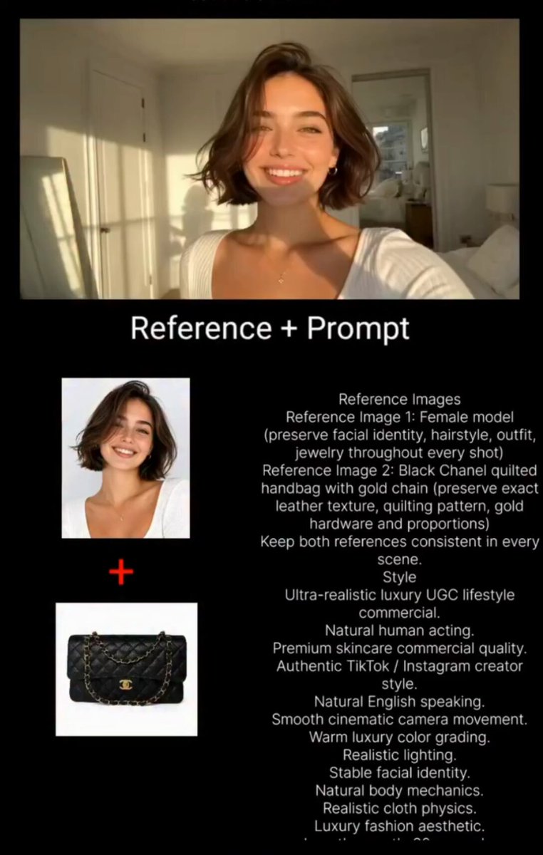

Text-to-image and text-to-video models have grown dramatically in quality, but the gap between a raw generation and a polished final frame is still enormous. A model may give you the right composition, yet introduce blurry edges, inconsistent lighting, or a style that does not quite match what you imagined. For anyone at the point where image quality and style control decide the success of a piece, the ability to refine and restyle output is more valuable than raw generation power.
That is the territory of image refinement and style shaping. This guide looks at the practical techniques, the technical decisions, and the workflow choices that let creators move from a good first pass to a consistent, high-quality visual result.
What image "quality" actually means in an AI workflow
Quality is not one thing. It is a stack of properties that each need to be handled, often in a specific order.
Sharpness is the most obvious. A generated image can suffer from softness, especially in edges and small details like hair or fabric texture. Improving sharpness means recovering fine detail without introducing the unnatural halos that come from careless sharpening.
Consistency is about the relationship between parts. Are the shadows falling in one direction? Does the material in the background feel like the same material as in the foreground? Inconsistent lighting and texture read as "AI slop" to a trained eye, even when the overall composition is impressive.
Style coherence is a third layer. Two images in a series should feel like they belong to the same visual language, sharing color palettes, line quality, and mood. Without this, even individually beautiful frames fail to form a convincing whole.
The role of pixel-level reconstruction in refinement
Many refinement tools work at the level of how individual groups of pixels are rebuilt. Rather than treating the whole image as a blank canvas, a reconstruction approach examines local regions, evaluates how each cluster relates to its surroundings, and rebuilds detail that preserves spatial relationships.
The practical result is a refinement that understands context. A reconstruction algorithm can smooth a noisy sky while preserving the fine texture of a woven fabric, because it treats different areas differently based on their local structure. This contextual awareness is what separates a genuinely useful refinement step from a generic blur-and-sharpen filter.
For users, the benefit is simpler: you can clean up artifacts and add crispness while keeping the image looking natural. The algorithm does not just increase contrast; it reconstructs plausible detail in the right places.
Why style transfer benefits from a layered approach
Putting a new style onto an image is rarely as simple as applying a filter. The reason is that style lives in multiple dimensions at once. Color palette, contrast behavior, texture density, line weight, and lighting model all contribute to how an image "feels." Dragging all of those dimensions together with one slider usually destroys the underlying structure.
A robust approach separates the image into structure and style. The structure holds the subjects and their arrangement; the style holds the visual vocabulary. Once separated, you can replace the style layer while leaving the structure intact. This is why good style tools preserve the identity of your subject even as the mood shifts dramatically.
This separation also matters for batch work. If you are producing a series where every item must share a style, you lock the style layer and vary only the structure. The result is a coherent set, rather than a pile of unrelated images that happen to share a keyword.
Controlling the color palette without flattening the image
Color is often the fastest way to unify a series, but it is also the easiest way to ruin depth. A heavy-handed color shift can turn a textured image into a flat poster.
The key is to control color at the palette level rather than the brightness level, and to preserve the relative differences between regions. If skin tones are warm and the environment is cool, that contrast carries meaning. A good palette tool lets you bend the overall mood while keeping those meaningful contrasts intact.
When restyling a series, define a small set of palette anchor points: a primary color, a secondary accent, and a neutral range. Keep those anchors consistent across frames. Everything else can vary naturally, and the palette anchors will pull the set together.
Handling artifacts and adding sharpness without over-processing
Artifacts are the fingerprints of fast generation. Common examples include repeated noise patterns in flat areas, wobbling edges on fine structures, and banding in gradients.
The first rule is to be selective. Aggressive processing across an entire image trades one set of artifacts for another. Target the areas that most need help: sharpen edges, denoise flat regions, and leave medium-texture areas mostly alone.
The second rule is to work in stages rather than one final filter. Clean, then sharpen, then light color balance. Each stage is small enough to inspect and undo. A long chain of tiny, reversible steps beats a single invasive pass.
Building visual consistency across a sequence of images
If you are producing frames for a sequence or frames that belong to the same story, consistency is the metric that matters most.
Lock the fundamentals first. Decide the primary light direction, the general time of day, the palette anchors, and the material language before generating anything. Write these down so every frame inherits the same defaults.
Then, review the set as a group, not one by one. Place several frames side by side and ask whether they feel like one world. Differences in sharpness, color temperature, or texture density between frames are what break immersion.
Finally, make pass adjustments uniformly. If frame three is slightly too warm, do not fix only frame three; nudge every frame by the same amount and preserve the relative differences.
Techniques for diverse styles without losing the subject
Exploring different styles is easiest when you can treat style as a swappable layer. Three approaches work well in practice.
Palette re-mapping for mood
Restricting a palette dramatically changes mood while leaving structure intact. A desaturated, high-contrast palette reads as dramatic; a warm, low-contrast palette reads as nostalgic. Choose the mood, then map the existing image into that palette.
Texture substitution for material feel
Changing perceived material is about texture. Grain, gloss, softness, and fabric density all read as material. By adjusting these without moving the subject, you can make the same composition feel like film, like illustration, or like sculpture.
Line and edge treatment for graphic styles
Line weight and edge sharpness push an image toward illustration or toward photography. Heavier, cleaner edges read as graphic; soft, organic edges read as photographic. Matching the edge treatment to your intent is a quick lever for style.
Practical workflow for a consistent set
A reliable workflow removes guesswork from finishing and restyling.
Start with selection. Choose a reference frame that best represents the mood and quality you want. Refine that frame fully until it is exactly right.
Establish the style settings. From that controlled frame, extract the palette anchors, contrast behavior, and texture treatment as your defaults.
Apply to the set. Run the same settings across the rest of the frames, reviewing them as a group.
Fix outliers. Bring inconsistent frames back toward the group average, preserving their individual composition.
Export and review on real devices. Colors and sharpness look different on a phone screen than on a desktop monitor, so check the final set where it will actually be seen.
Common mistakes and how to avoid them
Over-sharpening is the most common refinement error. It creates visible halos around edges that read as obviously processed. Prefer several light sharpening passes over one heavy one, and zoom in to check edges.
Losing the subject during restyle is a close second. When you push a style too far, the identity of your character or product can dissolve. Check that the key identifying features survive the style change.
Inconsistent processing across a set is third. Refining each frame separately without shared settings creates a set that looks like it was made by different people. Batch your settings and review as a group.
Building a reusable style kit
The fastest way to reproduce a style later is to save it as a kit. Store the palette anchors, the texture settings, the edge treatment, and the contrast pitch along with one or two example images.
When you need to reuse the style, load the kit, drop in new structure, and regenerate. This turns a one-time creative effort into an reusable asset that shortens every subsequent project.
Frequently asked questions
How do I know an image is over-processed?
Zoom into edges and flat areas. Halo lines around edges and a waxy, unnatural look in skin and sky are signs of over-processing.
Can I keep a subject's identity while changing style?
Yes, if you separate structure from style and apply the style layer while leaving the identifying features intact. Test that the key details survive.
What does "consistent lighting" mean?
It means the direction, intensity, and color of light are plausible and matching across an image or a set, so objects sit in one coherent space.
Is higher sharpness always better?
No. Sharper is not always better; naturalness matters more. Over-sharpened images look artificial and cheap.
How do I get a consistent palette across many images?
Anchor a small set of palette colors and apply them uniformly, preserving the relative differences between regions rather than forcing everything to the same tone.
Conclusion
Image refinement and style control are where generic AI output becomes distinctive work. Sharpness, consistency, and style coherence are not mysterious luxuries; they are outcomes you can plan for with a clear workflow. Separate structure from style, refine selectively and in stages, lock your palette anchors, and always review your work as a set rather than a collection of coincidences. With these habits, the images you finish will look intentional, coherent, and unmistakably yours, no matter which model produced the first pass.
Building a review loop with other creators
Style and consistency are hard to judge from inside your own workflow. After staring at the same set of frames, your eye normalizes the flaws. A fresh pair of eyes catches what you have learned to ignore.
A light review loop with a trusted collaborator adds enormous value for almost no cost. Ask someone to look at your frame set and simply point out where an image stops feeling cohesive. The feedback needs no technical vocabulary; a trusted instinct is enough.
You can also learn by studying reference work. Collect examples whose palette, material feel, or consistency you admire, and compare your output against those references. Not to copy, but to calibrate your standard. Over time you build an internal sense of "done" that is far more reliable than any checklist.
Managing refinement at scale with batching
When a project involves many frames, refining each one individually is both slow and inconsistent. Batching shares the decisions across the set and keeps the group coherent.
First define the style settings once on a single reference frame. Then apply those same settings to the entire batch. Review the results as a group, and fix only the genuine outliers rather than reworking every frame.
Batching also saves time on repetitive steps like resizing, format conversion, and metadata tagging. When you configure once and run across the set, the mechanical work collapses, leaving room for the creative judgement that only you can provide.
Choosing between automated polish and manual control
Not every step needs to be automated, and not every step should be. Automation gives speed and consistency; manual control gives nuance and the ability to handle unusual cases gracefully.
The skilled workflow is to know which is which. Let automation handle the repetitive, well-defined operations such as denoising standard noise, resizing, and applying a locked palette. Keep manual control for the moments that define the piece, such as the decisive color decision, the careful preservation of a subject's identity, or the fix for an unexpected artifact.
When you reserve your attention for the decisions that matter, the quality of the whole set rises without a proportional increase in effort. The goal is not to do everything by hand or to automate everything; it is to place each step in the camp where it performs best.
Building a consistent vocabulary across your work
The strongest visual identity is a vocabulary, a set of habits that persist across projects. This is what makes your work recognizable even when the subjects are completely different.
You can design this vocabulary deliberately. Choose a family of palettes, a range of textures, and a preferred treatment of edge and light that feel like yours. Keep those tendencies stable while the subject matter changes. Over time, viewers associate that range of ways of seeing with you.
This consistency does not mean repetition. A well-developed vocabulary has room for variation while still feeling like one author. It is the difference between works that are eclectic and works that are coherently diverse. Refinement and style control are the craft beneath that coherence.
Sustaining quality as your output grows
When you begin producing higher volumes, the risk is that consistency decays as speed rises. A few habits protect quality at scale.
Keep a written log of the decisions that produced your best work, so they can be reproduced. Keep a kit of your signature settings ready to load into any project. And keep reviewing your finished output as a group rather than trusting each image in isolation.
Quality at scale is not the absence of errors; it is the presence of a system that catches and corrects them quickly. When the system is strong, the individual weaknesses stop mattering, and your output remains recognizable, coherent, and well-finished no matter how fast you produce.
