
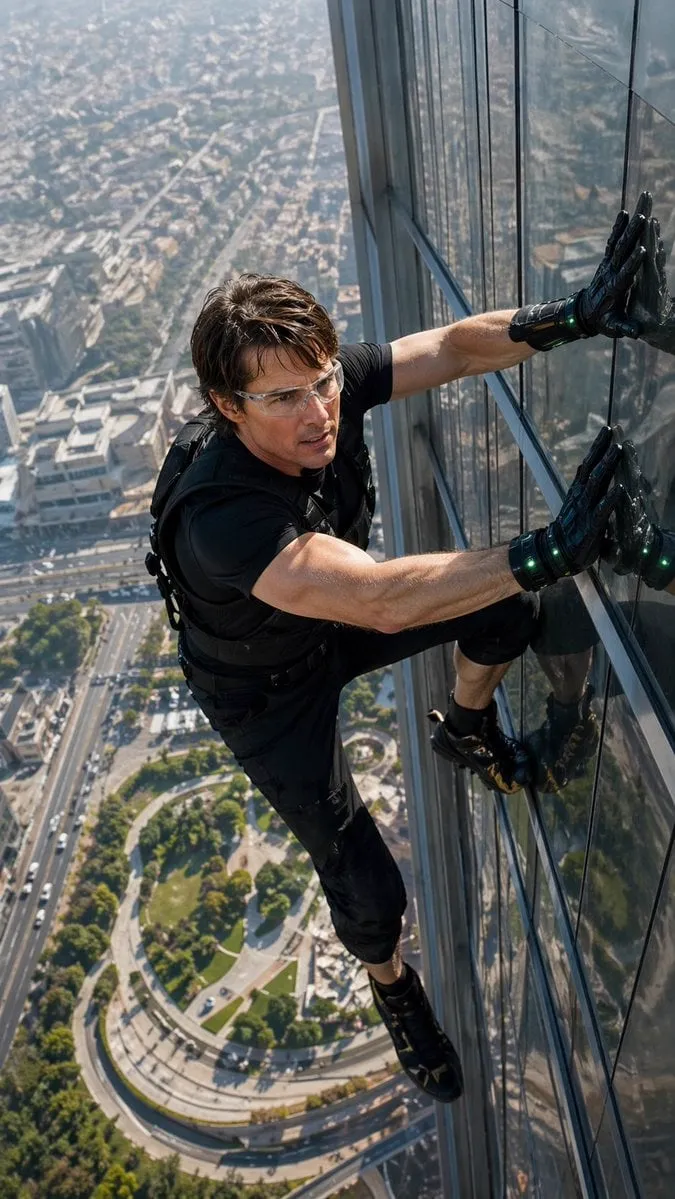
The difference between footage that looks ordinary and footage that looks expensive is rarely the camera. Often it is how the image is finished. Two files can start from the same source, and one will look soft, flat, and dated while the other looks sharp, rich, and cinematic. That transformation comes from two quiet but powerful steps: increasing resolution and grading color. Together they turn rough footage into content that holds up on today's large screens and feeds.
This guide is practical. We will cover how 4K upscaling works, why AI-powered upscaling beats older methods, how to protect quality while enlarging, and how color grading turns a neutral image into visual storytelling. You will learn about working with color spaces and dynamic range, using lookup tables effectively, and applying creative color choices that shape mood. By the end you will have a repeatable finishing routine for your footage.
Why Resolution and Color Matter Together
A high-resolution image with poor color looks technically clean but emotionally flat. A beautifully graded image at low resolution looks rich but falls apart when enlarged. Resolution and color are partners, and treating them as separate, independent steps misses the point of finishing. The goal is footage that is both sharp and expressive, and you achieve it by handling them in the right order and protecting both through the pipeline.
There is also a practical reality today. Screens are bigger and sharper than before, and audiences notice detail that used to be hidden. Footage that looked fine on an old phone looks blurrier and more washed out on a large 4K display. Finishing for sharpness and color is no longer a luxury for feature films; it is what keeps content competitive wherever it is watched.
What 4K Means in Practice
4K refers to a resolution of roughly 3840 by 2160 pixels, four times the pixels of standard high definition. More pixels mean more detail on large screens and more room to crop without losing sharpness. But simply declaring an output 4K does nothing if the source lacks detail. Enlarging a blurry image just produces a bigger blurry image. Real 4K work is about recovering and preserving detail as you scale, which is exactly where upscaling technology earns its keep.
How AI-Powered Upscaling Works
Upscaling is the process of increasing a video's resolution. The oldest methods, like bicubic interpolation, just estimate the missing pixels by averaging neighbors. They are fast but they make images look soft, and they often introduce halos and artifacts around edges.
AI-based upscalers work differently. Trained on enormous sets of high- and low-resolution image pairs, they learn how detail is structured in realistic images, and they use that learned understanding to reconstruct sharp edges and believable texture where a naive method would guess wrong. The result is footage that genuinely looks higher resolution, with cleaner edges and less softness, rather than merely being stretched.
What the AI Is Actually Filling In
When a model upscales, it creates information that was not explicitly there. It infers likely edge directions, plausible texture, and natural detail based on what similar regions look like in real footage. This is powerful, but it is also why AI upscaling must be used thoughtfully. It can invent texture that the original never had, which is usually good, or introduce a subtle synthetic look when pushed too aggressively. Understanding this trade-off helps you decide how far to push.
When AI Upscaling Helps Most
AI upscaling shines when the source is genuinely limited but the content matters, such as an old clip, a low-resolution source from a phone or a screen recording, or footage you want to crop into on a large canvas. It lets you rescue and enlarge material that would otherwise look dated. For footage already shot at high resolution, upscaling adds little, because the detail is already there. Match the technique to the need rather than applying it reflexively.
Tools and Workflows for Effective 4K Upscaling
A reliable upscale workflow is about preserving quality at every step, not just pressing an upscale button once.
Start From the Cleanest Source
Garbage in, garbage out. Begin with the cleanest, least compressed copy of the footage you have. Avoid re-encoding the source many times before you upscale, because each compression pass loses information that the upscaler then has to guess. Export in a high-quality codec from the editor and feed that to the upscaler.
Upscale in Stages, Not in One Leap
For very large jumps, such as from 720p to 4K, consider upscaling in stages rather than in one aggressive leap. Moderate increases in each pass preserve more detail and reduce artifacts than a single extreme enlargement. Test the pipeline on a short section before committing to the full clip, so you catch problems while they are cheap to fix.
Choose the Region, Not Just the Resolution
Where you upscale matters. A face, a product, or a complex texture benefits from careful detail recovery. A smooth sky or wall needs little. Some tools let you focus processing, and you can use masks to protect detail-rich regions. Matching processing effort to where the eye looks yields visible quality where it counts and saves compute where it does not.
Protecting Quality During Conversion
The most common way people ruin good footage is by crushing it during export. Every time you re-encode, you have a chance to lose data. Learn the settings that protect quality: a high bitrate, a codec that preserves detail, and the correct color handling.
Manage Your Dynamic Range
Footage can be recorded in standard dynamic range, SDR, or high dynamic range, HDR, which holds far more brightness detail. When you convert between them, decisions matter. Bringing an HDR clip into an SDR workflow requires deciding what to do with the extra highlight and shadow detail, and a careless conversion crushes those regions. Understand what the range of your source is and convert intentionally rather than letting a default setting decide for you.
Keep Color Faithful Through the Chain
Color shifts subtly at every stage: from capture, to editing, to the upscaler, to the final encode. If your color management is inconsistent, the same image can look warm on one screen and cold on another. Establish a consistent pipeline, calibrate what you can, and avoid double-applying color transformations. Consistency through the whole chain is the quiet foundation of trustworthy, predictable output.
Color Grading as Visual Storytelling
If upscaling makes footage sharp, grading makes it expressive. Color grading is the deliberate adjustment of color, contrast, and tone to support the mood and story of a piece. A thriller tends toward cool, desaturated shadows. A nostalgic scene leans warm and soft. A commercial product shot aims for clean, punchy, and appealing color. The grade makes the audience feel the scene, even when they cannot name why.
The Difference Between Corrections and Grading
There are two related but distinct jobs. Color correction brings footage to a neutral, natural, technically correct baseline: fixing white balance, bringing exposure into a pleasant range, and making skin tones look right. Grading then pushes the corrected image stylistically to create mood. Corrections hide problems and establish a clean base; grades add intent. Doing corrections before you grade prevents the creative decisions from being muddled by technical fixes.
Working With Color Spaces and Dynamic Range
Modern video involves several color spaces, and picking the right one shapes how your color survives delivery.
Understanding sRGB, Rec. 709, and Wider Spaces
For standard online delivery, color is usually expressed in a space such as Rec. 709 for video or sRGB for the web, which define how colors are stored and shown. Wider spaces hold more color, but only some displays can show all of it. The practical guidance is to work in the widest space your pipeline supports for editing, so you preserve latitude, and then convert carefully for delivery so the color appears as intended on the screens people actually use.
Managing SDR and HDR Together
If you deliver both an SDR and an HDR version of the same piece, do not grade them as if they were the same job. HDR holds far more brightness range, so shadows and highlights behave differently. Grade each version in the space it will be displayed in, or derive one from the other knowing that special attention is needed at the extremes. Consistent, intentional handling of both prevents one version from looking wrong.
Using Lookup Tables From Presets to Custom Grades
Lookup tables, LUTs, are one of the colorist's handiest tools. A LUT is a predefined set of color transformations, a recipe that maps every input color to a new output color.
Presets as a Starting Point, Not an End
Preset LUTs are fast and useful for quickly establishing a general mood, but they rarely fit a specific shot perfectly. The professional habit is to apply a LUT and then still correct beneath it, adjusting exposure, contrast, and color to fit the footage. A LUT that perfectly suits one scene can overdo another. Use presets to get close to the look, then finish it by hand for the shot you have in front of you.
Building Your Own Custom Grade
For signature, repeatable looks, build your own LUT or grade template and save it. Establish the contrast curve, the color balance, the specific saturations you want, and reuse that framework across a series or brand so everything feels connected. A custom grade is both a creative choice and an efficiency tool, because it turns a carefully designed look into a one-click starting point for every future clip.
Creative Color Techniques to Shape Mood
Beyond technical control, color is a creative instrument. Use it deliberately.
Contrast and Color as Emotion
High contrast drives drama and energy; soft, low contrast feels calm or nostalgic. Saturation directed at specific colors, warm skin tones, a cool-teal shadow, draws the eye. Desaturation muted a moody palette suggests seriousness or melancholy. When you understand how these levers read emotionally, you can grade a scene to reinforce exactly how you want the audience to feel.
Using Selective Color
Selective grading keeps one element neutral or colorful while pushing the rest, drawing the eye to a face, a product, or a key detail. Used well, it focuses attention invisibly. Used carelessly, it reads as gimmicky, so apply it where it truly serves the story and keep it subtle.
Skin Tone as an Anchor
Whatever the creative look, guard skin tones. Humans are finely tuned to how skin looks, and unnatural skin instantly unsettles viewers. A stylized grade can push everything else, but keeping skin tones believable keeps the scene grounded and trusted.
A Practical Finishing Workflow
Bring it together with a repeatable routine that protects quality and supports your creative intent.
Step 1: Conform and Prepare
Bring all footage to the same frame rate, resolution, and working color space. Start from your cleanest source and set the delivery target.
Step 2: Correct First
Fix exposure, white balance, and contrast to a clean, neutral baseline. Make sure skin tones look right before anything creative.
Step 3: Upscale With Care
Enlarge in stages if needed, protect detail-rich regions, and test on a section before committing. Start from the cleanest version you have.
Step 4: Grade for Mood
Apply your creative look, using LUTs as a starting point and finishing by hand. Manage contrast, selective color, and skin tone to support the story.
Step 5: Manage Dynamic Range and Delivery
Convert between SDR and HDR intentionally, choose the right color space, and export at a high bitrate. Verify the result on the screens your audience will use.
Common Mistakes to Avoid
- Upscaling garbage. No upscaler saves a heavily compressed, repeatedly re-encoded source.
- Pushing AI upscaling so hard it looks synthetic. Detail should look recovered, not plasticky.
- Grading before you correct. Creative decisions built on a broken base come out wrong.
- Letting skin tones drift. Unnatural skin unsettles viewers regardless of the stylization.
- Ignoring dynamic range in conversion, which crushes highlights or shadows.
- Grading in one space and delivering in another without intentional conversion.
Frequently Asked Questions
Can AI upscaling truly create detail that was not in the original? It infers plausible detail from learned patterns, so it can add believable texture and edges. But it is reconstruction, not restoration of literal data, so thoughtfulness and setting matter.
Is upscaling worth it for footage already filmed in 4K? Usually not. If the detail is already there, you gain nothing and risk softening it. Save upscaling for genuinely low-resolution sources.
Do I need a professional calibration setup to grade well? It helps, but consistent, repeated practice on screens you check against multiple displays is the more important habit. Calibrate what you can and verify on real devices.
Why does my video look different on different screens? Color spaces, brightness, and display calibration vary widely. Work in a consistent space and validate delivery on representative screens to reduce surprises.
LUTs fix a shot, right? A preset LUT is a starting point, not a fix. Always correct beneath it and finish by hand so the look suits your specific footage.
Final Thoughts
Sharpness and color are the two finishing levers that take footage from ordinary to professional. AI-powered upscaling lets you recover and enlarge genuine detail from limited sources, while deliberate color grading turns a neutral image into an emotionally expressive one. Handled in the right order, corrections first, then a careful upscale, then a creative grade, and protected through a consistent pipeline, they yield content that looks strong on any screen.
Start with a well-understood source, correct it to a clean baseline, upscale with care, and grade to a mood that serves your story. Save your best custom grades and workflows so the process gets faster with every project. That discipline, sharpness plus color worked together and repeated reliably, is what separates careful, professional finishing from footage that simply gets exported.
