
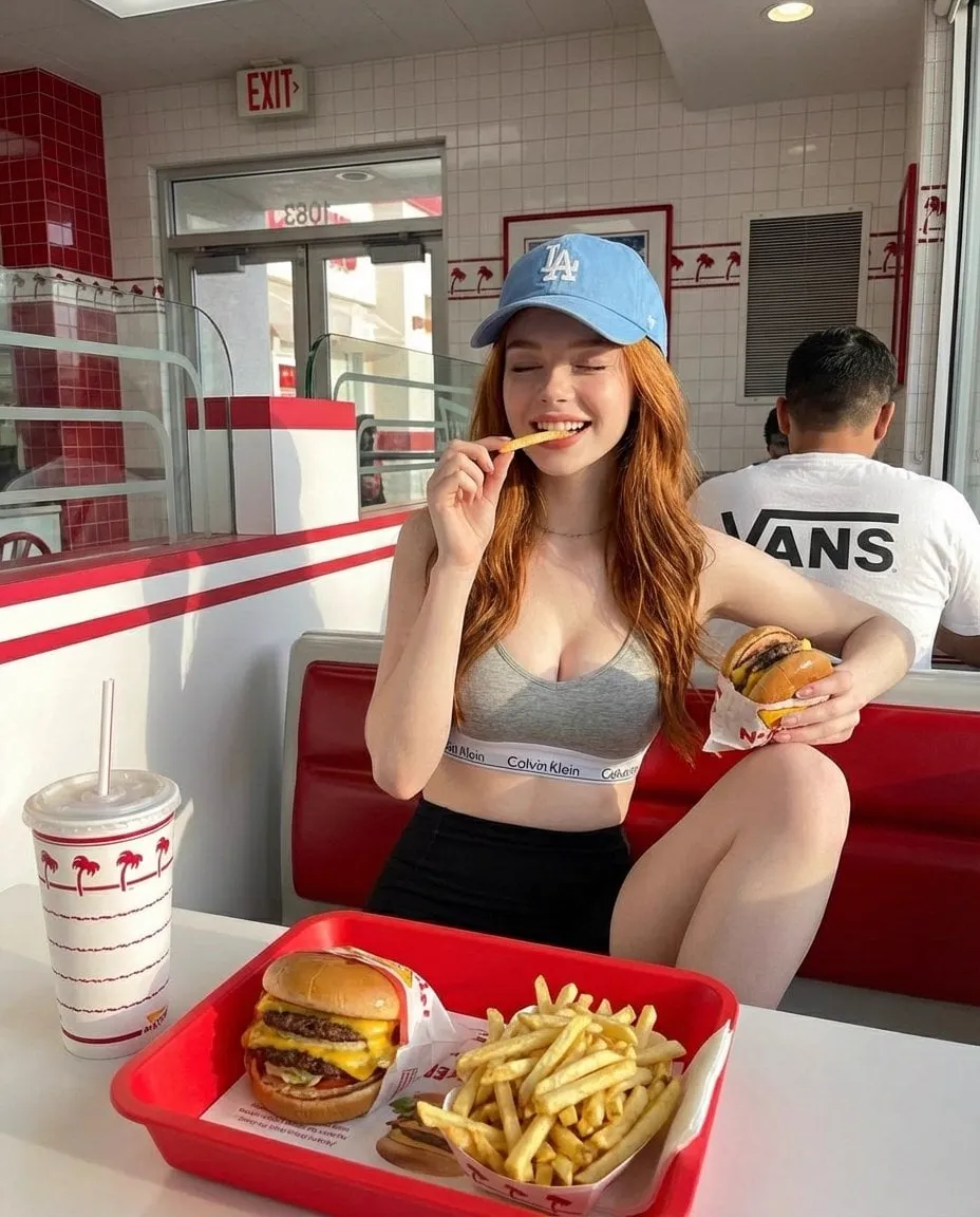
A YouTube thumbnail is the small rectangle that decides, in a fraction of a second, whether millions of people click your video or scroll past it. It is not decoration; it is the front door to your content, and in a crowded feed it is the difference between a video that gets discovered and one that quietly dies. This guide walks through the design principles behind thumbnails that actually get clicked, the review patterns of the ones that succeed, and how modern AI tools make high-quality thumbnails faster than ever without asking you to become a professional designer.
We are going to cover the fundamentals first, because no tool fixes a wrongly designed thumbnail. Then we will add the efficiency layer.
What makes a thumbnail work in under a second
Thumbnails are read by the brain before they are consciously seen. Your design has one job: communicate something worth clicking fast. Three things do most of the work.
Contrast and composition draw the eye. A thumbnail that is flat and evenly lit blends into the feed. One with a bright focal point against a darker or more saturated background stands out. The human eye is drawn to the highest-contrast area first, so put your most important element there and let everything else recede.
Typography that is legible at a glance. Thumbnails render small, often on a phone, competing with several others. A giant, high-contrast headline beats a clever but tiny one. Rule of thumb: if your text cannot be read in a half-size preview, it is too small or too low-contrast. Bold, thick strokes and a clear drop shadow read at speed.
A human face with exaggerated emotion. Faces are the strongest attention hook the brain has. A face looking at the camera, with an expressive, slightly exaggerated reaction, signals emotional content and invites connection. It is not an accident that the most successful thumbnails are full of faces; it is hardwired preference.
These three fundamentals come before any tool or trick. Get them right and everything else becomes polish.
Why these matter more than ever
The landscape has changed in two ways. First, discovery has become a numbers game: platforms heavily weight early click-through rate when deciding whether to recommend a video, so the thumbnail is now a ranking factor, not just a branding element. A weak thumbnail directly suppresses your early CTR, and suppressed early CTR means your video gets fewer impressions, which means even fewer chances to win clicks. It is a compounding downward spiral.
Second, the volume of content makes attention the scarcest resource. Hundreds of hours are uploaded every minute, and viewers scroll fast. The thumbnail is your only chance to interrupt that scroll with something the eye cannot ignore. In this environment a thumbnail is not a nice-to-have; it is a marketing asset that deserves real effort and testing.
Designing for the eye: contrast and composition
Let us get specific about composition because it is where beginners lose the most.
The center of interest should be obvious. Facing-forward eyes sit at or near the classic "thirds" intersection or the center of the frame; composition tools can guide the eye toward your focal element. You want the viewer's gaze to land on the thing that matters, then stay.
Backgrounds matter in a counterintuitive way: a busy background competes with your subject. Blurring or darkening the area behind the focal subject lets the face or product pop. This is why premium-looking thumbnails so often have a clean, slightly out-of-focus backdrop even when the video is busy.
Thumbnail-friendly composition rules worth stealing:
- High contrast between subject and background, with edges that separate clearly.
- A single dominant focal element, not several shouting at once.
- Consistent framing and branding so a returning viewer recognizes your channel at a glance.
- Negative space around the headline so text breathes instead of colliding with the face.
Typography that survives the small screen
Text in a thumbnail is a headline, not a paragraph. Two to four words is the sweet spot for reach and legibility. Anything longer starts to look like a screenshot of an article, which reads as spam and hurts CTR.
Practical text rules:
- Use bold, thick typefaces with strong stroke width; thin elegant fonts vanish at small sizes.
- Add a clear outline or drop shadow so the text separates from busy imagery.
- Pick a single accent color for the key word to add a focal pop without noise.
- Keep the contrast between text and its immediate background high; black text on dark video is unreadable.
- Place text where it will not be covered by the platform's duration or badge overlays.
A common failure is cramming a long title into the thumbnail. If the title already says it, the thumbnail should say the emotional hook instead. Short, punchy, and legible beats complete and tiny.
Faces and emotion: the reliable attention hook
Faces work, and exaggerated faces work better. A neutral face asks the viewer to work to understand the mood; an expressive one hands the emotion over instantly. For comedy, a huge smile or a shocked reaction. For a tutorial, a confident, slightly excited expression that signals the outcome.
Two practical tips:
- The face should be large enough to read the emotion at thumbnail size; if you have to squint to tell if they are happy or sad, it is too small.
- Eye contact with the camera creates a sense of being spoken to directly, which increases the pull to click.
If the video has an influencer or host, use their face; brand recognition multiplies the hook. If not, a relatable stock model showing the target emotion works too. What does not work is a face that is marginal, ambiguous, or drowned by a cluttered background.
Using AI to produce thumbnails efficiently
Once the design fundamentals are in place, AI tools accelerate the production dramatically. Modern image-generation models can take a scene description and produce cinematic, high-quality visuals in seconds, which lets you iterate on several concept directions before committing.
How AI fit into the workflow as a practical productivity boost:
- Idea generation: feed the model a short brief (subject, mood, style, palette) and generate a range of concepts to pick from. Seeing several directions beats staring at a blank canvas.
- Style consistency: use the same style descriptors across a set of thumbnails so a series or channel keeps a coherent visual identity.
- Background and cleanup: generate or replace busy backgrounds with clean, professional-looking scenes, and use the model to add the lighting and emphasis that elevate the subject.
- Rapid iteration: generate multiple variations of one composition, then pick the one with the strongest contrast and legibility.
The right approach is to treat AI as the fast draft and human design judgment as the selector and finisher. Generate broadly, then apply the contrast, face, and text rules to choose and refine. The goal is not "generate one and post it"; it is "generate ten, apply the design filters, and post the best."
Color psychology and visual storytelling
Color is the fastest way to steer emotion, and it can become a signature for your channel.
- Warm tones (red, orange, yellow) feel energetic, urgent, and emotional; they are for excitement, drama, and appetite-driven content.
- Cool tones (blue, green, purple) feel calm, trustworthy, and analytical; they suit tech, finance, health, and how-to explainers.
- High-saturation versus muted: saturated colors demand attention; muted colors read as premium and calm.
Storytelling via color means the palette should match the promise of the video. A calm tutorial with neon chaos colors will confuse the viewer about what they are getting. Consistency across a channel builds recognition: viewers come to expect your palette and can find your content by feel.
A practical palette recipe: pick a dominant mood color, one strong accent for the focal element or text, and a neutral for the rest. That is enough structure to be intentional without being rigid.
Setting up a simple thumbnail testing loop
Since course CTR decides discovery, you should treat thumbnail design as an experiment, not a one-time task. A lightweight loop:
- Generate three distinct concepts for a video (different focal emphasis, color, or layout).
- Apply the fundamentals: check contrast, face size, and text legibility on a phone-sized preview.
- Optionally run a small test audience with a platform A/B tool if available.
- Ship the winner, then archive what you learned for the next design.
Over time, personal "design rules" accumulate: the accent colors, the type style, the framing that keeps clicking. Combine those rules with AI's speed and your next thumbnails go from uncertain to repeatable.
Lighting as a design asset
Light is an underrated thumbnail ingredient, and it overlaps neatly with the contrast principle. A subject lit from the side or the back will separate cleanly from the background, while flat, even light makes everything blend into a uniform gray. The most effective thumbnails often use a directional or rim light to draw a bright edge around the subject, which creates instant separation at any size.
You can steer lighting through your design software or your AI prompt. Ask for a specific lighting style that supports the emotion: a dramatic low-key light for suspense, a soft and flattering frontal light for a friendly how-to, a warm golden glow for lifestyle or food content. When you pair a deliberate lighting style with the palette and focal framing, the thumbnail stops being a snapshot and starts looking designed.
Beware one common trap: in the pursuit of "cinematic," creators overload every thumbnail with moody shadows and then wonder why click-through drops. Lighting must serve legibility, not fight it. If it costs you contrast on the face or the text, it is wrong regardless of how atmospheric it looks in isolation.
Learning patterns from thumbnails that perform
It is worth studying native thumbnails that consistently outperform, not to copy them, but to extract transferable patterns you can apply to your own vertical. Across most niches, the winners tend to share a small set of structural habits:
- A named outcome or strong promise in the text hook, stated as a concrete benefit rather than an abstract phrase.
- One focal subject, usually a person's face, occupying a comfortable portion of the frame without clutter.
- Predictable brand framing so the audience associates the visual style with the creator and feels a sense of familiarity that lowers the barrier to click.
- A single accent color used consistently, which adds recognizability without cacophony.
When you annotate the top performers in your niche against these four habits, you get a checklist you can run any generated concept through. The goal is not imitation but the discipline of asking whether a design communicates a promise, holds a focal point, reads fast, and stays on-brand. A design that clears all four questions is usually far closer to the clickable end of the spectrum than one that wins on raw aesthetics alone.
Frequently asked questions
How many words should a thumbnail have?
Two to four strong words. Any more and it turns into a text screenshot that lowers CTR.
Is a face always necessary?
Not always, but faces reliably outperform abstract designs because they trigger an automatic emotional response. If your niche allows it, use one.
Do I need to be a designer to make good thumbnails with AI?
No, but you still need the fundamentals. AI produces speed and variety; the contrast, legibility, and focal rules are what turn a generated image into a thumbnail that wins clicks.
How important is brand consistency across thumbnails?
Very. Repeatable palette and framing build recognition and subscriber habit, which compounds your CTR over time.
What is the fastest improvement I can make today?
Make your text bold and smaller in count, and push the contrast between your subject and background so the focal point is unmistakable at a glance. Most thumbnails suffer from cluttered, low-contrast design, and that is the cheapest fix there is.
