
Your video can be brilliant, but if the thumbnail does not earn the click, nobody will ever see it. In the crowded 2025 content landscape, thumbnails are the primary marketing asset — the split-second decision that decides whether a viewer stops or scrolls. This guide covers the best practices that actually move engagement: visual hierarchy, text discipline, consistency, and testing.
Why Thumbnails Decide Everything
Most video views start from recommendations or browsing pages, where the thumbnail is the deciding factor. High-quality production does not matter if the entry point is weak. Treat the thumbnail as the first cut of your video: it must communicate the promise, the emotion, and the reason to care — all in under two seconds.
Visual Hierarchy in a Mobile-First World
The thumbnail is tiny on mobile. Every element must earn its place, and the hierarchy must be obvious at a glance.
1. One Strong Focal Point
Pick one subject — usually a face or the product — and make it the unmistakable center of the image. Faces with strong emotion outperform generic shots by a wide margin. If the viewer cannot tell what the video is about instantly, the thumbnail has failed.
2. High Contrast, Deliberate Color
High contrast between subject and background makes the thumbnail readable on any screen. Choose colors that match the video's genre: warm tones for excitement, cool tones for trust or analysis. Avoid muddy, low-contrast palettes that disappear in the feed.
3. Less Is More
Excessive text boxes, multiple overlapping subjects, and dim areas confuse the eye. Clarity beats complexity. Every element that does not support the core message should be cut.
Text Overlays: Tease, Don't Transcribe
Text on a thumbnail should complement the image, not repeat the title. Keep it to a few words maximum, use bold sans-serif fonts, and place it where platform UI elements — like the timestamp or progress bar — will not cover it. The text answers one question: why should I watch?
Consistency Between Thumbnail and Video
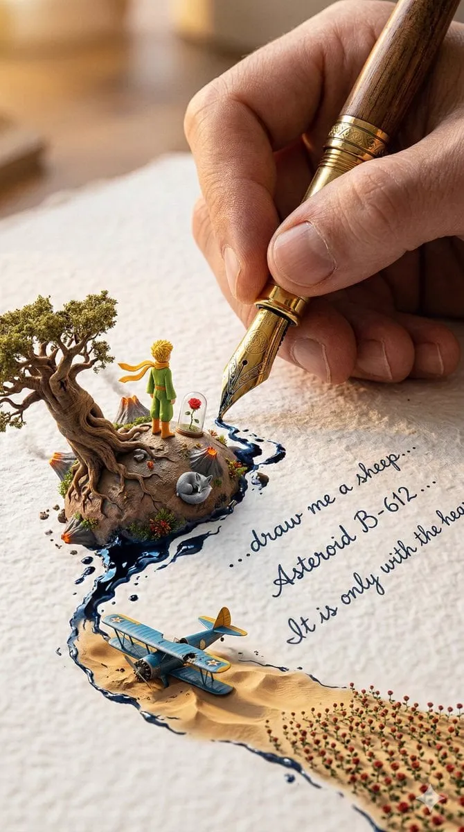
If the thumbnail promises a character, product, or aesthetic, the video must deliver it. Mismatch destroys trust and kills retention. The solution is a shared visual identity: create the thumbnail and the video from the same reference set. Start with a strong hero image from an AI image generator, then animate it or build scenes around it with image-to-video. That way the character in the thumbnail is the same character in the video.
Short Video Formats That Hold Attention
The First Three Seconds
Open with the most interesting moment, not an introduction. The hook is the thumbnail of the video itself. If the first seconds do not deliver on the thumbnail's promise, viewers leave immediately.
Vertical by Default
Design for vertical 9:16 first. Center the subject and captions — the middle of the screen is where attention lives on mobile. Keep text readable without zooming.
Pacing and Rhythm
Short video rewards rhythm: cut with the music, vary shot lengths, and place the payoff near the end to maximize completion. A consistent visual style across a series trains viewers to recognize your content instantly.
Testing: The Engine of Improvement
Thumbnails and formats are hypotheses. Test them.
- A/B test thumbnails: generate several versions of the same visual with different emphasis, text, or colors, and compare click-through.
- Test hooks: try different openings for the same video and compare early retention.
- Learn from winners: archive the winning patterns as templates for the next batch.
Using text-to-video tools makes rapid testing practical: you can explore many visual directions before committing production effort.
Building a Repeatable System
- Maintain a brand reference library: characters, colors, and recurring elements.
- Document winning patterns: which compositions, fonts, and color schemes convert for your audience.
- Batch produce, then curate: generate many options, select the strongest, and learn from the rest.
Conclusion
Boosting engagement with thumbnails and short video is not about luck. It is about disciplined design — one focal point, high contrast, minimal text — plus consistency between the thumbnail and the content, and systematic testing. Pair that discipline with modern AI tools like an AI video generator and current generation models such as GPT Image 2 for high-fidelity visuals, and your content will earn more clicks and more watch time.
