
Flux Redux vs Midjourney: Photorealistic AI Image Workflow
Oct 13, 2026
Why photorealism became the real benchmark
For the first few years of generative imagery, the wow factor came from novelty. A surreal cathedral made of glass, a portrait lit like a Renaissance painting, a cyberpunk street that never existed — those outputs impressed because they were strange and beautiful at the same time. That era is largely over. The questions clients, art directors, and editors ask now are far more mundane and far harder to answer: does the skin look real, does the light behave correctly, does the same character look like the same person in frame twelve as in frame one, and can anyone else on the team reproduce this result next week?
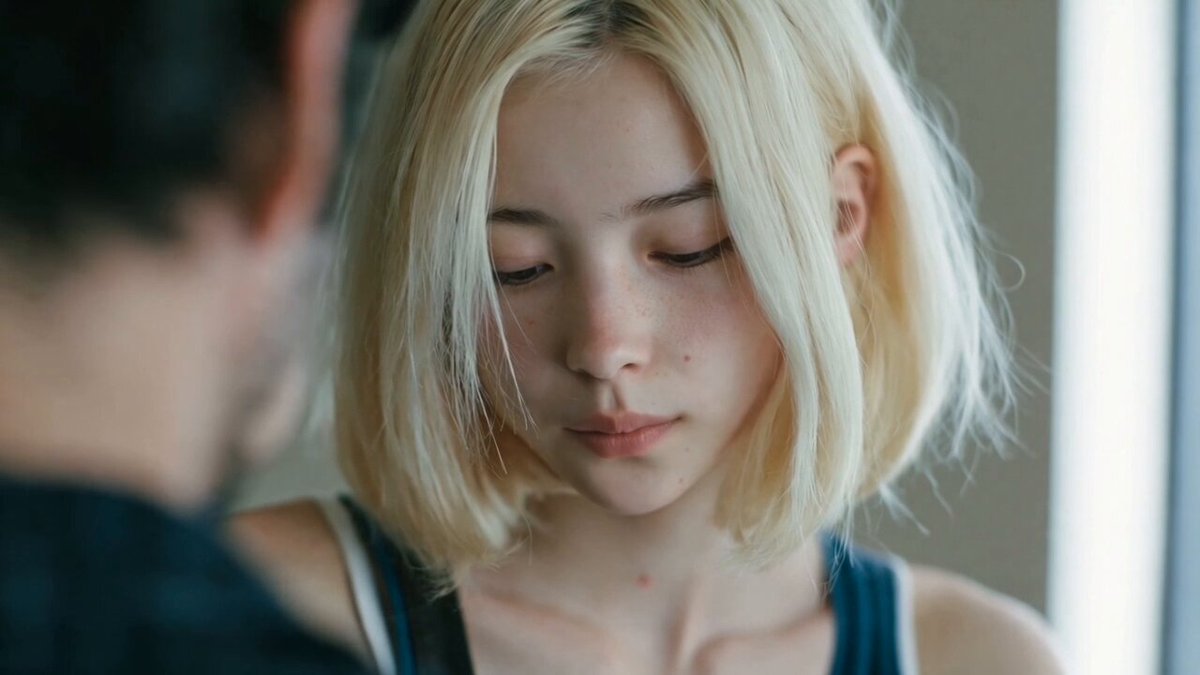
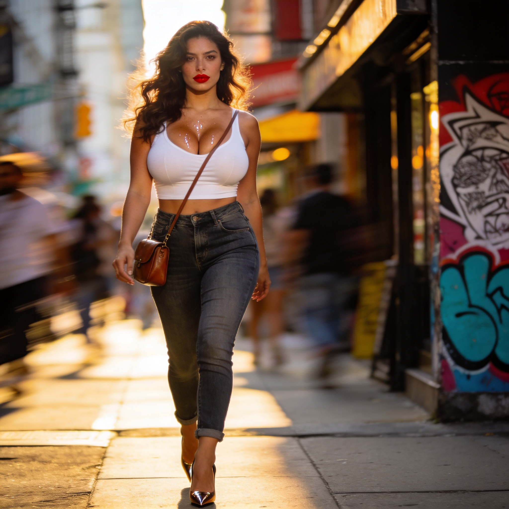
Photorealism is difficult not because a single image is hard to generate, but because believable imagery is a system problem. A photograph contains hundreds of small physical cues — subsurface scattering through skin, specular highlights that follow the curvature of a surface, micro-shadows under a jawline, lens imperfections, chromatic aberration at the edges, sensor noise that varies with luminance. When one of those cues is wrong, viewers cannot always name the problem, but they feel it instantly. That is the uncanny valley in practice.
This is why the conversation shifted from "which model makes the prettiest picture" to "which model gives me the most control over the physical plausibility of the result." Prompt-driven aesthetics alone cannot guarantee that. What guarantees it is a combination of strong reference conditioning, iterative refinement, and a repeatable pipeline that other people can follow. Flux Redux and Midjourney approach that problem from two different directions, and understanding the split is the fastest way to choose the right tool for a given job.
How Flux Redux differs from Midjourney in practice
The simplest way to describe the difference: Midjourney is a brilliant art director that you steer with language, while Flux Redux behaves more like a compositing suite that you steer with images. Both can produce photorealistic output. They get there through different instincts.
Reference-driven generation versus prompt-driven generation
Flux Redux shines when you can supply visual references — a face, a garment, a location, a color grade, a product shot. Its strength is fidelity to what you show it rather than what you describe. If you hand it a reference pack and a clear instruction, it tends to preserve the geometry, texture, and tonal character of those references instead of drifting toward a generic interpretation.
Midjourney still rewards prompt craft. Its aesthetic defaults are strong and often flattering, which means it can produce a striking image from a two-line prompt with almost no setup. That speed is genuinely valuable for mood boards, concept exploration, and advertising-style imagery where a slightly idealized look is an advantage rather than a flaw.
Where Midjourney still wins
The honest answer is: anywhere you want interpretive flair rather than documentary accuracy. Fashion editorial, stylized fantasy, poster art, and anything that benefits from a distinctive visual signature. Midjourney's style coherence across a set of prompts is exceptional, and its community knowledge base is enormous, which shortens the learning curve.
Where reference-based models pull ahead
Reference-heavy models pull ahead in identity-critical and product-critical work: brand campaigns where the actual product must appear unaltered, episodic content where a recurring character must stay recognizable, architectural visualization where the real building exists, and any workflow where the client will compare the output side by side with a reference photo.
| Criterion | Prompt-driven (Midjourney-style) | Reference-driven (Flux Redux-style) |
|---|---|---|
| Speed to first concept | Very fast | Moderate |
| Identity preservation | Inconsistent | Strong |
| Product accuracy | Approximate | High |
| Stylistic flair | Excellent | Good, more literal |
| Reproducibility | Medium | High |
| Best for | Concept, editorial, mood | Campaigns, series, episodic work |
A practical decision framework for choosing a generator
Before you open any tool, score the job on five axes. This takes two minutes and saves hours of rework.
- Identity criticality. Will someone notice if a face changes? If yes, weight reference conditioning heavily.
- Product fidelity. Does a real object need to appear with correct proportions, logos, and materials? Reference-driven wins.
- Volume. Are you producing three images or three hundred? Reproducibility matters more at volume.
- Iteration speed. Is this a pitch that needs twenty directions by tomorrow, or a locked brief that needs one perfect frame?
- Downstream motion. Will these stills become video? If so, prioritize models whose outputs hold up under interpolation and warping.
A quick rule that works well in practice: use the prompt-driven model to explore and the reference-driven model to finalize. Explore broadly, then lock the winning direction and rebuild it with references so it survives scrutiny.
Building a photorealistic workflow from brief to final frame
This is the part most tutorials skip. The model is maybe thirty percent of the outcome; the surrounding process determines the rest.
Step 1: Build a reference pack before you write a prompt
Collect eight to fifteen images that describe the target look: two or three for lighting, two for skin or material texture, two for color grade, two for composition, and one or two explicit subject references. Crop them to remove distracting elements. Keep them visually consistent with each other — a reference pack that mixes hard noon sun with soft window light will produce a muddled result.
Step 2: Lock identity and wardrobe early
Once you have a subject reference that works, freeze it. Save the exact combination of reference images, prompt text, seed, and settings in a project note. The single most common cause of unusable series work is re-deriving a character from scratch each session instead of reusing a locked configuration.
Step 3: Generate wide, then cull with a scorecard
Produce more variations than you think you need, then evaluate them against a fixed checklist rather than by gut feel: skin texture plausibility, eye reflection consistency, hand anatomy, shadow direction agreement, material accuracy, background coherence, and edge quality around hair. Score each from one to five. Anything below three in two categories gets discarded immediately.
Step 4: Refine locally, not globally
When an image is ninety percent right, do not regenerate it. Use inpainting or masked editing to fix hands, jewelry, text on labels, and background clutter. Regeneration resets the random elements you liked; local editing preserves them. This single habit dramatically improves both quality and consistency.
Step 5: Prepare for motion before you need it
If the stills will animate, generate them with motion in mind. Leave headroom around the subject, avoid extreme depth-of-field blur that leaves no usable detail, and keep lighting direction consistent between shots intended for the same sequence. Image-to-video tools inherit the flaws of the source frame, and they amplify blur and ambiguous edges.
Prompting and reference techniques that raise fidelity
Photorealistic prompting is less about adjectives and more about physical specification. "Beautiful, ultra-realistic, 8K" does almost nothing. What changes output is concrete detail about light, material, and camera.
Describe the light source, not the mood: "soft window light from camera left, single source, warm bounce from a wooden floor" beats "cinematic lighting." Describe materials with physical properties: "brushed aluminum with fine directional scratches," "wool with visible fiber fuzz at the collar." Describe the capture: focal length, aperture feel, distance, and angle. "85 mm equivalent, shallow but not extreme depth of field, eye-level, two meters away" gives the model a geometry to solve.
One underused technique is describing what should not be perfect. Real photographs have small asymmetries, dust, slight motion blur, uneven color temperature between foreground and background. Adding a controlled imperfection — a slight lens flare, a soft shadow dead zone, mild sensor grain — frequently reads as more photographic than a technically flawless render.
Negative prompts deserve the same specificity. Instead of listing abstract failures, name concrete artifacts: plastic skin, waxy highlights, extra fingers, melted jewelry, unreadable text, duplicated background figures, haloing around hair.
Consistency across a series: characters, products, and locations
Consistency is where photorealistic pipelines either earn trust or lose it. Three categories matter most.
Characters. Lock a face reference and a body-proportion reference separately. Faces drift when the pose changes; bodies drift when the framing changes. Keeping those variables isolated makes it easier to diagnose which reference failed. Then build a small library of approved expressions and angles so you rarely need to re-derive the character from language.
Products. Use a clean studio reference plus a real-world context reference. The studio shot preserves geometry and material; the context shot preserves how the object behaves in an environment. Never rely on text prompts to reproduce logos or label typography — composite those in a raster editor afterward if accuracy matters commercially.
Locations. A location is more than architecture; it is a lighting scheme, a color palette, and a set of recurring props. Build a location reference pack and reuse it across the entire sequence, otherwise a room will subtly change shape between shots and viewers will notice the discontinuity even if they cannot articulate it.
Common mistakes that break photorealism
Most failed photorealistic attempts share a small set of root causes. Watch for these.
- Over-prompting. Ten stacked style modifiers cancel each other out and produce a flat, averaged image. Short, physical prompts win.
- Inconsistent references. Mixing references with contradictory lighting or color temperature produces a composite that looks assembled rather than photographed.
- Ignoring hands and hair. These are the two highest-failure regions. Budget explicit review time for both.
- Fixing everything with regeneration. Global regeneration is a blunt instrument. Learn masked editing early.
- Chasing sharpness. Aggressive upscaling creates halos and artificial micro-contrast that immediately read as synthetic. Modest sharpening plus natural grain is more convincing.
- Forgetting the background. A perfect subject against a muddy, low-detail background still fails. Backgrounds need the same lighting logic as the subject.
- No project notes. If you cannot reproduce a result, you do not own it. Document seeds, references, and settings as you go.
Combining stills and motion in one pipeline
Photorealistic stills are increasingly a first step rather than a deliverable. The practical sequence looks like this: generate and approve stills, lock the strongest frame as the hero, then animate from that frame using image-to-video. Keep cuts short — three to five seconds per shot hides interpolation weaknesses and keeps attention. Generate a few alternate frames from the same scene so you have material to cut between.
Where motion reveals artifacts, return to the still and fix the source. Adding detail to a face, sharpening a garment edge, or simplifying a background in the still almost always produces a cleaner animation than trying to repair the video. Treat the still as the foundation and the video as the upper floor.
For dialogue or narration-led pieces, keep camera movement restrained. Slow pushes and gentle parallax read as photographic; fast orbits and dramatic zooms expose the synthetic seams in a generated environment.
Quality control checklist before delivery
Run this before anything leaves your desk.
- Skin realism. Look for pores, uneven tone, and natural specular rolloff. Reject waxy or uniformly smooth skin.
- Eye consistency. Catchlights should match the described light source in position and shape in both eyes.
- Shadow logic. Every shadow must trace back to a plausible source. Cross-check the subject and background separately.
- Anatomy. Hands, ears, teeth, and neck-to-shoulder transitions are the usual suspects.
- Material honesty. Metal reflects, fabric drapes, glass refracts. If a material behaves like plastic, fix it.
- Edge quality. Hair, fur, and semi-transparent fabrics should transition naturally, without cutout halos.
- Text audit. Remove or replace any generated text unless you have verified it.
- Series continuity. Place all approved frames side by side at thumbnail size. Discontinuities that are invisible at full size often jump out in a grid.
FAQ
Is a reference-driven model always better for photorealism?
No. It is better when accuracy matters. For exploratory, stylized, or advertising-flavored imagery, a prompt-driven model frequently produces a stronger first impression with far less setup.
How many reference images should I use?
Eight to fifteen is a practical range — enough to define lighting, material, color, and subject without introducing contradictions. Quality and internal consistency matter more than quantity.
Why does my character change between shots?
Almost always because the reference configuration was not locked, or because pose and framing changes forced the model to invent new detail. Freeze your references, then build an approved library of expressions and angles.
Should I upscale every final image?
Only to the resolution you actually need. Aggressive upscaling introduces halos and unnatural micro-contrast. A moderate upscale with light grain typically looks more photographic than an extreme one.
Can I mix outputs from different models in one project?
Yes, and it is often the best approach: explore in one tool, finalize in another. Match color grade and grain across the set so the mixed origins are invisible.
How do I keep a series looking like it was shot by one photographer?
Fix lighting direction, focal length feel, color palette, and grain level as project constants. Those four variables do more for visual unity than any single model choice.
What is the fastest way to improve fidelity overall?
Stop prompting in adjectives and start prompting in physics. Describe light sources, materials, distances, and camera behavior, and let references carry the rest.

Alexander
More Blogs
Read MoreVidu Q4 Alternatives: 4K AI Video Models Compared (2026)
Vidu Q4 alternatives compared: Kling 4.0, Seedance 2.5, Wan 3.0, and Runway Gen-4 — 4K support, input modes, durations, audio, and what each costs in credits on Domer.
Top 4K AI Image Generators in 2026: 5 Models Compared on Real Costs
The top 4K AI image generators on Domer compared: Flux 3 Klein, Nano Banana 2.1, GPT Image 2.5, GPT Image 2, and Nano Banana Pro — 4K credit costs, reference limits, and speed.
Nano Banana 2.1 vs GPT Image 2.5: Which Image Model Should You Use? (2026)
Nano Banana 2.1 vs GPT Image 2.5 Flare compared: credit costs per resolution, aspect ratios, reference images, text rendering, and which tasks fit each model.