

Make a Thumbnail From Video: AI Capture & Optimization
Oct 13, 2026

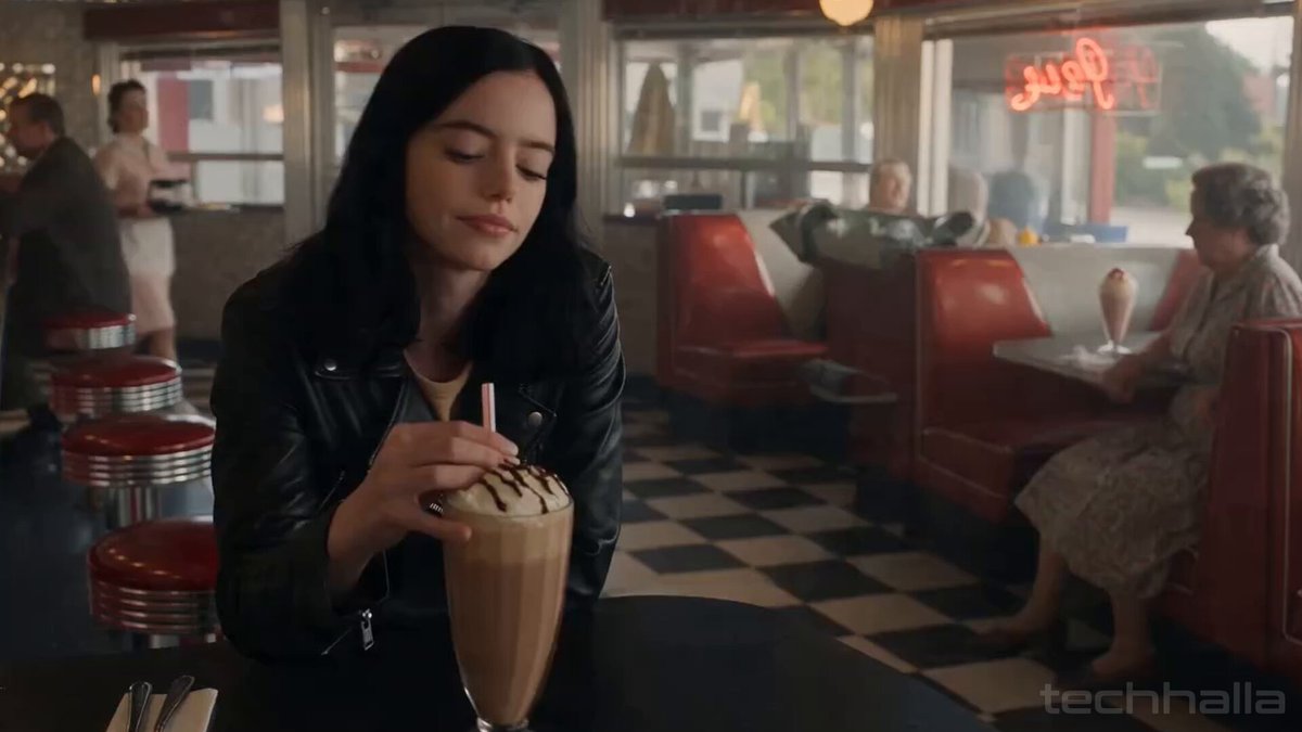
Every finished video contains thousands of frames, and exactly one of them has to do the hardest job in the entire production: convince a stranger to stop scrolling. For years that job was done by scrubbing a timeline, taking a handful of screenshots, and picking whichever one looked least like a blurry accident. That process throws away almost everything the footage knows about itself. An AI-assisted capture workflow flips the order: the whole timeline becomes the candidate pool, frames are scored for focus, expression, composition, and story, and the winner is repaired, cropped, and labeled before you ever open a design tool.
This guide walks through that pipeline end to end — how frame-ranking models actually work, how enhancement and segmentation turn a raw still into a designed asset, how to keep the process repeatable across dozens of uploads, and which small mistakes quietly flatten click-through over time.
What Changes When the Machine Picks the Frame
Manual thumbnail selection is a sampling problem disguised as a taste problem. You scrub, you stop somewhere that feels representative, you screenshot, and you accept whatever you got. The result is usually a frame that is technically fine and emotionally flat: mid-blink, half-turned, hands in a meaningless position, background competing with the subject.
The limits of scrubbing by hand
Human scrubbing has three structural weaknesses. It is slow, so you sample maybe ten candidates out of sixty thousand. It is biased toward the moment you remember while editing, not the moment that reads well as a still. And it is blind to technical quality — motion blur, compression artifacts, and awkward limb positions are far more visible in a 1280×720 still than in a moving clip.
What automated capture does differently
An automated pass evaluates the entire timeline in one sweep. Instead of asking "is this a good moment?" it asks a series of narrower, measurable questions: where is the sharpest focus, where is the face fully visible and expressive, where does the subject occupy a useful portion of the frame, where is the background least noisy, and where does the audio energy suggest something important just happened? Each answer becomes a score, and the scores combine into a ranked shortlist.
Where human judgment still wins
The machine is excellent at finding frames that are technically strong and compositionally usable. It is not good at knowing that this particular gesture is the entire point of the video. The practical division of labor is: let the model narrow sixty thousand frames to twenty good ones, then choose among those twenty with editorial intent.
How AI Frame Selection Actually Works
Understanding the mechanics makes you much better at tuning the output. Most frame-ranking systems stack several independent evaluators and blend their results rather than relying on a single "best frame" model.
Visual salience and subject detection
The first layer answers a simple question: what is the subject, and where is it? Salience detection looks for the region a human eye would land on first — usually a face, a product, a hand gesture, or a strong color contrast. Subject identification then classifies what it found: person, animal, object, text overlay, or scene.
Why this matters for thumbnails: a crop that centers a face at roughly a third of the frame width tends to outperform one where the subject is tiny in a wide shot. Models that understand subject position can prefer frames that will survive an aggressive crop to a square or 16:9 tile without decapitating anyone.
Semantic scoring and narrative peaks
Technical sharpness alone produces boring thumbnails. The second layer tries to understand what is happening. Typical signals include:
- Motion energy: frames near the peak of a gesture or action tend to feel more alive than frames at rest.
- Expression intensity: open eyes, raised brows, or an obvious reaction score higher than a neutral face.
- Scene change proximity: the instant just after a cut is often cleaner than a frame mid-transition.
- Audio correlation: loudness spikes and speech onset frequently coincide with the moment the creator emphasized.
Some pipelines also use transcript alignment, scoring frames by how closely they sit to a key sentence. That is how a system can surface the frame where you actually said the thing, not the frame where you were inhaling before saying it.
Platform aesthetics and crop constraints
A frame that sings on one platform can die on another. Safe-zone rules differ, aspect ratios differ, and the amount of interface chrome covering a thumbnail differs. A good capture pass applies platform profiles before ranking, so candidate frames are evaluated after the crop the platform will actually apply — not before.
Practical checks to encode into a profile:
- Aspect ratio: 16:9 for long-form video, 1:1 or 9:16 for feed and shorts placements.
- Text safe area: keep critical content away from corners where duration badges and progress bars sit.
- Face scale: aim for a head that occupies roughly a quarter to a third of the tile height.
- Contrast floor: reject frames whose subject luminance is too close to the background.
Enhancement and Layering: Turning a Still Into a Designed Asset
A video frame is a compromised photograph. It was compressed hard, it may carry motion blur, and it was lit for motion, not for a still. The enhancement stage exists to close that gap.
Repair: upscaling, denoise, and blur reduction
The most common defect is softness. Video codecs discard detail in areas that move, and a paused frame shows exactly what was discarded. Modern restoration models handle this in layers: denoise to remove blocky compression texture, deblur to reduce directional smear, then upscale to reach the target resolution with plausible detail rather than smeared interpolation.
Order matters. Running an upscaler before denoise tends to amplify artifacts. Running denoise too aggressively before upscaling produces a plastic, waxy face that reads as fake even to viewers who cannot articulate why.
Segmentation and subject isolation
Isolation is where a still becomes a design. Segmentation models produce a soft matte around the subject, which unlocks several useful moves:
- Background replacement or blur: a gentle blur or a solid brand color pushes the subject forward without destroying context.
- Edge cleanup: hair, fingers, and thin objects are the usual failure points; feathering and matte refinement matter more than raw mask accuracy.
- Relighting: adding a subtle rim light or gradient behind the subject separates them from the background at small sizes.
- Color grading per region: warming the subject slightly while cooling the background is a cheap, reliable way to create depth.
Text placement and hierarchy
Text on a thumbnail has one job: be readable at the size of a fingernail. Automated layout systems typically do three things well — find empty regions with acceptable contrast, size the type relative to the tile rather than the source image, and apply a stroke or shadow so the text survives any background.
Rules that hold up in practice:
- Keep it to three to five words. Thumbnail text is a label, not a sentence.
- Prefer one dominant line over two competing lines.
- If the subject's face is on the left, put text on the right, and vice versa.
- Test the final asset at 20% zoom. If the text disappears, it is decoration, not communication.
A Repeatable Workflow From Timeline to Upload
Here is a process you can run in under twenty minutes per video once it is set up.
- Export a clean master. Work from the highest-quality source you have. Capturing a frame from a heavily compressed delivery file means fighting artifacts you could have avoided.
- Run the automated candidate pass. Let the model score the full timeline and return a shortlist of ranked frames with thumbnails of each.
- Filter by story. Delete anything that does not relate to the video's central promise. A beautiful frame of an unrelated scene is a lie that costs retention.
- Pick three, not one. Selection bias is real; giving yourself options makes comparison testing possible later.
- Apply repair and enhancement. Denoise, deblur, upscale, then do a light grade. Resist heavy stylization — it dates quickly and reads as noise at small sizes.
- Isolate and layer. Segment the subject, adjust the background, and add a subtle separation light if the subject blends in.
- Add text last. Compose the image first, then place type into the space that remains. Reverse order produces cramped layouts.
- Export at the platform's native size. Do not let an upload pipeline re-compress and sharpen your asset for you; that step is where clean thumbnails turn crunchy.
If you produce at volume, save steps 5 through 7 as a reusable template: same treatment, same text style, same margins. Consistent visual identity compounds. Viewers start recognizing your assets before they read the title.
Choosing Tools: Decision Criteria That Actually Matter
Feature lists are noisy. These are the questions that separate a tool you keep from one you abandon after a week.
| Criterion | What to look for |
|---|---|
| Frame ranking quality | Does it return usable candidates for talking-head, action, and screen-recording footage alike? |
| Local vs. cloud | Local processing protects unreleased footage; cloud processing is faster and usually better at heavy upscaling. |
| Batch handling | Can it process a folder of videos and output organized assets per project? |
| Editing depth | Is there a manual override for crop, grade, and text, or only an accept/reject button? |
| Export control | Can you choose exact dimensions, format, and compression quality? |
| Cost model | Watch for per-minute or per-asset pricing that scales badly with volume. |
A useful test: take one difficult video — low light, fast motion, a face partly turned away — and run it through each candidate. Easy footage makes every tool look competent.
Common Mistakes That Flatten Click-Through
These show up again and again, even in otherwise polished channels.
- Choosing the sharpest frame instead of the most informative one. A crisp frame of someone listening is worse than a slightly soft frame of someone reacting.
- Over-processing. Heavy sharpening creates halos; heavy denoise creates wax. Both make the thumbnail look generated rather than captured.
- Ignoring small-size legibility. Design decisions made at full resolution often vanish in a feed.
- Repetitive composition. Fifty thumbnails with the same centered face and the same arrow train viewers to stop seeing them.
- Contrast collapse. A subject in a dark hoodie against a dark room reads as a rectangle. Add separation, not more saturation.
- Text that repeats the title. The thumbnail and the title should add up to more than either alone, not say the same thing twice.
- Wrong aspect for the placement. A 16:9 crop shown in a square slot loses the sides you composed around.
Testing Thumbnails Without Guessing
Automated capture makes it cheap to test, because you already have three good candidates instead of one. Rotate them deliberately rather than randomly: give each variant enough impressions to produce a meaningful signal, usually a few days on a moderately trafficked video, then keep the winner and store the losers in a swipe file of what worked.
Track more than click-through. A thumbnail that wins clicks but loses watch time is a net negative, because it attracted the wrong audience. Watch the pairing: click-through rate alongside average view duration for the first thirty seconds. The best thumbnail is the one that pulls the right people, not the most people.
Also examine the platform's own preview surfaces. Search results, suggested sidebars, and mobile feeds all render your asset at different scales on different backgrounds. Check all of them before you commit.
FAQ
Can I make a thumbnail from a video without any design skills?
Yes. The automated path — ranked frame capture, enhancement, automatic text placement — produces a competent asset with no manual editing. Design skill mainly improves the top ten percent of cases: unusual footage, crowded scenes, or a very specific brand look.
Why does my thumbnail look blurrier than the video itself?
Because video compression hides detail in motion, and a paused frame reveals it. That is expected. Repair the still with denoise, deblur, and upscaling rather than assuming the source is bad.
Should I capture from the original export or the uploaded version?
Always the original or a high-bitrate master. Platforms re-encode uploads, and capturing after that re-encode means starting from artifacts you cannot undo.
How many candidate frames should I review?
Ten to twenty is the sweet spot. Fewer means you are guessing; more means you are effectively exporting again.
Is a single-frame capture better than a composite?
For authenticity, yes. Composites built from multiple frames can look uncanny, especially with hands and hair. If you need a different expression, prefer a nearby frame from the same shot.
Does the thumbnail really matter for long videos?
It matters most at the top of the funnel. Once someone is already watching your channel regularly, the thumbnail's job shifts from persuasion to recognition — which is why consistent styling has value beyond clicks.
How often should I refresh an old thumbnail?
When the video's traffic has plateaued and the visual style now looks dated compared to your recent uploads. Refresh for consistency, not out of boredom.
Bringing It Together
The core shift is simple: stop treating a thumbnail as a screenshot you tolerate and start treating it as a designed asset that happens to originate from footage. Automated capture solves the sampling problem, scoring solves the quality problem, and layered enhancement solves the legibility problem.
Set up the pipeline once — a high-quality master, a candidate pass, a repair step, a subject layer, a text template — and each video afterwards costs a few minutes instead of an afternoon. Keep three varied candidates per upload so you can test deliberately rather than guessing, and review performance by pairs of metrics rather than clicks alone. The frames were always in there. The workflow is what makes them findable.

Alexander
More Blogs
Read MoreMontaggio video rapido: transizioni e software per l'AI
Guida pratica al montaggio video rapido con AI: transizioni fluide, software, workflow, coerenza visiva, errori da evitare e FAQ operative.
Building an AI Video Production Workflow From Concept to Cut
A practical guide to planning, generating, editing, and finishing AI-assisted videos with consistent characters, clear shot lists, and reliable review loops.
A Repeatable Post-Production Workflow for Polished AI Video
Build a repeatable AI video post-production pipeline: organize assets, cut story-first, design transitions, refine audio, and review versions calmly.