
How to Create Stunning Ad Teasers With Multi-Image AI Video
Oct 1, 2026
Why multi-image consistency is the real bottleneck in ad teaser production
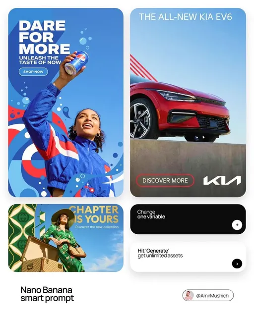
A 15-second teaser has one job: stop a stranger, make the offer instantly clear, and push toward a single action. AI video generation already handles the look expensive part reasonably well. The part that still breaks is repetition. A teaser is not one beautiful image; it is eight to fourteen beautiful images that must clearly belong to the same world. The same founder's face. The same matte-black bottle. The same kitchen counter, the same warm window light, the same charcoal jacket. When you generate every shot from a text prompt alone, small disagreements accumulate: the jawline shifts, label lettering warps, the grade drifts from warm to cool, wardrobe turns from charcoal to navy. Viewers cannot always name what is wrong, but they feel it. The ad reads as assembled rather than directed, and assembled ads lose the trust that makes a click feel safe.
Multi-image referencing is the practical answer. Instead of hoping a model interprets your paragraph the way you imagined it, you pass several stills and declare which ones are authoritative for identity, which for product geometry, and which for mood. The model now has constraints rather than suggestions. The payoff is not only prettier frames; it is a shorter feedback loop. Fewer regenerations, fewer rebuilds, less time arguing with a render at 1 a.m. before a client review.
There is also an attention argument. Short-form feeds reward visual coherence because coherence reads as competence. When a viewer sees the same face, the same product, and the same palette across three quick shots, their brain files the content under real brand rather than random clip. That classification happens in well under two seconds, and it decides whether they keep watching or swipe away.
What multi-image referencing actually means in practice
The phrase gets used loosely, so it helps to separate two very different techniques.
Reference conditioning versus first-frame animation
First-frame animation takes one still and asks a model to extend it into motion. It is excellent for a single continuous move: a slow push on a product, steam rising from a cup, hair shifting in wind. Reference conditioning is different. You supply several images at once and instruct the model that certain ones must be respected for specific attributes. That is what allows shot two to feature the same person as shot one without animating a single continuous take.
Most modern generation tools support some blend of both. A practical production pipeline usually uses first-frame animation inside a shot and reference conditioning across shots.
The three anchor types
Regardless of which tool you use, organize references into three buckets:
- Character anchors describe people. Four to six stills work well: straight-on, three-quarter, profile, full body, plus one expressive frame. Keep wardrobe, hair, and lighting consistent across the set so the model learns identity, not outfit changes.
- Product anchors describe the object being sold. Include a hero angle, a macro detail that captures texture or typography, a flat lay or packaging view, and a scale shot showing the product in a hand or on a surface. If the product has a distinctive finish, add a frame that shows how it catches light.
- World anchors describe the environment and grade. Location stills, a palette swatch image, and a lighting reference are enough. These keep background architecture and color temperature stable while the camera moves between setups.
Three buckets, one rule: each bucket should be internally consistent. Mixing two lighting conditions in one character set teaches the model that identity is negotiable.
Preparing the reference stack before you generate anything
Most failed teasers were doomed at the asset folder stage, not at the prompt stage.
Sourcing stills that behave well
Use photography or renders you own or have licensed. Clean, well-lit images with a clear focal subject outperform moody, grainy images every time, because the model treats grain and heavy shadow as content rather than texture. If you are shooting specifically for this, shoot a reference day: one light setup, one lens, neutral background, and a dozen frames per subject covering angles. It takes an hour and saves a week.
Normalizing and cropping
Bring every reference to a common size, ideally 2048 pixels on the long edge, in sRGB, with the subject filling roughly 60 to 80 percent of the frame. Crop out distracting background objects that you do not want replicated. Check for conflicting shadows: if your character set has a hard shadow to the left in one frame and to the right in another, the model will average them into mush.
Naming, folders, and versioning
Adopt a naming pattern that survives a shared drive: hero_char_01_front.png, hero_prod_03_macro.png, world_kitchen_02_palette.png. Keep references in a folder that only contains approved assets. The moment rejected stills sit next to approved ones, someone on the team will use the wrong file, and you will spend the afternoon debugging consistency that was never going to happen.
Prompt architecture for multi-image ad teasers
Prompts with references still matter. They tell the model what to do with the constraints you supplied.
The five-part formula
Write each shot prompt in five parts: subject, action, camera, light and grade, continuity lock.
Subject: same female founder from reference A, charcoal blazer, short dark hair
Action: turns from laptop to camera, lifts ceramic mug, small exhale
Camera: 40mm equivalent, slow dolly in, eye level, shallow depth of field
Light and grade: warm window key from camera left, soft fill, subtle film grain
Continuity lock: preserve exact facial structure, wardrobe, and mug from references A and C
That last line is doing more work than it looks. Naming which references lock which elements makes the difference between a model that blends everything and a model that respects hierarchy.
Drift guards and negative prompts
Add short, specific exclusions rather than long lists. Effective guards include: no face morphing between frames, no changing logo typography, no extra fingers, no shifting wall color, no text generation unless requested. Vague negatives such as no bad quality accomplish little and eat context.
Version prompts like code
Save every prompt with the shot number and a revision marker, and note which references were active. When shot six finally looks right, you want to be able to rebuild it. Teams that keep prompts in a plain text file or a shared doc move twice as fast on revisions than teams that retype prompts from memory.
Blueprint: a six-beat structure for a 15 to 30 second teaser
A teaser is short enough that structure is not optional. Use this skeleton, then adapt it to the product.
| Beat | Timing | Purpose | Anchors in play |
|---|---|---|---|
| Hook | 0.0-1.5s | Interrupt the scroll with motion or a bold claim | World |
| Problem | 1.5-4s | Show the friction the viewer recognizes | Character, world |
| Reveal | 4-7s | Introduce the product as the answer | Product |
| Proof | 7-12s | Demonstrate a real detail or outcome | Product, character |
| Transformation | 12-18s | Show the after state | All three |
| End card | final 2-3s | Brand, offer, one call to action | Brand assets |
Making the hook earn its 1.5 seconds
Generate at least four hook variants per teaser. Hooks are the cheapest experiment in the entire pipeline and the one with the largest effect on cost per result. A hook with motion toward camera, a face doing something unexpected, or a product detail in extreme close-up reliably beats a slow establishing shot.
Keeping the reveal readable
In the reveal beat, resist the urge to show the product in a complex scene. Give it a clean setup with the product anchor heavily weighted, and let the world anchor stay soft in the background. Clarity beats spectacle here.
Sequencing generation so continuity survives
Order matters when you are producing eight to fourteen shots.
Generate the hero shot first
Start with the shot the whole ad depends on, usually the product hero or the transformation beat. Get it approved. Then extract stills from that approved clip and add them to your reference set. Now your references include frames that already look like the final film, which tightens everything downstream.
Lock seeds and keep motion modest
Where the tool allows, reuse the same seed for shots sharing a scene. Moderate motion prompts, such as slow push, subtle handheld, gentle turn, preserve identity far better than dramatic camera moves. If a shot requires a big move, split it into two shorter shots rather than asking the model to invent a lot of new information.
Batch by location, not by shot number
Generate all shots in the same environment in one session, with the same references loaded. Batching by setup keeps lighting logic intact and makes it easier to spot a drifting grade before you assemble the timeline.
Editing and finishing for platform performance
Raw generations are footage, not an ad. The cut is where the teaser becomes persuasive.
Cut rhythm and safe zones
Keep the first three cuts fast, roughly under 1.2 seconds each, then allow the reveal and proof beats to breathe at two to three seconds. Respect platform safe zones: keep captions and logos away from the outer edges where interface elements sit, and design a vertical-first composition even if you also deliver square and landscape versions.
Sound design carries more weight than people admit
Add a subtle whoosh on the hook cut, a low sustain under the reveal, and one distinctive sound on the end card. Consistent sound design is a brand cue as strong as color, and it costs almost nothing to reuse across campaigns.
Captions, end cards, and legibility
Most feed viewing happens with sound off. Captions should be short, high contrast, and positioned so they never cover the product. End cards need one line of text and one action. If your end card needs a paragraph, the ad is not finished.
Quality control checklist before delivery
Run this list on every teaser, before anyone outside the team sees it.
- Facial identity matches the character anchor in every appearance
- Product geometry, label typography, and finish are unchanged across shots
- Hands, fingers, and teeth survive close inspection at full resolution
- Color grade is consistent; no shots drift warm or cool
- Wardrobe and props do not change between beats
- The first frame works as a still image on its own
- Text is legible on a phone at arm's length, sound off
- Platform specs, aspect ratios, duration, and file size are correct
- End card resolves in less time than the viewer needs to read it
Common failure modes and their fixes
Face morphing across shots
Cause: too few reference angles, or references with conflicting lighting. Fix: add a profile and a full-body frame, normalize lighting, and weight the character anchor explicitly in every prompt.
Product label warping
Cause: the model is being asked to invent typography at an angle. Fix: supply a macro flat reference of the label, avoid extreme angles in shots that show text, and add a guard that prohibits text changes.
Style collapse
Cause: mood references and character references fighting each other. Fix: separate them. Give the model the world anchor only when the environment is actually on screen, and avoid mixing grade references into close-ups.
Weak hooks and over-long clips
Cause: writers falling in love with the setup. Fix: test hooks as separate deliverables, and cut any shot that does not advance comprehension. Two seconds saved in the first three seconds usually improves performance more than any visual upgrade.
Scaling from one teaser to a campaign system
Once a teaser performs, the goal is a repeatable system rather than one lucky ad.
Keep a reusable asset library: approved character sets, product reference packs, world stills, grade LUTs, and sound beds. Build three to five templates for common beats, and localize by swapping captions, voiceover, and end cards rather than regenerating footage. Produce variants in matched sets, for example three hooks by two proof beats, so you can test structure rather than vibes.
Also plan for maintenance. When packaging or wardrobe changes, update the reference pack and regenerate, rather than patching old shots with new elements. Stale references are the most common reason a campaign's second wave looks worse than its first.
FAQ
How many reference images do I really need per character?
Four to six, covering different angles under the same lighting. More is not better. Beyond about eight, models start averaging conflicting details, which softens facial features instead of sharpening them.
Can I keep the same character across multiple separate videos?
Yes, if you keep the reference pack stable and save the prompt text with the seed and reference list. Treat the character as a versioned asset, exactly as you would treat a logo file.
Do I need professional editing software?
No. Any editor that supports frame-accurate trimming, keyframed text, and stereo audio will do. What matters is cut timing and audio design, not the brand of the timeline.
How long should an ad teaser be?
Fifteen to thirty seconds for most direct-response placements, with the offer and one call to action resolved in the final two to three seconds. Longer cuts work for warm audiences who already know the product.
How do I handle legal risk with references?
Use stills you own or have licensed, avoid recognizable faces you do not have permission to use, and avoid replicating trademarked packaging or logos. When in doubt, shoot your own reference day; it removes ambiguity and improves results.
What is the fastest way to improve a teaser that feels off?
Before regenerating anything, check three things: is the grade consistent, is the product identical across shots, and does the hook land in the first 1.5 seconds. Fixing those three usually resolves the vague feeling that something is wrong.

Alexander
More Blogs
Read MoreAutomating Video Creation from Transcripts: A Practical Workflow
Turn raw video transcripts into scripts, shot lists, voiceover, captions, and polished video with a repeatable AI workflow that keeps quality high.
Unified AI Video Workflow for Social Media and Web Teams
Learn how to build a unified AI video workflow for social media and web: planning, asset management, generation, consistency, adaptation, QA, and publishing.
Global Video News Agency Workflow: AI, Verification, Speed
Learn how global video news agencies source, verify, package, and distribute footage with AI-assisted workflows that protect speed and trust.