
Create
Photorealistic AI Image Generators: How to Choose and Use Them
Oct 13, 2026

Start With the Deliverable, Not the Model
Every discussion about photorealistic image generation tends to start in the wrong place. The first question is usually which tool is best, and that question has no stable answer, because photorealism is not one quality. It is a bundle of constraints imposed by the artifact you have to ship. A full-page print advertisement, a vertical video keyframe, a marketplace thumbnail, and a packaging mockup stress a generator in completely different ways, and a model that dominates one category can be unusable in another.
The practical alternative is to write an output contract before you open any tool. The contract is a short list, no longer than a page: final aspect ratio, delivery resolution, where the subject sits in frame, the direction and color temperature of the key light, the palette you need to stay inside, and the exact space reserved for typography or interface elements. Once those details are fixed, most of the tool-selection debate resolves itself. You are no longer asking which generator produces the prettiest samples. You are asking which generator can hit a specified target repeatedly.
This reframing also protects you from the pull of launch demos. A demo image is curated, retouched, and chosen from an unknown number of attempts. It tells you very little about whether a model will hold a face steady across twelve frames, keep a product silhouette clean at print resolution, or respect the empty space a designer needs. Judging a generator on its best output is like judging a camera on its sharpest photograph. What matters is the distribution of results, not the peak.
The rest of this guide covers the dimensions that actually predict success, how the major model families behave under production pressure, a reusable workflow, the failure modes that waste the most time, and how to keep commercial work defensible when every image is synthetic.
The Photorealism Scorecard: Five Dimensions That Predict Success
Photorealism evaluations collapse into five dimensions that matter across nearly every use case. Marketing language usually emphasizes the first and quietly downplays the other four, and those four are the ones that decide whether a project finishes on schedule.
Material and Skin Micro-Texture
Micro-texture is what your eye reads as real. It includes pores and subsurface scattering in skin, the way cotton, wool, and leather catch a highlight differently, the soft shadow under a jawline, and the slight optical imperfection of a real lens. Modern generators handle mid-tones well and stumble at the extremes: highlights that blow out into plastic, hair boundaries that dissolve into the background, or specular reflections that sit slightly wrong on curved surfaces. Test models on materials, not only on faces.
Structural Coherence Under Scrutiny
Structure is where realism survives cropping. Zoom to two hundred percent and look at fingers, ears, eyeglass frames, chair legs, and the point where a product meets its shadow. Small geometry errors are invisible in a feed and glaring in a printed layout. A generator with excellent texture but weak structure is a generator you will spend hours repairing.
Prompt Adherence and Compositional Obedience
A photoreal image can still be the wrong image. Adherence means the model places the subject where you asked, respects the requested lens length, camera angle, and depth of field, and leaves the negative space you reserved in your contract. Models that score beautifully on aesthetics frequently ignore composition instructions, which forces endless rerolls. A quick test: request a slightly wide shot with deliberate empty space on the left, and see whether the output obeys without nudging.
Iteration Throughput
Photorealism is iterative, so speed compounds. Time-to-usable-output matters far more than raw generation time. A model that takes three minutes per image and yields one usable frame in eight is functionally slower than a model that produces a strong frame in twelve seconds and lets you refine it three times. Always measure the full loop, including whatever editing or upscaling step you perform on every single image.
Editing Depth
Text prompting alone cannot carry commercial work. What carries it is the ability to correct one region without disturbing the rest: inpainting precision, regional prompts, pose or depth conditioning, style references, and seed locking. Breadth of control matters more than any single feature, because real projects always require at least one correction that words cannot express.
How the Major Model Families Behave in Real Projects
Underneath the interfaces, model families behave differently in ways you notice long before you read any benchmark table.
Latent Diffusion and Its Ecosystem
Latent diffusion remains the workhorse. It is strong on texture, relatively forgiving with imperfect prompts, and benefits from the deepest ecosystem of fine-tunes, adapters, and community tooling for specific looks. Its weaknesses are familiar: occasional coherence failures in hands and background text, and a glossy sheen that starts to read as synthetic once you have seen enough of it. Community derivatives often solve a narrow domain better than general-purpose releases, which makes them valuable for product or architectural work.
Flow Matching and Rectified Trajectories
Newer families built on flow matching or rectified trajectories tend to converge in fewer sampling steps and produce cleaner geometry. In practice they often deliver sharper edges and better structural coherence, which helps with architecture, hardware, and anything with precise straight lines. The trade-off is temperament: some of these models reward literal, structured description and punish loose, poetic prompting.
Autoregressive Models and Hybrid Refiners
Autoregressive and hybrid pipelines, sometimes paired with a diffusion refiner, are increasingly competitive at instruction following and in-image text. They interpret multi-part prompts more faithfully, which matters when the image must contain readable signage, a specific object count, or a precise arrangement of elements. Hybrid stacks combine strong instruction following with diffusion-grade texture, at the cost of more moving parts and more places for a pipeline to break.
One caution: architecture labels are weaker predictors than the specific checkpoint you are running. A well-tuned diffusion model with a good adapter can beat a newer architecture with a generic fine-tune. Judge the artifact, not the category.
Control Surfaces: What to Demand Beyond the Text Box
When you evaluate a generator, list its control surfaces explicitly and check each one against the work you actually do.
- Image-to-image strength. Essential for matching a mood board or an existing brand asset. Too strong and the output is a copy; too weak and the reference is ignored. Look for a continuous slider rather than a coarse preset.
- Inpainting and regional editing. The single highest-value feature in a production tool. If fixing a hand requires a full reroll, your iteration cost triples.
- Pose and depth conditioning. Necessary whenever a subject must match a plate, a storyboard panel, or an existing composition.
- Character and style references. Distinct from a style prompt. A reference image carries identity in a way that adjectives cannot.
- Seed locking and batch reproducibility. Without it, a good frame is a lottery win rather than a baseline.
- Aspect ratio and resolution controls that do not degrade structure. Cropping a square generation never produces a clean vertical frame.
A useful habit is to test each of these surfaces once with a deliberately awkward request. Ask for a hand resting on a textured wall, then repair only the fingers. Ask for a wide frame and then extend the left edge. Five minutes of testing tells you more about a tool than an hour of gallery browsing.
A Repeatable Production Workflow, Step by Step
The following sequence works for campaigns, editorial illustration, product visualization, and video pre-production alike. It is deliberately boring, which is the point.
- Write the output contract. Aspect ratio, resolution, subject placement, light direction, palette, and text zones. One page, shared with anyone who reviews the work.
- Collect three references. One for lighting, one for material or texture, one for composition. This prevents the model from inventing a look you did not intend.
- Generate a look anchor. Produce a single frame that represents the target. Then freeze everything that should not change: seed, reference images, style description, camera language, and prompt template.
- Batch wide, then sort ruthlessly. Generate more variations than you need and sort into three buckets: usable as-is, fixable, and discard. Most people spend too long rescuing discards. Deleting early is faster than editing late.
- Fix locally, never globally. When one detail is wrong, inpaint it. A global reroll destroys the parts that already worked and reintroduces randomness you had already eliminated.
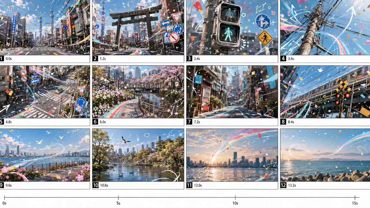
- Assemble a contact sheet. Before judging individual frames, view everything at thumbnail size in a grid. Composition collisions, tonal drift, and lighting inconsistencies become obvious in a grid and are almost invisible when you scroll one image at a time.
- Upscale once, then grade. Choose an upscaler that reconstructs plausible texture rather than smoothing it into wax. Apply a light grade and a subtle grain or lens treatment. Over-sharpening is the fastest way to make a convincing image look manufactured.
- Log the settings. Record model, version, seed, references, and prompt for every delivered frame. This log pays for itself the first time someone asks how a shot was made, or the first time you need to reproduce a frame from last quarter.
A short version of this loop, run on three test prompts before a project starts, will tell you whether a tool fits your timeline. Skipping it is the most common reason teams switch tools mid-project.
Character Continuity for Video and Campaign Work
Consistency is where still-image work meets motion production, and it is the single biggest reason teams abandon a model halfway through a project.
Build an anchor set. Create four reference images: a neutral front-facing portrait, a three-quarter view, a profile, and one expressive frame, all under similar lighting. Feed the same anchor set every time and keep the character description in your prompt byte-identical except for pose and scene. Rewriting the description between shots is the leading cause of drift, and it is usually done unconsciously.
Treat frames as keyframes. If the images will be animated, generate each one with a defined camera move and framing rather than as a standalone picture. Keep focal length, subject scale, and color treatment consistent so the animation stage has less to reconcile. Producing a coherent sequence of six to ten frames before animating is far more efficient than fixing continuity afterwards.
Diagnose drift before you correct it. When a character changes between frames, the cause is almost always one of three things: the reference set changed, the lighting description changed, or the seed was reshuffled. Fix the cause rather than adding more descriptive adjectives, which usually makes consistency worse.
Separate identity from wardrobe. If a campaign needs the same person in five outfits, lock the face and hair first, then vary clothing in a second pass with inpainting. Trying to change both simultaneously pushes the model into averaging the two looks.
Troubleshooting the Failures That Cost the Most Time
Hands, teeth, and hair edges. These remain the fastest way to spot a synthetic image. Look for knuckles that merge, teeth that form one unbroken ribbon, and hair that ends in a blurred smudge instead of a taper. Examine the boundary between hair and a bright background at full magnification; that is where otherwise excellent models fall apart.
Text, logos, and packaging. Typography has improved but remains model-dependent and language-dependent. Short Latin-script words are usually fine; long strings, dense paragraphs, and non-Latin scripts remain unreliable. For packaging or signage, generate the scene and composite the typography properly. That single habit saves hours and produces a better result.
Lighting that ignores physics. Watch for shadows falling in two directions at once, rim light with no visible source, reflections that miss the object they should mirror, and interiors where window light contradicts the ambient color temperature. Viewers rarely name these problems, but they sense that something is wrong.
Uniform sharpness. Real photographs are uneven. Focus falls off, corners darken slightly, highlights clip. A uniformly crisp image reads as rendered no matter how good the texture is. Adding mild depth of field, a touch of vignetting, or a natural foreground obstruction often improves believability more than any prompt tweak.
Resolution mismatch. Generating small and enlarging aggressively destroys the micro-texture that makes an image read as photographic. Match generation resolution to your distribution format whenever the tool allows, and upscale at most once.
Over-prompting. Long piles of adjectives dilute the signal and push output toward generic stock imagery. Write the scene like a shot list: subject, action, location, light, lens, mood. Six precise clauses beat thirty vague ones.
Silent edits by collaborators. When someone else retouches a delivered frame, continuity breaks. Share the anchor set and the seed log with anyone who touches the images, and ask them to work on copies.
Decision Guide: Matching the Generator to the Job
Rather than crowning a single winner, match capabilities to the work in front of you.
- Editorial portraits and people-led campaigns: prioritize skin and hair rendering, identity references, and inpainting precision. Speed is secondary.
- Product and e-commerce: prioritize structural coherence, material fidelity, background control, and the ability to match an existing lighting setup. Reflective surfaces are the deciding test.
- Architecture and interiors: prioritize line stability, perspective accuracy, and depth conditioning. Look for models that respect vanishing points without warping.
- Video pre-production and storyboards: prioritize reference consistency, aspect ratio flexibility, and low iteration cost. You will generate hundreds of frames, so throughput dominates quality at the margins.
- Social and paid media: prioritize speed, vertical framing, and safe zones for text overlays. Reserving negative space in the prompt is more valuable than maximum realism.
A pragmatic professional setup uses two or three tools rather than one: a base generator for composition and texture, a specialist for upscaling, and a dedicated editor for repairs. Chaining specialists usually beats forcing one model to do everything, and it lets you swap out a weak link without rebuilding the whole pipeline.
Rights, Disclosure, and Working With Clients
Check the terms that apply to the specific model or service you use. Commercial permissions, training-data policies, and output restrictions differ meaningfully between providers and change over time, so review them per project rather than once. Keep a record of which model, version, and settings produced each delivered asset, and store it alongside the project files.
On the creative side, prompting for a named living artist's signature style raises ethical and sometimes legal questions. Prompting for a general visual language, a lighting setup, or a film stock reference is safer and usually produces more useful results anyway, because it describes an outcome rather than borrowing an identity.
Disclosure expectations vary by industry and jurisdiction. In advertising, news, and documentary contexts, assume transparency about synthetic imagery is required unless you have confirmed otherwise. In product and packaging work, the question is usually whether the client's own guidelines demand a note. Ask before delivery rather than after, because retroactively labeling a published asset is far more expensive.
Finally, treat synthetic imagery as one input among several. Combining generated plates with real photography, real textures, and proper typography produces work that holds up at print resolution and ages better than an all-generated composite.
Frequently Asked Questions
Why do my images look generated even when the quality is high?
Usually because of micro-detail rather than composition. Check hair edges, hands, and reflections first. Then examine sharpness uniformity: real photographs have natural falloff, so a fully crisp frame often reads as synthetic. Adding mild depth of field or grain frequently fixes the impression.
Do I need one model or several?
Several, in most professional workflows. Use one model for base generation and another for upscaling or repair if it performs better at that step. Chained specialists usually outperform one generalist, and they let you replace a weak component without redoing your prompt library.
How do I keep a character consistent across many shots?
Lock a fixed reference set, keep your prompt template identical except for pose and scene, and never rewrite the character description mid-project. If drift appears, revert to your anchor frame instead of adding more adjectives to the prompt.
What resolution should I generate at?
Generate at the highest resolution your tool handles without degrading structure, then upscale once with a texture-aware model. Multiple upscaling passes add softness and are best avoided. If you need a large print, test the final output at full crop before committing to the whole series.
Is photorealism achievable without editing tools?
You can get close, but a small amount of editing is normal even in professional pipelines. Typical fixes are removing stray artifacts, correcting a light direction, and compositing typography the model could not render dependably.
How many test prompts do I need before choosing a tool?
Three is usually enough if they are chosen well: a portrait in difficult lighting, a product shot with reflective surfaces, and a wide environmental frame with a person in the mid-ground. Each stresses a different failure mode, and running them on every candidate takes less time than one unbudgeted round of revisions later.
What is the biggest mistake teams make?
Skipping the output contract. Without a written definition of the deliverable, prompts wander, reviewers disagree about what good looks like, and the project drifts toward whichever image happens to look nicest rather than the one that fits the brief. A one-page contract is the cheapest quality control available.
Should I disclose that an image is synthetic?
Follow the strictest applicable guideline, which is usually the client's or the platform's. When in doubt, disclose. It costs nothing during production and prevents an uncomfortable conversation after publication.

Alexander
More Blogs
Read MoreMontaggio video rapido: transizioni e software per l'AI
Guida pratica al montaggio video rapido con AI: transizioni fluide, software, workflow, coerenza visiva, errori da evitare e FAQ operative.
Building an AI Video Production Workflow From Concept to Cut
A practical guide to planning, generating, editing, and finishing AI-assisted videos with consistent characters, clear shot lists, and reliable review loops.
A Repeatable Post-Production Workflow for Polished AI Video
Build a repeatable AI video post-production pipeline: organize assets, cut story-first, design transitions, refine audio, and review versions calmly.