

Social Media Image Sizes: Auto-Resize Assets for Every Platform
Oct 13, 2026


Why Cross-Platform Image Sizing Still Breaks Creative Workflows
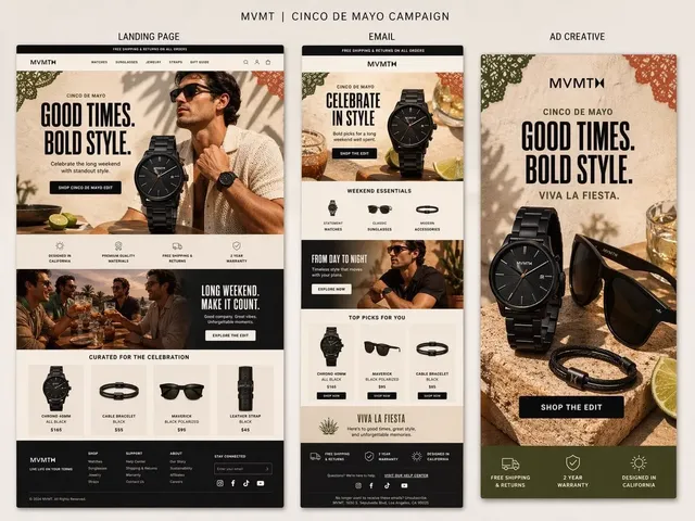
A single campaign visual rarely travels intact. It starts as a carefully composed hero image, gets squeezed into a square grid, stretched into a vertical story, cropped into a thumbnail where the product sits half out of frame, and finally re-compressed until the gradient background shows banding. Nothing about that journey is creative. It is pure logistics, and it eats more hours than most teams want to admit.
The reason is structural. Every distribution channel has its own idea of what a correct image looks like. Vertical-first platforms reward tall, mobile-native compositions. Professional networks still render link previews in wide landscape ratios. Marketplaces and discovery feeds crop toward squares. Grids enforce uniformity that fights against the mixed ratios you actually produced.
The bottleneck has quietly moved from creation to distribution. Generative and AI-assisted tools can produce dozens of visual variations in an afternoon. The slow part is now adapting those visuals to eight or ten placements, checking each one by hand, and discovering after publishing that the headline text disappeared behind a user-interface overlay.
Three failure modes show up again and again:
- Softness. An asset that was never large enough gets upscaled, and the result looks slightly out of focus at full width.
- Chopped composition. A center crop cuts off faces, product labels, or the one detail the image existed to show.
- Crushed quality. Repeated re-encoding of an already-exported file introduces artifacts that no amount of sharpening can fix.
All three are preventable with a small amount of upfront structure. This guide lays out that structure: one master source asset strategy, a clear understanding of aspect ratios and safe zones, a practical export matrix, and a repeatable workflow for automated resizing that you can hand to a teammate.
The Master Source Asset: One File to Rule Every Placement
The foundation of fast, consistent distribution is what photographers would call a digital negative: a single highest-quality file that every derivative is built from. If you only take one idea from this article, take this one. Derivatives should never be built from other derivatives.
Resolution and Aspect Ratio Choices
Start with the largest native resolution your toolchain supports, and keep at least two masters when your work is visual-first:
- A landscape master at 16:9, ideally 3840 x 2160 or larger.
- A vertical master at 9:16, ideally 2160 x 3840 or larger.
- A square or 4:5 master around 2048 pixels on the short edge, which covers most feed placements gracefully.
Why two or three instead of one? Because cropping down always beats scaling up, and because horizontal and vertical compositions are genuinely different images, not the same image rotated through a crop tool. A product shot that breathes in landscape often feels empty and distant when pulled into 9:16, while a vertical portrait that feels intimate on a phone becomes a thin sliver in a wide preview.
Minimum practical sizes to remember: 1080 pixels wide for anything shown full-bleed in a feed, 2048 pixels for anything rendered edge-to-edge on a desktop display, and 1280 x 720 for video thumbnails.
Naming, Versioning, and Color
Store masters in a read-only folder and treat them as immutable. Adopt a naming convention that a machine can parse, something like brand-campaign-subject-aspect-version. This pays off immediately when a batch export script or a template system needs to match files to placements without human guesswork.
On color: work in sRGB, embed the profile, and keep files 8-bit unless you have a specific reason to go deeper. CMYK masters cause the muddy, desaturated results people blame on compression. Also resist the temptation to apply a final sharpening pass on the master. Sharpening belongs after the resize, on the derivative, because downscaling changes how much sharpening an image can absorb.
Aspect Ratios, Safe Zones, and Platform Crop Behavior
An aspect ratio is just width divided by height, but the interesting part is what each platform does when your ratio does not match the slot. Most automatic croppers assume the center of the image is the most important part. Some use saliency detection to guess. Almost none of them know what your image is actually about.
That means the practical rule is simple: compose so the center crop is always acceptable. Put the subject, face, product, or key visual element in the middle 60 to 70 percent of the frame, and treat the outer edges as expendable. If you have text baked into an image, this rule is not optional.
Safe zones matter just as much as ratios. Vertical video placements cover the bottom fifth of the frame with captions, usernames, and progress bars. Action buttons and profile bubbles sit along the right edge. Story formats push interface elements into the top and bottom bands. Design as though a 15 to 20 percent border on the relevant edges will be painted over, and your text will survive.
There is also a tradeoff between cropping and letterboxing. Cropping preserves impact but risks cutting content. Letterboxing preserves everything but adds empty bars that look unpolished in a feed. The middle path, and the one most polished accounts use, is a blurred or color-matched background fill that extends the image rather than cropping it.
Platform-by-Platform Cheat Sheet
These targets are practical starting points rather than hard laws, because interfaces change constantly. Verify against your own upload preview before committing to a template.
| Platform | Placement | Ratio | Target Pixels |
|---|---|---|---|
| Meta feed | Image post | 4:5 or 1:1 | 1080 x 1350 / 1080 x 1080 |
| Meta feed | Landscape post | 1.91:1 or 16:9 | 1200 x 628 / 1600 x 900 |
| Meta stories and reels | Full screen | 9:16 | 1080 x 1920 |
| Meta profile | Avatar | 1:1 | 320 x 320 minimum |
| X | In-stream image | 16:9 | 1600 x 900 |
| X | Timeline single image | ~2:1 | 1600 x 800 |
| Feed image | 1:1 or 4:5 | 1200 x 1200 / 1080 x 1350 | |
| Link preview | 1.91:1 | 1200 x 627 | |
| Company banner | ~4:1 | 1584 x 396 | |
| TikTok | Full screen video or cover | 9:16 | 1080 x 1920 |
| YouTube | Thumbnail | 16:9 | 1280 x 720 |
| YouTube | Shorts | 9:16 | 1080 x 1920 |
| YouTube | Channel banner | ~16:9 | 2560 x 1440 (safe area 1546 x 423) |
| Standard pin | 2:3 | 1000 x 1500 | |
| Threads | Feed image | 4:5 or 1:1 | 1080 x 1350 |
Meta: Feed, Stories, and Reels
Vertical 4:5 posts generally occupy more screen real estate in the feed than square images, which is why they tend to earn more engagement. Reels and Stories demand genuinely vertical composition. A landscape image dropped into a 9:16 slot gets blurred filler on the top and bottom, which reads as low effort even when the underlying photo is excellent.
X and LinkedIn
Both networks still render link previews in a wide landscape ratio, so keep a 1200 x 627 crop in your export set for every campaign. For native images, a tall 4:5 upload is usually fine, but the timeline will still crop the top and bottom to a shorter ratio, so keep the subject centered.
TikTok and YouTube
TikTok is vertical-only and aggressive about overlays. YouTube is dual-format: horizontal for long-form, vertical for Shorts. If you publish both, maintain two masters from the start instead of cropping one into the other at the last minute. Thumbnails deserve their own careful pass, because they are the single highest-leverage image on the platform and they are viewed at very small sizes where detail vanishes.
Pinterest and Regional Networks
Pinterest rewards tall 2:3 pins; anything shorter gets truncated in the feed. If you distribute in markets with strong local platforms, check their current specs independently rather than assuming global defaults apply.
Compression, File Formats, and the Quality Cliff
Every platform re-encodes what you upload. Your job is to arrive with enough headroom that their compression does not visibly degrade the result.
- JPEG remains the safest universal choice for photographic content. Export at quality 80 to 85 for feeds, 90 or higher for hero placements where banding would be noticeable.
- WebP typically produces files 25 to 35 percent smaller than JPEG at comparable quality and is now widely accepted.
- AVIF compresses better still but encodes slowly and is unnecessary for most marketing work.
- PNG is correct for flat graphics, logos, screenshots, and anything with transparency. Never use PNG for a photograph; the file size is punitive.
Watch for the quality cliff, which is not linear. Dropping from quality 90 to 80 often saves a third of the file size with no visible difference. Dropping from 60 to 50 can introduce smearing across an entire image. Test at your actual display size, not at 400 percent zoom on a desktop monitor.
Two more rules. Never re-encode an already-exported JPEG; go back to the master. And sharpen after resizing, not before, with a light unsharp mask rather than a heavy sharpen filter.
How Automated Resizing Actually Works
Automated resizing tools fall into three families, and knowing which one you are using tells you how much supervision it needs.
Geometric tools apply deterministic rules: hard center crop, letterbox, pad with a solid or blurred fill. They are predictable, fast, and never invent content. They are the right default for anything with legal or brand sensitivity, such as product packaging or pricing imagery.
Content-aware tools build a saliency map, detect faces and subjects, and choose a crop window that keeps the important material inside the frame. Many can also anchor the composition to rule-of-thirds positions instead of dead center. These produce noticeably better results on people-centric imagery and are the sweet spot for social teams.
Generative tools extend the canvas by synthesizing new pixels, filling backgrounds, or removing unwanted objects. The output can be remarkable, especially when turning a landscape shot into a vertical one. But generative fill is a creative intervention, not a mechanical resize. It can alter logos, add phantom objects, or subtly change a product's shape. Treat every generative resize as a draft that requires review.
A sensible policy is tiered: geometric for legally sensitive assets, content-aware for everyday social distribution, and generative only for background expansion where no text, logo, or identifiable product sits near the new edge.
Building a Repeatable Resizing Workflow
Here is a workflow that scales from a solo creator to a small team without adding meetings.
- Inventory your placements. List every slot you actually publish to, not every slot that exists. Most accounts need six to ten variants, not thirty.
- Build masters. Produce the landscape, vertical, and square sources at maximum resolution, color-corrected, unsharpened.
- Define an export matrix. Write down the placement, ratio, pixel dimensions, format, and quality setting for each row. This becomes your template.
- Standardize naming. One pattern, applied everywhere, with the aspect ratio embedded in the filename.
- Batch process. Use presets, actions, or a scripted pipeline so no one is doing this by hand at the end of a long day.
- Quality-check the top placements only. Spend your review budget on the feed post and the thumbnail; spot-check the rest.
- Archive derivatives next to the master. Future edits then start from the correct source, not from a stale export.
- Revisit after interface changes. Any time a platform redesigns, re-test your safe zones and crop assumptions.
Illustrative export matrix
| Row | Placement | Ratio | Pixels | Format | Quality |
|---|---|---|---|---|---|
| 1 | Vertical feed | 4:5 | 1080 x 1350 | WebP | 82 |
| 2 | Square feed | 1:1 | 1080 x 1080 | WebP | 82 |
| 3 | Story or short | 9:16 | 1080 x 1920 | JPEG | 85 |
| 4 | Link preview | 1.91:1 | 1200 x 627 | JPEG | 85 |
| 5 | Thumbnail | 16:9 | 1280 x 720 | JPEG | 88 |
| 6 | Vertical pin | 2:3 | 1000 x 1500 | WebP | 82 |
Once this matrix exists, adding a new platform is a five-minute task instead of a half-day project.
Common Mistakes and How to Avoid Them
Resizing upward. If the source is smaller than the target, you are asking software to invent detail. Fix it at the source by rendering or exporting larger.
Baking text into the image. Text cannot be reflowed. Keep copy on a separate layer in the master so it can be repositioned for each ratio.
Ignoring the bottom band. The most common cause of a good post looking broken is a caption or call to action swallowed by a video overlay.
Assuming one crop fits all. A composition that works at 1:1 is rarely the same composition that works at 9:16. Compose for the target, then crop.
Over-compressing to hit a size target. Slight file-size overage is almost always better than visible artifacts. Platforms will compress anyway.
Inconsistent branding across variants. If your logo sits bottom-left on one platform and top-right on another, the campaign looks assembled rather than designed.
Skipping the upload preview. Every platform shows you a rendering before publish. Look at it on a phone, which is where the majority of impressions happen.
Forgetting accessibility. Low-contrast text survives neither compression nor sunlight. Assume the image will be seen at half brightness on a small screen.
Working With AI-Generated Visuals and Video Frames
AI-assisted production changes the resizing problem in a helpful way: you can choose the aspect ratio at generation time rather than after. If you know you need a vertical cut, generate vertical. Prompting for a wide composition and then cropping the middle out of it is a self-inflicted wound.
A few habits make this smoother:
- Generate at the largest dimension your pipeline supports. Downscaling preserves crispness; upscaling never does.
- Keep subjects centered and give headroom. Generative compositions often push subjects to the edges, where crop windows cut them off.
- Avoid asking for text inside generated images. Text generated into pixels cannot be edited, translated, or repositioned, and it frequently renders as gibberish.
- Extract stills from video at source resolution. A thumbnail grabbed from a compressed export will look soft next to everything else in the feed.
- Keep an overlay layer. Titles, logos, and lower-thirds applied as a layer after generation survive every resize and localization.
- Review generative fills carefully. When a tool extends a background to fill a vertical frame, check the new region for duplicated objects, warped edges, or altered brand marks.
For teams producing both motion and stills, the cleanest structure is a single master timeline or master composition with named aspect-ratio variants. Everything downstream is an export, not a rebuild.
FAQ
How large should my master file be?
Large enough that your biggest placement is a downscale, not an upscale. In practice, that means at least 2048 pixels on the short edge and ideally 3840 on the long edge for landscape work.
Can I use one square image everywhere?
You can, and it will look acceptable almost everywhere. It will also look identical everywhere, which forfeits the mobile-native advantage of vertical formats and the cinematic advantage of wide formats.
Is content-aware cropping safe for product photos?
For the crop window itself, usually yes. The risk is not the crop but generative fill, which can subtly redraw packaging. Use deterministic crops for anything with a legal or brand-compliance dimension.
What file format should I upload?
Use WebP or JPEG for photographic content and PNG for flat graphics or transparency. Whatever you upload, the platform will re-encode it, so start from a high-quality master.
Why does my image look sharp on desktop and soft on mobile?
Mobile rendering combines heavy compression with high pixel density, which hides fine detail and amplifies banding in smooth gradients. Test on a real phone before publishing anything important.
How much of the frame is safe from interface overlays?
Assume the outer 15 to 20 percent on the busiest edges will be covered in vertical video formats. Keep essential content inside the central 60 to 70 percent.
Should I sharpen before or after resizing?
Always after. Downscaling softens edges slightly, and a light post-resize sharpening pass restores perceived crispness without amplifying noise.
How often should I re-check platform specifications?
Every time a platform announces a design change, and otherwise once or twice a year. Specs drift slowly, but safe zones and interface overlays can shift without much fanfare, and those are what break layouts.
Do I need separate graphics for each network's audience?
The crop variants can be automated, but the message should not be. A short punchy line that works in a fast vertical feed may feel thin on a professional network where longer context performs better.
What is the fastest way to handle ten placements?
Build the matrix once, automate the exports, and review only the two or three placements that carry the most impressions. Consistency across the rest matters more than individual perfection.

Alexander
More Blogs
Read MoreVidu Q4 Alternatives: 4K AI Video Models Compared (2026)
Vidu Q4 alternatives compared: Kling 4.0, Seedance 2.5, Wan 3.0, and Runway Gen-4 — 4K support, input modes, durations, audio, and what each costs in credits on Domer.
Top 4K AI Image Generators in 2026: 5 Models Compared on Real Costs
The top 4K AI image generators on Domer compared: Flux 3 Klein, Nano Banana 2.1, GPT Image 2.5, GPT Image 2, and Nano Banana Pro — 4K credit costs, reference limits, and speed.
Nano Banana 2.1 vs GPT Image 2.5: Which Image Model Should You Use? (2026)
Nano Banana 2.1 vs GPT Image 2.5 Flare compared: credit costs per resolution, aspect ratios, reference images, text rendering, and which tasks fit each model.