
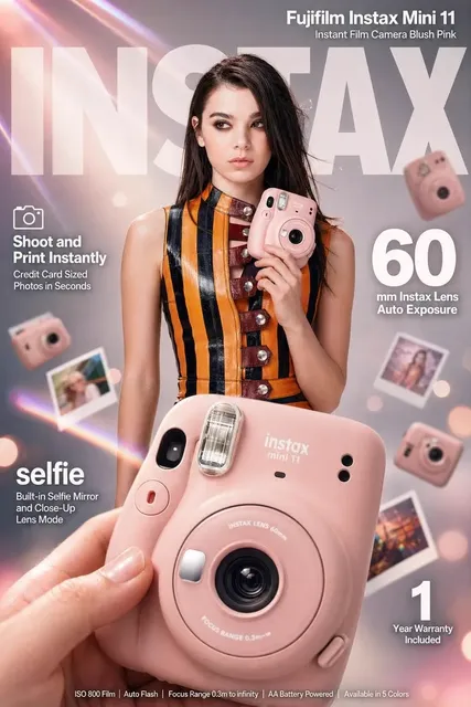
Thumbnail Design That Wins the Scroll: A Practical Guide
Oct 13, 2026

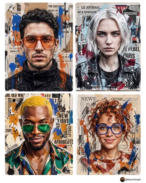
The Thumbnail Is the Front Door of Every Video
Every video you publish competes in a feed where the viewer's thumb is already moving. The script, the research, the edit, the sound design — none of it matters until someone stops. That stop is a visual decision made in well under a second, and it is made almost entirely on the strength of the still frame attached to your video.
Think of the thumbnail as packaging. On a grocery shelf, packaging is not decoration; it is the argument for why a person should pick this item up instead of the twelve alternatives beside it. In a video feed, the thumbnail is the only part of your work that every potential viewer sees. Someone who scrolls past never encounters your hook, your pacing, or your payoff. They encounter a rectangle a few hundred pixels wide, decide in a glance, and keep moving.
That asymmetry is what makes thumbnail work so valuable. A modest improvement in click-through rate compounds across every video you publish, every search result, every suggested-feed impression, and every time an older video resurfaces. Meanwhile, a brilliant video with a weak frame is functionally invisible — it exists, but nobody arrives.
This guide is a practical system for making that rectangle work harder: the psychology behind instant visual decisions, a repeatable production workflow, tool choices, testing methods, and the mistakes that quietly cap performance.
The Millisecond Decision: What Happens Before the Click
Contrast and cognitive load
The human visual system is a threat-detection and pattern-matching machine, not a careful reader. When a feed loads, your eye does not scan each thumbnail in sequence. It extracts the most salient shapes and colors, discards anything that reads as noise, and lingers only on frames that promise new information.
This is why contrast matters more than beauty. A busy thumbnail forces the brain to work, and the brain responds to work in a feed by moving on. Clean separation between subject and background, one dominant focal point, and a clear silhouette will almost always outperform a technically polished but cluttered composition.
A useful test: shrink your thumbnail to roughly the size of a postage stamp, or blur it heavily. If you can still describe what is happening in one sentence, the composition is doing its job. If it becomes an indistinct smear of color, your viewer will see the same smear at speed.
Faces, emotion, and the human anchor
Human faces carry disproportionate weight in visual scanning, particularly faces showing a legible emotion — surprise, delight, concentration, disbelief. The emotion does not need to be extreme; it needs to be readable. A neutral expression is often invisible in a feed because it offers no story the viewer can complete.
Two practical cautions. First, a face that is too close to the camera can crowd out context and make the frame feel confrontational rather than inviting. Second, expressions that read as obviously staged undermine trust; audiences have become fluent at spotting performance. The strongest frames usually capture a genuine reaction from the actual video rather than a posed shot.
Text as a companion, not a crutch
Short text on a thumbnail can sharpen an idea, but the image should carry the concept on its own. If your thumbnail collapses without words, the composition was never strong enough. Keep overlay text to a handful of words, set it in a heavy weight, and give it real contrast against the background — thin type over a detailed photo is unreadable at feed size, no matter how elegant it looks at full resolution.
Avoid repeating your video title verbatim. The title already sits next to the thumbnail; using the same phrase twice spends your limited visual real estate on redundancy. Instead, let the text add a second beat: a number, a stake, a contrast, or a question that the image alone cannot pose.
Six Levers You Can Pull on Any Thumbnail
Focal hierarchy. Decide what the viewer should see first, second, and third. If you cannot rank them, the viewer cannot either. Most weak thumbnails are not ugly — they are unresolved.
Color separation. Backgrounds should support, not compete. A saturated subject against a desaturated background, or a warm subject against a cool environment, creates separation instantly. Beware of greens, browns, and mid-tone greys that muddle into the feed palette.
Legibility at small sizes. Design at full resolution but judge at feed size. Set up a preview at the actual displayed dimensions and check it on a phone, not a desktop monitor.
Emotional signal. Ask what feeling the frame transmits before any text is read: curiosity, tension, joy, absurdity, awe. A thumbnail with no emotional signal is a thumbnail with no reason to click.
The curiosity gap. The best frames show something mid-action and withhold the outcome. A closed loop (fully explained image) removes the reason to click; an open loop creates it. Just make sure the payoff inside the video actually resolves the gap — bait that does not deliver damages future clicks, because returning viewers weight their decisions with memory.
Brand consistency. Recurring color, type treatment, framing, or a signature element helps returning viewers recognize your work instantly in a crowded feed. Recognition is a competitive advantage most creators never build because they redesign their look with every upload.
A Repeatable Thumbnail Workflow
Ad hoc thumbnails lead to inconsistent quality. A short pipeline fixes that without slowing you down.
- Write the thumbnail idea before the video is finished. If you cannot articulate the single image that sells the video, the video may not have a clear promise. Treat this as a diagnostic step, not just a marketing one.
- Capture deliberately. During editing, flag three to five candidate frames with strong expressions, clear subject separation, and an unfinished action. Shooting a dedicated still or a staged moment is also legitimate and often yields better results than hunting through footage.
- Pick and crop to the platform ratio. Decide the primary canvas (widescreen, vertical, or square) and frame the crop so the subject sits off-center, leaving room for text if needed. Never center a subject mechanically.
- Composite in layers. Background treatment, subject cutout, color grade, text, and any graphic accents should each live on their own layer so you can toggle, reposition, and re-export variations quickly.
- Grade for separation. A light vignette, subtle background blur, or a slight outline around the subject can rescue a frame where the background is stealing attention.
- Export at required resolution and inspect the result at realistic feed size on both a phone and a desktop browser.
- Archive the project file. You will want to make variants later, and rebuilding from a flat export wastes hours.
One efficiency habit worth adopting: build a small template library — three or four recurring layouts with different focal arrangements. Templates eliminate blank-canvas paralysis while still leaving room for creative variance.
Using AI Image and Editing Tools in the Pipeline
AI image generation has changed what is feasible in a thumbnail workflow, particularly for creators without illustration or compositing skills.
Background generation and replacement. Generative fill, background expanders, and inpainting tools let you extend a crop, clean up a distracting element, or place a subject in a context that reinforces the video's theme. Tools like Photoshop's generative features, Photopea for free layered editing, and Canva for quick assembly all cover different parts of this. When prompting a background, describe mood, color direction, and depth of field rather than specific objects — the goal is supporting context, not a competing subject.
Style consistency across a series. Reference-based generation is the most useful technique for channel growth. Feed the tool one or two prior thumbnails and ask for a consistent palette, lighting direction, or treatment so new frames feel like part of a set. Consistency is what converts a single click into a subscription pattern.
Upscaling and cleanup. If you are pulling a frame from older footage, an upscaler and a light denoise pass can make it usable. Be careful not to over-smooth — plastic skin tones read as artificial at feed size.
Subject cutouts. Automatic background removal is fast but imperfect around hair, fur, and semi-transparent edges. Budget an extra minute to refine edges manually; sloppy cutouts are one of the most visible quality tells in a thumbnail.
A reasonable division of labor: use AI for backgrounds, fills, and variants; rely on human judgment for composition, expression selection, and the final crop. The composition is the part viewers actually respond to, and it is the part automation still handles poorly.
Platform Realities: Ratios, Safe Zones, and Feeds
Aspect ratios
Widescreen thumbnails dominate search and browse surfaces, vertical frames dominate short-form feeds, and square or 4:5 crops often serve social previews. You do not need a fully separate design per ratio, but you do need to check the crop. A vertical frame cropped to widescreen frequently decapitates the subject or loses the text.
Design the safe area first: place the subject and any essential text inside the center of the frame so that multiple crops still work. Then treat the outer margins as expendable.
Overlays and safe zones
Platforms layer timestamps, progress bars, badges, and duration labels onto thumbnails. Keep critical elements away from the bottom-right and lower edge, where overlays commonly sit. A frame whose only text is buried under a duration badge is effectively text-free.
Feed context versus search previews
In a high-velocity feed, thumbnails are seen rapidly and mostly in motion — the goal is interruption. In search results, viewers are already motivated and comparison-shopping among similar titles. Search contexts reward clarity and specificity: legible subject, obvious topic, minimal stylization. Build for the environment your video will mostly live in, then sanity-check the other.
Testing Without Burning Weeks
Thumbnail testing does not require elaborate tooling, but it does require discipline.
Change one variable at a time. Swap the expression, then the text, then the background — not all three. Otherwise you learn nothing about why performance shifted.
Judge on impressions, not raw clicks. A thumbnail with 40 views tells you almost nothing. Wait for a few thousand impressions before drawing conclusions, and give each variant enough time to exit the early testing phase.
Watch click-through rate together with retention. A high click-through rate paired with steep early drop-off means the thumbnail overpromised. Over time, that pattern suppresses distribution far more than a modest click rate would.
Keep a swipe file. Screenshot thumbnails that stopped you — from your niche and from outside it. Annotate what specifically caused the pause: color, cropping, expression, text treatment. Patterns will emerge quickly, and they will be more useful than any generic best-practice list.
Test the concept before the polish. A different idea usually beats a different font. If variant B is a recolored version of variant A, you are optimizing the wrong layer.
Mistakes That Quietly Cap Click-Through
- Too many competing elements. Three focal points equal no focal point.
- Text that duplicates the title and wastes the only visual space you control.
- Low-contrast subject and background, especially in mid-tone greens and browns.
- Illegible small text that was designed on a large monitor and never checked at feed size.
- Posed or exaggerated expressions that signal performance rather than genuine reaction.
- Inconsistent visual identity, forcing returning viewers to re-evaluate whether this video is yours.
- Mismatch between promise and content, which wins a click and loses a viewer.
- Last-minute production, where the thumbnail is assembled after the upload is scheduled and never compared to alternatives.
- Ignoring mobile. Most impressions happen on a small screen in bright ambient light, not at your desk.
Advanced Moves Worth Building Into Your Routine
Series systems. If your content runs in sequences, build a visual grammar: fixed palette, fixed text position, and a variable element that changes per episode. Viewers learn to recognize the series and binge accordingly.
Motion stills. For vertical feeds, the first frame acts as the thumbnail. Choose a frame with a complete subject rather than a transitional blur, and front-load the visual hook so the opening second earns the next three.
Adaptation, not duplication. Cropping one master design into four ratios rarely works well. Design the master, then consciously re-compose for each format — moving text, resizing the subject, adjusting the crop. Fifteen extra minutes per variant is a small price for frames that hold up everywhere.
A monthly audit. Compare your last twenty thumbnails side by side. Gaps in consistency, overused colors, or repetitive compositions become obvious in a grid and invisible in isolation.
Frequently Asked Questions
How much time should a thumbnail take? For most creators, twenty to forty minutes including capture, compositing, and export is a realistic target. Templates and a saved layer structure bring that down further. Anything under two minutes usually shows in the result.
Do I need a design tool, or can I do this on a phone? Mobile editors handle basic overlays and crops well, and they are fine for vertical-first publishing. For layered compositing, cutouts, and series consistency, a desktop tool pays for itself quickly.
Should I always use a face? No. Faces are a strong default because humans are wired to read them, but an object, a diagram, or a striking environment can outperform a face when it carries more specific meaning for your audience. Test rather than assume.
How much text is too much? If a viewer can read your thumbnail without pausing their scroll, you likely have too much. Three to five words is a workable ceiling for most feeds.
What if my click-through rate is good but views are low? That usually points to distribution rather than packaging — topic demand, publishing timing, or audience fit. Packaging can only amplify an impression; it cannot create one from nothing.
Can AI generate an entire thumbnail unaided? It can generate attractive images, but it does not know your video's promise, your audience's vocabulary, or which frame will actually resolve the curiosity gap. Use it as a production accelerator, not an art director.
How often should I redesign my thumbnail style? Change individual elements freely, but treat your core visual identity as a long-term asset. Audiences build recognition over months; a wholesale redesign resets that recognition to zero.
The through-line across all of it is simple: the thumbnail is not a formality attached to a video, it is the first and sometimes only piece of your work that a viewer experiences. Treat it with the same intention you bring to the edit, build a repeatable system around it, and the cumulative effect on discovery will be far larger than any single video's performance suggests.

Alexander
More Blogs
Read MoreVidu Q4 Alternatives: 4K AI Video Models Compared (2026)
Vidu Q4 alternatives compared: Kling 4.0, Seedance 2.5, Wan 3.0, and Runway Gen-4 — 4K support, input modes, durations, audio, and what each costs in credits on Domer.
Top 4K AI Image Generators in 2026: 5 Models Compared on Real Costs
The top 4K AI image generators on Domer compared: Flux 3 Klein, Nano Banana 2.1, GPT Image 2.5, GPT Image 2, and Nano Banana Pro — 4K credit costs, reference limits, and speed.
Nano Banana 2.1 vs GPT Image 2.5: Which Image Model Should You Use? (2026)
Nano Banana 2.1 vs GPT Image 2.5 Flare compared: credit costs per resolution, aspect ratios, reference images, text rendering, and which tasks fit each model.