


Why the Final Pass Decides Whether an AI Video Performs
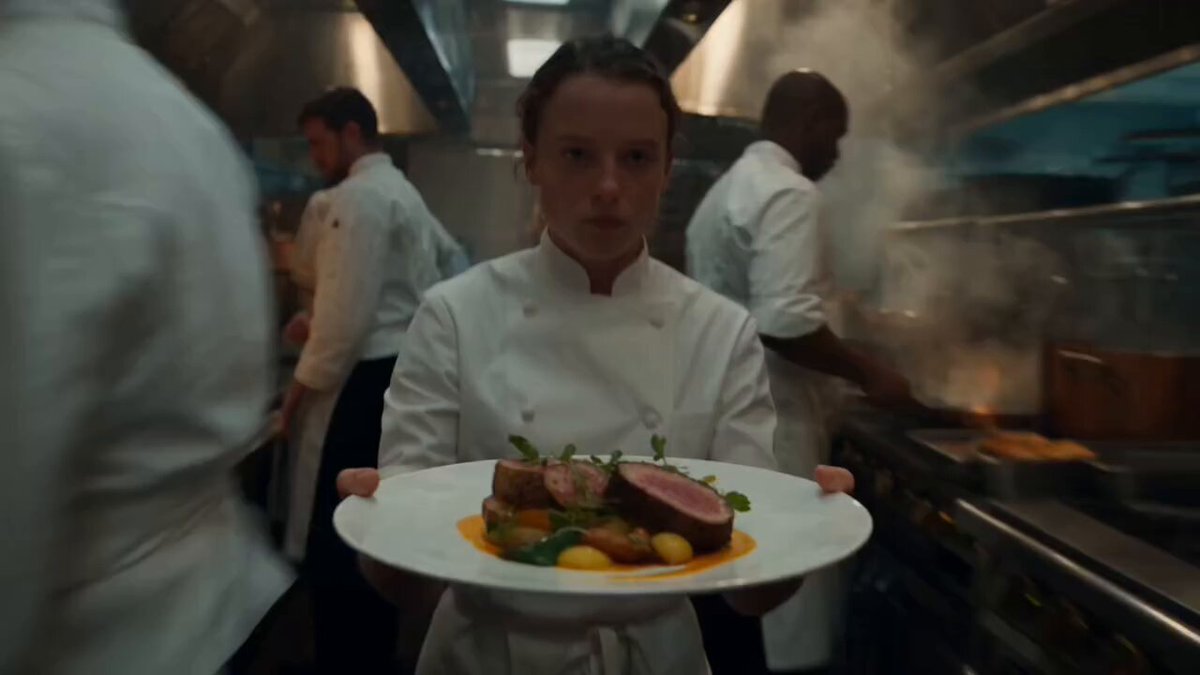
Generative video tools have removed the most expensive part of production. You can describe a scene, get usable footage in minutes, iterate on camera angles, and build B-roll that would once have required a permit, a crew, and a lighting kit. What they have not removed is the last ten percent: the pass that turns a raw clip into something an audience reads as intentional rather than experimental.
That final pass almost always contains the same three ingredients. A brand signature — logo, colour, type — so viewers know who is speaking. An audio bed — music, voice, sound design — so the video carries emotion instead of sitting flat. And a restrained layer of visual effects that guides the eye and hides the seams between generated shots.
The commercial reason is simple. Feeds autoplay with sound off, and the first second and a half decides whether anyone keeps watching. A raw generated clip usually has no visual anchor in that window and no audio hook waiting underneath it. A finished clip has both, and it also holds up when someone watches it later on a phone at arm's length.
There is a quieter benefit too. When logo placement, lower thirds, caption style, and loudness targets are defined once as a template, new footage becomes a drop-in. When they are not, every upload turns into a fresh design project — and design projects do not scale to a weekly publishing schedule.
The Three Layers of a Finished Video
Thinking in layers keeps the work modular, because each layer can be built once and reused across projects. Build them in order, since each one constrains the next.
Brand layer
Colour, logo, type, lower thirds, end card. The test: if you paused on any frame, would a viewer still know it came from you? Keep it to one primary colour, one accent, and two type sizes. More than that and the frame starts competing with itself.
Audio layer
Voice, music, and effects working at defined levels. The test: can you understand every word on a phone speaker, and does the music lift the pacing without fighting the voice? If you have to choose between a louder music bed and clearer speech, choose speech.
Effects layer
Grades, transitions, grain, particles, kinetic captions. The test: does the effect direct attention to something, or is it decoration that makes the footage harder to read? Good effects are almost invisible. Bad effects are the first thing a viewer notices.
Brand decisions change the composition. Audio decisions change the cut rhythm. Effects depend on both. Working in that sequence means you rarely have to redo work.
Step 1 — Build a Brand Kit Before You Generate Anything
Before you prompt for a single shot, assemble the assets you will need at the end of the project:
- Logo variants. A full lockup for end cards and a compact mark for corner placement. Use vector or transparent PNG files, exported at twice the largest size you will ever display.
- Colour values. Exact hex codes for primary, accent, and text colours. Never sample a colour from a screenshot; the compression will lie to you.
- Type choices. One display face and one highly readable body face. Confirm the licence covers video, commercial use, and embedding in rendered files.
- Safe-area templates. Overlay guides for 9:16, 1:1, and 16:9 so nothing important lands behind a platform interface.
- Timing budget. For a 24-second vertical clip: a 0–2.5 second hook, a 2.5–20 second body, and a 20–24 second end card.
Save all of this as a reusable project template in your editor. In CapCut, DaVinci Resolve, Premiere Pro, or Canva, that means a saved project with the logo, lower third, caption style, and audio track structure already in place. The setup costs an hour the first time and saves twenty minutes on every video after that.
One decision worth making early: whether your logo is a persistent watermark or a punctuating mark. If your footage is visually busy, a constant watermark becomes noise. If it is clean and slow, a persistent mark reinforces ownership without distracting.
Step 2 — Generate Footage With Overlay Space in Mind
Most people generate first and only then discover there is nowhere clean to put text. Reverse the order: decide where your overlays will live, then prompt for negative space in those regions.
Useful prompt fragments include "wide negative space in the left third", "soft gradient sky in the upper area", "shallow depth of field with a blurred background", and "slow push-in with minimal subject movement". Avoid dense texture, busy crowds, flickering light, or high-contrast detail in the exact band where a caption will sit, because captions over complexity become unreadable on a small screen.
| Overlay | Best region | Generation cue |
|---|---|---|
| Corner logo | top-right or bottom-left | calm, low-detail background |
| Lower third | lower-left band | uncluttered midground |
| Captions | centre-lower strip | subject framed slightly high |
| End card | full frame replacement | clean plate or freeze frame |
Two technical habits pay for themselves. First, generate at a higher resolution than you deliver — 4K source for a 1080p upload — so you can reframe, stabilise, or crop without softening the image. Second, keep a consistent look across shots by reusing a reference frame or an image-to-video starting still instead of re-prompting from scratch. Consistency across six shots matters more than novelty in any single one.
Finally, generate a few extra seconds of every shot. AI video tends to have weak beginnings and endings, and trimming into the middle of a clip gives you cleaner in and out points.
Step 3 — Cut the Story First, Then Style It
Sequence matters more than any individual effect. Lock the picture edit before you touch colour, brand elements, or effects, for a practical reason: keyframes and transitions are timed to the final cut. If the cut shifts, every animation you built has to be re-timed.
A working order that avoids rework:
- Assemble shots, discarding anything that repeats information already communicated.
- Set durations by rhythm — two to four seconds for fast short-form sequences, longer holds when a single idea needs room.
- Add a scratch voice track so pacing follows the narration rather than an arbitrary beat.
- Layer music, then brand elements, then effects, checking readability at each stage.
Two editing decisions shape everything downstream. The first is whether you cut on motion or on stillness; cutting on movement hides the transition, while cutting on stillness gives the cut a deliberate feel. The second is where you place your strongest shot. Placing it in the first three seconds buys you attention, and placing a second strong beat around the midpoint reduces drop-off.
Keep a separate sequence for vertical and horizontal delivery rather than cropping a finished horizontal cut. Reframing after the fact is how logos end up half outside the frame.
Step 4 — Place Logos, Lower Thirds, and Captions That Don't Fight the Frame
Logo placement rules
A corner mark should sit inside a margin of roughly five to eight percent of frame width and occupy eight to twelve percent of the width. Reduce opacity to sixty or eighty percent if it stays on screen continuously, or keep it at full strength and animate it in and out. Add a subtle shadow or soft gradient scrim when the background behind it is unpredictable, and always check legibility at 360p — that is what many viewers will actually see.
Lower thirds and on-screen text
Keep a lower third visible for at least a second and a half, and give the viewer enough time to read it once at normal speed without pausing. Left-align text with a consistent margin rather than centring it, unless the composition demands otherwise. Use a single accent colour for the name or key term, and let the rest sit in a neutral tone.
Captions
Animated captions are the single highest-return overlay for muted viewing. Two rules keep them clean: never let captions cover a face or the primary subject, and never exceed two lines at once. Use one font, one weight change for emphasis, and consistent positioning so the eye learns where to look.
Motion timing
Animation should feel quick on entry and gentle at rest. An eight to twelve frame fade or slide with an ease-out curve reads as professional; longer animations feel sluggish, and bounce effects date quickly. If your platform recommends an end card, design it as a deliberate held frame with a single call to action rather than a crammed list of links.
Step 5 — Build the Audio Bed with Music, Voice, and Sound Design
Audio is where most AI-assisted videos quietly undermine themselves. Footage that looks good can feel unfinished the moment the sound is thin.
Music selection
Match tempo to cutting rhythm. Roughly 90–110 BPM suits explainers and calm product stories; 120–140 BPM suits energetic launch edits. Check that the licence covers commercial use and monetised platforms before you publish, not after, and keep documentation of every track you use. When you cannot find the right track, a simple sustained pad plus a rhythmic pulse often works better than a busy composition.
Voice and level balance
If you record or generate narration, place it around -14 to -16 LUFS integrated for streaming platforms and keep true peaks below -1 dBTP. High-pass the voice around 80–100 Hz, apply gentle compression, and de-ess harsh sibilance. Music should duck under speech by roughly 12 to 18 dB. If you are using a synthetic voice, check the platform's disclosure requirements and be prepared to label it.
Sound design
Small sounds do most of the work. A soft whoosh on a transition, a click under an animated caption, a short riser before a reveal, and low room tone under silence all make an edit feel considered. Keep individual effects around -18 to -24 dB, and never stack more than two layers on the same beat — audio clutter is harder to notice and harder to fix than visual clutter.
One more habit: listen to the entire piece once on a phone speaker with no headphones. That is the environment where an unbalanced mix shows itself immediately.
Step 6 — Add Visual Effects Without Overwhelming the Story
Grade and grain
Generative shots often differ subtly in contrast and white balance, which becomes obvious when they sit next to each other. Match shots to a single reference frame, then apply a light film grain of three to eight percent across the whole timeline. Grain acts as visual glue: it unifies mismatched footage and reduces the plasticky look that flat grading can produce.
Transitions and particles
Choose one primary transition style and use it consistently — a light leak, a soft wipe, or a motion blur cut. Reserve decorative particles for two or three moments of emphasis, such as a product reveal or a title. If every cut has its own effect, none of them registers as important.
Motion graphics and kinetic type
Animated titles bridge the gap between brand and footage. Keep them to two fonts and three colours, animate position rather than scale where possible, and align text to the same margin grid as your captions. A simple rule: if you cannot explain what an animation is emphasising, remove it.
Speed and reframing
Subtle speed ramps can rescue a shot that drags, and a slow push-in can add movement to a static generation. Use them sparingly and always with motion blur enabled, otherwise the effect reads as a technical glitch rather than a choice.
Pre-Export Checklist, Common Mistakes, and Tool Options
The sixty-second pre-export check
Before rendering, confirm: audio peaks never clip; the mix is intelligible on a phone speaker; the logo is legible at low resolution and inside safe areas; captions are synced and never cover a face; the grade is consistent from first shot to last; the end card holds long enough to read; the frame rate matches your delivery target; and the export bitrate is high enough for the platform.
Mistakes that quietly kill polish
- Placing a logo over busy footage or in the region where platform buttons appear.
- Letting music sit at the same level as narration.
- Using a different transition on every cut.
- Exporting the overlays into the generated clip before the cut is locked.
- Re-compressing an already exported file instead of editing from the original.
- Forgetting to check that fonts and music are licensed for commercial use.
- Judging the result on a large monitor only, never on a phone.
Tool stacks by volume
For occasional publishing, a browser editor such as CapCut, Clipchamp, Canva, or Kapwing covers logos, captions, and music quickly. For weekly output, a desktop editor with saved templates — DaVinci Resolve, Filmora, or Premiere Pro — pays back the learning curve within a month. For high-volume or team work, add shared brand templates, an audio tool such as Audacity or Audition, and a licensed music library so nobody is sourcing tracks ad hoc. Choose based on publishing volume, number of collaborators, and whether clients need to approve brand assets.
FAQ
How long should a logo appear on screen?
For a persistent corner mark, the entire video at reduced opacity is fine if the background is calm. If you prefer full-strength placement, show it for one to two seconds near the start and again on the end card. Anything shorter reads as a flicker.
What music can I use with AI-generated footage?
Use tracks from a library whose licence explicitly permits commercial use, monetised platforms, and the territories you publish in. Generated footage does not change copyright rules for music. Keep a record of the licence for each track so you can respond if a platform ever asks.
Do I need professional editing software?
Not to start. Free and low-cost editors handle logo placement, captions, music ducking, and basic grades. Move to a desktop editor when you need reusable templates, consistent colour management, or multi-track audio control — usually once you are publishing more than once a week.
How do I keep a consistent look across many clips?
Fix three things: the grade reference frame, the grain amount, and the type and caption template. Reuse your last approved project as the starting file for the next one instead of beginning from a blank timeline.
Is AI voiceover safe to publish?
It is widely accepted, provided you have the rights to the voice model you used and you follow the platform's disclosure rules for synthetic media. Always listen critically for mispronounced brand names and unnatural pacing before publishing.
What export settings should I use?
For 1080p delivery, H.264 at 10–16 Mbps is a safe default; H.265 saves space if your audience devices support it. Match the frame rate to your source footage, render audio at 48 kHz, and export a master file at maximum quality so future re-edits never start from a compressed copy.
How do I stop effects from looking cheap?
Reduce the number, increase the restraint. One transition style, one grain level, one type treatment, and consistent timing will always look more expensive than a dozen different effects competing for attention.
The most reliable approach is to treat your first finished video as a template rather than a one-off. Save the project with its logo, caption style, audio levels, and grade already in place, and every future clip inherits the polish you built once. That is what turns AI-assisted video from a novelty into a sustainable publishing habit.
