

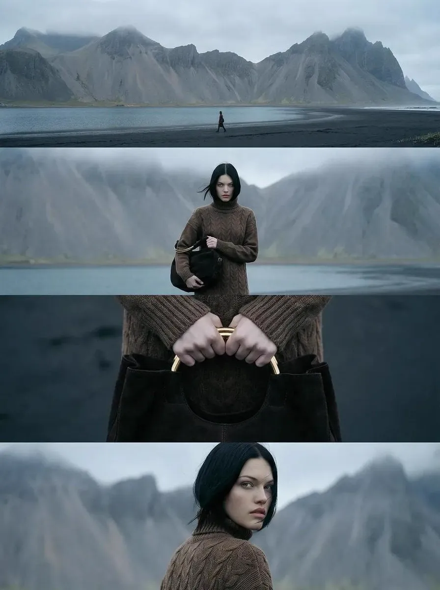
Why Visual Treatment Decides Whether Your Video Gets Watched
Two edits can contain identical footage, identical pacing, and identical sound design, yet one feels cinematic and the other feels like a phone recording. The difference is rarely the camera. It is the visual treatment applied after the shoot: color correction, contrast shaping, light simulation, compositing, and the deliberate use of filters as a storytelling device.
Audiences decide within a few seconds whether a video looks "professional." That judgment is subconscious. They are not evaluating your white balance; they are feeling whether the image has depth, whether skin tones look alive, whether highlights roll off smoothly, and whether the frame feels intentional. When those signals are missing, viewers scroll away before your first sentence lands.
The modern toolkit has expanded dramatically. Where editors once relied on a handful of presets and manual curve tweaks, they now combine traditional grading tools with AI-assisted correction, automatic relighting, shot matching, and generative cleanup. The challenge is no longer access to power — it is knowing which tool solves which problem, and in what order.
This guide walks through the techniques that matter most, organized as a working pipeline rather than a list of effects. You will find practical steps, decision criteria, mistakes to avoid, and answers to the questions editors ask most often.
Anatomy of a Modern Look: Correction, LUTs, and AI-Assisted Grading
Before anything creative happens, you need a clean image. The mistake most editors make is applying a dramatic look to footage that has not been technically corrected. The result is crushed shadows, blown highlights, and skin tones that shift unpredictably from shot to shot.
Technical correction first
Technical correction answers objective questions: Is the exposure consistent? Is the white balance neutral? Is the shot too noisy or too soft? Tools like DaVinci Resolve's color management, Premiere Pro's Lumetri scopes, or Final Cut Pro's video scopes give you measurable answers. Use waveforms for exposure, vectorscopes for saturation and hue, and RGB parades for channel balance.
Creative grading second
Once the image is neutral, creative grading introduces intent. A warm, low-contrast palette reads nostalgic. A cool, high-contrast palette with lifted blacks reads tense and modern. Teal shadows against warm highlights remain popular because the split complements skin tones instead of fighting them.
Where AI assistance genuinely helps
AI-assisted grading does three things well:
- Shot matching. It analyzes multiple clips and proposes corrections so that a scene cut between two angles feels continuous rather than jarring.
- Skin tone protection. It isolates faces and preserves natural tones even when the surrounding grade pushes hard in one direction.
- Semantic masking. Instead of rotoscoping a sky, a subject, or a background, you describe what you want and refine the edge with traditional tools.
What AI does not do is decide what your film should feel like. A model can match two shots; it cannot know that your opening scene should feel colder than your ending scene. That judgment stays with you.
A Repeatable Color Pipeline You Can Reuse on Every Project
Ad hoc grading produces inconsistent results and wasted hours. A fixed pipeline makes your work faster and more predictable, especially when multiple editors or generated clips are involved.
Step 1 — Normalize before you stylize
Bring every clip into a common baseline: matched exposure, neutral balance, consistent contrast curve, and a shared color space such as Rec.709 for delivery or a log working space for heavier grades. If you are mixing footage from a camera with AI-generated shots, this step is non-negotiable. Generated frames often arrive with slightly different gamma and saturation than camera originals.
Step 2 — Separate correction from style
Keep two node or layer groups: one for correction, one for the look. When a client asks for a warmer version, you adjust the style group without disturbing the technical foundation. This structure also makes it trivial to export alternate versions for different platforms.
Step 3 — Build the look from three ingredients
Most memorable looks combine:
- A tonal curve that sets contrast and where the image sits in the shadows and highlights.
- A color decision — the palette, usually two or three dominant hues and how they relate.
- A texture layer — grain, halation, diffusion, or a subtle bloom that keeps the image from looking digitally sterile.
A look-up table handles ingredient two quickly, but it cannot fix a broken tonal foundation. Use LUTs as a starting point, then adjust intensity, hue rotation, and highlight rolloff until the look fits your footage rather than the other way around.
Step 4 — Lock and version the look
Save the finished grade as a preset or still, then apply it as a reference across the rest of the timeline. Label versions clearly: look_v1_warm, look_v2_neutral, look_final_delivery. Versioning prevents the classic disaster of a late-night creative detour that nobody can undo.
Step 5 — Check on multiple screens
Grade on a calibrated display, then verify on a phone, a laptop, and a television. Dark scenes that look rich on a reference monitor frequently turn into muddy gray blocks on mobile screens, where most viewers will actually watch.
Virtual Lighting: Relighting Footage After the Shoot
Virtual lighting is the practice of adding, moving, or reshaping light in post. It used to require expensive 3D tracking and rotoscoping. Modern tools make it practical for ordinary projects.
Practical uses
- Motivated light sources. A lamp appears in frame but casts no glow. Add a warm falloff so the lamp feels real.
- Relighting for mood. Push a flat interview into a dramatic single-source look without reshooting.
- Day-for-night. Cool the image, suppress highlights, add a subtle blue ambient fill, and preserve enough detail that the shot is still readable.
- Screen replacement glow. When you replace a phone or monitor screen, add light spill onto the actor's face so the composited element integrates.
A simple relighting workflow
- Generate a depth or normal pass if your tool supports it, or isolate the subject with a mask.
- Place a virtual key light from a believable direction — usually the direction already implied by existing shadows.
- Add a rim or edge light to separate the subject from the background.
- Control falloff with a gradient rather than a hard edge; real light never stops abruptly.
- Match grain and noise between the relit area and the original footage.
The most common failure is light that contradicts the scene. If the window is behind the subject, a hard key from the front looks wrong no matter how well it is executed. Always check the geometry of existing shadows before adding anything.
Multi-Image Fusion and Character Consistency
When a project combines live-action footage, generated frames, stock elements, and archive material, the visual challenge is fusion: making incompatible sources behave like one continuous image.
The consistency checklist
- Grain and noise. Every source should share a similar texture profile. Adding a single grain layer over the whole composite is often more convincing than matching each element individually.
- Black levels. Generated footage frequently has crushed or lifted blacks. Match them before you composite, or the seams will be obvious.
- Sharpness. Mixing a razor-sharp generated frame with soft camera footage looks artificial. Slight sharpening or slight softening brings them into agreement.
- Motion blur. A fast-moving element without motion blur reads as pasted-on, no matter how clean the key.
- Color temperature. Indoor footage is warm; outdoor footage is cool. When you intercut them, decide which one shifts.
Keeping characters stable across shots
Character consistency is one of the hardest problems in mixed-source editing. Practical tactics that work:
- Lock a reference frame. Choose one shot as the canonical look for a character's skin tone, wardrobe color, and lighting direction.
- Build a character grade. Apply the same style group to every shot featuring that character, then adjust individual exposures underneath.
- Fix wardrobe keys rather than faces. Slight hue shifts in clothing are far more noticeable than subtle shifts in skin, because skin is variable in reality and fabric is not.
- Use a continuity still sheet. Export a frame from each character's key moments and review them side by side before delivery.
Filters as Emotional Language
Filters are not decoration. They are a vocabulary. Once you accept that, choices become easier because you are answering a storytelling question instead of a visual one.
- Warm, soft, slightly hazy. Memory, nostalgia, safety, romance.
- Cool, high contrast, crushed blacks. Anxiety, technology, isolation, night.
- Desaturated with a single saturated accent. Focus, obsession, a single object of desire.
- High saturation, high brightness. Energy, youth, comedy, advertising.
- Heavy grain and imperfect halation. Authenticity, documentary, found footage.
A useful exercise is to assign each act of your video a distinct but related palette. The shift between acts then carries meaning without a single line of dialogue. Audiences may not consciously notice, but they feel the transition.
Consistency matters more than novelty. A filter used once is a gimmick; a filter used with intent throughout a piece becomes a signature.
End-to-End Workflow: From Raw Clips to Final Export
A practical order of operations for a typical project:
- Ingest and organize. Group clips by scene, camera, and source type. Note resolution, frame rate, and color space.
- Assemble and lock picture. Resist grading until the edit stops changing, or you will grade footage you cut.
- Correct technically. Match exposure and balance across every clip in a scene.
- Apply the base look. Start with a LUT or preset, then customize until it fits the footage.
- Handle problem shots individually. Noise reduction, stabilization, and generative cleanup belong here, not earlier.
- Add virtual lighting. Integrate composites and relight so that new elements share the scene's light.
- Composite and finish. Titles, overlays, screen replacements, and any multi-source fusion.
- Add texture. Grain, halation, bloom, and subtle diffusion at the end of the chain, applied globally where possible.
- Review on multiple devices. Phone first, then reference monitor.
- Export systematically. One master file at high quality, plus platform-specific versions with their own compression settings.
Notice that texture comes last. Grain applied before compositing will not sit properly on elements added later, and heavily processed footage tends to soften, which you want to compensate for after all the processing is done.
Common Mistakes That Break an Otherwise Good Grade
Grading before the edit is locked. Every recut invalidates work. Lock picture first.
Applying a look at full strength. Most presets work better at 40–70 percent intensity. Full strength flattens skin tones and clips highlights.
Ignoring scopes. Monitors lie, ambient light changes, and eyes adapt. Scopes do not.
Overusing a single trend. A fashionable look on every project makes your work interchangeable. Treat trends as accents, not foundations.
Forgetting audio-visual balance. A heavily stylized image paired with flat audio feels unfinished. Sound design and color are perceived together.
Neglecting mobile delivery. Vertical crops, safe areas for captions, and mobile contrast checks are not optional if most of your audience watches on a phone.
Stacking too many effects. Grain plus diffusion plus bloom plus heavy LUT plus sharpening produces mush. Choose two texture elements and commit.
No version control. Save named versions. The ability to return to yesterday's grade is worth more than any single plugin.
Choosing the Right Tools for Your Workflow
Tool decisions should follow your constraints, not marketing. Consider four criteria.
Source complexity. If you mix camera footage, generated clips, and stock, prioritize a tool with strong color management and round-tripping between editing and compositing. DaVinci Resolve and Premiere Pro with After Effects are the common choices. For simpler mixes, Final Cut Pro or CapCut handles a great deal.
Team size. Single editors can work in one application. Teams need shared projects, consistent color spaces, and locked presets so two people produce the same look.
Turnaround time. For fast social content, template-driven grading with light manual adjustment usually wins. For narrative work, the extra hour spent building proper nodes or adjustment layers pays for itself many times over.
Learning investment. Free tools with deep capability often beat paid tools with shallow depth. Pick one editor and one compositor, learn them properly, and add specialized utilities — denoisers, upscalers, relighting plugins — only when a specific problem demands them.
FAQ
Do I need a calibrated monitor to grade well?
You need consistency more than perfection. A calibrated display removes guesswork, but the real safeguard is scopes plus verification on multiple devices. If you cannot calibrate, at least keep your room lighting constant and avoid grading late at night when your perception of contrast drifts.
Are LUTs still worth using?
Yes, as starting points. A good LUT gives you a tonal and color direction in seconds. The value comes from what you do after: reducing intensity, adjusting hue, protecting skin tones, and matching the look to each scene.
How much grain is too much?
If viewers notice the grain before they notice the subject, you have gone too far. Add grain at low intensity, then check on a phone screen where compression exaggerates texture.
Can AI replace a colorist?
It can replace repetitive matching and masking tasks. It cannot decide what a scene should feel like, how the palette should evolve across acts, or when a technically imperfect image serves the story better. Treat AI as an assistant that removes tedium.
How do I match generated footage with real footage?
The four levers are black level, contrast curve, color temperature, and grain. Match those and most viewers will accept the combination, even under close inspection. Sharpness and motion blur are the second-order fixes when the first four are already aligned.
What is the fastest way to improve a flat-looking video?
Increase contrast slightly, deepen the shadows without crushing them, add a subtle warm-cool split between highlights and shadows, and finish with light grain. That combination reliably makes flat footage look intentional in under ten minutes.
Final Checklist
Before you export, confirm the following: exposure and balance are consistent across every clip; the look is applied at a controlled intensity; skin tones remain natural; composites share grain, black level, and light direction; the grade holds up on a phone; and you have saved a named version you can return to.
Advanced filters and visual techniques are not about owning the most tools. They are about building a repeatable process, understanding what each layer contributes, and using color and light to serve the story. Master the pipeline, and the effects stop being effects — they become the language your video speaks.
