

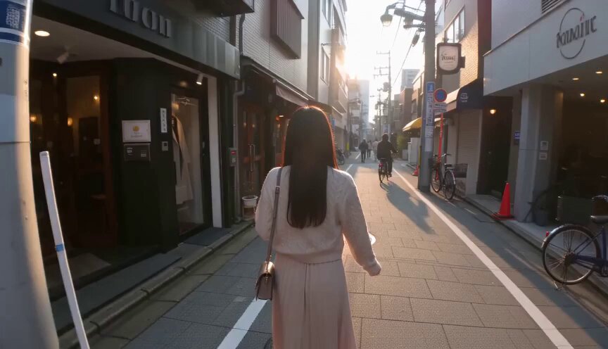

Why Visual Polish Decides Whether Anyone Watches
Every platform is a competition for the first two seconds. Thumbnails, opening frames, and the first cut carry more weight than most creators admit. When a video looks flat, muddy, or like it was shot in a dim room with a phone, viewers scroll before the story has a chance to land. When a video looks lit, genuinely lit, as if someone had shaped the scene with real fixtures, people stay, even if they cannot explain why. That instinct is not shallow. Human vision is tuned to detect depth, contrast, and the direction of light, because those cues once told us where objects were and whether a situation was safe. A frame that violates those cues feels wrong even when the subject matter is interesting.
Visual appeal is also functional. Contrast directs attention. Warmth and coolness set emotional temperature. Haze, glow, and shadow tell the eye where to look next. A creator who understands this stops treating effects as decoration and starts treating them as punctuation, marks that tell the audience how to read a shot. The practical consequence is that lighting and color decisions are narrative decisions, not finishing touches applied at the last minute.
That is why the recent generation of AI-assisted editing tools matters. They collapse tasks that used to require a compositor, a colorist, and a lot of time into a few directed passes. You still make the creative choices, but the mechanical work, from rotoscoping and tracking to matching exposure across shots and generating plausible bounce light, gets much cheaper. Small teams can now reach a level of finish that used to be reserved for productions with dedicated post crews.
What AI Video Editors Actually Change
For years, the workflow for improving a weak shot was predictable: add an adjustment layer, push contrast, mask the subject, fight the edges, and hope the result survived compression. It worked, but it was slow and fragile. Move the camera and the mask drifted. Change the exposure and the grade broke.
AI-assisted editors attack the problem differently. Instead of asking you to describe a change in numbers, they ask you to describe intent in language, then estimate a plausible physical result. Telling an editor to light a subject from the left with a warm practical and let the background fall off is an instruction a person can act on and a model can approximate. That shift, from parameter twiddling to direction, is the real change.
Relighting Instead of Filtering
A filter multiplies every pixel by the same curve. Relighting estimates the scene's geometry, identifies surfaces facing the camera, and adds illumination as if a new source existed in the room. Practically, this means you can add a rim light behind a subject's shoulder, open up a dark side of a face, or replace a harsh overhead source with a soft window, all without a reshoot.
The quality difference shows up most clearly on skin and in backgrounds. A brightness filter leaves flat, gray faces. A relight keeps the falloff across a cheekbone and lets the background keep its own exposure. If your tool offers both, prefer the relight every time.
Volumetric and Atmospheric Effects
Volumetric effects, including light shafts, haze, drifting particles, and lens bloom, are what separate clean footage from cinematic footage. They work because they make the space between the camera and the subject visible. A beam of light through a window reads as depth. A soft glow around a practical lamp reads as warmth.
The trap is overuse. Atmosphere is seasoning. A little haze in a wide shot creates depth. A lot of haze in every shot creates fog, kills contrast, and makes an entire project look like it was shot in a steam room. A useful rule: place atmosphere where you want the eye to travel, and keep it away from the area you want sharpest.
Combining Several Models in One Timeline
Modern pipelines rarely rely on a single model. A typical stack might include one component for segmentation, one for depth estimation, one for relighting, and one for color. Each does a narrow job well. The editor's role becomes orchestration: deciding the order of operations, checking that each stage does not undo the previous one, and keeping the look consistent across every clip.
Order matters more than people expect. Relight before you grade, because a grade applied first will fight the new light. Grade before you add atmosphere, because haze shifts contrast and changes how the grade reads. Add texture, grain, and sharpening last, because those operations should respond to the final image, not an intermediate one.
Color Grading: From Auto Looks to Intent-Driven Decisions
Automatic grading has improved dramatically, and that is both good and dangerous. Good, because it removes the tedium of matching shots by hand. Dangerous, because a look designed for a horror trailer will be applied to a cooking video if you click the wrong preset.
Reading the Shot Before You Touch a Slider
Before choosing a look, answer three questions. Where is the light coming from? What is the emotional temperature of the scene? What must remain readable, whether that is skin, product color, or text on screen? The answers constrain everything that follows. A scene lit by a single warm window at dusk should not be graded neutral-cool, no matter how fashionable the preset is.
Color Separation, Skin Tones, and Memory Colors
Color separation is the quiet workhorse of professional grading. It means shifting hues apart so that similar colors become distinct: warm highlights and cool shadows, teal backgrounds and orange skin, controlled saturation in the midtones. Done well, it adds three-dimensionality without any lighting change at all.
Three color families deserve protection. Skin tones fall apart fast when saturation is pushed. Foliage reads as artificial when yellow and green are separated too aggressively. Brand colors and product packaging must survive the grade, or the client will reject the cut. Use targeted masks or hue-versus-hue curves to keep these regions stable while you push everything else.
Building a Repeatable Look for a Brand or Series
If you publish a series, consistency is worth more than novelty. Build a look once, a base contrast curve, a highlight roll-off, a signature color bias, a grain profile, then save it as a preset with adjustable strength. Apply it at partial intensity to every episode, and vary only what must change: exposure matching, local relights, and atmosphere.
A practical trick is to create three versions of your look, subtle, standard, and dramatic, and choose per scene rather than per project. This gives you variety inside a recognizable world.
Matching Light and Color to Story: A Decision Framework
Effects should answer a question about the story, not fill a gap in the edit. Use this framework to avoid arbitrary decisions.
A Simple Genre-to-Effect Table
- Interview or documentary: soft key from one side, gentle fill, minimal haze, neutral grade with slight warmth in skin. Effects should be nearly invisible. Showy work breaks trust.
- Product or commercial: hard, controlled highlights on the product, clean gradient background, selective bloom, high color separation, and careful saturation so packaging stays accurate.
- Narrative drama: motivated practicals, directional key, deeper shadows, moderate contrast, cool shadows and warm skin.
- Music video or fashion: aggressive relighting, colored practicals, volumetric beams, high-contrast grade, stylized color separation.
- Tutorial or explainer: even, readable light, relatively flat grade, high legibility for screens and overlay text, minimal atmosphere that could soften on-screen interface elements.
- Horror or thriller: low key, single source, heavy shadow, desaturated palette with one aggressive color accent.
Two Worked Examples
A talking-head clip recorded in a badly lit room is the first case. The window sits behind the subject, so the face is two stops dark. The fix is not brightness. Relight with a soft source from camera-left, reduce the window's blowout with a highlight roll-off, then grade warm-neutral and keep skin saturation low. Add a whisper of haze so the background separates from the subject.
A product shot on a white sweep is the second case. The item reads flat because the lighting is even everywhere. Add a hard rim from behind, darken the background gradient on one side, and push color separation so the product's accent color pops. Keep exposure exactly matched to the previous shot, since commercial work lives or dies on continuity.
A Practical Workflow for a 30-Second Vertical Clip
This sequence works for nearly any short-form edit.
Normalize Before You Stylize
Cut and assemble first. Match exposure and white balance across shots with a simple correction pass. Do not add looks yet. A grade applied to mismatched footage creates a mess you will have to undo later, and undoing work is the most expensive habit in editing.
Direct the Light, Not the Filter
Go shot by shot and describe the lighting you want. Add a key where the face is dark. Add a rim where the subject merges into the background. Remove a color cast caused by mixed sources. Keep notes on what you changed, because you will need to repeat it for the next clip in the same setup.
Grade in Two Passes
Pass one is technical: exposure, contrast, white balance, shot matching. Pass two is creative: color separation, signature look, saturation shaping. Separating the passes prevents you from solving a technical problem with a creative decision, which is how projects end up looking strange in ways nobody can name.
Add Atmosphere Last
Add haze, glow, and light shafts only after the grade is locked. Adjust strength to taste, then check on a small screen. Atmosphere that looks subtle on a large monitor can be invisible on a phone, so verify on the device your audience actually uses.
Finish With Texture
Grain, subtle sharpening, and vignetting are finishing moves. They unify mixed footage and give digital images a bit of physical character. Keep grain low, enough to break banding in gradients, not enough to look like a retro filter.
Mistakes That Make AI Effects Look Cheap
- Relighting without checking shadows. Added light that ignores existing shadow direction reads as a sticker on the frame.
- Cranking haze in every shot. Contrast dies and the project looks foggy rather than atmospheric.
- Oversaturating skin. This is the most common tell of an amateur grade.
- Using one look across unrelated scenes. Variety signals intent; uniformity signals a preset.
- Ignoring compression. Heavy grain and fine gradients turn into blocks after platform encoding.
- Applying effects before matching exposure. You end up correcting twice and losing detail both times.
- Letting the model make the creative call. Models approximate; they do not know your story.
- Skipping the mobile check. Most viewers watch vertical video on a phone, often at low brightness.
Choosing the Right Tool for the Job
Evaluate editors and models on practical criteria rather than feature lists.
- Relight quality: does relighting preserve skin texture and shadow structure, or does it flatten faces?
- Temporal stability: do effects flicker between frames? Flicker is the fastest way to look artificial.
- Mask and edge quality: hair, motion blur, and semi-transparent objects such as glasses are the hard cases.
- Gradient handling: smooth gradients should stay smooth after export and platform encoding.
- Control over strength: you need partial intensity, not just on and off.
- Preset portability: can you save a look and apply it across a whole series?
- Render time predictability: a slow pipeline changes how many iterations you can afford.
- Language-based direction: describing intent and getting a plausible result saves more time than any slider.
Writing Effective Prompts for Light and Color
Direct the effect the way you would brief a cinematographer: source, direction, quality, and relationship to the subject.
Weak: make it cinematic.
Strong: soft warm key from camera-left at eye level, gentle falloff on the right side of the face, background two stops darker, slight cool rim on the shoulder.
Weak: better colors.
Strong: warm highlights, cool shadows, muted greens, natural skin, reduce midtone saturation slightly, keep the product accent color accurate.
Two habits make prompts more reliable. First, name the source: window, practical lamp, overcast sky, phone screen. Second, name the falloff: hard, soft, gradual. Those two details carry most of the visual information, and they are exactly the details a human crew would ask about first.
Performance, Consistency, and Delivery
Rendering Budgets
AI effects are compute-heavy. A workflow that takes four minutes per clip is fine for a five-shot video and impossible for a fifty-shot one. Test the pipeline on the hardest shot first, usually the one with hair, motion, and mixed lighting, so you discover problems before committing to a full render.
Keeping a Series Consistent
Save every effect configuration. Keep a reference frame from each setup so you can compare new shots against it. When in doubt, match to the reference rather than to your memory of the previous episode. Memory drifts, and drift is how a series slowly loses its identity.
Export Settings and Platform Compression
Deliver high-quality masters and let platforms transcode. Avoid aggressive sharpening, because compression amplifies it into halos. Check a gradient-heavy shot after upload, since banding is the most common surprise, and fix it at the source by adding fine grain or dithering.
FAQ
Do AI lighting effects replace a colorist? No. They replace repetitive manual work. Taste, shot matching, and story judgment remain human tasks, and those are what make a grade feel intentional rather than generated.
Should I relight before or after grading? Relight first. Grading is a response to the image's light, so changing the light afterwards invalidates the grade and forces a second pass.
How much haze is too much? If you cannot see the subject's eyes clearly, you have gone too far. Atmosphere should support separation between subject and background, not obscure either one.
Can these tools fix genuinely bad footage? They can improve exposure, lighting direction, and color considerably. They cannot invent detail that was never captured, and they struggle with heavy noise and severe motion blur.
How do I keep vertical video looking good on a phone? Check the final file on a phone at low brightness. Increase contrast slightly, keep grain minimal, and make sure overlay text stays legible after compression.
Is a stylized look better than a neutral one? Only if it serves the story. A neutral, well-lit image almost always outperforms a heavily stylized one that fights its own content.
What is the fastest way to improve a weak shot? Fix the light direction and the skin tones. Those two changes account for most of the perceived quality gap between amateur and professional footage.
The underlying principle is simple. Tools change, models improve, and processing gets faster, but the audience still responds to the same thing: a frame where the light makes sense, the color carries emotion, and nothing distracts from what matters. Direct the light, protect the skin, place atmosphere where the eye should go, and the technical polish stops being visible and starts being felt.
