

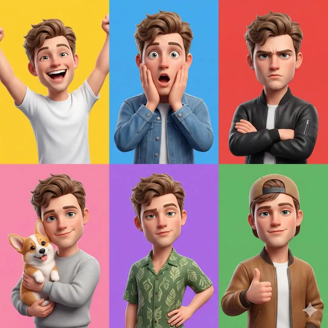
Why ultra-detail became the new quality bar
For years the hardest part of digital illustration was labour: a detailed anime key visual or a cinematic landscape could take days of manual rendering. Generative models collapsed that timeline and immediately created a new problem — sameness. Early outputs were soft, plastic, and instantly recognisable as machine-made. Today's models are judged on the opposite axis: micro-detail, material realism, and the ability to hold one style across dozens of frames without drifting.
That shift is commercial, not just aesthetic. A game studio reviewing environment art, an animation team assembling a pitch, and a solo creator selling prints all ask the same question: does the image survive a zoom? Detail is what separates a throwaway draft from a usable asset. The rest of this guide covers how detail is produced inside modern models, which model families handle anime and scenery best, and how to build a workflow that repeats on demand instead of relying on lucky prompts.
How modern image models generate fine detail
Detail is not a slider you push to the maximum. It is the sum of architectural decisions inside a model plus the way you drive it, and understanding both makes results far more predictable.
Diffusion architectures and the refiner pass
Latent diffusion models denoise a compressed representation of the image rather than raw pixels, which makes high resolutions affordable. Detail emerges in the final denoising steps, where the model decides whether a surface is brushed metal, weathered concrete, or watercolour paper. Stacked pipelines — one model for composition, a second for refinement, sometimes a third dedicated to faces and hands — push that decision further. When you see crisp eyelashes, stitching on a jacket, or individual leaves in a forest, you are usually looking at a refinement stage doing targeted work rather than a single lucky pass.
Training data, curation, and style breadth
Model quality tracks data quality. A model trained on a narrow, heavily filtered set produces beautiful but repetitive faces. A model trained on curated, well-captioned, style-diverse material can distinguish 1990s cel animation from modern digital painting from acrylic on canvas. Caption accuracy is the silent hero: if the training captions never mention lens type, weather, or fabric, the model cannot respond to those words later. This is why two models with similar architectures behave completely differently when you ask for rain on asphalt at dusk.
The bridge from still images to motion
The most consequential change is that image and video models now share a visual vocabulary. A still with strong depth cues — foreground framing, atmospheric haze, consistent light direction — converts far more cleanly into a short animated clip. Teams increasingly design stills as if they were storyboards: locked camera language, clear subject separation, and layered depth so the motion model has something meaningful to move. Scenery generated with parallax-friendly structure saves hours later, while flat compositions reveal their limits the moment anything moves.
Choosing a model: anime specialists versus cinematic generalists
There is no single best model; there is a best model for a specific deliverable. Sorting tools into three buckets makes the choice obvious.
Cinematic generalists
General-purpose image and video models excel at light and camera behaviour. They understand focal length, golden hour, volumetric fog, and how a lens flares when pointed at a window. For environments — city streets, mountain ranges, interiors, science-fiction corridors — they produce images that feel photographed rather than illustrated. Use them when the scenery is the hero and realism is the goal.
Anime and illustration specialists
Anime-focused models are tuned for line economy and colour blocking: clean contours, deliberate shading bands, expressive eyes, and the flat-but-layered look that audiences expect. They are far more reliable for character sheets, key visuals, and manga-style panels. Their weakness is texture: ask for rusted iron or wet stone and results can look like painted cardboard.
Multi-reference and character-lock pipelines
The newest category is not really a model but a method: feeding several reference images — face, outfit, environment, palette — so output stays consistent across a series. This is essential for anything episodic, from a webcomic to an animation test to a campaign placing the same character in ten settings. Expect slower iteration and more setup, and budget real time for reference curation.
| Pipeline | Strongest at | Trade-off |
|---|---|---|
| Cinematic generalist | light, camera, photoreal scenery | weaker anime line weight |
| Anime specialist | faces, cel shading, stylised panels | weaker material realism |
| Multi-reference | identity and style consistency | slower, reference-dependent |
Hybrid workflows are common in practice: block out a scene with a cinematic generalist, then restyle it through an anime-tuned model, or generate a character with a specialist and composite them into a photoreal environment. The key is knowing which stage owns which strength.
Prompt architecture for consistent, detailed results
Prompts are specifications, not wishes. Teams producing reliable output use a layered structure and keep it stable across a project.
The five-layer prompt
Write in this order: subject, action or pose, environment, light and mood, then technical finish. A useful example: a young swordswoman in a wind-battered coat, mid-step on a cliff path, storm clouds breaking over distant mountains, cold rim light with warm lantern glow behind her, 35mm cinematic still, fine grain, high micro-detail. Each layer narrows the probability space. Skipping layers does not make the model creative; it makes it guess.
Negative prompts and the repair pass
Negative prompts handle recurring defects: extra fingers, watermark text, plastic skin, muddy shadows, over-saturated greens. Keep them short and specific, because twenty negatives dilute each other. For stubborn artefacts, do not fight the prompt. Generate a clean base and run a targeted repair pass on the hands or face using a smaller region and a tighter description.
Reference images and identity locking
When consistency matters, reference images beat adjectives. Supply a character reference, describe only what should change, and lock the seed. Change one variable at a time: pose first, then wardrobe, then location. This single discipline removes most of the frustration people associate with character consistency, and it makes a series feel authored rather than assembled.
A repeatable production workflow, step by step
- Define the deliverable. Aspect ratio, final resolution, and where the asset will live determine model choice more than personal preference does.
- Collect references. Five to ten images spanning character, palette, and lighting. Separate the mood board by function so you do not blend two incompatible styles.
- Draft at low resolution. Generate ten to twenty fast variations. Do not chase detail yet; chase composition and silhouette.
- Select and refine. Take the two strongest compositions and re-render at higher resolution with a refinement pass. Fix anatomy and hands before worrying about texture.
- Upscale deliberately. Use a dedicated upscaler or tiled diffusion. Oversharpening is worse than softness because it cannot be recovered.
- Grade and finish. Adjust contrast, colour temperature, and grain. A light film grain often sells detail better than additional sharpening.
- Animate if needed. Convert the finished still into a short clip with restrained camera motion — a slow push-in or subtle parallax. Aggressive movement exposes flat depth.
- Archive the recipe. Save prompt, seed, model version, and reference set. Reproducibility is the difference between a hobby and a pipeline.
The workflow is deliberately sequential. Most quality problems trace back to skipping a step — refining before composition is locked, or upscaling before anatomy is fixed.
Sharpening detail: upscaling, tiling, and post-processing
Upscaling is where most detail is either won or lost. A 2048-pixel render upscaled with the right method can look like a painting; the same file pushed through aggressive sharpening looks like a compressed JPEG. Prefer tiled or latent-aware upscalers that re-denoise during enlargement, then inspect the result at 100% zoom in three places: a face, a textured surface, and an area of smooth gradient such as sky. Banding in gradients is the most common failure, and it is usually fixed by adding subtle noise before the final pass rather than by upscaling again.
For video, the same principles apply with one addition: temporal consistency. If your upscaler treats frames independently, fine texture will shimmer between them. Test a two-second clip before committing to a full sequence, and prefer tools that carry detail across frames rather than re-inventing it each time.
Post-processing should stay boring. Slight curve adjustment, a touch of chromatic aberration, and grain will do more for perceived quality than any filter stack. Keep the original file untouched so you can return to it when a client asks for a different crop or a vertical variant.
Common mistakes and how to fix them
- Detail without composition. Crisp textures on a weak silhouette still read as amateur. Solve composition before resolution.
- Prompt bloat. Long adjective lists create averaged, muddy images. Cut every word that does not change the picture.
- Style mixing. Asking for anime line work with photoreal skin produces the uncanny middle ground nobody wants. Choose one tradition and commit.
- Ignoring hands and eyes. Viewers check faces first. Budget repair time for them explicitly.
- Inconsistent seeds. Randomising the seed every run makes a series impossible to hold together.
- Confusing resolution with detail. A 4K image of a blurry concept is still blurry; a well-structured 1080p frame often beats it.
- No source archive. Without saved settings, recreating last month's look becomes guesswork.
Recognising these patterns early saves entire afternoons. If an image feels wrong but you cannot say why, the cause is almost always composition, light direction, or scale — not a shortage of texture.
Where detailed AI imagery pays off
Game and virtual-world production is the clearest beneficiary. Concept art, texture references, mood boards, and in-engine skyboxes all benefit from high micro-detail, and iteration cost drops dramatically compared with manual painting. Marketing teams use the same pipeline for storyboards and social variants — one base scene, multiple crops and colourways. Animation and motion design use still-to-video conversion for animatics before committing to expensive 3D work. Publishing uses stylised detail for covers and interior spreads, where a single strong image carries a whole product.
The common thread is volume with consistency: the value is not one spectacular frame, it is fifty frames that clearly belong to the same world. That is also why documentation and naming conventions matter more than most artists expect — a series is only as good as your ability to find and reuse its parts.
Rights, disclosure, and quality governance
Three practical policies prevent trouble later. First, track provenance: record which model version produced each asset and what reference material went into it. Second, check commercial terms before using outputs in paid work, especially when reference images of real people or existing characters are involved. Third, disclose AI involvement where audiences or clients expect it; it is increasingly a trust signal rather than a liability. Internally, set a minimum quality bar — a resolution, a zoom test, a consistency check across a series — so review conversations are about content rather than technical defects.
It also helps to keep a simple style bible for recurring projects: the prompt skeleton, the seed range, the palette, and the grain level. Anyone joining the project can then produce something that fits, and the look survives staff changes.
FAQ
Do I need an anime-specialised model for manga panels?
Yes, in most cases. General models can approximate the style, but line weight control and panel-friendly flat colouring are far more reliable in illustration-tuned models.
How many reference images are enough?
Three to five well-chosen references outperform twenty random ones. Include one face reference, one outfit reference, and one lighting reference.
Why does my scenery look flat?
Usually missing depth layers. Add foreground framing, a mid-ground subject, and a distinct background plane, then give each layer its own light logic.
Should I generate at final resolution directly?
Rarely. Draft small, select, then refine and upscale. It is faster and produces better structure, because you are evaluating composition rather than texture.
How do I keep a character consistent across ten images?
Lock the seed and the character reference, change exactly one prompt variable per run, and keep a written log of what changed.
Is grain or film noise worth adding?
Light grain helps perceived detail and hides gradient banding. Keep it subtle; heavy grain reads as an effect rather than a finish.
Can still images be turned into video reliably?
Yes, when the still has clear depth cues and simple motion is requested. Complex camera moves reveal the limits of flat depth very quickly.
What is the fastest way to improve output quality?
Fix composition and lighting first, then references, then resolution. Most people work in the opposite order and wonder why their results plateau.
A closing checklist
Before you call an image finished, zoom to 100% on a face, a textured surface, and a sky gradient. Confirm the silhouette reads at thumbnail size. Check that light direction is consistent across every object in the frame. Verify that the seed, prompt, and model version are saved somewhere you will find them again. If the asset belongs to a series, place it beside its siblings and ask whether they look like one world. If the answer is yes, the model did its job — and so did your workflow.
