
Anime is one of the most stylized visual languages in animation, and that stylization makes it an unusually good fit for generative tools. It also makes it easy to fool yourself: the first few outputs look impressive, and then you try to build a scene with two characters and a consistent lead, and everything falls apart. This guide is about closing that gap.
What follows is a practical, repeatable workflow for producing anime-style stills and short animated shots: how to pick the right model type, how to write prompts that produce cel-shaded lineart instead of generic illustration, how to keep a character recognizable across a dozen images, how to add motion, and how to diagnose the artifacts that inevitably show up. Nothing here depends on one specific product. The same pipeline works whether you generate stills first and animate later, or run everything through a single image-to-video tool.
What AI Anime Art Generation Does Well (and Where It Breaks)
Anime's visual grammar rests on a small set of conventions: confident lineart, flat cel shading with a hard shadow edge, exaggerated eye and hair silhouettes, restrained color palettes, and lighting that reads clearly even at thumbnail size. Because those conventions repeat across decades of illustration, generative models absorb them well. That is why anime is often the easiest style to get a decent result from on the first attempt, and also why it is easy to get a result that looks like everyone else's.
Where these tools are genuinely strong: single-character portraits and key visuals, background plates and environment concepts, color and lighting studies, rapid exploration of costume and hairstyle variations, converting a rough sketch into a finished-looking illustration, and turning a still into a few seconds of motion.
Where they struggle: hands holding objects, two characters physically interacting, consistent identity across many generations, readable signage, precise mechanical design, and subtle acting. The tiny eyebrow and mouth adjustments that make an expression feel intentional are exactly the kind of detail a model has no reason to get right. Anything requiring a specific spatial relationship between two subjects is a coin flip.
The practical rule is to use the model for breadth and your own hands for precision. Generate fifteen options, pick one, then spend most of your time refining that single frame with image-to-image generation, control inputs, and manual cleanup in a paint tool. The people getting the best results are not writing better prompts than everyone else. They are editing more, and they are editing earlier.
Choosing the Right Kind of Model for Anime Visuals
Rather than chasing a single "best" tool, think in terms of three families and match them to the job in front of you.
Base diffusion models plus style-tuned checkpoints
A general image model combined with an anime-oriented fine-tune gives you the widest style range. You can pivot from a soft watercolor look to a sharp action-show look without switching tools. The tradeoff is variance: the same prompt can drift dramatically between checkpoints, so you need to lock your settings before you build a sequence.
Anime-specific models
Models trained primarily on illustration corpora tend to nail lineart and facial proportions out of the box, with less prompting effort. They are excellent for character work and key visuals. Their weakness is range — push them toward realism, unusual anatomy, or complex perspective and they degrade faster than a general model would.
Control and reference layers
This is the layer that actually decides whether your project succeeds. Pose estimation, depth maps, edge or lineart extraction, and reference-image conditioning let you dictate composition instead of hoping for it. If your tool supports a reference image alongside a text prompt, that single feature is usually worth more than any prompt trick.
What to check before committing to a tool
Run a small test before you build anything serious. Generate the same prompt ten times and look for consistency. Feed in a sketch and see whether the model respects the lines or ignores them. Test a reference image and check whether the character's face holds. Generate at your final aspect ratio, not just square. Check the licensing terms if the work is commercial. And measure how long a batch takes, because iteration speed shapes how you work more than raw quality does.
Designing Prompts That Actually Read as Anime
Most disappointing anime generations come from under-specified prompts. "Anime girl in a city" gives the model almost nothing to work with, so it averages everything it has seen into a bland composite.
The six-slot prompt structure
Build every prompt from six slots and fill them deliberately:
- Subject — who or what, including age range, build, and action.
- Identity anchors — hair color and style, eye color, signature clothing, distinctive accessories.
- Style descriptor — the specific visual tradition you want.
- Line and color treatment — how edges and shading behave.
- Composition and camera — shot size, angle, lens feel, depth of field.
- Lighting and mood — time of day, key light direction, emotional temperature.
A filled example might read: a teenage swordswoman mid-lunge, short black hair with a red ribbon, wearing a layered indigo coat; modern television anime style, clean cel shading; crisp dark lineart with flat color blocks and a single hard shadow edge; dynamic three-quarter low angle, medium shot, slight motion blur on the blade; late afternoon backlight with long shadows and warm rim light on her shoulders.
Lineart and color vocabulary
Specific phrases reliably shift output. For crisp traditional work, try clean cel shading, flat color with confident lineart, or limited palette with hard shadow edges. For softer looks, soft gradient shading, watercolor background wash, or pastel palette with thin lineart. For period flavor, nineties original video animation look, film grain overlay, or retro television color bleed. Stacking too many of these at once produces mush, so pick one primary style phrase and one secondary texture phrase at most.
Negative prompts and guardrails
Negative prompts are most useful for excluding failure modes rather than defining style. A reliable baseline: extra fingers, merged limbs, duplicate faces, watermark, signature, text artifacts, photorealistic skin, three-dimensional render look, muddy colors, oversharpened edges, cropped head. Add negatives only for problems you actually see, otherwise you are spending prompt budget on problems you never had.
Length and weighting
Prompt quality peaks and then declines. Keep the core prompt to roughly sixty to one hundred twenty tokens, most of it concrete nouns and adjectives. Weighting syntax helps when one element keeps getting ignored, but heavy weighting tends to produce stiff, over-literal images that have lost the style entirely.
A Step-by-Step Workflow From Concept to Finished Shot
This is the loop that works for both a single illustration and a full scene.
Step 1: Lock the style before you lock the subject
Collect eight to twelve reference images that share the look you want. Write one style descriptor sentence from them and reuse it verbatim for the entire project. Changing style phrasing between generations is the single most common reason a sequence stops feeling like one project.
Step 2: Explore at low resolution
Generate a grid of eight to twelve rough variations at low resolution. Do not judge these on polish — judge them on composition and silhouette. If the shapes are not interesting as tiny thumbnails, they will not be interesting at full size.
Step 3: Refine with image-to-image
Take the best one and run it back through the model at a moderate strength setting. This preserves the composition while improving detail. Push strength higher to change more, lower to preserve more. For character work, stay in the lower half of the range and accept slower progress rather than gambling on a complete redraw.
Step 4: Fix anatomy with control inputs
When a pose is wrong, do not fight it with words. Block the pose in a simple three-dimensional program, a mannequin tool, or even a stick-figure sketch, then feed that as a pose or depth guide. Ten minutes of posing saves an hour of rejected generations.
Step 5: Upscale and clean up manually
Upscale, then open the result in a paint tool. Fix fingers, clean interrupted lines, unify stray highlights, and correct eye shapes. This is the step most people skip and it is the one that separates a portfolio piece from an obvious generator output.
Step 6: Export for the destination
Decide early whether the image needs vertical framing, widescreen framing, or a square thumbnail crop. Regenerating for a new aspect ratio changes composition, so plan your crops before you fall in love with a version.
Keeping Characters Consistent Across Images and Shots
Character drift is the hardest problem in this workflow, and it is mostly a documentation problem.
Build a character sheet first
Generate a small turnaround: front, three-quarter, and profile views, plus one full-body and one close-up. Save the strongest one as your canonical reference. Every future generation for that character starts from that reference rather than from text alone. Text cannot reliably describe a face; an image can.
Freeze everything you can freeze
Use a fixed seed when the tool supports it, reuse an identical prompt template with only the action and camera slots swapped, keep the wardrobe limited to two or three outfits per arc, and avoid changing model or checkpoint mid-project. Small consistency wins compound.
The continuity checklist
Before approving a new image, verify: hair silhouette and length, eye color and shape, skin tone, signature accessory present, clothing color values matching the reference, and overall shading style identical to previous frames. Post these as a short list next to your workspace. It sounds pedantic until you notice a character who has quietly changed eye color across six frames.
When to accept drift
Sometimes drift is useful. Aging a character, changing seasons, or showing an alternate timeline all benefit from controlled variation. The trick is to make it deliberate: change one anchor at a time so the audience reads it as intentional storytelling rather than inconsistency.
Turning Anime Stills Into Motion
Once you have a frame you like, image-to-video tools can give it two to five seconds of life. The quality ceiling is lower than the still-image ceiling, so plan shots that hide the weak points: short durations, one clear action, minimal dialogue, and camera movement instead of complex body motion.
Motion prompt vocabulary
Describe motion the same way you describe composition — concretely. Useful phrases include slow push in, subtle camera shake, hair drifting in the wind, cloak fluttering, dust particles rising, rain falling steadily, character turning slightly toward camera. Avoid asking for walking cycles, complex hand gestures, or choreography; those are where limbs melt.
Reducing flicker and morphing
Generate the longest clip your tool handles comfortably, then trim to the cleanest two or three seconds rather than trying to fix a bad full clip. If you are assembling multiple shots, keep them visually separate with cuts instead of trying to blend frames, and match color grading across clips in post. Interpolation can smooth motion but it also amplifies warped anatomy, so apply it selectively.
Where motion adds real value
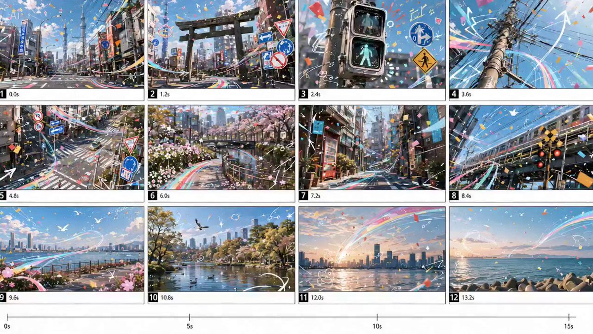
Animated shots work best as atmosphere: a poster that breathes, a landscape with drifting clouds, a character portrait with moving hair and a subtle camera drift. Used this way, the technique reads as intentional stylization rather than an attempt at full animation.
Troubleshooting the Most Common Artifacts
Learn to read the failure and respond with the smallest possible change.
Extra or fused fingers. Regenerate at a slightly different seed, then fix the hand manually in a paint tool. Pose guides help more than prompting here. Do not burn an hour on prompts for a problem a five-minute paint fix solves.
Face drift between frames. Reintroduce the canonical reference image and lower the generation strength. Consistency problems are almost always a reference problem.
Blurry or asymmetrical eyes. Upscale before evaluating details; many eye problems vanish at higher resolution. If they persist, crop tight on the face and regenerate that region only.
Oversaturated colors. Add a negative for high saturation, or reduce style phrases that push vibrancy, then color correct in post. Grading is faster and more controllable than prompt surgery.
Muddy lineart. Increase the emphasis on lineart and flat color phrasing, reduce texture phrases, and check that upscaling is not smearing edges. Some upscalers soften lines aggressively; try a different one.
Style mismatch between character and background. Generate background and character separately, then composite. Trying to force both from one prompt usually produces a compromise on both.
Flicker in video. Shorten the clip and cut around the clean section. Flicker is a duration problem more often than a settings problem.
Style, Ethics, and Rights
Working in anime style raises real questions, and it is worth having clear answers before you publish.
Copying the signature style of a living artist and presenting the result as original work is both risky and, in most communities, poorly received. Studying a style and developing your own is different from targeting a specific person's work. If you are producing commercial material, read the terms of the model you are using and check whether outputs are cleared for commercial use, whether attribution is required, and whether training data restrictions apply to your jurisdiction.
For fan-oriented work, keep in mind that recognizable characters belong to their rights holders regardless of how the image was made. Original characters avoid that entire problem, and they are also more useful over time because you control the reference sheet. When you publish, a brief disclosure that generative tools were used in the process costs you very little and prevents an awkward conversation later.
Building a Repeatable Pipeline
Once a project grows past a handful of images, organization becomes the real bottleneck. A simple structure handles most workflows:
Keep a style folder with your reference images and your one-line style descriptor. Keep a characters folder with the canonical sheet for each character plus their prompt template. Log seeds and settings in a plain text file alongside each approved image, because you will need to reproduce something eventually. Name files with project, character, shot number, and version rather than final-final-two. Review in batches instead of approving one image at a time, so consistency problems become obvious. And keep a rejected folder — sometimes a cut frame is exactly right for a different scene later.
One more habit matters: timebox exploration. Give yourself a fixed number of generations per shot and then commit to the best one. Endless regeneration is the fastest way to stall a project that was ninety percent finished an hour ago.
Frequently Asked Questions
How many generations does a finished anime illustration usually take?
For a simple portrait, expect ten to thirty explorations plus a few refinement passes and fifteen to thirty minutes of manual cleanup. Complex scenes with two characters and a detailed background can take several times that. Budget your time around cleanup, not generation.
Do I need to draw to use these tools well?
You do not need to draw, but visual judgment is not optional. The people who improve fastest are the ones who can identify exactly what is wrong with an image — composition, proportion, color, lighting — and then make one targeted change.
Can I create a full animated episode this way?
Not reliably. Current image-to-video tools work best in short atmospheric shots. For longer narrative work, use them for backgrounds, establishing shots, and stylized inserts, and handle character animation with traditional or rigged techniques. Hybrid pipelines produce far better results than forcing one tool to do everything.
Which resolution should I generate at?
Start low for exploration so you can review more options per minute, then upscale your selected frame. Only generate at final resolution once composition is locked. Generating high resolution too early wastes time and tempts you into fixing images that should have been discarded.
How do I stop characters from looking different every time?
Use a reference image rather than a text description, keep the prompt template identical except for action and camera slots, freeze your seed and model, and maintain a written continuity checklist you actually read before approving frames.
Is it better to prompt for a style or use a style reference image?
A reference image wins almost every time for style fidelity. Use text style descriptors to reinforce what the reference already shows, not to replace it.
What is the fastest way to improve my results?
Narrow your scope. Most improvement comes from committing to one style, one character, and one shot type, then iterating within those constraints until the output is genuinely good. Range is easy to add later; discipline is what makes the images work.
