

Why Thumbnails Decide Whether Your Video Gets Watched
A video is only as good as the number of people who press play, and in a browse feed where viewers scan dozens of options in seconds, the thumbnail does most of the persuading. It is not decoration or an afterthought exported minutes before publishing. It is the package that tells a stranger what they will feel if they click. The title supplies context; the thumbnail supplies impulse.
Creators often underestimate how crowded that decision moment is. A viewer may be holding a phone in one hand, scrolling a feed that mixes long videos, short clips, and unrelated recommendations. They are not reading, they are pattern-matching: face, expression, color, object, contrast, text. Anything that fails to register during that scan is functionally invisible, no matter how strong the video itself is.
When a thumbnail works, three things happen together. Impressions convert into clicks, the platform reads that early interest as a reason to test the video with more viewers, and the audience that arrives is better matched because the packaging set an accurate expectation. The useful mental shift is simple: stop asking whether a thumbnail looks good and start asking whether it wins a specific side-by-side comparison against nine other options.
What Viewers Actually Process in the First Second
Human attention is biased toward a small set of visual cues. Thumbnails that exploit those cues consistently outperform thumbnails that chase polish alone.
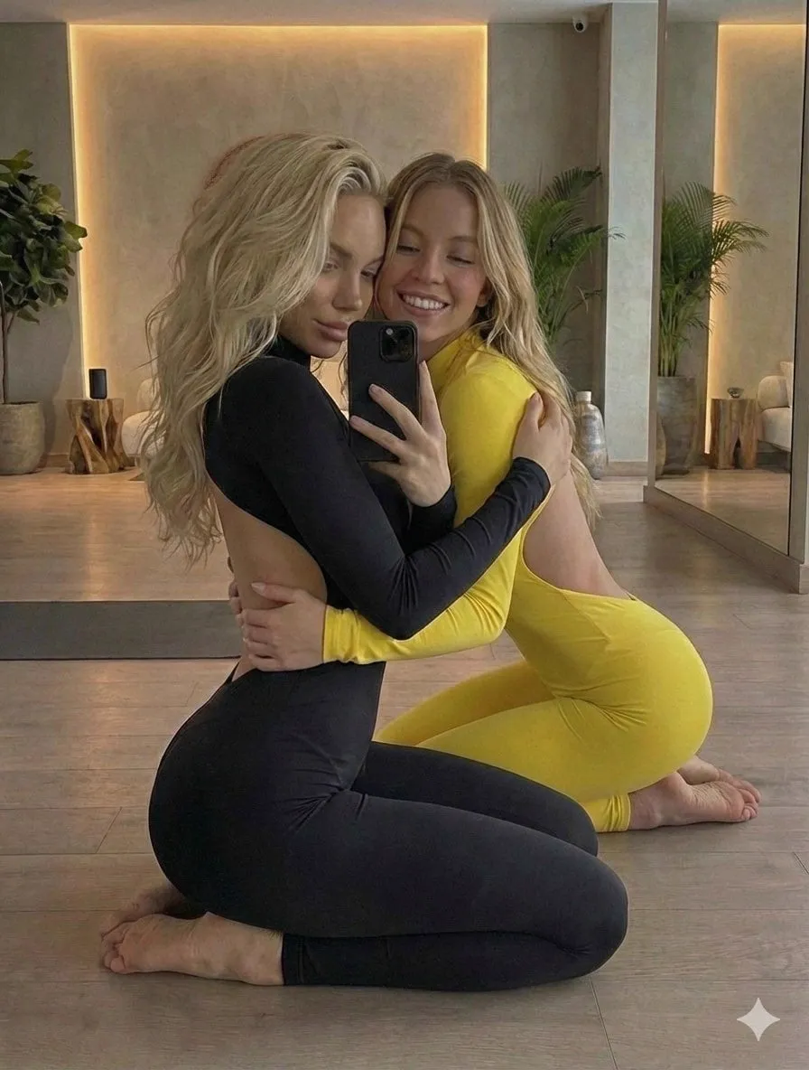
Faces and expressions come first. A clear face carrying one strong emotion, surprise, delight, concentration, mild disbelief, gives the brain an instant social signal. The emotion does not need to be extreme; it needs to be unambiguous. A half-smile that could mean anything reads as nothing. Blurred or over-processed faces are worse than no face at all, because the eye tries to resolve them and fails.
Contrast wins the next fixation. The highest-contrast region of an image attracts the eye before shape or meaning is processed. If your subject is dark against a dark background, viewers will look at whatever bright object happens to be nearby, which is usually a competitor's thumbnail, not yours. Lighting, rim separation, and a background that differs in value from the subject all matter more than saturation tricks.
Isolation creates speed. A subject cut out from its background and placed on a clean, textured, or gradient field reads faster than a busy photograph. Isolation removes the decoding work, and decoding work is what makes a viewer skip past. Depth cues such as a soft shadow or slight scale exaggeration add separation without clutter.
Curiosity gaps pull, spoilers push. The strongest thumbnails imply a question instead of answering it. A closed box, an unfinished diagram, a before-and-after with the after partially hidden, an object placed in an unexpected context: each creates a small tension that only clicking resolves. If the thumbnail already shows the outcome, the click has no job to do.
Novelty inside a category beats novelty outside it. Viewers recognize genre conventions, and the fastest way to be understood is to keep the familiar shape of a category thumbnail while changing one element. Wholesale reinvention forces the viewer to learn your visual language in a fraction of a second, which most will not do.
Visual Hierarchy: Designing the Reading Order
Every thumbnail should have an intended sequence: what the eye sees first, second, and third. If you cannot describe that sequence in a sentence, the design does not have one yet, and viewers will improvise their own.
Choose one dominant subject
A thumbnail with two equally important subjects usually reads as zero subjects. Decide what the video is really about, then let everything else support that. Secondary elements, arrows, small props, logos, should occupy noticeably less visual weight. A common failure is a presenter and a product competing at the same scale, which makes the image feel noisy rather than rich.
Control the path with contrast
Contrast is your steering wheel. Put your brightest highlight near the subject, keep the corners darker, and let the text sit in a lower-contrast zone so it does not fight the focal point. If you use an arrow or a circle, make it point at something specific and keep it visually subordinate to the subject it highlights.
Protect the empty space
Negative space is not wasted space; it is where text, badges, and progress indicators live. Composition tools that preview your thumbnail at small size will reveal whether your subject is crowding the frame. Leaving a deliberate margin also protects you from interface overlays that cover parts of the image on different devices and surfaces.
Keep color intentional
Two or three strong colors, chosen for contrast rather than personal taste, will outperform a rainbow. If your channel already uses a palette, use it to build recognition, but make sure the thumbnail still differs in value from the surrounding feed. A checkerboard preview of your thumbnail next to competing ones is the fastest way to test this.
Text on Thumbnails: Fewer Words, Bigger Meaning
Text is a supporting actor. Three to five short words are usually the ceiling, and the words should add information the image cannot carry on its own. If your thumbnail text simply repeats the title, you have spent your most valuable area on redundancy.
Type needs to survive compression and small display. Use a heavy weight, generous letter spacing, and a stroke, shadow, or solid backing shape that guarantees legibility over any background. Avoid thin serif fonts, gradients with low contrast, and script faces that collapse at phone size. Test by shrinking your design to roughly a stamp-sized preview; if you cannot read it instantly, viewers on mobile will not either.
Numbers and short phrases work well because they are processed as symbols: a countdown, a ranking, a percentage change. Full sentences do not. Also avoid placing text in corners where platform overlays commonly appear, and keep important elements away from the extreme edges of the frame.
Build a Repeatable Thumbnail Design System
Ad-hoc thumbnails produce inconsistent results and slow you down. A small system solves both problems.
Template and grid
Create two or three layout templates, not twenty: a subject-left version, a subject-right version, and a full-frame version. Reuse the same grid, safe margins, and focal placement so that every thumbnail feels like it belongs to the same channel without being a copy.
Type and color tokens
Decide on two fonts (one display, one supporting) and a fixed palette with defined roles: primary accent, background value, and text color. Written rules prevent the slow drift into inconsistency that happens when every thumbnail is designed from scratch.
Recurring brand elements
A consistent badge, border treatment, or corner mark helps returning viewers recognize your work before they read anything. Keep it small and out of the focal path, and never let it compete with the subject.
Asset library and naming
Store cutouts, backgrounds, and past winners in a searchable folder with descriptive filenames. A version log noting which thumbnail ran, when it changed, and what happened next turns your archive into a decision-making tool instead of a graveyard of files.
An AI-Assisted Thumbnail Workflow, Step by Step
Generative tools are most useful when they handle the expensive middle of the process: exploration, background creation, and variation at volume. They are least useful when they are trusted to produce a finished thumbnail with no human direction. This workflow keeps the human decisions where they belong.
Step 1: Write the hook in one sentence
Before opening any tool, write the single idea the thumbnail must communicate. If the sentence needs a comma and a clause, the concept is not ready. The hook determines the subject, the emotion, and the text, so skipping this step guarantees you will iterate blindly later.
Step 2: Scout the shelf you are entering
Look at the thumbnails currently competing for your topic. Note the dominant colors, the recurring compositions, and the visual clichés. Your goal is not to copy them, but to find the one element you can change that will read as new while staying instantly recognizable as the same genre.
Step 3: Generate base imagery with structured prompts
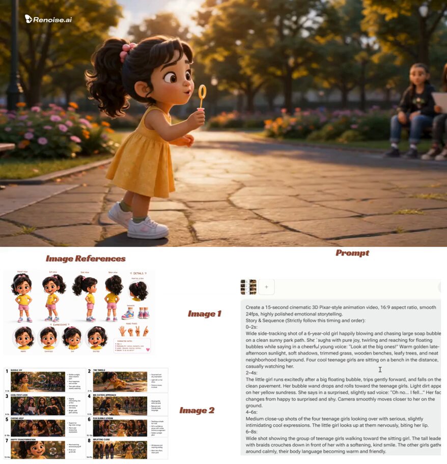
Text-to-image models respond well to structured prompts: subject, action or pose, expression, lighting, camera angle, lens feel, background type, color palette, and aspect ratio. Add negative guidance for anything you do not want, such as visible text, extra limbs, or busy backgrounds. Generate at a wide aspect ratio so the composition is already framed for a video thumbnail.
Step 4: Produce controlled variations, not random ones
Vary one dimension at a time: expression, camera angle, background value, or color temperature. Changing everything at once produces a folder of unrelated images and no learning. Keep the prompt seeds you like, and note which parameters produced a usable result so the process becomes repeatable.
Step 5: Isolate, composite, and repair
Use background removal and masking to extract the subject, then place it on a background you control. This is where AI output becomes a thumbnail rather than an illustration. Check hands, hair edges, reflections, and jewelry closely; generative images commonly fail there, and a viewer will notice an unnatural hand even if they cannot say why.
Step 6: Upscale and clean before adding type
Upscale to at least the platform's recommended resolution, then apply light sharpening and noise reduction. Add text and brand elements after upscaling, never before, so type stays crisp. Keep the final file comfortably under the platform's size limit and export in a standard photo format.
Step 7: Preview at real size and ship
View the finished thumbnail at thumbnail scale on a phone, next to competing examples, in both light and dark interface modes. If the focal point or the text disappears, fix it before publishing rather than after the video has already spent its first impressions.
Testing Thumbnails Without Wasting Weeks
The platform's built-in testing tools let you run multiple thumbnails against each other, which removes guesswork from the process. Used badly, they also produce confident conclusions from noisy data.
Change one variable per test. If you swap the subject, the text, and the palette simultaneously, a win tells you nothing you can reuse. Give each test enough exposure to be meaningful; small samples fluctuate wildly and will tempt you into decisions that do not hold. Run tests on videos that still receive steady impressions, not on content that has already gone quiet, and let a test run long enough to include different times of day and traffic sources.
Watch for the mismatch penalty. A thumbnail can lift clicks while lowering average view duration, which usually means the packaging promised something the video did not deliver. A modest click-through gain paired with a sharp drop in retention is a net loss, because early abandonment suppresses further distribution. Always pair click data with watch-time data before declaring a winner.
Finally, write down what you learned. The pattern library you build from ten tests is worth more than any single winning image.
Common Mistakes That Quietly Kill Click-Through
- Too much text. Anything beyond a short phrase forces reading, and nobody reads in a browse feed.
- Low subject-background contrast. The subject blends into the frame and the eye moves on before recognition happens.
- A tiny face. Faces work when they are large enough to read emotion; a small headshot wastes the strongest available cue.
- Spoiling the payoff. Showing the result removes the reason to click.
- Inconsistent branding. Viewers cannot build recognition if every thumbnail looks like a different channel.
- Ignoring mobile. A design that only works on a large monitor fails where most impressions happen.
- Mismatched promises. Aggressive packaging that the video cannot support damages trust and retention.
- Designing in isolation. A thumbnail evaluated on its own is not evaluated at all; it is always judged next to competitors.
Metrics Beyond Click-Through Rate
Click-through rate is the headline number, but it is not the whole story. Track impressions alongside it, because a rising rate on collapsing impressions usually means distribution is shrinking, not improving. Track average view duration and total watch time for the videos where you changed packaging. Track which traffic sources the video earns, since browse, suggested, and search audiences respond to very different cues.
Watch your returning-viewer share as well. A channel whose packaging builds recognition will see more repeat viewers over time, and those viewers are less sensitive to individual thumbnail choices. If your click-through rate is strong but your views are modest, the constraint is often impression volume rather than design, which points to topic selection, publishing cadence, or the first thirty seconds of the video.
Use these metrics together as a feedback loop: package, measure, adjust, and keep a record of what changed.
FAQ: Thumbnail Questions Creators Ask Most
How many words should a thumbnail contain? Aim for three to five at most, and only if the image cannot carry the idea alone. Zero words is a valid and often strong choice.
Can AI-generated images be used in thumbnails? Yes, as a base layer or background. Treat the output as raw material: composite, retouch, and add your own type so the final image is deliberate rather than prompted-and-published.
What dimensions should I export? Standard 16:9 at 1280 by 720 pixels, in a normal photo format and well under the file size ceiling. Higher resolution is fine but rarely necessary.
Should the thumbnail match the title exactly? They should complement, not duplicate. The title can carry specifics; the thumbnail should carry emotion, subject, and a visual question.
Do faces always win? No. Faces are a strong default because humans read emotion quickly, but objects, contrasts, and unusual scenes can outperform a mediocre facial expression. The test is whether the element is instantly legible.
How often should I change a thumbnail? Only when you have a specific hypothesis and enough impression volume to test it. Constant changes make the data unreadable and confuse returning viewers.
Can I reuse templates across videos? You should. Reuse the grid and the type system, and vary the subject, color emphasis, and composition within it. Consistency builds recognition; sameness builds boredom.
What if my click-through rate is high but views stay low? That usually points to limited impressions rather than weak packaging. Look at topic demand, publish timing, and whether early retention is causing the system to reduce distribution.
How do I design for both mobile and desktop? Design at thumbnail scale first, verify on a phone in both light and dark modes, and only then check the larger preview. Mobile is the constraint that matters most.
Turning Thumbnail Design Into an Advantage
The creators who consistently win attention are not the ones with the most elaborate artwork. They are the ones who treat the thumbnail as a decision made on purpose: one subject, one emotion, one question, and enough contrast to survive a two-second scan. An AI-assisted workflow does not replace that thinking, it accelerates it, letting you produce more variations, test more hypotheses, and spend your limited time on the choices a viewer will actually notice. Start with a hook sentence, build a small template system, generate base imagery with structured prompts, and let real performance data, not personal taste, decide what stays.
