
Why AI Image Generation Became a Production Discipline
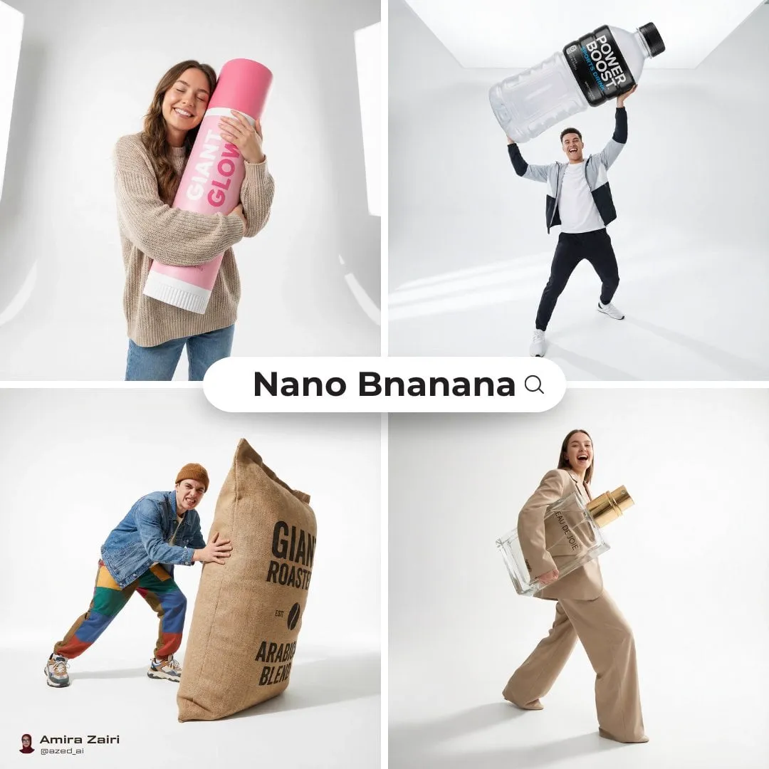
A few years ago, generating an image from a text prompt was a party trick. Today it is a step in a real pipeline: concept art for a client pitch, thumbnails for a video series, product mockups, storyboard frames, and social assets that need to ship in hours rather than weeks. The shift is not only about stronger models. It is about the workflows people have built around them — prompt templates, reference libraries, approval gates, and naming conventions that make output usable instead of merely impressive.
The practical consequence is that the interesting question is no longer "which generator makes the prettiest picture?" It is "which combination of tools gets me from a written brief to a consistent, on-brand, deliverable image without the process falling apart halfway through?" That question has a very different answer than raw benchmark scores suggest, because it weighs reliability, editability, and repeatability alongside pure visual quality.
This guide walks through the current tool landscape in three tiers, then gives you a decision framework, a prompt architecture that transfers across models, and a repeatable workflow you can run on almost any project. The aim is a process you could hand to a teammate on a Monday morning and get predictable results by Friday.
The Tool Landscape: Three Tiers of Capability
Most available generators fall into one of three practical tiers. The tiers overlap, and plenty of studios use one tool from each, but they behave differently enough that mixing them up causes most of the frustration people report.
Everyday access tools
This tier lives inside software you already open: Microsoft Designer, Adobe Firefly, Canva's image tools, and Ideogram. They prioritize speed, plain-language prompts, and built-in layout or text handling. Microsoft Designer is particularly good at turning a short description into a usable social graphic, invitation, or presentation visual, and it handles typography better than most general-purpose generators. The trade-off is control: fine-grained composition, exact camera language, and character consistency are limited. Treat this tier as your fast-drafting layer, not your finishing layer.
Controllable professional tools
Here you find Midjourney, Flux, the Stable Diffusion ecosystem, and the surrounding utilities such as ControlNet-style structure guidance, LoRA-style style adapters, inpainting, and regional prompting. These tools let you dictate pose, framing, and palette, reuse a look across dozens of images, and repair a single flawed area instead of rerolling everything. The cost is setup time and a steeper learning curve. If a project involves a recurring character, a product that must look identical across ten frames, or a brand palette that cannot drift, this tier is where the real work happens.
Cinematic and motion-adjacent models
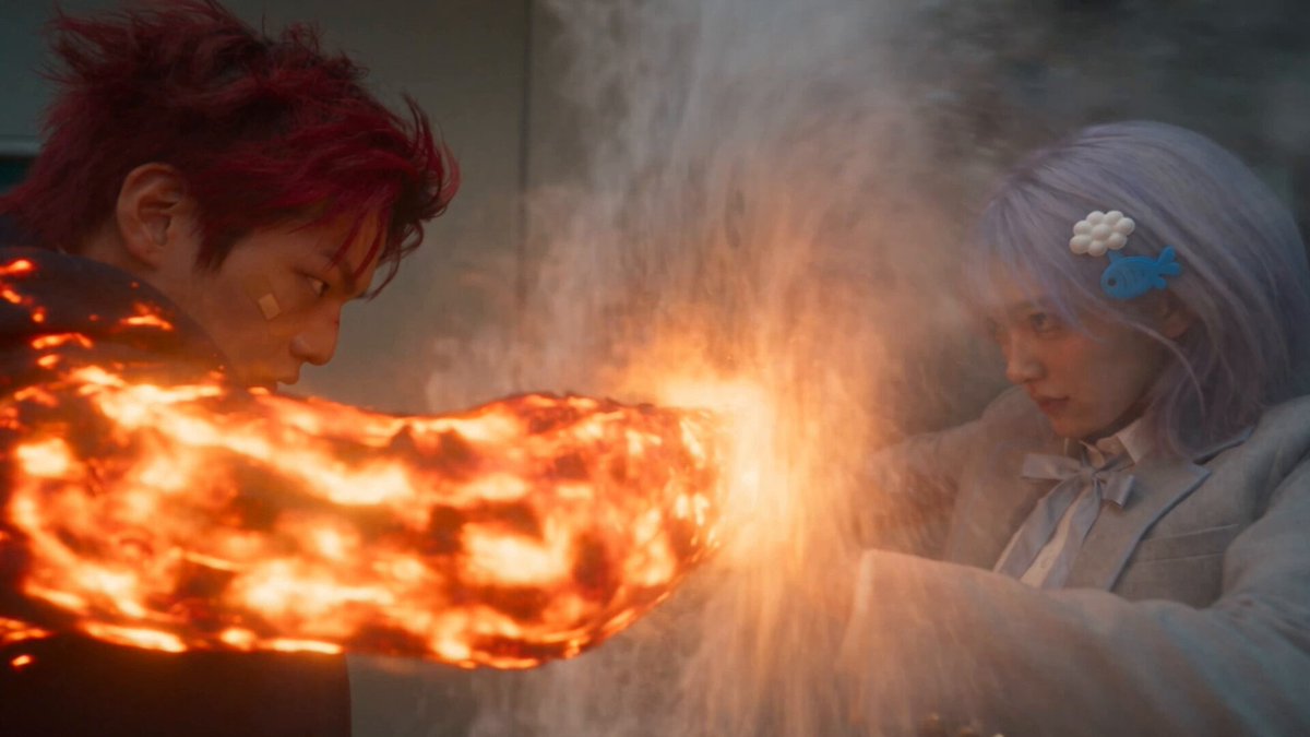
Runway, Sora, Kling AI, MiniMax Hailuo, Pika, Luma Ray, and Tencent Hunyuan sit at the boundary between still and moving image. Their generation quality is often strongly cinematic: shallow depth of field, motivated lighting, believable atmosphere. Even when you only need a still, this tier is worth using for hero frames that will later be animated, because a keyframe generated by a video-oriented model tends to survive motion better. The trade-off is unpredictability in fine detail, especially hands, text, and symmetrical architecture.
Choosing a Model: A Decision Framework
Before opening anything, answer four questions about the job.
- Does it need to be edited later? If the client will ask for "the same thing but with a different background," pick a tool with reliable inpainting and outpainting rather than the one with the nicest default look.
- How many images share one identity? One image tolerates improvisation. Twenty images featuring the same character or product do not. Consistency requirements push you toward reference-image support and repeatable seeds.
- Is text part of the image? Signage, packaging, and UI mockups usually favor generators that handle letterforms natively. Otherwise you will be compositing text in a design tool anyway.
- Where does it go next? A still destined for a video pipeline should be generated with motion in mind: simpler silhouettes, cleaner edges, fewer ambiguous details that flicker once animated.
A useful rule of thumb: draft broadly in the accessible tier, refine in the controllable tier, and validate hero frames in the cinematic tier. That sequence keeps you fast at the start and precise at the end, instead of trying to force precision out of a tool designed for speed.
The Prompt Architecture That Works Across Models
Prompts are not magic incantations. They are specifications, and good specifications have layers. A three-layer structure transfers surprisingly well between Microsoft Designer, Flux, Midjourney, Runway, and the Asian video-first models.
Layer one: subject and action
State who or what is in frame and what they are doing, in plain nouns and verbs. "A ceramicist glazing a bowl" beats "artistic pottery scene." Ambiguity here is the single most common source of disappointing output, because the model fills the gap with its own average of the training data — which is exactly what makes images feel generic.
Layer two: style, medium, and reference
Name the medium and the visual tradition: editorial photography, gouache illustration, architectural render, 1990s print advertisement. Then add one or two quality anchors such as "soft studio light" or "fine grain, muted palette." Resist stacking ten style words; they compete and the result becomes muddy. If a model supports reference images, one reference is worth roughly a paragraph of adjectives.
Layer three: camera, light, and format
Specify framing and lens language — wide establishing shot, tight portrait, macro detail, low angle — plus light direction and output format. Aspect ratio matters more than beginners expect: a horizontal composition rarely survives being cropped to a vertical story format without losing its subject. Decide the final frame size before you generate, not after.
Write the layers in that order, then edit rather than rewrite. Changing one variable at a time is how you learn what a model actually responds to; changing five at once teaches you nothing except whether you got lucky.
A Repeatable Workflow From Brief to Final Export
Step 1: define the visual intent in writing
Spend ten minutes turning the request into three sentences: what the image must communicate, who will see it, and what it must not look like. "Not like stock photography" and "no sci-fi glow" are legitimate constraints. Written intent prevents the slow drift that happens when a project is steered entirely by reactions to whatever appears on screen.
Step 2: build a direction board with fast tools
Generate eight to twelve low-effort variations in the accessible tier. You are not looking for a finished image; you are looking for a direction you can defend. Save everything, label it, and pick two or three candidates to develop. This stage should take minutes, not hours.
Step 3: lock composition before style
Move the chosen direction into a controllable tool and fix geometry first: subject placement, horizon, negative space for headline text. Iterate on composition with minimal stylistic language, because style changes are cheap later while structural changes usually mean starting over. Once the layout is right, layer in palette, texture, and lighting.
Step 4: repair, upscale, clean, and deliver
Use inpainting to fix hands, edges, and small artifacts rather than regenerating the whole frame. Upscale in a controlled way and inspect at 100 percent on the areas a viewer will look at first: faces, product edges, and any text. Then export at the sizes you actually need, with consistent filenames that include project, version, and aspect ratio.
Consistency Across a Series: Characters, Products, Brand
Consistency is a systems problem, not a prompting problem. Three habits do most of the work.
First, maintain a reference library: one neutral front-facing portrait, one three-quarter view, one detail shot, plus a color reference for brand work. Feeding the same references every time anchors the model far more reliably than describing features in words.
Second, freeze your variables. Keep the prompt template, seed, model version, and aspect ratio constant, and change only what the scene requires. When a model updates, re-run one known image as a control so you can see what shifted before you generate fifty frames.
Third, build a small style sheet — three to five adjectives, one lighting phrase, one palette — and reuse it verbatim across the series. Teams that write this down once save hours of re-deriving the same look, and the resulting assets feel like one campaign rather than a folder of unrelated pictures.
Common Mistakes That Wreck Outputs
The most expensive mistake is over-prompting. Long prompts with competing style references produce images that look busy but say nothing; trimming to a clear subject plus one medium usually improves results immediately.
The second is ignoring aspect ratio until the end. Designing a wide cinematic frame and then discovering it must become a square thumbnail forces either a worse crop or a full regeneration.
The third is judging at thumbnail size. Zoom in. Artifacts in eyes, jewelry, reflections, and product labels are invisible in a contact sheet and glaring on a phone screen.
The fourth is skipping version control. Without numbered versions and saved prompts, you cannot reproduce a success, and clients who ask for "exactly like last week's but warmer" will get a partial answer instead of a fast one.
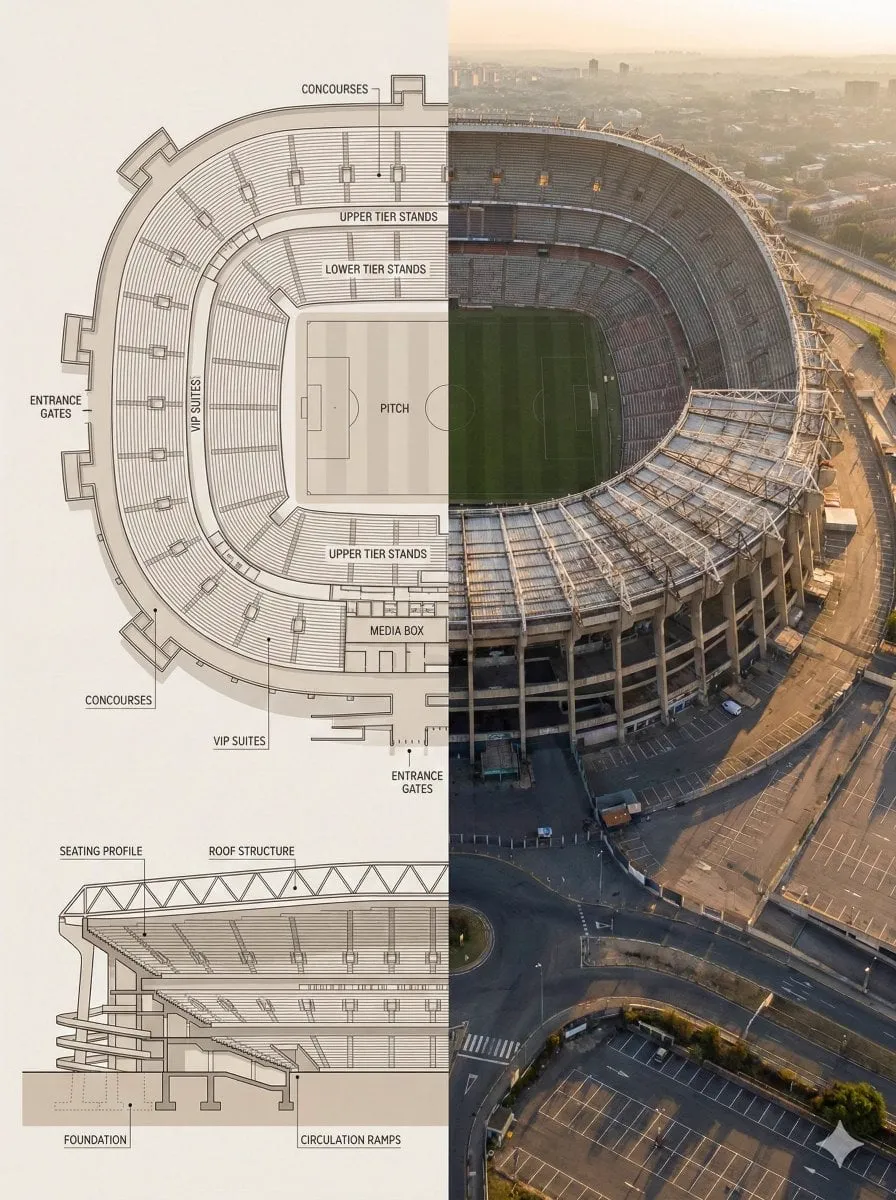
Finally, do not use a generator for work it is bad at. Precision diagrams, accurate typography-heavy layouts, and strict brand templates are usually faster in a vector or layout tool with generated imagery dropped in as an element.
Ethics, Licensing, and Working With Clients
Before delivering anything, understand what the model's terms allow for commercial use, whether reference images you supplied carry rights, and whether the client wants disclosure that AI was involved. Many brands now have a written policy, and asking early prevents an uncomfortable revision at delivery time.
Be careful with likeness, logos, and recognisable locations. Generating a famous person's face, a trademarked mascot, or a distinctive landmark in a commercial context invites problems that no amount of retouching solves. When a project needs a human subject, hiring a photographer for the hero shot and using generated imagery for context and variants is a defensible, common compromise.
Keep provenance records: prompt, model, version, date, and any references used. It takes a minute per image and it protects you when a question arises months later about how something was made.
FAQ
Do I need more than one image generator?
Usually yes, but only two: one fast tool for ideation and one controllable tool for refinement. Adding a third is worthwhile mainly when you need text rendering or motion-ready hero frames.
Why does the same prompt give different results in different tools?
Each model weights prompt terms differently and has its own aesthetic bias. Treat your prompt as a specification the model interprets, not a command it obeys, and adjust the wording when switching tools.
How do I stop images from looking generically AI-made?
Reduce style adjectives, name a specific medium, choose less obvious angles, and add deliberate imperfection: off-center framing, natural shadow, texture. Generic output usually means a generic brief.
What is the fastest way to fix one bad area?
Inpainting or a masked edit. Regenerating the whole frame risks losing everything you already liked, and compositing in a design tool is slower and often leaves visible seams.
Should I generate at final resolution?
Rarely. Iterate at a working size, then upscale the approved frame. Resolution should be the last decision, not the first.
A Short Pre-Flight Checklist
Before you call an image finished, confirm six things: the subject is unambiguous at a glance; the composition leaves room for whatever text or UI will sit on top; lighting direction is consistent across the frame; hands, eyes, and product edges survive a 100 percent zoom; the palette matches the brand reference; and the file is exported at the correct aspect ratios with clear version labels.
Run that checklist every time and the tool you use matters far less than the process around it. Models will keep improving, and new ones will keep arriving with louder claims. The teams that stay productive are the ones whose workflow survives the upgrade.
