
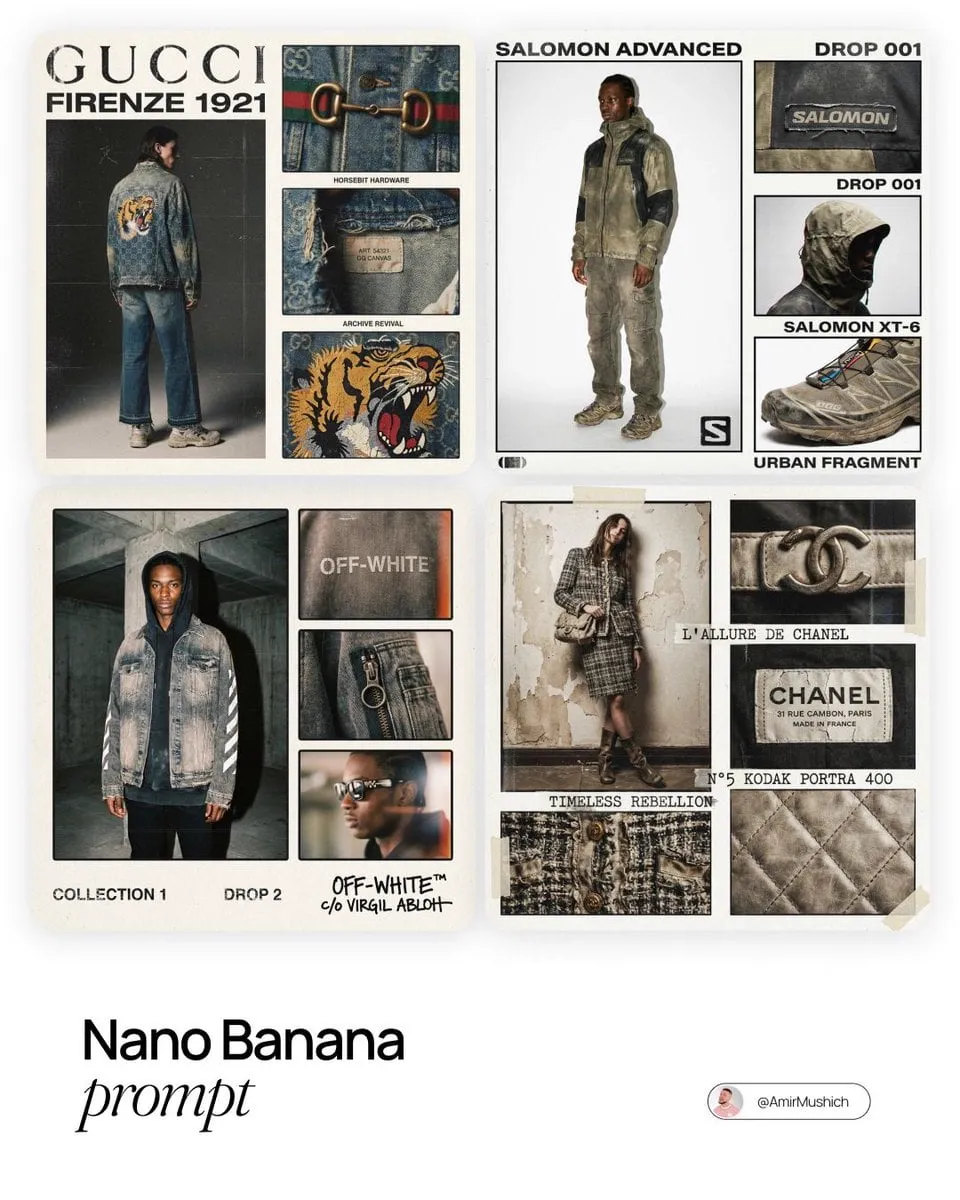
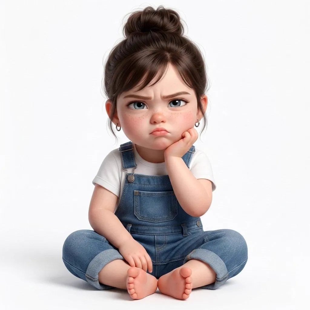
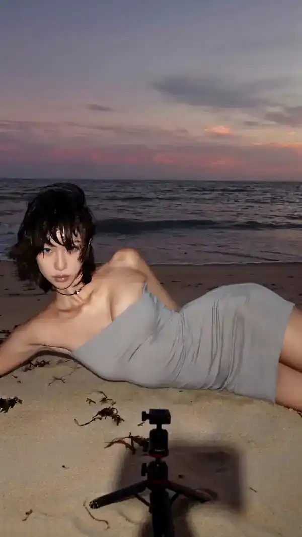
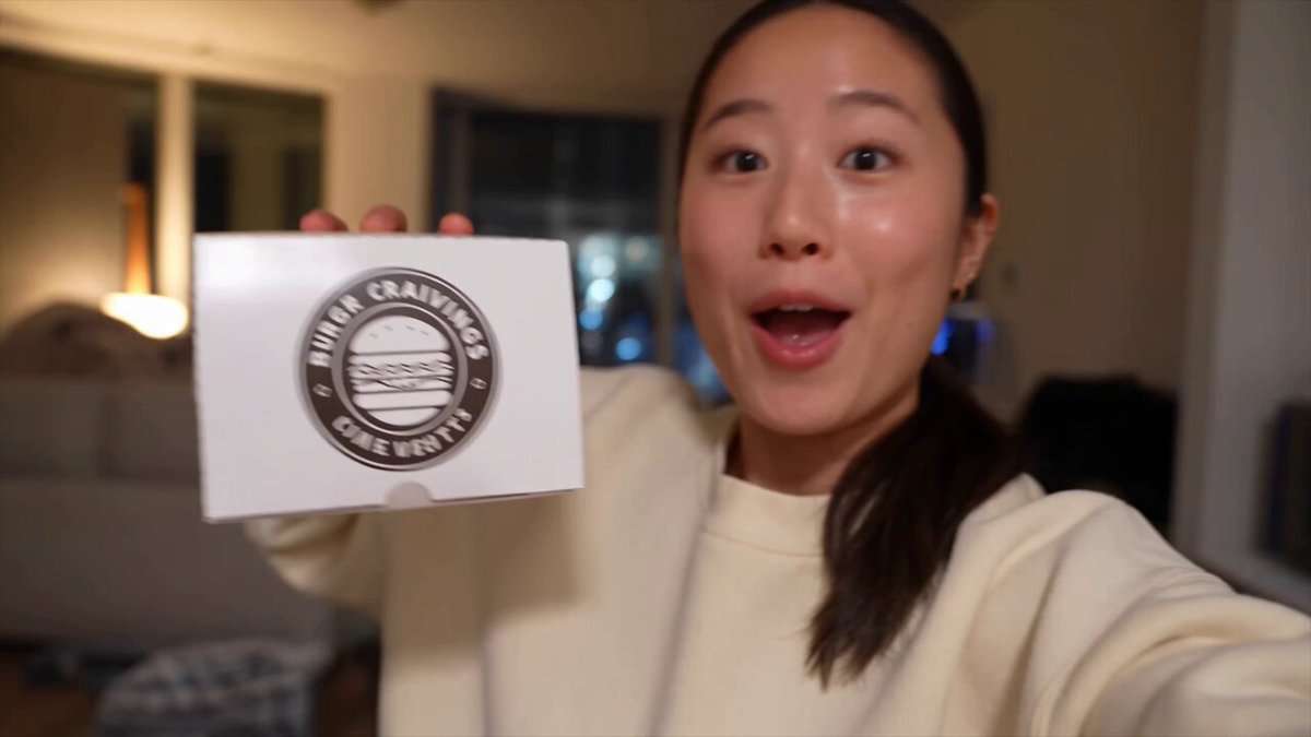
Why Thumbnails Decide Whether Your Video Gets Watched
A thumbnail is the first argument your video makes, and it makes that argument in roughly a fifth of a second. In a feed, viewers do not read titles first. They scan a grid of images, and only the image that opens an unresolved question earns a second look. Everything else in your pipeline, the script, the lighting, the edit, stays invisible until that image wins. Thumbnail design deserves its own structured workflow rather than a frantic screenshot grab five minutes before publishing.
Generating thumbnails with AI has changed the economics of that workflow. Where a designer once needed hours for a single composite, a text-to-image model produces a dozen usable directions in minutes. The bottleneck has moved. It is no longer production capacity, it is judgment. The creators who benefit most from AI thumbnails are rarely the ones generating the highest volume of images. They are the ones with a clear standard for what a preview image must accomplish.
That standard is easy to state and hard to hit: one subject, one emotion, one visual promise, legible at the size of a postage stamp. The rest of this guide walks the full loop, from extracting a hook out of your footage to writing prompts that behave like shot directions, refining with local edits, running honest tests, and exporting files that survive every platform crop.
What AI Image Models Actually Do Well for Thumbnails
Modern image models are exceptional at a specific set of tasks. Photorealistic faces with believable skin and eye highlights. Dramatic lighting setups you could not afford to shoot. Clean product renders on seamless backgrounds. Background replacement, object removal, style transfer, and upscaling that holds up at 1280 by 720 pixels. If your thumbnail concept is a metaphor, a composite, or an exaggerated version of reality, generation is often faster than photography.
They are also good at variation. Ask for the same scene five times with different camera angles or emotional beats and you get five genuinely different starting points. That is the real advantage: not the perfect first image, but a wide funnel of directions you can narrow quickly.
Where the models still struggle
Text inside the image remains unreliable, especially short words with tight kerning. Generate the visual, then set the text yourself in a layout tool. Hands, small props, and complex interactions between two people are frequent weak spots. Brand-accurate logos should never be generated; place them as clean vector overlays. And precise composition, meaning "subject on the left third with empty space top right," often requires several attempts or a mask-based edit rather than a single prompt.
Synthetic image or extracted frame?
Use a real frame when the value of the thumbnail is a genuine expression, a candid moment, or proof that something happened on camera. Use a generated image when the value is a concept: transformation, scale, contrast, or a scenario you cannot stage. A practical hybrid works well. Pull a real frame for the subject, generate a background or an exaggerated element, and composite them. You keep authenticity in the face, which drives trust, and gain the visual punch that makes the click.
A Repeatable Thumbnail Generation Workflow
Ad hoc prompting produces inconsistent results. A fixed sequence produces a library you can test. The workflow below assumes you already have the video edited, or at least a rough cut, so you know what the content actually delivers.
Step 1: Extract the hook before you open any tool
Watch your own video and write one sentence: what does the viewer get, and what tension makes them curious? "I rebuilt a broken laptop with parts from a flea market" contains a subject, a constraint, and a promise. That sentence becomes the spine of the thumbnail. If you cannot write the sentence, no image model will save the video.
Next, list the three most visually distinctive moments in the footage with timecodes. Those moments are your candidate sources. A thumbnail should not summarize the whole video, it should spotlight its most surprising instant.
Step 2: Write prompts like shot directions, not captions
Weak prompts read like alt text: "a man with a laptop." Strong prompts read like a director's note to a cinematographer. Include the subject and their expression, the action, the setting, the lighting direction, the lens and framing, the color mood, and the negative space you need for text.
A template that works across models:
- Subject: age range, clothing, expression, gaze direction
- Action: what the hands or body are doing
- Environment: location, time of day, weather, background detail level
- Camera: close-up or medium shot, angle, shallow or deep depth of field
- Light: key light direction, rim light, practical sources
- Mood: three adjectives, plus a color palette
- Space: "leave the upper right third uncluttered for a text overlay"
One caution: describing composition in prose works better than a long list of technical parameters. Models respond to narrative. "Shot from slightly below, subject leaning toward camera, warm lamp light from the right" beats a wall of comma-separated keywords.
Step 3: Generate in batches of eight to twelve
Generate a batch for each of your two or three concepts, not one image per concept. Variation is where discovery happens. Keep the seed fixed when you want to refine a direction and change the seed when you want to escape a rut. Save everything to a folder with a naming convention that includes the concept and iteration number, otherwise you will lose the one good frame in a sea of near misses.
Step 4: Refine with inpainting instead of rerolling
When an image is 80 percent right, do not regenerate. Mask the problem area and fix it: replace a mangled hand, widen the empty zone for text, change the background from a cluttered street to a plain wall, adjust the expression. Inpainting preserves the parts that already work, which is why it converges faster than repeated full generations. Two or three targeted edits usually beat twenty fresh rolls.
Step 5: Validate at 20 percent zoom
Before you fall in love with a 2048-pixel render, shrink it to roughly 168 by 94 pixels, which is close to how a viewer sees it on a phone. If the subject disappears, the emotion is unreadable, or two elements merge into visual mush, the thumbnail fails regardless of how good it looks full size. This single check eliminates most bad candidates faster than any other step.
Keeping Subjects Consistent Across a Series
If you publish a recurring show, a recognizable visual identity is worth more than any individual clever image. Consistency comes from locking variables. Fix the color grade, the lighting direction, the framing distance, and the position of your title text across every episode. Only the central subject should change.
Techniques that help: reuse the same descriptive phrase for your subject in every prompt, keep a reference image and use image-to-image or character reference features where the model supports them, and build a small reusable layout in your editor so text placement never drifts. When faces must match a real host, a composited real frame is almost always more reliable than a generated likeness, and it avoids the uncanny drift that appears when a model reinvents a face each time.
Composition Patterns That Earn Clicks
Most high-performing thumbnails follow one of a few underlying structures. Knowing them gives your prompts something to aim at.
Face plus object
A human face on one side and a single object on the other. The face supplies emotion, the object supplies context. Keep the object unmistakable in silhouette and large enough to read at small size. Avoid two competing objects; the eye should not have to choose.
The three-zone layout
Divide the frame into left, center, and right thirds. Place the subject in one zone, the key object in a second, and leave the third empty for text. This structure reads in the same order every time, which is why it performs so steadily across niches. It also means your graphic text never fights your photographic subject for attention.
Color and contrast for small screens
Small images live or die on contrast. Give the subject a light rim or a darker background so the silhouette separates cleanly. Use one saturated accent color and keep everything else muted. Avoid images that are mostly midtone gray, they turn into fog at thumbnail size. Warm skin tones against cool backgrounds tend to pop without looking artificial.
Testing Thumbnails Without Fooling Yourself
Aesthetic opinions are useful for generating candidates, not for choosing winners. Test with data, but test carefully.
Set up the test properly
Change one variable at a time: expression, background, text wording, or crop. If you change all four, you learn nothing about why one image won. Run two to four variants, not ten, because each variant needs enough impressions to produce a meaningful signal. Let tests run long enough to cover different times of day and different audience segments, then stop.
Read more than click-through rate
Click-through rate is the headline metric, but average view duration tells you whether the thumbnail told the truth. A preview that overpromises produces a spike in clicks followed by a cliff in retention. Watch for that pattern. Also track impressions, since a thumbnail can lift click-through rate while the platform reduces distribution. And note returning viewers separately: loyal audiences respond to different cues than first-time viewers.
Export and Platform Checklist
Technical sloppiness destroys good creative work. Standard video platforms want a 16:9 image at 1280 by 720 pixels or larger, under a couple of megabytes, in JPG or PNG. Short-form vertical platforms want 9:16, and square feeds want 1:1. Design for the smallest crop you need and keep the subject centered enough to survive it.
Additional checks: keep text at least 10 percent away from every edge, avoid placing important elements where a duration or progress bar appears, export at the highest quality your file size allows, and check the final file on an actual phone rather than only on a desktop monitor. Desktop screens flatter images that fail on mobile.
Common Mistakes That Kill Otherwise Good Thumbnails
Too many elements. Three competing focal points is two too many. Text that repeats the title instead of adding to it. Faces cropped at the chin. Contrast so low the subject merges with the background. Generated text with broken letters. Human hands with six fingers left uncorrected. Thumbnails that look identical across a series, so viewers cannot tell episodes apart. And the most common error of all: designing for the editor's full-screen preview instead of the feed.
A second cluster of mistakes is about strategy rather than craft. Chasing a style because a competitor uses it, even though it does not match your content. Overpromising to win a click, then losing the viewer in the first thirty seconds. Testing only two images and concluding that a face always wins. And treating thumbnail work as a one-time task rather than a repeating loop that improves with every release.
Choosing Tools and Building Your Stack
You do not need a single monolithic platform. A practical stack has four parts: a text-to-image generator for concepts and backgrounds, an editing tool with masking and inpainting for refinement, a layout tool for text and logos, and an analytics view for testing. Some suites combine all four, which reduces friction, but separate specialist tools are often more capable at any single step.
Decision criteria that matter more than brand names: does the generator support consistent character references, does it allow inpainting and outpainting, can it output at high enough resolution without an obvious upscale, and does your editing tool handle layered text cleanly. For teams, add collaboration and version history. For solo creators, add speed. The tool that lets you produce twelve tested variants in an afternoon beats the one that produces a single beautiful image in three days.
FAQ
Do AI-generated thumbnails perform worse than photographed ones?
Not inherently. Viewers respond to clarity, emotion, and relevance, not to how the image was made. Generated backgrounds combined with real faces often outperform both pure photography and pure generation.
How many thumbnails should I generate per video?
Generate eight to twelve candidates per concept, then narrow to two to four for testing. Most of the value comes from the narrowing, not the generating.
Can I let the model render the text inside the thumbnail?
Small, stylized text sometimes works, but reliability is low. Generate the image without text and add typography in a layout tool for full control over legibility.
How long should a thumbnail test run?
Long enough that each variant accumulates a meaningful number of impressions and the test spans several hours of audience activity. If the difference is not visible by then, the two images are close enough that other factors should decide.
What is the biggest improvement most creators can make?
Checking candidates at actual feed size before choosing. Half of all weak thumbnails are strong images that simply cannot be read small.
