
Why the Thumbnail Decides Whether Your Video Gets Watched
A viewer never meets your opening shot first. They meet a rectangle roughly the size of a postage stamp on a phone screen, in a feed that is scrolling faster than they can read. That rectangle has about half a second to answer one question: is this for me, and is it worth the next ten minutes of my life?
Everything you build afterward — the hook, the pacing, the payoff, the edit that took three weekends — only matters if the thumbnail wins that half second. Packaging, not editing, is usually the highest-leverage skill on a growing channel. A strong thumbnail on a mediocre video can still find an audience. A weak thumbnail on an excellent video usually buries it, and the creator often concludes the topic was bad when the packaging was the problem.
AI has changed the economics of that first frame. Backgrounds that once required a photoshoot, a stock subscription, or an afternoon of masking are now a prompt away. Character consistency that used to demand careful lighting setups can be approximated with reference images. Iteration that used to cost hours now costs minutes, which means you can test more directions and discard more bad ones.
But speed introduces a new failure mode: thumbnails that look generated rather than designed. Plastic skin, melted fingers, gibberish lettering, and that unmistakable synthetic glow. Viewers may not consciously identify why an image feels off, but they scroll past it anyway. The goal of this guide is not to use AI everywhere. It is to use AI for the parts where it is genuinely faster and better, and to keep human judgment on the parts that decide whether a click feels earned rather than extracted.
What "Positive Click-Bait" Means in Practice
The phrase sounds like a contradiction, so it is worth defining precisely. Negative click-bait overpromises and underdelivers. The thumbnail implies a confrontation, a reveal, a transformation, or an outcome that never arrives. The viewer feels tricked, leaves early, and — more damaging over time — learns to distrust your future thumbnails.
Positive click-bait does the opposite. It creates a genuine curiosity gap and then closes it inside the video. The thumbnail is an honest trailer, not a bait-and-switch. People click because they actually want the thing you are actually delivering, which means retention holds and the recommendation system keeps showing the video.
The distinction matters because platforms and audiences punish deception on different timelines. Audiences punish it immediately, with a fast exit in the first thirty seconds. Recommendation systems punish it more slowly, with weaker distribution once retention signals flatten out. By the time a creator notices the second punishment, they have often already built a content strategy on top of it.
The Three Tests Every Thumbnail Should Pass
The clarity test. Squint at your thumbnail from two meters away, or shrink it to ten percent zoom. Can you tell what the subject is, what the emotion is, and roughly what the video is about? If you need to enlarge it to understand it, it has already failed for most of the feed.
The honesty test. Write a one-sentence promise based only on the thumbnail. Then watch the first sixty seconds of your video. If the promise and the payoff are two different things, redesign the thumbnail rather than rewriting the script. Changing the image is faster and usually more accurate than changing the video.
The distinctiveness test. Place your thumbnail next to five competing thumbnails on the same topic. Does yours use a different color palette, framing, or visual metaphor? If a viewer could swap the images between videos without noticing, you have produced wallpaper, not packaging.
Emotion Travels; Information Does Not
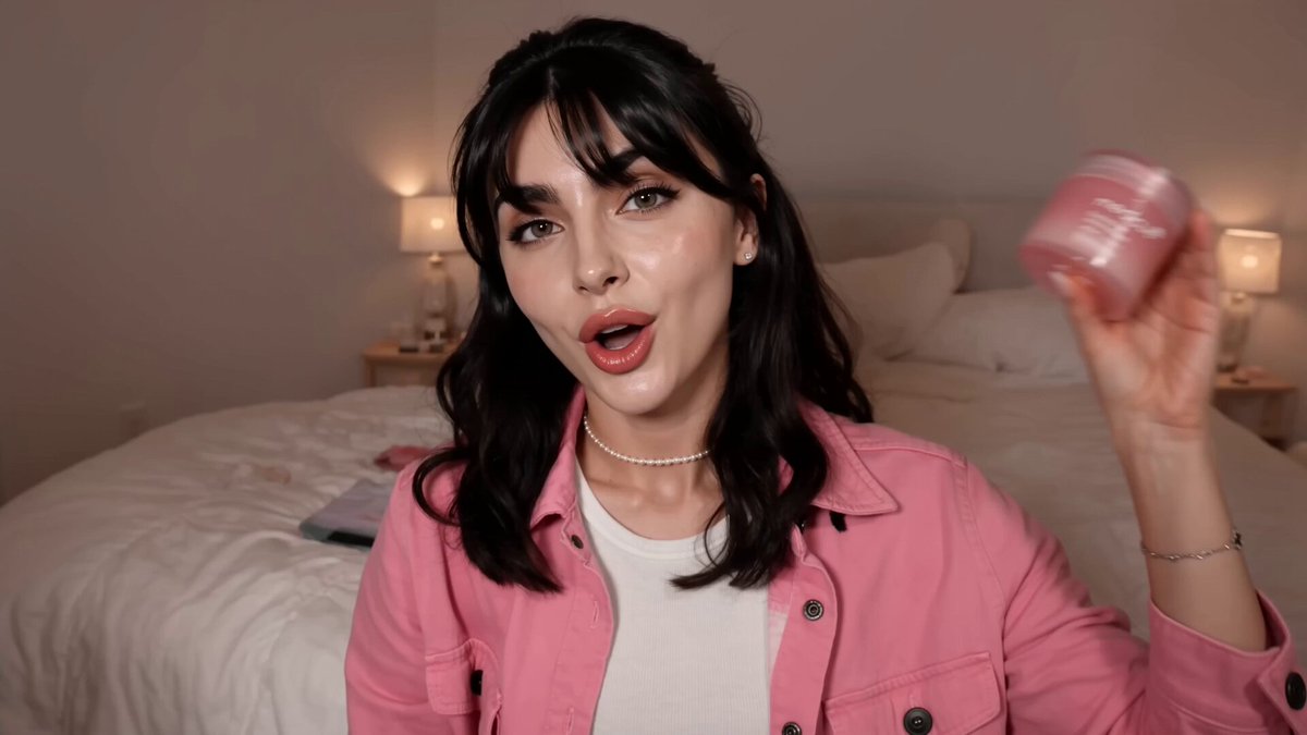
New creators often try to convey the entire topic in the image. That produces busy, text-heavy thumbnails that read like presentation slides. What survives at small sizes is a single clear emotion: surprise, satisfaction, relief, tension, curiosity, mild disbelief. Emotion is legible at thumbnail scale. Detail is not.
The Packaging Loop: Thumbnail, Title, and Hook as One Asset
The most common workflow mistake is treating the thumbnail as a final decoration applied after the video is finished. Strong channels design the packaging first and let it shape the script. Thumbnail, title, and first thirty seconds should feel like three angles on a single promise.
A useful rule: the title and thumbnail should not repeat each other. If the title states the thing and the thumbnail shows the thing, you have spent two assets saying one sentence. Instead, let the thumbnail supply the visual stakes and the title supply the specifics.
| Title does this | Thumbnail does this |
|---|---|
| Names the subject precisely | Shows the emotional stakes |
| Adds a number, timeframe, or constraint | Shows a before-and-after or a conflict |
| Signals format (test, review, teardown) | Signals visual quality and tone |
| Answers "what will I get?" | Answers "why should I care?" |
The third piece, the hook, is where the promise gets cashed. If the thumbnail shows a wrecked kitchen and the title says "one pan ruined dinner," the first thirty seconds should be standing in that kitchen, not a thirty-second intro animation. Any gap between packaging and payoff reads as a broken promise, even when the content is good.
A Quick Packaging Brief You Can Reuse
Before generating any image, write five lines:
- One-sentence promise in plain language.
- The single emotion the viewer should feel.
- The one object or person that must be recognizable at small size.
- The color that carries the emotion (and the color you will avoid because competitors use it).
- The contrast pairing with your title, so the two assets add up to more than either alone.
This brief takes four minutes and prevents the most expensive error in thumbnail work: generating twenty attractive images that do not mean anything.
An AI-Assisted Thumbnail Workflow From Brief to Export
This is a practical sequence that works whether you are a solo creator or part of a small team. It assumes you already have a video topic and rough script, not a finished edit. Packaging first, footage later.
Step 1: Collect Reference, Not Inspiration
Open the search results for your exact topic and screenshot the top ten thumbnails. Do not save them as mood boards. Instead, mark three things about each: dominant color, subject framing, and text style. You will almost certainly find a pattern — everyone using the same blue-to-orange gradient, everyone putting an arrow on the left, everyone framing a face on the right third.
That pattern is your opportunity. Your packaging brief should specify at least two deliberate departures from it.
Step 2: Generate Backgrounds and Props, Not Faces
AI image generation is weakest at the exact thing thumbnails rely on most: a specific human face expressing a specific emotion with a specific expression of surprise. It is excellent at environments, textures, abstract shapes, props, and stylized illustration.
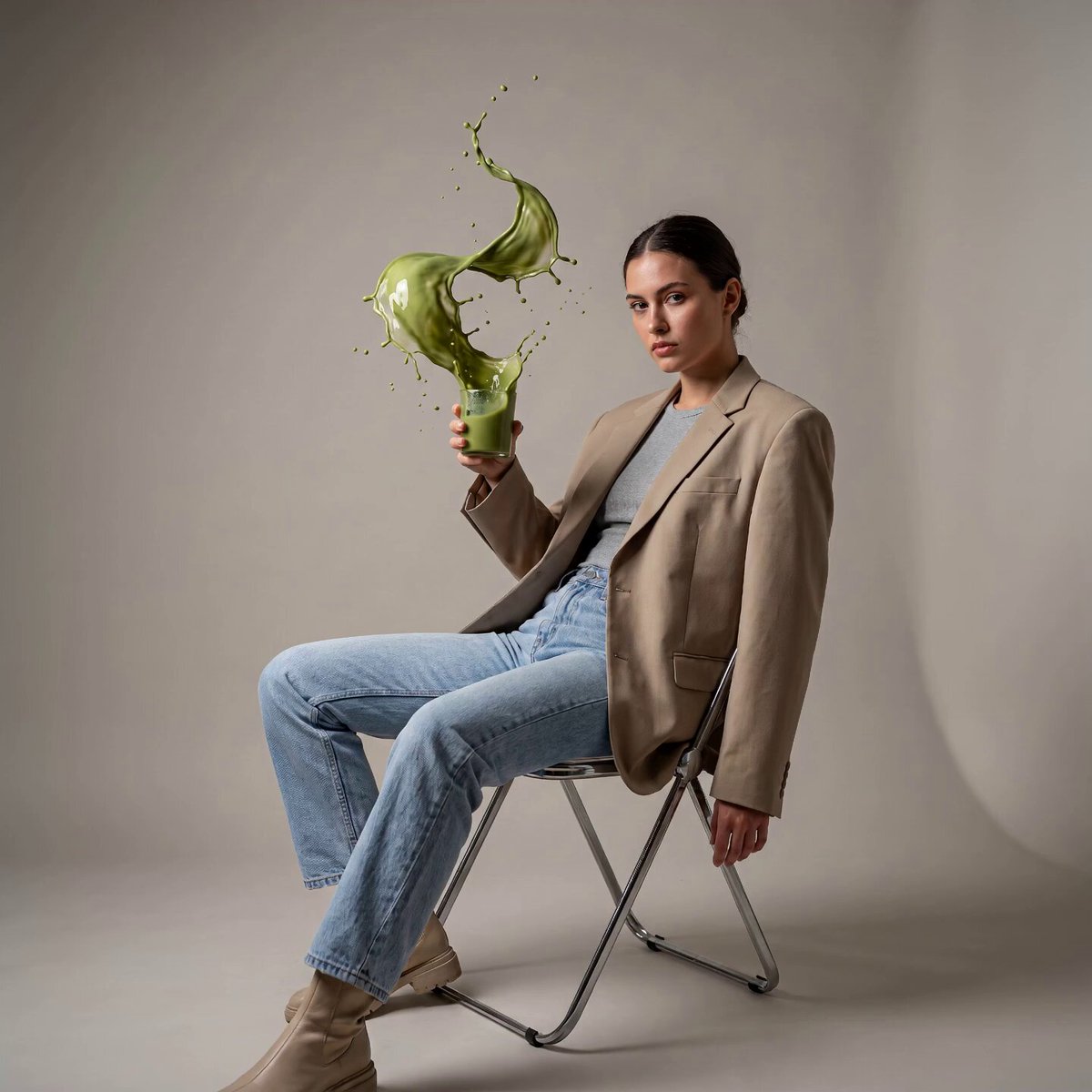
So split the job. Generate the kitchen, the workshop, the studio, the tropical storm, the abstract gradient, the pile of objects. Use real footage frames or a photographed expression for the person. Composites built this way look intentional because they are intentional.
Step 3: Build the Composition in Three Layers
Layer one is the background, generated or photographed. Layer two is the subject cutout, placed on a third line rather than dead center. Layer three is text, added last so the type respects the subject's silhouette.
A simple sanity check: convert the whole thing to grayscale. If the layers do not separate into clearly different values, the thumbnail will collapse into mush on a small screen, no matter how good the colors are.
Step 4: Add Type Like an Editor, Not a Poster Designer
Three to five words maximum. Big, heavy, condensed letterforms with tight spacing. High contrast against whatever is directly behind them. Either a hard shadow or a solid color block behind the text — never both, unless you enjoy visual noise.
Avoid thin serif fonts, avoid outlines so thin they disappear on mobile, and avoid placing text over a busy region of the image even if the AI output would let you get away with it at full size.
Step 5: Export and Check on an Actual Phone
Export at the resolution the platform recommends, then view it at actual phone size, at arm's length, in a bright room. This is the only test that matters. A thumbnail that looks impressive on a 27-inch monitor and illegible on a phone is a thumbnail designed for the wrong audience.
Step 6: Version It Immediately
Export three variants while the project is fresh: one with a different background color, one with a tighter crop, one with alternate text. Having variants ready turns testing into a ten-second decision instead of a new project.
Prompt Patterns That Produce Usable Frames
Most bad AI thumbnails come from lazy prompts, not weak models. A prompt that says "epic dramatic cinematic kitchen disaster" will produce a generic, over-rendered mess. Specificity is what makes an output usable.
The Four-Part Prompt Structure
Use this order every time: subject, environment, lighting, camera.
- Subject: what the object or scene literally is, described physically. Not "a sad meal" but "a burnt cast-iron skillet with a broken egg on top, smoke rising."
- Environment: where it sits, and what is visible behind it. "Rustic wooden counter, blurred kitchen background, one empty stool."
- Lighting: the emotional lever. "Hard side light from the left, deep shadows, warm highlights." Or "soft overcast daylight, flat shadows."
- Camera: focal length and angle, which controls how much distortion and depth you get. "50mm, slightly above eye level, shallow depth of field."
Negative Constraints Matter More Than Style Words
Style adjectives like "cinematic" or "award-winning" mostly confuse image models. Negative constraints do more work. Specify: no text, no watermark, no extra hands, no visible brand logos, no faces (if you plan to composite a real person), and clear empty space on one side for type.
That last constraint — reserving negative space — is the single most useful thing you can add to a thumbnail prompt. It is the difference between an image you can use and a pretty image you have to crop badly.
Aspect Ratio and Safe Zones
Generate at the aspect ratio the platform expects so you are not stretching pixels later. Then keep the essential subject inside a generous center area, because feeds crop differently across devices, and overlays can cover edges. Nothing that matters should touch the border.
Iterate in Threes
Generate three images at a time, pick one, then change one variable. Changing everything at once teaches you nothing about what worked. Ten iterations of one variable beats one iteration of ten variables.
Consistency Across a Series: Characters, Palettes, and Templates
If you publish a series, your thumbnails are a brand system whether you planned one or not. Viewers should be able to recognize your work in the feed before reading the channel name.
Lock a Palette
Choose three colors and use them for a full season: one dominant, one accent, one for text. Write the values down. When you generate backgrounds, include those colors in the prompt. When you finish in an editor, check that the accent has not drifted into a fourth hue.
Lock the Subject Treatment
Decide how people appear. Cutout with a thin white outline? Natural photo edges? Stylized illustration? Whatever you choose, repeat it. Mixed treatments across a channel's grid look like five different channels fighting for the same click.
Lock the Text Position
One consistent text zone — top-left, bottom-third, whatever fits your composition style — makes your thumbnails scannable as a set. It also speeds up production, because you stop redesigning layout decisions you already made.
Build a Reusable Template File
Create a project file with your palette swatches, your text layer styles, your grain texture, and your export presets already in place. New thumbnail, new background image, same skeleton. Production time drops from an hour to fifteen minutes, and consistency stops depending on your mood.
Legibility Rules: Typography, Contrast, and the Small-Size Test
Half of all thumbnail failures are text failures. The rules are unglamorous and reliable.
Rules Worth Following
- Three to five words. If it needs six, the thumbnail is doing the title's job.
- Set the type large enough that it occupies a meaningful share of the frame.
- Use one font family per thumbnail. Two only when one is a deliberate accent word.
- Keep the stroke thick. Hairline strokes vanish on mobile.
- Watch letter spacing on heavy type; heavy fonts set too tight become single blobs.
Rules Worth Breaking Carefully
- All caps is usually strongest, but a lowercase word in a friendly series can soften the tone.
- Numbers and short phrases beat full sentences, but a well-chosen four-word phrase with a strong verb can outperform a single word.
The Squint Test, Mechanically
Blur your thumbnail heavily, or shrink it until it is about 120 pixels wide. If you can still identify the subject, the emotion, and the text, it will work. If the whole thing becomes a smudge of one color, change the framing before you change the type.
Contrast Is a Value Problem, Not a Color Problem
Two saturated colors can have the same brightness and therefore no separation. That is why the grayscale check matters. If you want text to pop, the space behind it needs to be substantially darker or lighter — not merely a different hue.
Testing Thumbnails Without Wasting Weeks
There is a lot of folklore about thumbnail testing, and most of it comes from applying ad-testing logic to a platform that does not work like an ad platform. Here is a practical middle path.
What You Can Actually Control
You cannot run two thumbnails on the same video simultaneously and get a clean comparison, because the platform serves one asset at a time. What you can do is sequence and compare across similar videos, or swap after a fixed window and watch the shape of the curve rather than the raw number.
The Practical Testing Protocol
- Let a new video run for a set window — often the first 48 to 72 hours — with its original thumbnail.
- Record click-through rate, average view duration, and impressions as a baseline.
- Swap one variable only: background color, subject crop, or text.
- Watch the following window. If click-through rises while average view duration holds, keep the change.
- If click-through rises but average view duration collapses, revert immediately. That pattern means the new image is promising something the video does not deliver.
Why Retention Is the Tiebreaker
Click-through rate can be gamed by an appealing image that lies. Average view duration cannot. When the two metrics disagree, trust retention, because it is the signal the recommendation system weighs more heavily over time. A thumbnail that wins clicks and loses viewers is a slow-acting penalty.
Test Ideas, Not Shades
Swapping a background from blue to teal is not a test, it is decoration. Test meaningfully different concepts: a face versus an object, a before-and-after versus a single subject, a high-contrast text block versus no text at all. Concept-level tests give you insights you can reuse across dozens of videos.
Ten Mistakes That Quietly Kill Performance
1. Designing at full size only. Always check at phone scale before publishing.
2. Repeating the title in the image. Use the two assets to say two complementary things.
3. Using an obviously generated face. Composite real footage or photographs whenever the person must carry the emotion.
4. Overloading with elements. One subject, one emotion, one idea. Everything else is noise.
5. Fighting the surrounding feed. If you look identical to the top ten results, you are invisible by design.
6. Forgetting mobile crops. Keep important content away from edges and corners.
7. Using AI text inside the generated image. Image models still mangle lettering. Add type in an editor.
8. Neglecting the thumbnail's relationship to the first thirty seconds. Packaging and hook should feel like one sentence.
9. Changing five things at once. You will never learn what worked.
10. Never revisiting old videos. Back-catalog thumbnails benefit from refreshes more often than most creators expect, especially evergreen how-to content that keeps surfacing in search.
FAQ: Practical Questions About AI Thumbnail Work
Should I use AI for the whole thumbnail or only parts of it?
Use it for backgrounds, textures, props, and stylized illustration. Handle the human subject with real footage or photography when the expression matters. Handle typography in a design editor, always. That split gives you speed without the synthetic look that makes viewers scroll.
How many variants should I generate before choosing?
Three to five per concept is plenty, and one strong concept beats ten variations on a weak one. If you find yourself generating twenty images and still not happy, the problem is the packaging brief, not the model. Go back and rewrite the one-sentence promise.
Can I reuse the same template for every video?
Yes, and you probably should for a series. Consistency in palette, text zone, and subject treatment makes your channel recognizable at a glance. Just rotate the background, the subject, and the emotional angle so consecutive uploads do not look like duplicates.
How long should a thumbnail take?
With a saved template and a clear brief, fifteen to thirty minutes is realistic. If it is taking two hours, you are making design decisions that should already be locked in your template file.
Does a clickbait-style expression actually help?
Exaggerated shock faces have been overused to the point that they read as generic. A genuine, specific emotion tied to the video's actual content performs better and does not train viewers to distrust you. If the emotion in the image is not in the video, remove it.
What if my best-performing thumbnail is one I did not like?
Trust the data but investigate it. Ask what the winning image did structurally — contrast, crop, simplicity, unusual color — and try to reproduce that quality intentionally rather than copying the image itself.
How often should I refresh old thumbnails?
Review your back catalog when you notice a video with strong retention but weak click-through. That combination is the clearest signal that the content is good and the packaging is the bottleneck. Refresh those first.
Do I need professional design software?
No. You need layer control, text styling, and export presets. Plenty of browser-based editors handle that. What you cannot skip is a template file and a habit of checking on a real phone before publishing.
Turning the Workflow Into a Weekly Habit
The creators who win the thumbnail game are rarely the most talented designers. They are the ones who built a repeatable loop: brief, generate, composite, check at phone size, export variants, publish, review the numbers, and refine one variable next time.
Start small. Take your next three videos and run them through the packaging loop before you edit anything. Write the promise line, lock the palette, generate a background with reserved negative space, composite a real expression, add three words of heavy type, and look at the result on your phone. Then note what you learned and change exactly one thing on the next video.
AI makes the raw material cheap. Judgment is still the scarce resource — knowing which frame means something, which emotion is honest, and which promise your video actually keeps. Get that right, and the clicks stop feeling like bait and start feeling like an invitation.
