

Why the Thumbnail Carries More Weight Than the Video Itself
A thumbnail is not decoration. It is the compressed argument for why someone should spend the next eight minutes of their life with you. In a crowded home feed, three elements compete at once: the image, the title, and the channel name. Of those, only the image communicates before the viewer consciously decides to read. That is why the same video can perform dramatically differently with two different thumbnails, and why excellent content can stay invisible behind a weak cover image.
The uncomfortable implication for creators is that thumbnail design belongs at the start of production, not at midnight before publishing. Treating it as a first-class step changes how you script, how you shoot B-roll, and even how you frame your talking-head shots. When you know the thumbnail needs a clear emotional face, a single readable phrase, and strong separation between subject and background, you start capturing those assets on set instead of hunting for them later.
AI has not changed what makes a thumbnail work. It has changed how quickly you can produce, test, and refine candidates. The creative judgment remains yours; the mechanical labor of rendering variations, resizing, cleaning edges, and exploring lighting styles is where automation earns its place.
How AI Changes the Thumbnail Production Pipeline
Speed becomes a design variable
Traditional thumbnail production is serial: sketch, source assets, arrange, export, review, revise. Each revision costs real time, so creators usually stop at two options. AI generation collapses the middle of that loop. You can produce twenty distinct visual directions in the time it used to take to produce two, which turns iteration from a luxury into a normal part of the process. When variation is cheap, you stop defending your first idea and start comparing alternatives honestly.
Consistency stops being a manual chore
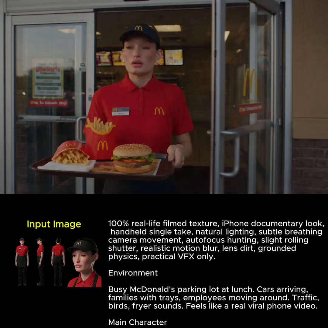
Series-based channels live or die on recognition. A viewer should identify your content from a thumbnail alone, at a glance, without reading the channel name. AI helps here in two ways: it can reproduce a recurring character or mascot with stable facial features across many images, and it can apply a consistent grading and lighting language so every cover feels like it belongs to the same family. Manually matching skin tones, color temperature, and framing across dozens of files is exhausting. Generating all of them from a shared prompt scaffold removes most of that drift.
Cheap iteration changes your decision-making
The real benefit is not aesthetic, it is statistical. When generating alternatives is fast, you can test more hypotheses per month, and each test teaches you something about your audience. Over a quarter, a channel that tests one thumbnail idea per video learns far less than a channel that tests three. AI does not guarantee better results by itself, but it dramatically increases the number of learning opportunities you get.
Anatomy of a High-Performing Thumbnail
The face and the emotion
Human faces attract attention faster than any other visual element, and emotional faces attract it faster still. Surprise, delight, mild disbelief, and focused concentration all read instantly at small sizes. The mistake is using a neutral or overly polished expression. A subtle smile often looks like nothing at 15 percent scale. If your thumbnail depends on a face, exaggerate the emotion one step beyond what feels natural on a large monitor.
Contrast that survives a small screen
Thumbnails are viewed at roughly the size of a postage stamp on mobile. Fine detail disappears. What remains is shape, silhouette, and contrast. A useful test is to squint at your design until detail vanishes; whatever still reads at that point is your real thumbnail. Strong subject-background separation, a bright subject against a dark field, or a saturated accent against muted surroundings will always beat intricate texture that only looks good full-screen.
Text you can read at 10 percent scale
If you include words, cap them at three or four. Use a heavy typeface, tight tracking, and a thick outline or a soft shadow so the letters never melt into the image. Place text where it does not collide with the timestamp overlay in the corner or the progress bar. And remember that on mobile, long words get truncated visually by surrounding elements; short, punchy phrases survive better than complete sentences.
Composition and negative space
An effective thumbnail has one dominant subject and deliberate empty space. Negative space is what makes the subject legible and gives text somewhere to live. AI generations often fill the frame with detail because the model interprets an empty prompt region as a request for more texture. Counteract this by explicitly asking for clean, uncluttered backgrounds, shallow depth of field, and a single focal subject.
Curiosity gaps without deception
A strong thumbnail opens a question the viewer wants answered. It should not promise something the video never delivers. Mismatch between thumbnail and content produces short watch sessions, and platforms notice retention far more than they notice the click. Aim for tension that resolves inside the video: a partial reveal, a before-and-after split, an object that obviously does not belong.
A Repeatable AI Thumbnail Workflow
Step 1: Write a thumbnail brief before you write a prompt
Before touching any tool, answer four questions in a note: what is the single idea, what is the emotion, what is the one phrase of text, and what visual element creates curiosity. A brief of three sentences prevents the most common failure mode, which is generating attractive images that have nothing to do with the video. The brief is also what lets you hand the task to someone else later without losing the intent.
Step 2: Build prompts in layers
Effective prompts read like a shot list. Start with the subject and action, then add framing, then lighting, then color treatment, then rendering style, then negative constraints. A layered example for a tutorial video might look like: a person with a surprised expression holding a laptop, upper body, centered, shot at eye level, soft key light from the left, warm orange and teal palette, crisp photographic realism, clean uncluttered background, no text, no watermark, no extra fingers. That final negative list matters more than most creators expect, especially for hands and background clutter.
Step 3: Generate a wide first pass
Produce far more candidates than you intend to use, then cut hard. Do a first pass at speed and reject anything that fails the squint test. A useful rule is to keep only images that work as a silhouette alone. If you cannot tell what is happening from the outline, no amount of color grading will save it.
Step 4: Composite rather than accept
Generation is a raw material stage, not a finishing stage. Move the strongest candidate into a normal image editor. Recompose, crop to a 16:9 frame, add your text layer, adjust local contrast, and clean stray artifacts. This step is where AI output stops looking generic and starts looking like your channel. It is also where you fix the small errors models consistently make: asymmetrical eyes, merged fingers, floating objects, and backgrounds that mutate halfway across the frame.
Step 5: Export for the platform
Export at a resolution that survives compression and upload at high quality. Keep the file under the size limit your platform allows, and avoid stacking too many aggressive JPEG saves. Save your layered source file so you can re-crop for community posts, shorts covers, and social reposts without rebuilding from scratch.
Prompt Patterns for Common Video Formats
Tutorial and how-to videos
Lead with the outcome, not the process. A finished object, a clean interface, or a before-and-after pair communicates value instantly. Keep the palette bright and the composition tidy so the thumbnail feels instructional rather than dramatic.
Reaction and commentary
These live on emotional faces and strong expressions. Ask for an exaggerated reaction, tight framing, and a background that hints at the subject without competing. If the reaction is about another person or brand, avoid generating a real likeness; use an abstract visual cue instead.
Storytelling and documentary
Atmosphere does the work here. Fog, directional light, a lone figure in a landscape, and a restrained palette create a mood that promises narrative. Text should be minimal, often just a short thematic phrase.
Lists and comparison videos
Numbers help. A large numeral, two contrasting halves, or a ranked arrangement of objects gives the viewer an immediate structural promise. Keep the layout symmetrical so the eye reads it in one pass.
Building Visual Consistency Across a Channel
Consistency is a compounding asset. Define a small style guide and hold to it: two or three core colors, one accent, one typeface for thumbnail text, one lighting direction, one level of contrast. Write these down as reusable prompt fragments so each new thumbnail starts from the same recipe.
For recurring characters or hosts, keep a reference set of two or three approved images and describe the same physical traits in every prompt. Avoid re-rolling a character from scratch each time. Instead, use image-to-image workflows or reference-guided generation so facial proportions, hair, and clothing stay stable. If a character drifts, viewers lose the recognition that made the series feel like a series.
Testing, Measuring, and Improving Click-Through
Treat thumbnails as experiments. Change one variable at a time: expression, palette, text length, or composition. If you change all four at once, you learn nothing about which one moved the needle.
Track click-through rate alongside average view duration. A thumbnail that raises clicks but tanks retention is a net negative, because it attracts the wrong audience. The healthiest pattern is a modest click-through improvement paired with stable or rising watch time. Also note that thumbnails behave differently depending on traffic source: subscribers respond to familiarity, while browse and suggestion traffic responds to curiosity and contrast.
Run comparisons long enough to get a meaningful signal, and keep a simple log of what you tried. A spreadsheet with the video, the thumbnail variant, the hypothesis, and the outcome will teach you more about your audience than any generic best-practice list.
Common Mistakes and How to Fix Them
Too much text. Cut to three or four words. If the idea needs a sentence, the idea is not clear yet.
Low contrast between subject and background. Add separation through lighting, a rim light, or a deliberate color split. Do not solve this with a busy outline that makes the image look like a sticker.
Generic AI look. Overly smooth skin, uniform lighting, and glossy plastic textures announce that an image was generated. Push for a specific lighting setup, a real palette reference, and visible imperfection such as grain or fabric texture.
Repeated composition. If every thumbnail is a centered face with the same expression, viewers stop seeing them. Rotate between at least three layout archetypes.
Text hidden under overlays. Check the mobile preview. Corner timestamps and progress indicators cover more space than most creators assume.
Thumbnail promises the video does not keep. This is the only mistake on the list that can genuinely damage a channel, because it trains the audience to distrust your covers.
Tools, Exports, and a Realistic Setup
A workable stack is smaller than most people think: one generative image tool for raw material, one raster editor for compositing and text, one plain notes file for briefs and style rules, and one spreadsheet for test results. Add a reference-image workflow if you run recurring characters, and a simple folder structure so old layered files remain findable.
Budget your time in blocks. Fifteen minutes for the brief, twenty for generation and selection, thirty for compositing and export. Batching a month of thumbnails in one session is often faster than doing them one at a time, because you stay in the same visual headspace and reuse prompt fragments.
FAQ
Can AI-generated thumbnails match the quality of hand-designed ones?
They can match the visual layer, but the strategy layer still comes from you. Generation handles texture, lighting, and variation; composition decisions, text hierarchy, and the choice of which idea to express remain manual work. The combination consistently outperforms either approach alone.
How many words should a thumbnail contain?
Three to four in most cases, and no more than five. The image should carry the idea; the text should sharpen it.
Is it a problem if a thumbnail includes a realistic human face?
Avoid generating realistic likenesses of real people without permission. For your own on-camera presence, photograph yourself and composite rather than generating an approximation of your face, which will look subtly wrong and weaken recognition.
How do I stop AI thumbnails from looking identical?
Vary layout, framing distance, palette temperature, and emotional register across a series. Keep the typeface and accent color constant so the channel still feels unified. Consistency should come from a small set of shared rules, not from repeating one composition.
Should I test thumbnails before publishing or after?
Both, if you can. Pre-publish comparison against past thumbnails helps you pick, and post-publish rotation lets you measure real behavior. Always pair click data with retention so you do not optimize for clicks alone.
What is the fastest way to improve a weak thumbnail?
Usually one of three fixes: increase contrast between subject and background, reduce the text, or exaggerate the facial expression. Start with those before you rebuild the whole image.
